The network for creativity
Join 1.25M professional creatives like you
Connect with clients, get discovered, and run your business 100% commission-free
Creatives on Contra have earned over $150M and we are just getting started
Back to feedPost

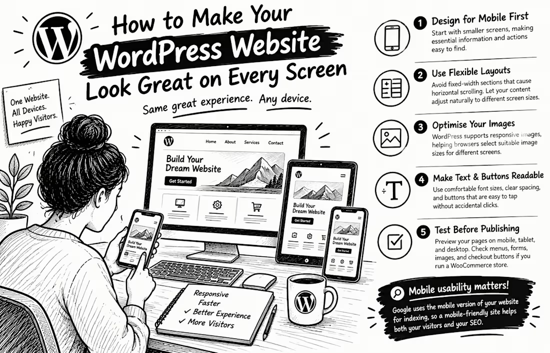
How to Make Your WordPress Website Look Great on Every Screen
Have you ever opened a website on your phone and had to zoom in just to read the text or tap a button? Your visitors shouldn't have to struggle with your website.
A professional WordPress website must work beautifully on phones, tablets, and desktops not just on the designer's computer.
Here are 5 practical ways to achieve that:
1. Design for mobile first. Start with smaller screens, making essential information and actions easy to find.
2. Use flexible layouts. Avoid fixed-width sections that cause horizontal scrolling. Let your content adjust naturally to different screen sizes.
3. Optimise your images. WordPress supports responsive images, helping browsers select suitable image sizes for different screens.
4. Make text and buttons readable. Use comfortable font sizes, clear spacing, and buttons that are easy to tap without accidentally clicking something else.
5. Test before publishing. Preview your pages on mobile, tablet, and desktop. Check menus, forms, images, and checkout buttons if you run a WooCommerce store.
Here's something important: Google uses the mobile version of a website's content for indexing.
So mobile usability isn't just about appearance; it also matters for how your website is understood by search engines.
Your turn: When you visit a website on your phone, what frustrates you most tiny text, slow loading, or confusing navigation? Share your answer below


The network for creativity
Join 1.25M professional creatives like you
Connect with clients, get discovered, and run your business 100% commission-free
Creatives on Contra have earned over $150M and we are just getting started
Related posts

I migrated Pi-lit's site from WordPress to a custom-coded, AI-native website with its own hosting. The result:
-A scalable design system that also supports their ecommerce
-30+ pages with consistent branding throughout
-Animated illustrations of their scenes and products that bring the roadway safety story to life
See Full Case Study


Lovely work


We’re testing two filtering layouts for a template library.
Top Filters
The filters are placed above the content. This option feels lighter, leaves more space for the cards, and works well when there are only a few main categories.
Sidebar Filters
The categories remain visible in the sidebar. This makes the available options easier to scan and works better for more complex filtering, but takes up some of the content space.
Which layout would help you find the right template faster?

24 voted
39%
37 voted
61%
61 votes
Closed

Such a clean presentation. You can tell a lot of thought went into this.


Designers, which direction would you go with: photography or illustration?
83 voted
69%
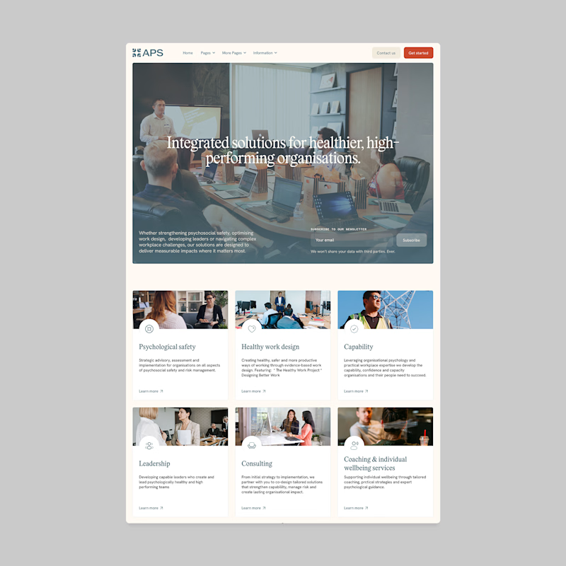
37 voted
31%
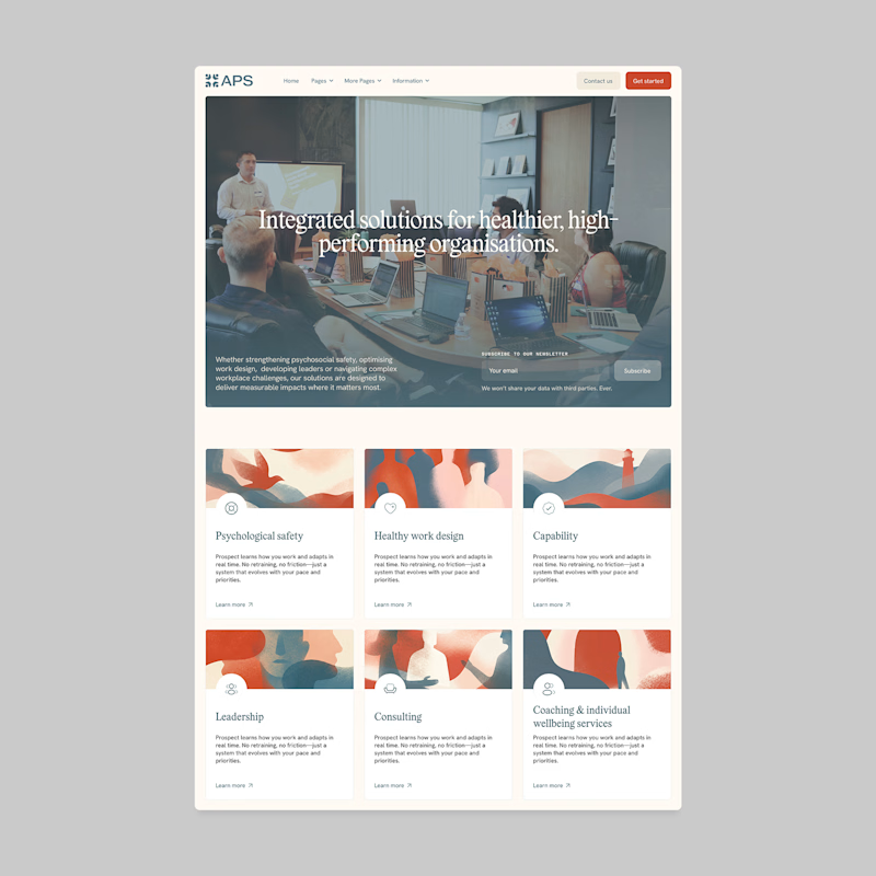
120 votes
Closed

I'll prefer photos, specially talking about organizations in your page, human faces and real scenarios can have a better effect in this case.


