The network for creativity
Join 1.25M professional creatives like you
Connect with clients, get discovered, and run your business 100% commission-free
Creatives on Contra have earned over $150M and we are just getting started
Back to feedPost
Taste Test


Designers, which direction would you go with: photography or illustration?
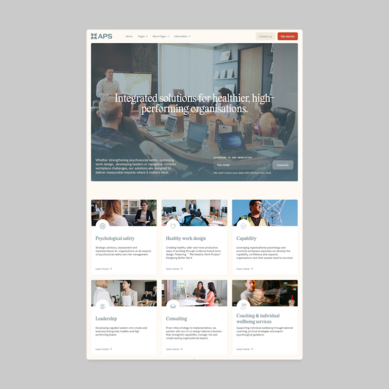
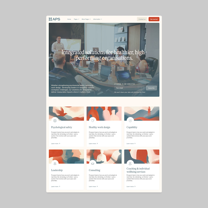
117 votes
Ends in 1h

Photography Illustration


Illustrative one feels more authentic to me.


Photography without questions


Illustration for me. It gives the brand a personality that stock-style photos usually can't match.

Photography looks way professional!

I think it really depends on your audience and who you build for. For some part of people will be enough to only check the title of card + abstract illustrations, but for the audience that not really friendly with sites (old people for example) - it would be better to associate service and their need with specific image.

Very well done! The structure feels organized and professional.

Photography

Photogtaphy

Went with illustration. The photo version is clean but the illustrated blocks give the page more personality.

voted photography
but I think the illustration would work too if there was a illustration too

I choose photography

photography style feels friendly and inviting. Overall layout is very good.

Definitely illustration. The illustrated cards look warm, modern and unique. The photo version feels a bit too much like typical office stock images.


illustration. the hero is already a photo, so the illustrated cards give the page a second texture. with photos all the way down the grid kind of melts into the hero

Photography feels more consistent with the hero section

Nice one mate

Photography, your target audience are organizations.

I'll prefer photos, specially talking about organizations in your page, human faces and real scenarios can have a better effect in this case.

Photography

Photography: I give each blog and individual blog indenitity, and the Illustration page feels we have main blog on to and the smaller cards (bottom section) is the part of upper section.
That what 85% user may feel at a first glance.

Amazing
The network for creativity
Join 1.25M professional creatives like you
Connect with clients, get discovered, and run your business 100% commission-free
Creatives on Contra have earned over $150M and we are just getting started





Related posts


A logo reveal created in Blender, where simple geometric shapes come together to form the Geisleris Studio identity.


Nice

Jordan Racing concept.
What if Jordan Brand launched its own racing team? We imagined the full launch, from the Speed Demon campaign and posters to a telemetry inspired website, racing streetwear and a flagship research facility. Basketball heritage meets Formula 1 speed.
Designed by Studio /03
Concept project, not affiliated with Nike or Jordan Brand.
Art Direction, Brand Identity, Campaign Design, Web Design, Poster Design, Apparel Graphics, Motorsport, Concept


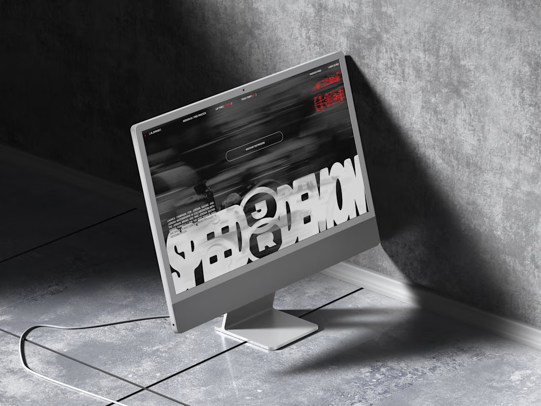
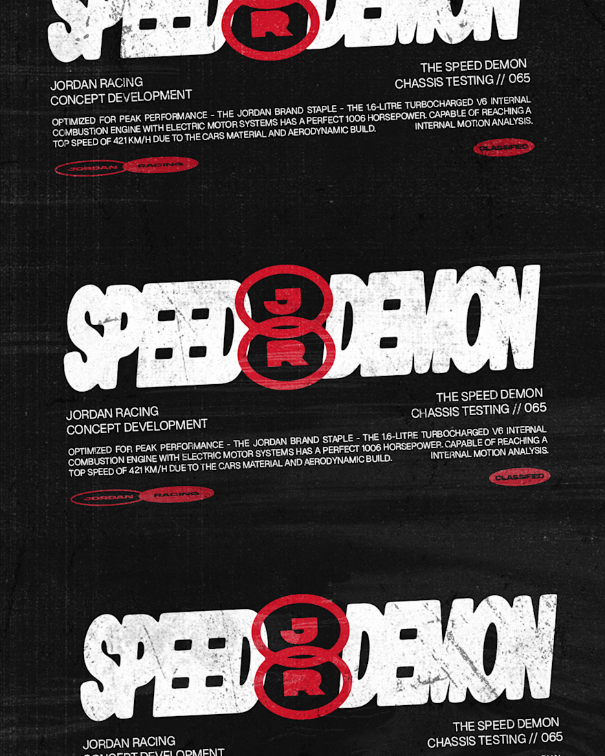
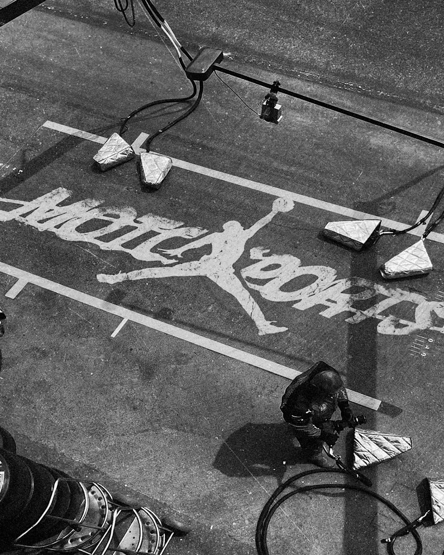
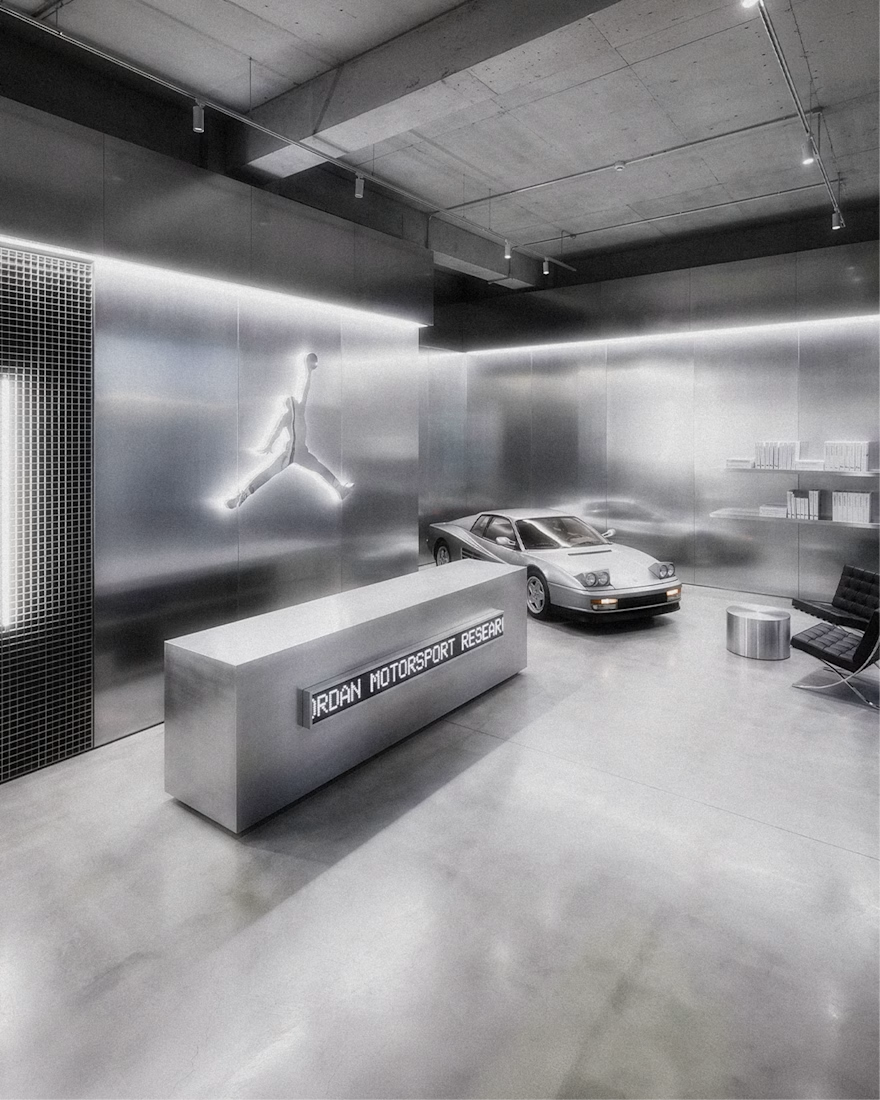
The grayscale with that one red accent keeps the whole system tight. Telemetry style site is a smart touch.

Which N works better? 🗳️
Worked on a logo for Nelcos, a Canadian company that refinishes interiors with architectural film instead of replacing them.
The idea: an unrolled roll of film that turns into the letter N.
The green is there to highlight eco-friendliness: less demolition, less waste.
Two directions for the symbol:
A: rectangular, compact
B: hexagonal, more dynamic
Vote and tell me why in the comments 👇
logodesignlogodesignerbrandidentityLogo DesignBrand DesignGraphic DesignAdobe IllustratorAdobe Photoshop

6 voted
43%
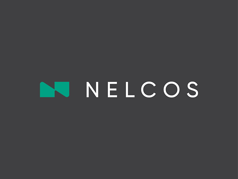
8 voted
57%
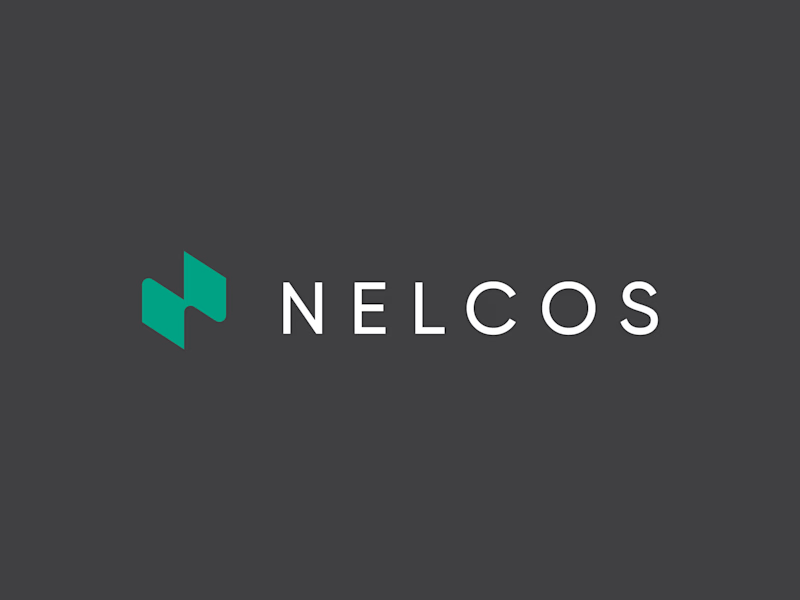
14 votes
Closed

Love the concept! The rectangular N feels more architectural and stable, which fits interiors. Hexagonal feels too techy. The unrolled film idea is brilliant - green for eco is perfect. I'd vote rectangular for this brand. Great work! 👏