
Yusuf Sodiq
Website Designer | Wordpress Designer | UI/UX Designer
Ready for work
Yusuf is ready for their next project!
Hey designers! 👋It's been a while
I recently worked on a mobile banking app concept to add to my portfolio, and the main idea behind it was simple: banking should feel easy, not overwhelming. Most people open their banking app to do just a few things. So the goal was to design a home screen that helps users get to those actions quickly without clutter or confusion.
That’s why the layout focuses on clear sections, simple navigation, and the most important actions right where users can find them. The intention was to make everyday banking feel smoother and more intuitive.
I’d really love for you to take a look and tell me what you think about the experience.
Does the flow feel natural? Is there anything you’d improve?
Your feedback would mean a lot. Let me know in the comments. 👇
1
41
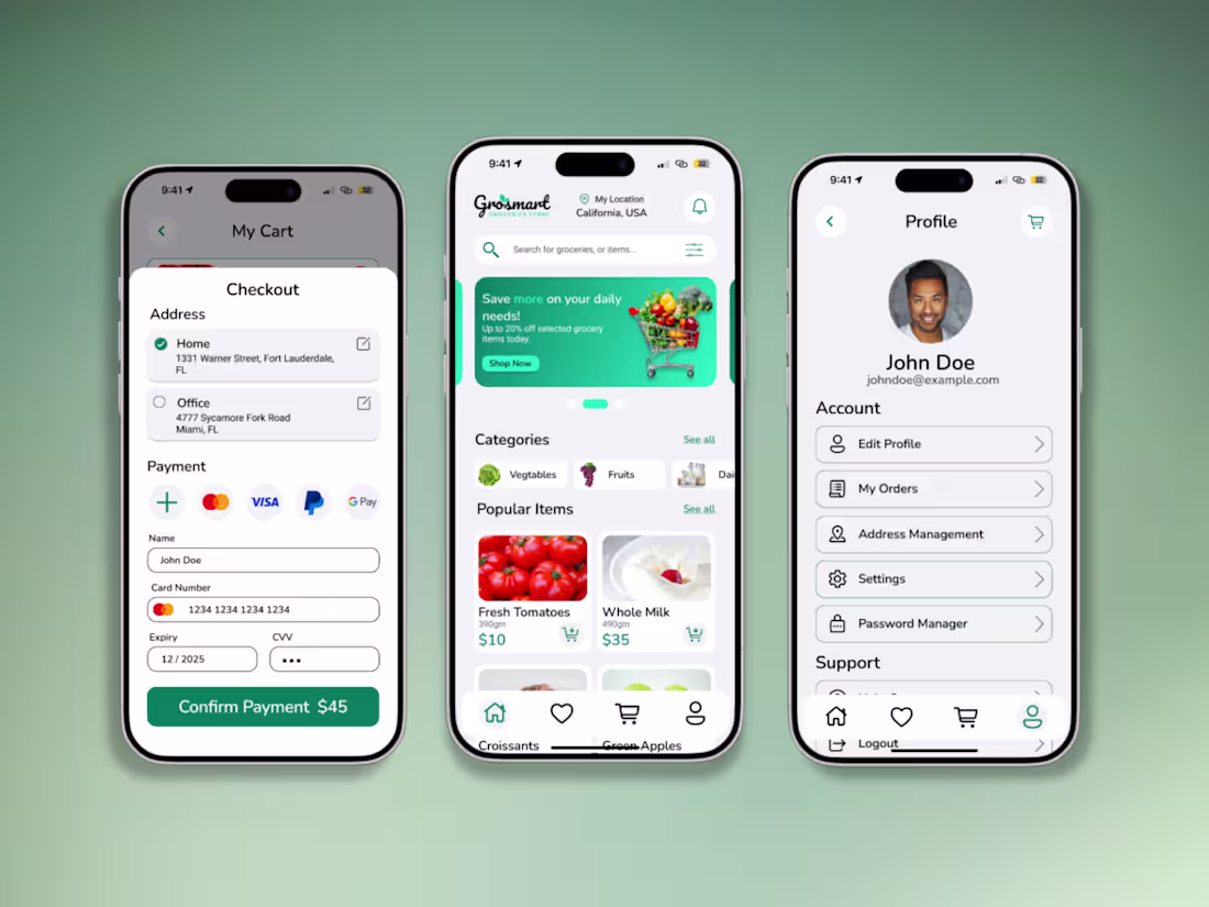
So I recently ventured into UI/UX design and I’m genuinely enjoying the process. As part of that journey, I designed Grosmart, a grocery delivery app focused on making everyday shopping simple, fast, and intuitive.
The design explores clear user flows, clean layouts, and a smooth ordering experience, from browsing products to checkout. I focused on usability and visual clarity while keeping the interface modern and easy to navigate.
Open to feedback and thoughts on the design.
5
12
148
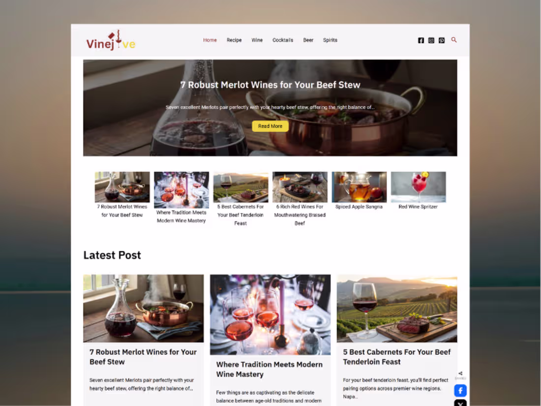
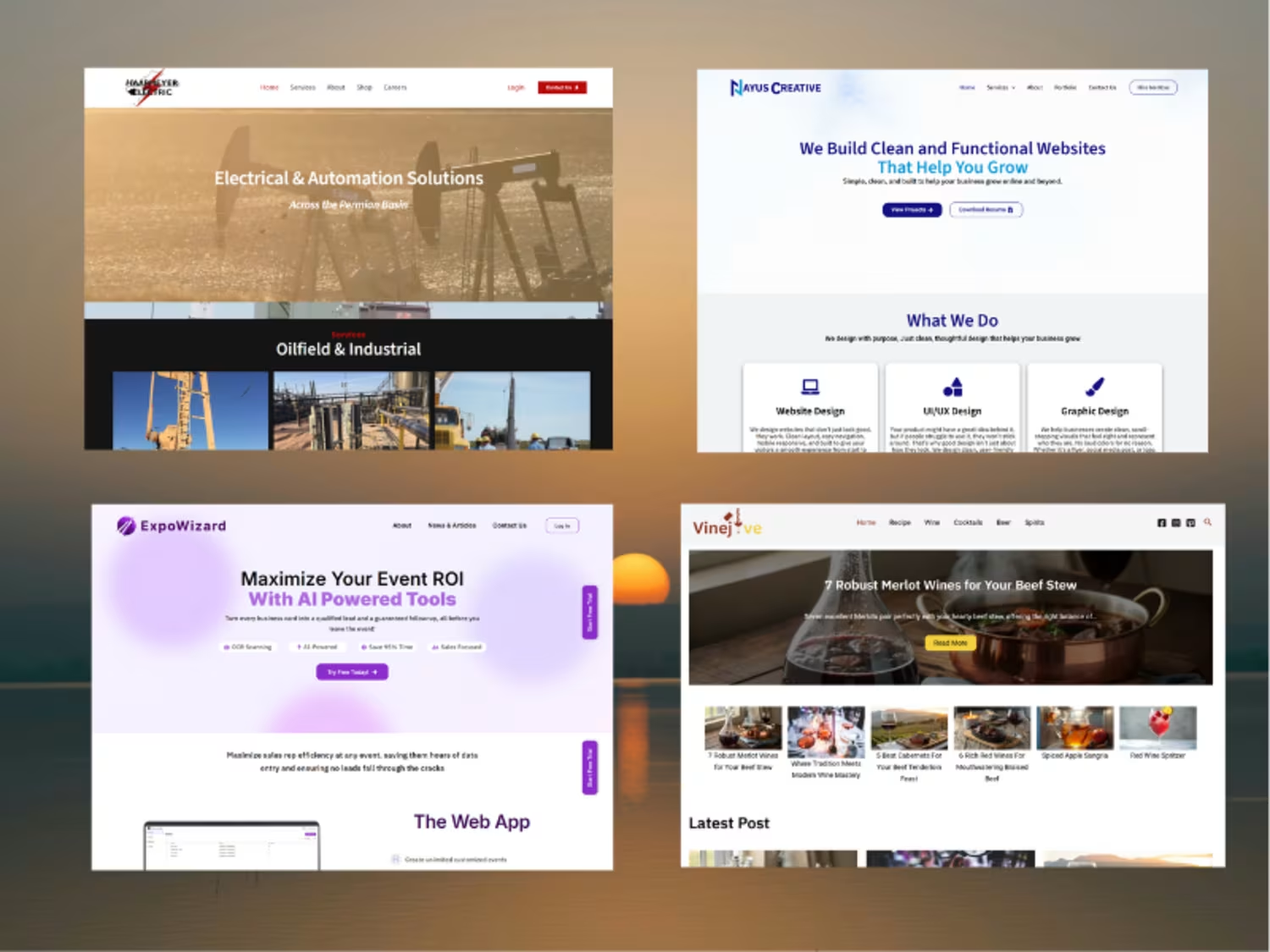
This is one of the project I started with back then as wordpress developer. I helped a business owner design and build VineJive, a blog and recipe website focused on wine-based drinks. The goal was to create a clean, easy-to-manage platform where recipes and content could be published consistently without friction.
I handled the WordPress build, making sure the layout was simple, readable, and flexible enough to grow as more content is added over time.
2
66
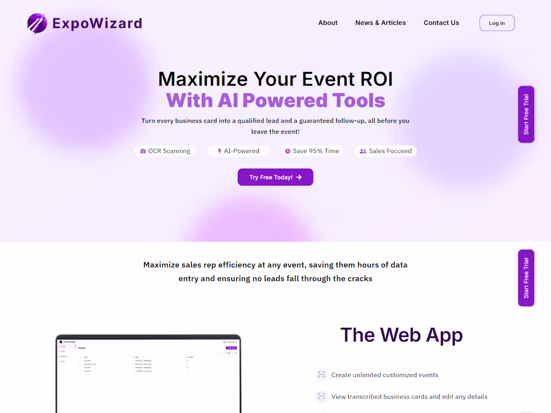
Here is another project collaboration with the Artoria Media team, to design and fully develop the ExpoWizard website, a platform built to help sales teams get more value from trade shows by focusing on real connections, not manual follow-ups.
The goal was to present a clear, modern website that explains the product without overcomplicating it. I handled the full WordPress build, translating the designs into a responsive, easy-to-navigate site that communicates the problem ExpoWizard solves and how it fits into a sales team’s workflow.
1
65
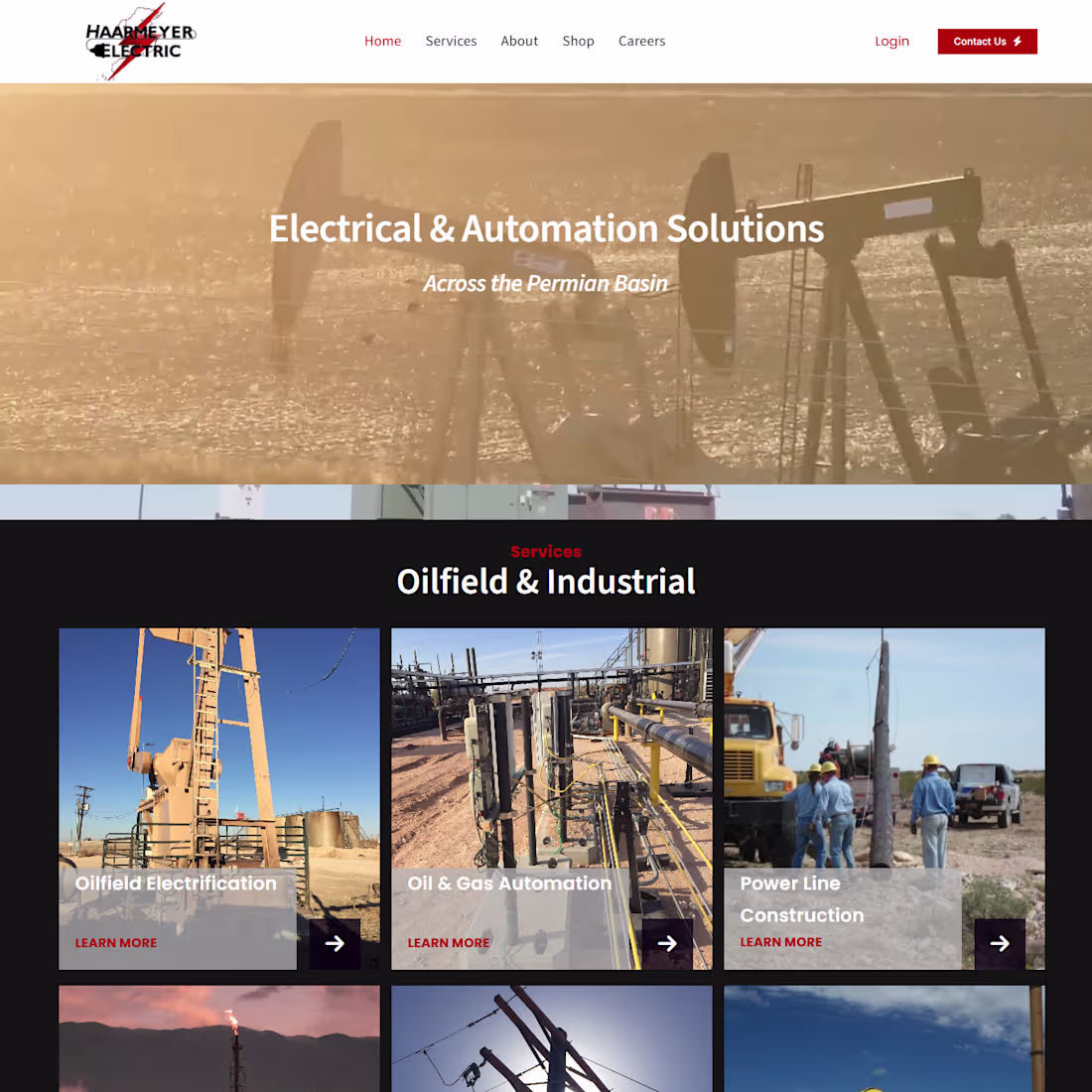
I worked with the team at Artoria Media on the design and development of Haarmeyer Electric’s website, an all-in-one provider of powerline services, electrical design and construction, field automation, and SCADA integration.
Using Figma designs as the foundation, I translated the layouts into a functional, responsive website that clearly communicates their services while maintaining a strong, professional presence. The focus was on structure, clarity, and usability making it easy for visitors to understand what Haarmeyer does and trust their expertise.
2
56