The network for creativity
Join 1.25M professional creatives like you
Connect with clients, get discovered, and run your business 100% commission-free
Creatives on Contra have earned over $150M and we are just getting started
Back to feedPost

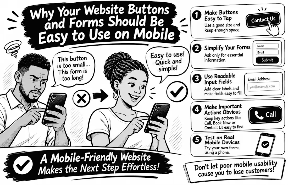
Why Your Website Buttons and Forms Should Be Easy to Use on Mobile
Imagine a potential customer visiting your website, ready to contact you, but struggling to tap your tiny contact button or complete your enquiry form.
What happens next? They may simply leave.
Mobile usability goes beyond making your website fit a smaller screen. Every interaction should feel effortless.
Here are 5 things every business website should get right
Make buttons easy to tap. Avoid tiny buttons and keep enough space between clickable elements to prevent accidental taps.
Simplify your forms. Ask only for information you genuinely need. Too many fields can make enquiries feel like hard work.
Use readable input fields. Make text clear, provide visible labels, and ensure fields are easy to select and complete.
Make important actions obvious. Your Call, Book Now, Contact Us, and Submit buttons should be easy to find.
Test on real mobile devices. Don't rely only on desktop previews. Try completing your own contact form using your phone.
Here's an important detail WCAG 2.2 recommends a minimum target size of 24 × 24 CSS pixels for many interactive controls, with certain exceptions. Bigger, well-spaced buttons can make mobile interactions even easier.
Remember: A website shouldn't just attract visitors; it should make taking the next step easy.
Have you ever abandoned a website because its buttons or forms were difficult to use on your phone? Share your experience


The network for creativity
Join 1.25M professional creatives like you
Connect with clients, get discovered, and run your business 100% commission-free
Creatives on Contra have earned over $150M and we are just getting started
Related posts

Landing page design for Lumo — banking for freelance life
Banks sell control — dashboards, charts, a card floating at fifteen degrees. Freelancers don't want control over their money. They want to stop thinking about it in the gap between sending an invoice and the money landing.
That gap is what the page is built on. The product sits in a meadow instead of on a dark grid, because the promise isn't "manage your finances better" — it's "we handle the part that keeps you up." And the strongest line on the page isn't a feature: no waiting for Monday. Freelancers don't lose weekends to fees. They lose them to timing.
The proof follows the same rule. One freelancer, one number — 4% lost on every international payment. A percentage someone can check against their own account beats any adjective.


great visuals 🙌

IPO Gateway landing page web design 3D animation website


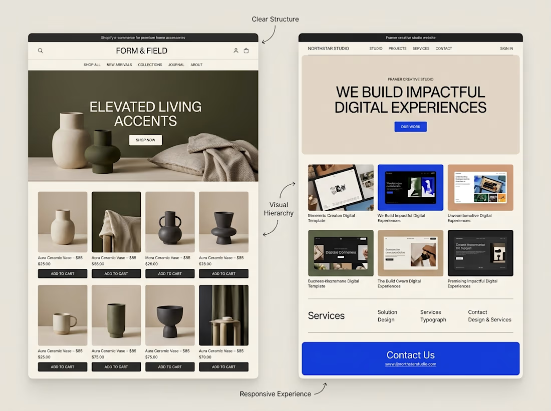
A website can look beautiful and still be difficult to use.
That's something I keep in mind when exploring both Shopify store design and Framer website design.
Although the platforms serve different purposes, some design principles apply to both:
→ Clear navigation helps visitors find their way.
→ Strong visual hierarchy makes important information stand out.
→ Thoughtful page structure creates a natural flow.
→ Responsive layouts help the experience work across screen sizes.
→ Clear calls to action help visitors understand what to do next.
The goal isn't simply to make a website look impressive.
It's to make the experience clear, useful, and easy to navigate.
I'm continuing to explore how these principles can be applied across different types of websites and projects.
What matters most to you when visiting a website, its visual design, its usability, or a combination of both?



Well said. Usability first, then visuals. Clear navigation wins me every time. 🙌