The network for creativity
Join 1.25M professional creatives like you
Connect with clients, get discovered, and run your business 100% commission-free
Creatives on Contra have earned over $150M and we are just getting started
Back to feedPost
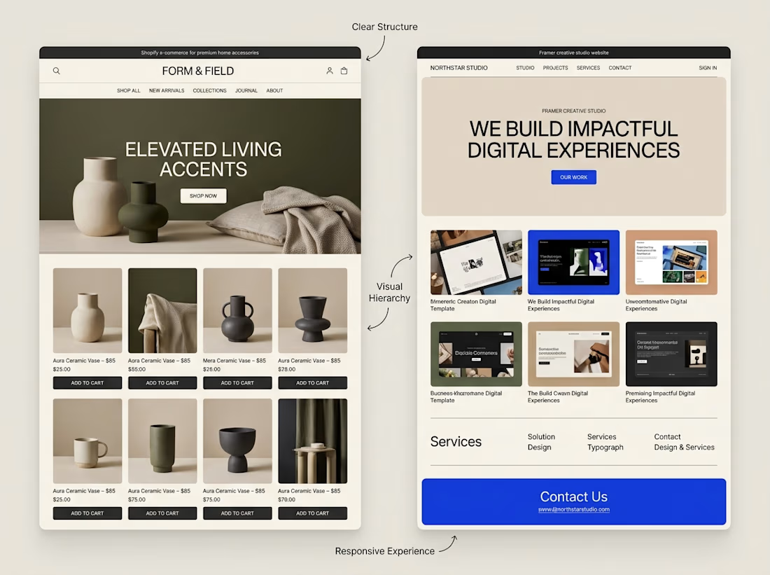
A website can look beautiful and still be difficult to use.
That's something I keep in mind when exploring both Shopify store design and Framer website design.
Although the platforms serve different purposes, some design principles apply to both:
→ Clear navigation helps visitors find their way.
→ Strong visual hierarchy makes important information stand out.
→ Thoughtful page structure creates a natural flow.
→ Responsive layouts help the experience work across screen sizes.
→ Clear calls to action help visitors understand what to do next.
The goal isn't simply to make a website look impressive.
It's to make the experience clear, useful, and easy to navigate.
I'm continuing to explore how these principles can be applied across different types of websites and projects.
What matters most to you when visiting a website, its visual design, its usability, or a combination of both?



Both matter, but usability keeps people coming back. 👏

Agreed. Looks attract, usability keeps them. 👏

Well said. Usability first, then visuals. Clear navigation wins me every time. 🙌
Thanks! Clear navigation really does carry everything else. 🙌

Agree that pretty and usable are different jobs. Navigation clarity is the one I see broken most often, especially on stores where the menu got a new item every time a campaign launched.

Definitely both. Looks build trust upfront but usability drives conversion. Do you find clients lean more into visual flair on Framer portfolio sites compared to Shopify where checkout clarity is everything?
The network for creativity
Join 1.25M professional creatives like you
Connect with clients, get discovered, and run your business 100% commission-free
Creatives on Contra have earned over $150M and we are just getting started



Related posts

Solvane is a tranquil, editorial front store for a conscious skincare line, crafted using Framer with Framer Commerce and Shopify. Warm neutrals and large lifestyle photography allow the products to breathe. Beneath that is product listing pages with variants, an ever-present add to cart feature and full Shopify checkout – all without writing any code.


So cool


Are you struggling to highlight your expertise on your website?
Are your visitors leaving even before they reach the service section?
Introducing Luven, our new Framer template.
Built for architectural and interior lighting studios.
With editorial layouts, immersive imagery, bold typography, and subtle motion.
It makes for a premium website to guide visitors towards consultation enquiries.
• Conversion-focused homepage.
• Focusing on selected work, process, testimonials, and an FAQ section.
• Project case details with location, area, and visuals.
• Responsive layouts, enquiry forms, newsletter signup, and CTA.
Check the comment for the link.


Nice work


wowwwww😍