The network for creativity
Join 1.25M professional creatives like you
Connect with clients, get discovered, and run your business 100% commission-free
Creatives on Contra have earned over $150M and we are just getting started
Back to feedPost

IPO Gateway landing page web design 3D animation website


Excellent work!

Such a sleek and professional aesthetic.

great animation in the hero, really suits. good work

Nice Work

stunning work!

Top notch!

Great job


Wow that's unique


Amazing work👏🔥🔥

Excellent work!

Great work.

I love it. Great work

That gold coin sitting in the curve of the ring is a really nice touch. Super clean hero, the 3D adds weight without getting loud

Thats great work
The network for creativity
Join 1.25M professional creatives like you
Connect with clients, get discovered, and run your business 100% commission-free
Creatives on Contra have earned over $150M and we are just getting started



Related posts

Webiste redesign for Saas company


2 voted
4%
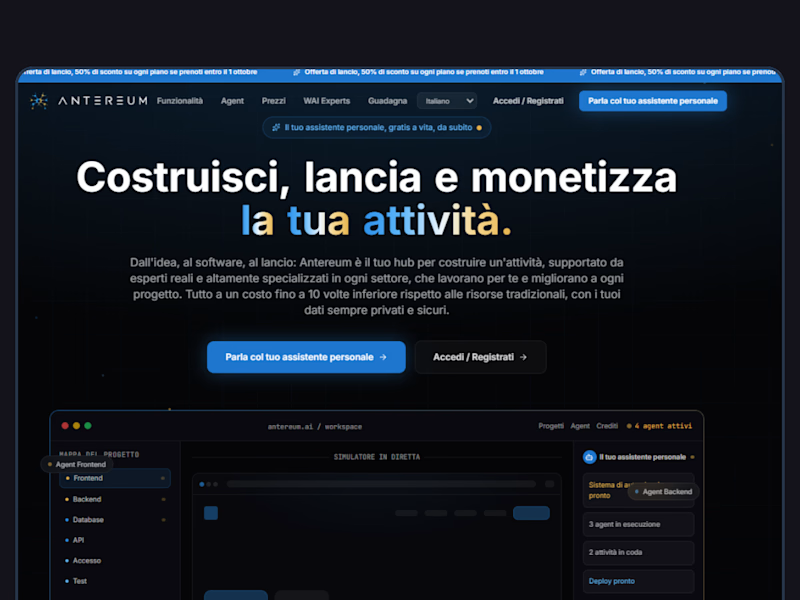
44 voted
96%
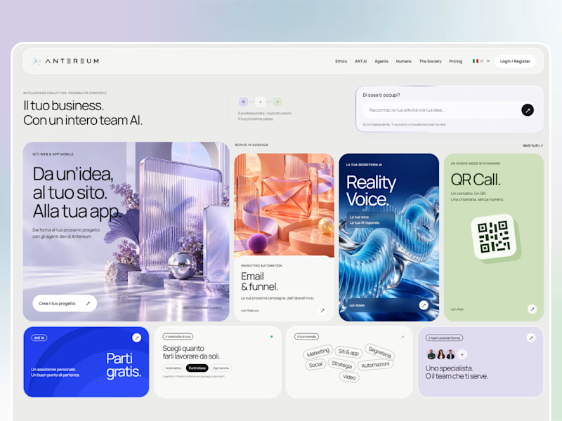
46 votes
Closed


Exploring mobile app onboarding options for a Fintech app. Which version should I lock?
8 voted
44%
10 voted
56%
18 votes
Closed

Version 2 is stronger for Fintech. More clear, trustworthy & explains value instantly. Version 1 looks bold but feels vague for onboarding. I'd lock Version 2.