Freelancers using Figma Make in London
Sign Up
Post a job
Sign Up
Log In
Filters
2
Projects
People
Cara Ellis
max
London, UK
Designing for connection ⋆˚꩜。
$50k+
Earned
24x
Hired
5.0
Rating
1.8K
Followers
Top
expert
+1
Follow
Message
Designing for connection ⋆˚꩜。
139
CANVAS (https://vest-paste-10212601.figma.site/) ₊✩‧₊˚౨ৎ˚₊✩‧₊ An infinite canvas of anonymous, asynchronous conversations between strangers and friends. Inspired by bathroom stall graffiti, where passersby leave messages and questions but may never read the replies. Explore the void and leave a note HERE (https://vest-paste-10212601.figma.site/) <3
45
139
9.4K
108
Web Poetry: Figma Makeathon Grand Prize Winner
108
2.6K
37
Guerilla Marketing Shirt Artworks and Design for Conduct AI
37
1K
57
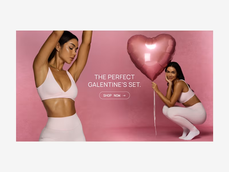
PAVOI Social Media Content Design
57
1K
Figma Make
(2)
Follow
Message
Geeks Design
Bexley, UK
We design digital experiences that users love to navigate
New to Contra
Follow
Message
We design digital experiences that users love to navigate

0
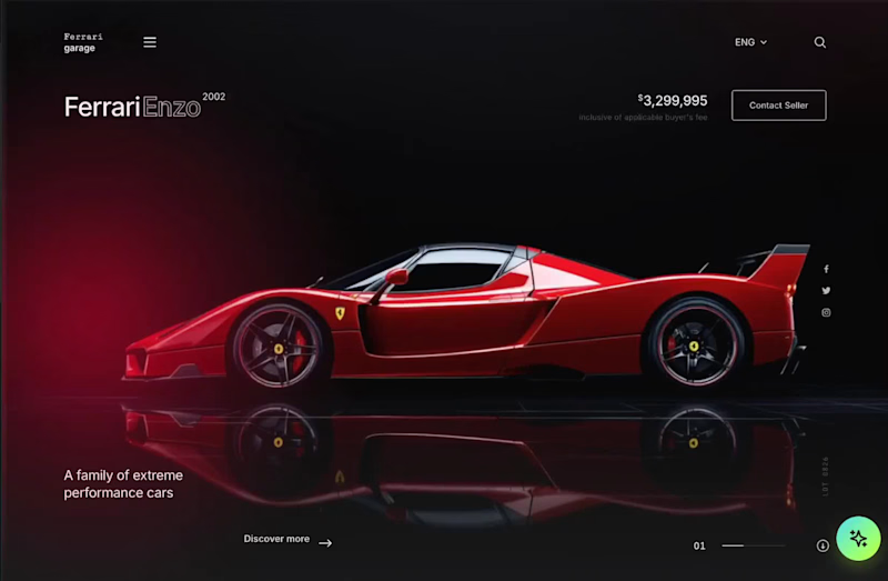
Ferrari Garage Automotive Website Design
0
8
1
ACE Money Transfer Website Redesign
1
6
1
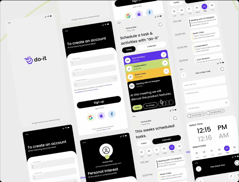
Do-It Productivity App.
1
8
0
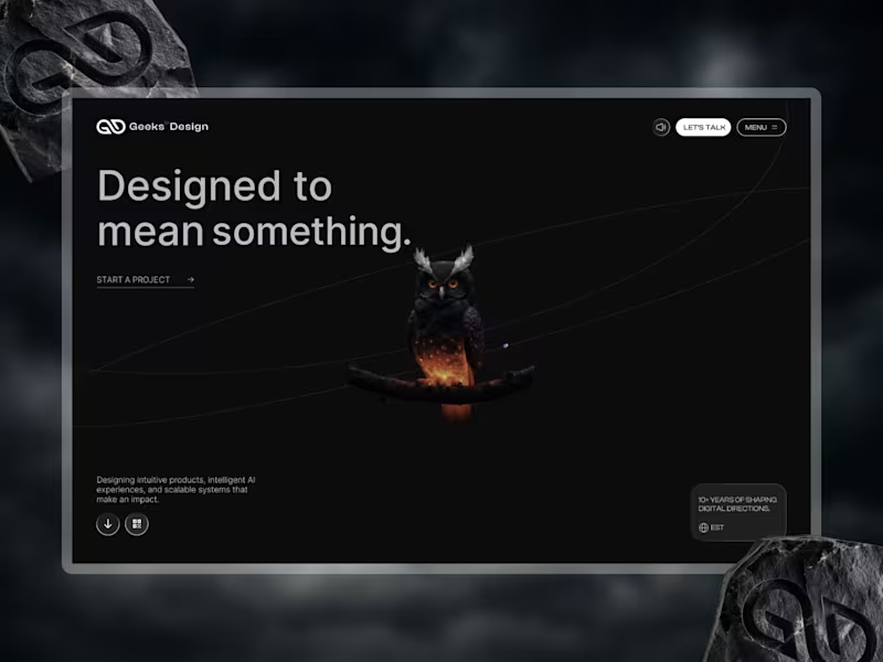
We’re excited to unveil the new Geeks-In-Design website. Designed at the intersection of strategy, AI, design, motion, and technology, the new experience reflects how we think about and build modern digital products and brand experiences. More than a visual refresh, this launch represents the evolution of Geeks-In-Design—our thinking, our process, and our commitment to creating work that is thoughtful, innovative, and built to make an impact. Every detail was crafted with purpose to communicate clarity, ambition, creativity, and a future-forward mindset that drives our work. We’d love to hear your thoughts and feedback. #UIUXDesign #UXDesign #UIDesign #ProductDesign #WebDesign #InteractionDesign #MotionDesign #Figma #FigmaAI #GeminiAI #AIDesign #DesignServices #FreelanceDesigner #UIUXDesigner #ProductDesigner #WebsiteDesign #DesignAgency
0
105
Figma Make
(4)
Follow
Message
Tanjim Islam
max
London, UK
Digital Product & AI Engineering Partner
$100k+
Earned
20x
Hired
5.0
Rating
246
Followers
Top
expert
+1
Follow
Message
Digital Product & AI Engineering Partner
9
Your SaaS doesn't have a feature problem. It has a clarity problem. I've worked with 50+ founders. The pattern is always the same: → Product does 10 things → Landing page tries to explain all 10 → Visitor understands none of them → Visitor leaves The founders who convert best pick ONE problem. ONE user. ONE outcome. And they say it in 8 words or less. More features don't build trust. Clarity does. Simplify your message before you ship your next feature.
9
1.3K
4
Good SaaS design works. Great SaaS design disappears. Here's what I mean: Good design: – Users can find what they need – The flow makes logical sense – It looks professional and clean Great design: – Users don't notice the design at all – They just feel like the product "gets" them – New users figure it out without a tutorial – Power users move fast without thinking The gap between good and great isn't more features or more polish. It's ruthless clarity about what the user needs to do next and making that one thing impossible to miss. That's the standard I hold every screen to.
2
4
1.2K
18
Here is our submissions The Wall. You can art on your Canvas, also see others work. You can play with color, Brush, Size, Opacity, also you can control the canvas. This is the fun project. https://thewall.figma.site/ try it here, Love to get your Feedback.
4
18
808
5
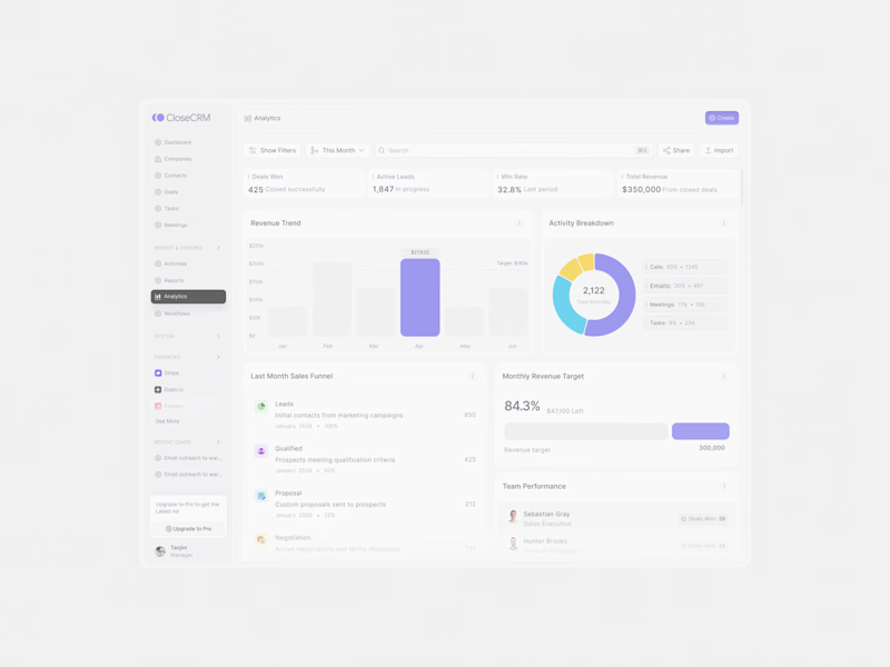
CRM analysis dashboard design screen in motion
4
5
1.2K
Figma Make
(6)
Follow
Message
Everther Studio
London, UK
Shopify Partner, Framer, Media Buying, Web Dev. & Kajabi
$1k+
Earned
3x
Hired
5.0
Rating
47
Followers
Follow
Message
Shopify Partner, Framer, Media Buying, Web Dev. & Kajabi
0
(Framer) Flight Level 320 – UX/UI & Redesign for Pilot Community
0
13
0
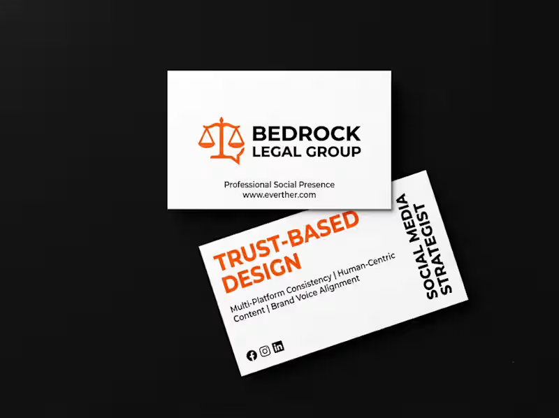
Social Media Assistant for a Melbourne Law Firm
0
1
0
Kajabi Newsletter Paywall & Drip System
0
17
1
Kajabi Website for Sereniti - Yoga & Wellness Membership Brand
1
28
Figma Make
(1)
Follow
Message
Arina Alexandra
pro
London, UK
Senior Product Designer & Product Experience Strategist
$1k+
Earned
1x
Hired
14
Followers
Follow
Message
Senior Product Designer & Product Experience Strategist
0
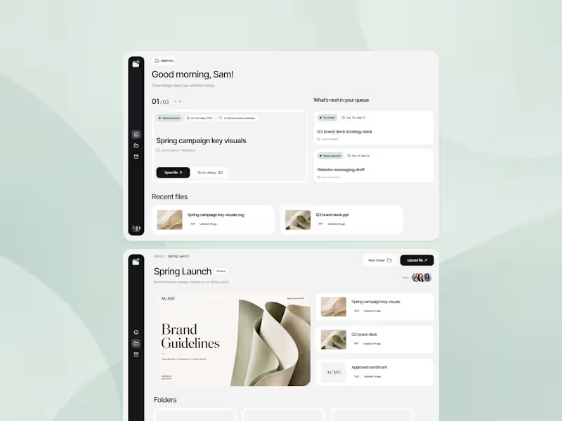
Internal File Management Tool Development
0
7
1
This is a smart home control concept where I experimented with glow, depth, and micro-interactions to create a more immersive experience.
1
636
0
Fintech App • Digital Product Design
0
13
1
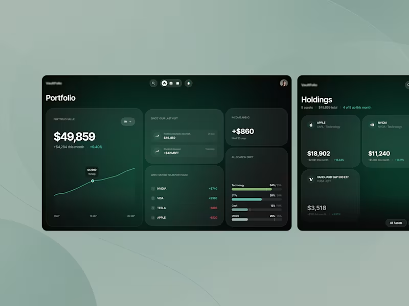
Investment Portfolio Platform UX Redesign
1
7
Figma Make
(3)
Follow
Message
Ashish Sandhu
London, UK
Fractional CTO / AI Specialist Award Winning AI Engineer
$5k+
Earned
1x
Hired
11
Followers
Follow
Message
Fractional CTO / AI Specialist Award Winning AI Engineer
3
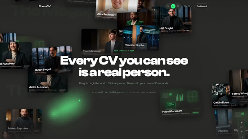
I've spent the last few days building something I genuinely wish existed years ago. When I was job hunting, I had a PDF. A white rectangle with my name, dates, and bullet points. The same format invented in 1482. I was competing with thousands of people who had the exact same white rectangle. I'm a builder. I ship products. I've worked with real companies, shipped real things, have real skills. None of that showed in a CV. It couldn't. A PDF wasn't built to show it. And building a personal website? That's a project in itself. Design it, code it, host it, maintain it. Most people never do. So their career stays a white rectangle forever. So I built RoomCV. (https://roomcv.figma.site/) You don't build anything. You paste your LinkedIn URL, your Contra profile, or upload your CV. In under 60 seconds, your career has a home on the internet. A real one. With your name on the door. Not a template you fill in. Not a prettier PDF. A room that reads your data and builds itself with all your pretty links. And then there are the portraits. The AI photoshoot is unlike anything else in this space. It runs a 3-stage pipeline (thanks to Figma Weave): Stage 1 - A casting director model analyses your reference photo and writes a precise physical description. Hair, skin tone, bone structure, build. This becomes a consistency anchor so every portrait is recognisably you. Stage 2 - A photography director model reads your actual CV. Your job title, your company, your career highlights, your personal note. It writes a bespoke scene brief the way a Vogue photo director would. A founder gets a quiet boardroom at night with a city skyline. A developer gets a dark server room with terminal green glow. A designer gets mood boards and soft daylight. Stage 3 - The image model takes that bespoke brief, your reference photo, and your character anchor and generates 6 editorial portraits. Hero. At work. Thinking. Off duty. Achievement. Environmental. Every portrait is specific to you. Because the AI read their actual careers before picking up the camera. The room is alive. People can visit your room at its permanent URL. They can leave signed notes in your guestbook. They can react with rockets, fire, or lightbulbs. You can see who's browsing right now, live presence, like a real room. Every visit is counted. The whole city of rooms is browsable and is a directory of real people's careers, each one visually distinct. Three visual themes: Cinematic - moody contrast, 35mm grain, deep editorial shadows. Brutalist - harsh direct light, raw concrete textures, technical glitch aesthetic. Minimal - soft diffused window light, high-key, warm neutrals, conversion-focused. The copywriting changes completely per theme too. Same person, three radically different editorial voices. Wieden+Kennedy wrote none of them — Gemini did, with a prompt that bans every CV cliché and demands specific references to real company names, real project names, real skills. What I used to build it: Figma Make - the entire app. Every component, every interaction, every route. Built in natural language, iterated in real time. Figma Weave - the portrait pipeline visualised as a node-based workflow. The casting director, the photography director, the 6 parallel image generation nodes. The hero background video on the landing page. The logo. Figma MCP - connecting the design token system into the Make build so the three themes stayed consistent with the Figma source of truth. Supabase - backend, auth, KV storage, private portrait bucket, signed URLs, edge functions. Gemini - character extraction, photography direction, copywriting, profile parsing, room generation from raw LinkedIn/Contra/CV data. The numbers that matter: 60 seconds from paste to published room. 6 portraits per person, all unique. 3 complete design systems per room. 0 templates. Every room is generated, not filled in. 1 permanent URL per person. Unlimited visitors, reactions, guestbook notes. Who this is for: Designers who are tired of Behance looking like everyone else's Behance. Developers whose GitHub is invisible to anyone who isn't technical. Founders who have a LinkedIn but not a story. Freelancers on Contra who want their profile to stop at the URL and start in the room. Anyone who has ever felt like their career deserved better than a white rectangle. Yesterday a dev called Andrei pasted his LinkedIn URL. 30 seconds later he had six editorial portraits and a career room that looked like the cover of Wired. He sent me a voice note. He said it was the first time his career had felt like his, and here it is for everyone to try. Try it. Paste whatever you have. LinkedIn URL, Contra URL, raw CV text, PDF. Your room is waiting. roomcv.figma.site (http://roomcv.figma.site)Figma Make: https://www.figma.com/make/3kpbdErsXVZqPSkZS2LdvY/Design-RoomCV-Creatively?t=ZnnNnUei4aE16P6e-1 Figma Weave: https://app.weavy.ai/flow/RK8qIG0eKBpyoJLOg4JgrC Figma Community: https://www.figma.com/community/file/1649649240602428392/roomcv?fuid=1004476920505329686 X: https://x.com/AshishSandhu/status/2067821599223316662 (https://x.com/AshishSandhu/status/2067821599223316662?s=20)https://x.com/AshishSandhu/status/2067824940154269961 Drop your room link in the comments. I want to see every single one. Built for the Figma Config Makeathon. Figma Make + Figma Weave + Figma MCP + Supabase + Gemini. #ConfigMakeathon #Figma #FigmaMake #AI #Portfolio #CareerDesign
2
3
317
4
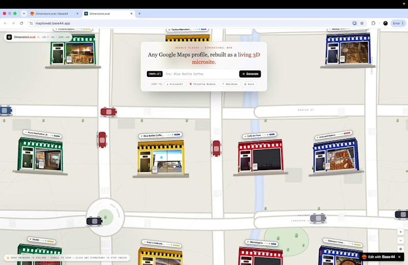
Local businesses—from neighborhood bakeries and specialty coffee roasters to barbershops and lounges—spend years building 5-star reputations on Google Maps. Yet their actual websites are often broken, outdated, or non-existent, costing them direct bookings and forcing them to pay hefty third-party platform fees. The Solution: DimensionLocal (Built on Base44) DimensionLocal transforms any raw Google Maps listing into both a tactile 3D neighborhood discovery experience and a production-ready, high-converting flagship website in seconds. Key Design & Engineering Highlights: Infinite 2D/3D Spatial Neighborhood Canvas: Instead of a static landing page, the homepage is an infinite, seamlessly wrapping cartography board populated with volumetric 3D storefronts. Each shop dynamically reflects real-world status—cycling through live venue photos when open, or dropping physical roller shutters when closed. Live Google Places API Extraction: Paste any Google Maps URL or search any business worldwide. The backend automatically pulls high-resolution place photos, aggregate ratings, customer testimonials, 7-day Monday–Sunday schedules, phone numbers, and exact coordinates. 4 Polymorphic Website Archetypes: No two businesses look the same. With one click, any storefront transforms across 4 complete design systems: Obsidian Flagship: Dark carbon & champagne gold luxury one-pager. Spatial Glass: Frosted acrylic cards over an ambient blurred aura generated from the venue's own photography. Tactile Craft: Warm limestone paper, exposed architectural grids, and mechanical offset shadows. Swiss Editorial: High-contrast gallery typography and asymmetric lookbook layouts. Closed-Loop Automation & Owner OS: Customers can book tables or appointments directly on the generated microsite. Flipping to the Owner Automation OS reveals a live reservation dispatch pipeline, local competitor radar analysis, and an AI Review Autopilot that drafts tailored responses to customer reviews in one click. Built With: Base44 (Frontend UI, Database, Backend Functions & AI Superagents), Google Places API (New), CSS 3D Transforms & Custom SVG Cartography.
3
4
395
11
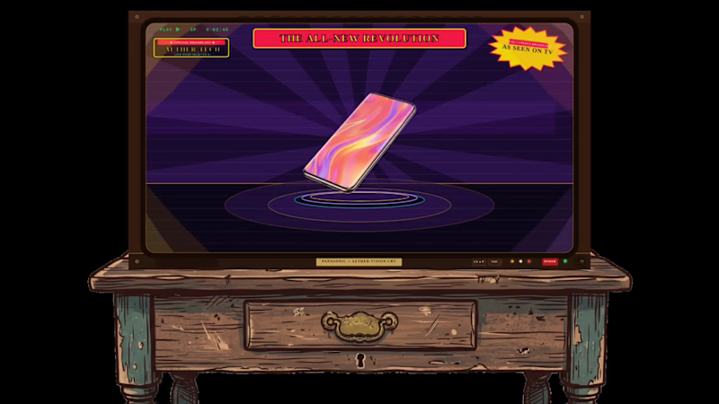
📺 90s RETRO INFOMERCIAL A late-night broadcast ad that puts your product in prime time. Tuesday, 2:14 a.m. Special Broadcast. A communicator exploded into five floating layers of pure silicon. Callers flooded the switchboard. Operators urged viewers to stay on the line. Friday night, a titanium smartphone outlived the entire weekend. Its charger was reported missing, presumed retired. Saturday, 3:30 a.m. Dual cooling turbines spun up inside a creator laptop. The studio stayed completely cold. Sunday morning, marathon carbon sneakers hit the pavement. The stopwatch gave up. None of it aired on cable. All of it broadcast on Channel 90. 📼 Every product wants to feel iconic. Most of them get a generic banner. I could not find a single vintage cathode-ray infomercial in SVGator's template gallery. So I built one. Mobile Laptop Shoes Juice Four editions, One template, Zero redraws. Retype the headline, swap the product image, update the logo. or Directly connect your MCP and ask the agent to "Change the Image with "PRODUCT" and use these images" or "Create images using Nano Banana and Generate this for New Pair of Headphones named "BOKE NICE 2.0" Every word is live text. Every element has a clean name: logo, headline, product-image. The 5-layer isometric explosion never breaks. The best part? I did not touch the canvas inside SVGator once. Not a single keyframe was dragged by hand. Every geometry node, 5-layer isometric physics curve, phosphor flash, and color palette was architected and synced directly into SVGator Cloud purely via the SVGator MCP. That is how frictionless the programmatic integration is. So what are you broadcasting tonight? Operators are standing by. 📞✨ 🛠️ 100% Built Programmatically via the SVGator MCP. Zero manual GUI editing. 5 live cloud projects deployed through code with authentic CRT scanlines, corner light leaks, and 1,270 named elements.
14
11
905
7
I created THE TABLE because the most uncomfortable human moments deserve to be witnessed without the mercy of a camera cut. We have all seen dramatic cafe encounters on film, but they are usually softened by edits and reaction shots. I wanted to create an experience that traps the audience in a continuous reality, making the viewer feel the tension of a silent conflict unfolding in real time. What if we watched a bizarre fracture between two people in a cozy space, and the camera simply refused to look away? That question became THE TABLE. The Production Workflow I had a vision but no traditional crew. CapCut Video Studio and the Seedance 2.5 model made a complex one-take sequence entirely possible. Prompt-Driven Choreography: I mapped out a 30-second physical space in a single text prompt. Every action, from the walk to the aggressive muffin snatch, was engineered to unfold sequentially. Unbroken Camera Control: To ensure the "one-take" rule was followed, I instructed the AI to use physical camera movements. Seedance 2.5 maintained the spatial consistency flawlessly. The Assembly: The magic of this workflow was the lack of assembly. The final output is a raw, continuous generation with no manual splicing. Platform Feedback Seedance 2.5 brilliantly held the entire world together. When the camera whip-pans back from the street to the interior at the end, Table 1 and Table 2 are exactly where they should be. It felt like directing a steady-cam operator on a live set. One honest piece of feedback: generating timed character interactions in a continuous 30-second shot requires immense trial and error. Optimized rendering costs for long-form visual storytellers would make a meaningful difference, also if specific editing can take place at point notes that will change massive things. Ultimately, Seedance 2.5 helped me protect the awkward silence at the end of the film. X: https://x.com/AshishSandhu/status/2090161080857223462?s=20
4
7
392
Figma Make
(1)
Follow
Message
doris james
London, UK
WordPress & WooCommerce Website Developer
11
Followers
Follow
Message
WordPress & WooCommerce Website Developer

1
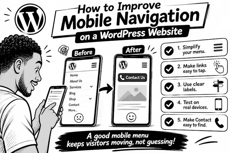
How to Improve Mobile Navigation on a WordPress Website Ever tried to find a service on a website, only to give up because the menu was confusing? Visitors can face the same frustration on mobile. Here are 5 practical fixes 1. Keep the menu simple. Prioritise pages people need most: Services, About, Contact, or Shop. Too many options make decisions harder. 2. Make links easy to tap. Digital.gov (http://Digital.gov) recommends touch targets around 48 CSS pixels, with enough space between them to reduce accidental taps. 3. Use clear labels. “Get a Quote” tells visitors more than “Explore.” Make each menu item’s destination obvious. 4. Test on a real phone. Try every link, check submenus, and make sure the menu opens and closes easily. 5. Make the next step easy to find. If calls or bookings matter, keep Contact, Book Now, or Call visible without crowding the menu. WordPress’s Navigation block lets you control how menus collapse into a mobile icon and how submenus open so check those settings in your editor. 💬 What frustrates you most on mobile websites: tiny links, confusing menus, or too many options? Tell me below.
1
44
0
How to Test Your Website's Mobile Experience Without Being a Developer Your website may look perfect on a laptop but become frustrating on a phone Tiny buttons, unreadable text, and complicated forms can make simple tasks harder than they should be The good news? You don't need coding skills to test your mobile experience. Try these 5 simple checks Use your actual phone. Open your website and browse it like a customer. Can you find important information quickly? Test every button. Tap your menu, phone number, contact button, and links. Are they easy to press without accidentally clicking something else? Check readability. Is the text comfortable to read without zooming? Does anything extend beyond the screen? Test your speed. Enter your page URL at Google PageSpeed Insights (pagespeed.web.dev) and review its mobile performance report. Complete a real task. Try submitting a contact form, booking an appointment, or completing a test purchase. Don't stop at the homepage! Remember, a good mobile experience isn't just about fitting a smaller screen. It's about helping visitors accomplish what they came to do. Your turn: When did you last test your entire website on your phone? Try it today and tell me what you discover
0
36
1
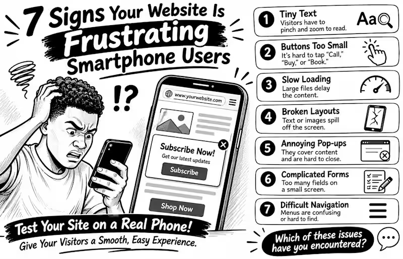
7 Signs Your Website Is Frustrating Smartphone Users Your website may look perfect on a laptop but feel like hard work on a phone. And that matters: the 2025 Web Almanac found that only 48% of mobile websites achieved good Core Web Vitals, compared with 56% on desktop Here are 7 warning signs to check 1️⃣ Tiny text Visitors have to pinch and zoom just to read. 2️⃣ Buttons too small People struggle to tap “Call,” “Buy,” or “Book” without hitting something else. 3️⃣ Slow loading Large images and heavy scripts delay the content people came to see. 4️⃣ Broken layouts Text, images, or menus spill off the screen or overlap. 5️⃣ Annoying pop-ups Full-screen offers cover the content and are difficult to close. 6️⃣ Complicated forms Too many fields make enquiries or checkout tiring on a small screen. 7️⃣ Difficult navigation Menus are confusing, links are crowded, or important actions are hard to find. Don't just shrink your desktop website and call it mobile-friendly. Open it on a real phone and try to complete a task as a customer would 💬 Which of these problems have you encountered on a business website?
1
1
30
1
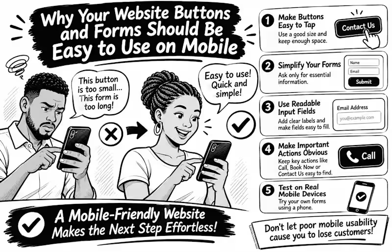
Why Your Website Buttons and Forms Should Be Easy to Use on Mobile Imagine a potential customer visiting your website, ready to contact you, but struggling to tap your tiny contact button or complete your enquiry form. What happens next? They may simply leave. Mobile usability goes beyond making your website fit a smaller screen. Every interaction should feel effortless. Here are 5 things every business website should get right Make buttons easy to tap. Avoid tiny buttons and keep enough space between clickable elements to prevent accidental taps. Simplify your forms. Ask only for information you genuinely need. Too many fields can make enquiries feel like hard work. Use readable input fields. Make text clear, provide visible labels, and ensure fields are easy to select and complete. Make important actions obvious. Your Call, Book Now, Contact Us, and Submit buttons should be easy to find. Test on real mobile devices. Don't rely only on desktop previews. Try completing your own contact form using your phone. Here's an important detail WCAG 2.2 recommends a minimum target size of 24 × 24 CSS pixels for many interactive controls, with certain exceptions. Bigger, well-spaced buttons can make mobile interactions even easier. Remember: A website shouldn't just attract visitors; it should make taking the next step easy. Have you ever abandoned a website because its buttons or forms were difficult to use on your phone? Share your experience
1
39
Figma Make
(2)
Follow
Message
Velocity Labs
London, UK
Product design and dev for startups and innovative companies
5.0
Rating
8
Followers
Follow
Message
Product design and dev for startups and innovative companies
0
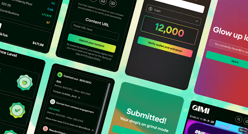
GIMI – A Bold Redesign for a UGC Creator Brand Marketplace
0
19
0
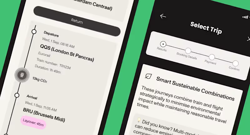
PLANIT – AI-Powered Trip Planning with Built-In CO₂ Tracking
0
13
1
SousChef, Hospitality Intelligence Platform, Rebuild to Launch
1
8
0
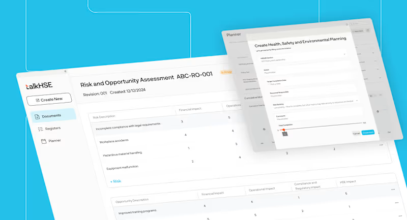
TalkHSE - AI-Powered Health & Safety Compliance App
0
11
Figma Make
(2)
Follow
Message
Explore people