The network for creativity
Join 1.25M professional creatives like you
Connect with clients, get discovered, and run your business 100% commission-free
Creatives on Contra have earned over $150M and we are just getting started
Back to feedPost

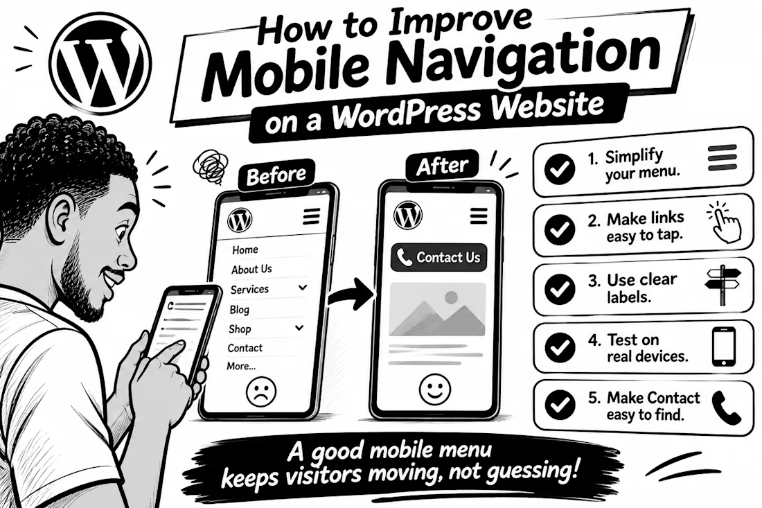
How to Improve Mobile Navigation on a WordPress Website
Ever tried to find a service on a website, only to give up because the menu was confusing? Visitors can face the same frustration on mobile.
Here are 5 practical fixes
1. Keep the menu simple. Prioritise pages people need most: Services, About, Contact, or Shop. Too many options make decisions harder.
2. Make links easy to tap. Digital.gov recommends touch targets around 48 CSS pixels, with enough space between them to reduce accidental taps.
3. Use clear labels. “Get a Quote” tells visitors more than “Explore.” Make each menu item’s destination obvious.
4. Test on a real phone. Try every link, check submenus, and make sure the menu opens and closes easily.
5. Make the next step easy to find. If calls or bookings matter, keep Contact, Book Now, or Call visible without crowding the menu.
WordPress’s Navigation block lets you control how menus collapse into a mobile icon and how submenus open so check those settings in your editor.
💬 What frustrates you most on mobile websites: tiny links, confusing menus, or too many options? Tell me below.


The network for creativity
Join 1.25M professional creatives like you
Connect with clients, get discovered, and run your business 100% commission-free
Creatives on Contra have earned over $150M and we are just getting started



Related posts

I designed and developed a modern fashion e-commerce storefront focused on creating a premium shopping experience. The project includes a stylish homepage, organized product collections, attractive product displays, mobile-responsive layouts, and intuitive navigation. The goal was to create a professional online shopping experience that helps fashion brands showcase their products and attract customers.


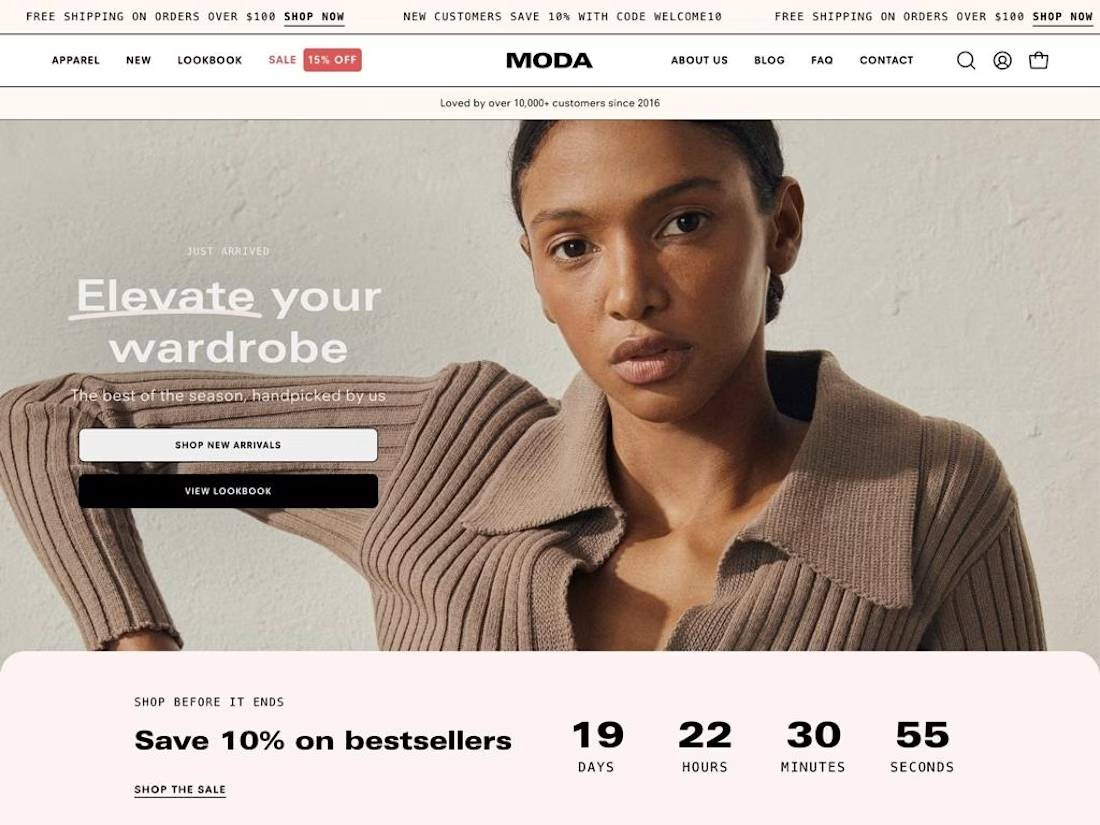

Organised collections and clear navigation are what keep fashion shoppers browsing, so it is good to see them front and centre here. How did you handle the product image sizes on mobile?

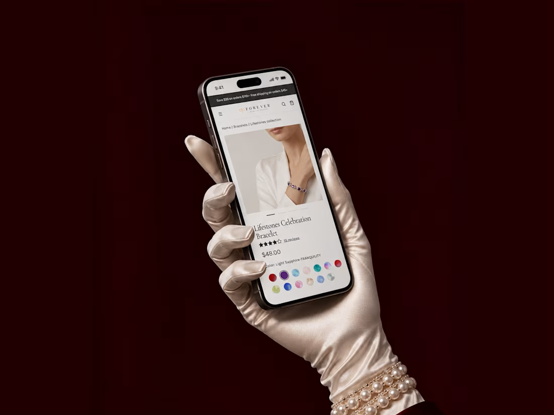
Just added a new case to my portfolio - a redesign focused on improving the user experience and making the shopping journey smoother


The satin glove with the pearl bracelet against the burgundy curtain makes a jewellery product page feel like a stage reveal. Do the colour dots change the main photo?


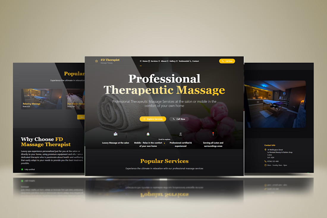

The yellow accents work well.