Investment Portfolio Platform UX Redesign

Arina Alexandra


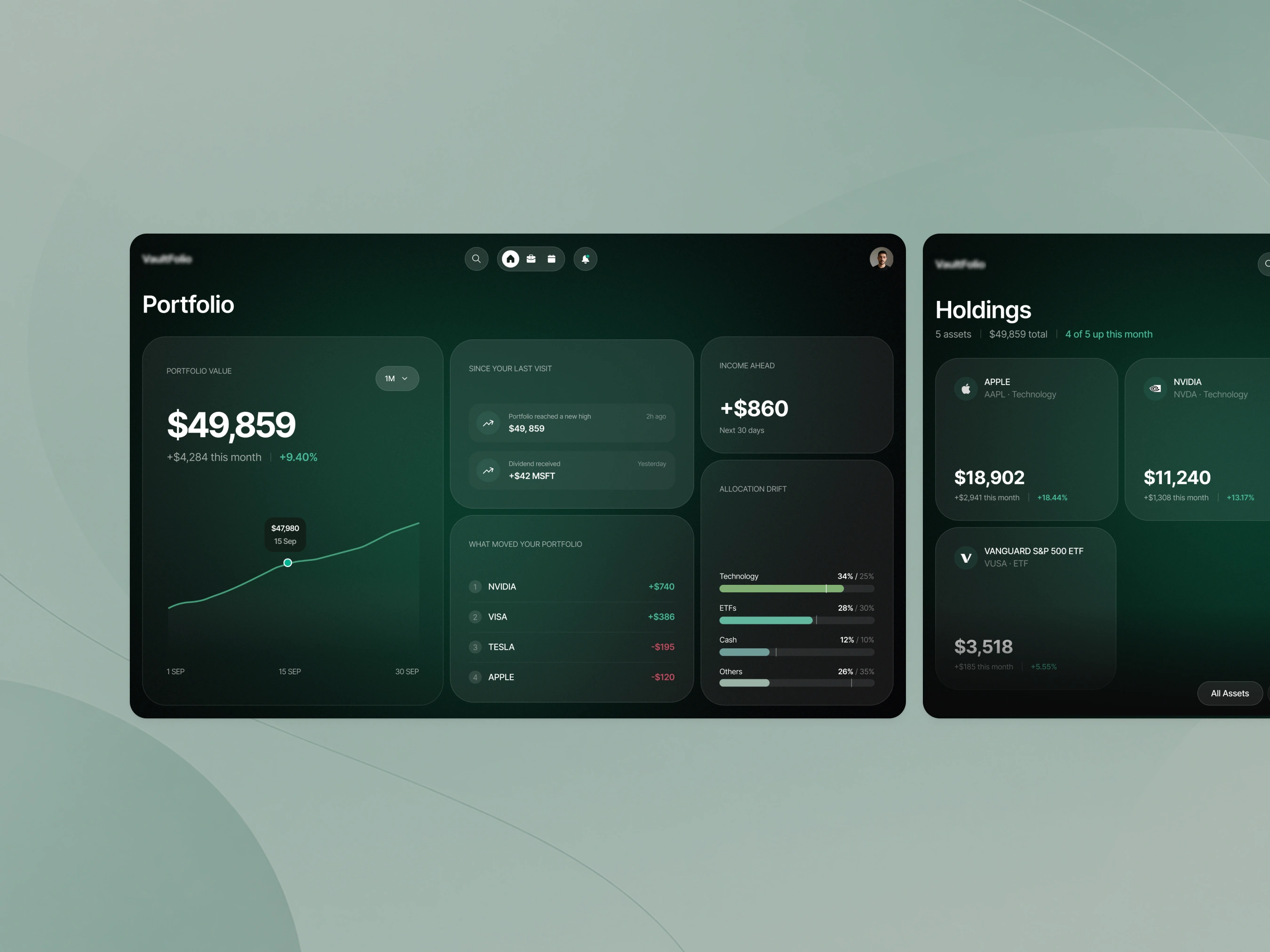
Investment portfolio platform
Helping investors understand what changed in their portfolio, without making them dig through the numbers.
Investment products can easily become overloaded with charts, percentages, prices and transaction history. There’s a lot of information, but understanding what actually matters can still take time.
For this platform, I focused on making the portfolio easier to read at a glance. Not just showing the current value, but helping users understand what moved, what changed since their last visit and where they might need to pay attention.
The problem
A portfolio can change in lots of small ways between visits.
A stock moves, a dividend comes in, an allocation shifts, or an investment reaches a new high.
The challenge was deciding what information should come first, without turning the dashboard into another screen full of numbers.
I kept coming back to a few simple questions:
How is my portfolio doing? What caused the change? What happened since I was last here? Is anything starting to move away from my plan?
Making changes easier to understand
The main portfolio view gives users the overall picture first, then helps explain what is behind it.
What moved your portfolio shows which investments had the biggest impact, while Since your last visit brings forward the things that happened while the user was away.
I also added allocation drift to make it easier to see when the portfolio is starting to move away from its intended balance.
Going deeper when needed
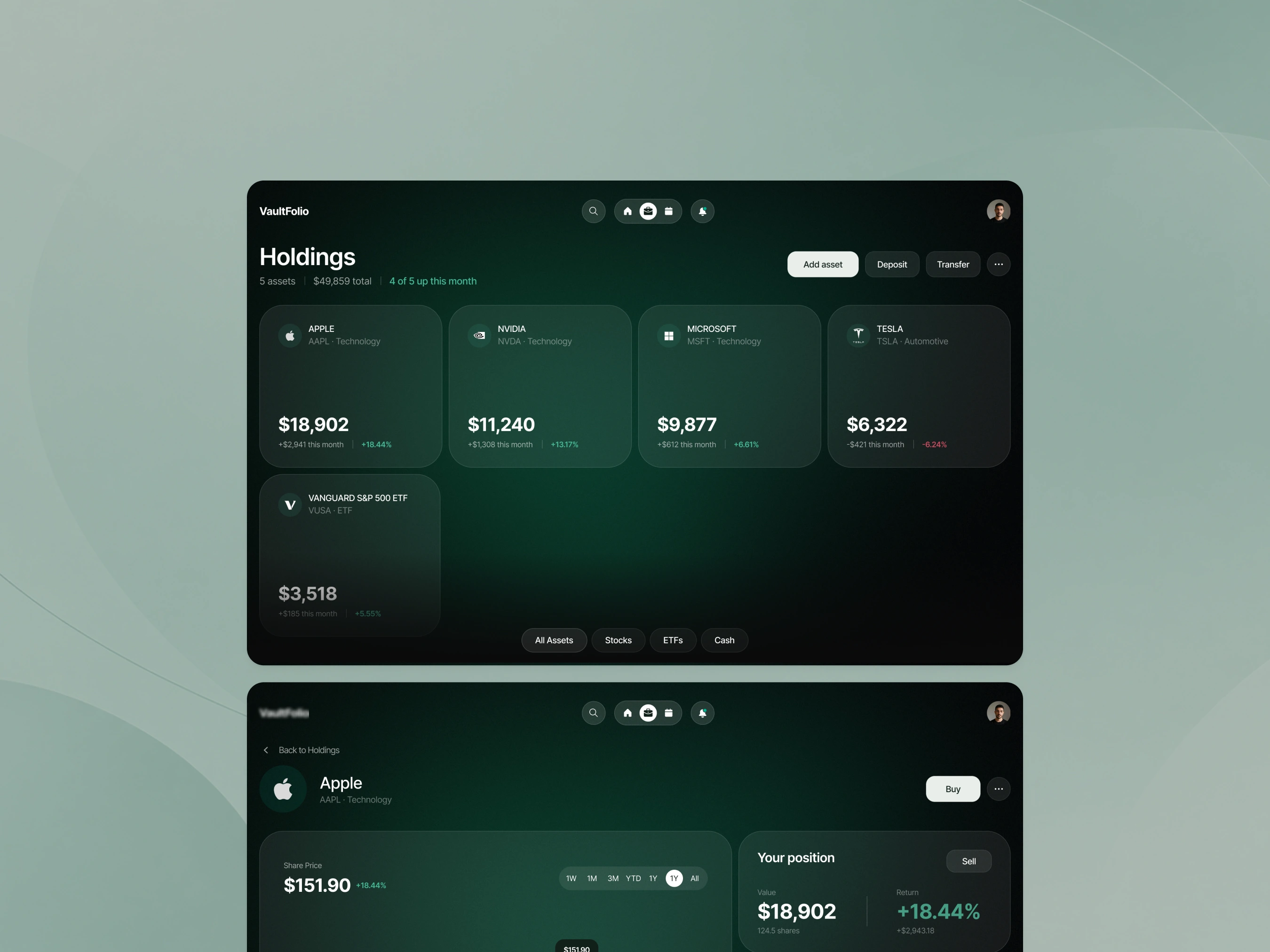
The Holdings view gives a simple overview of where the money is invested.
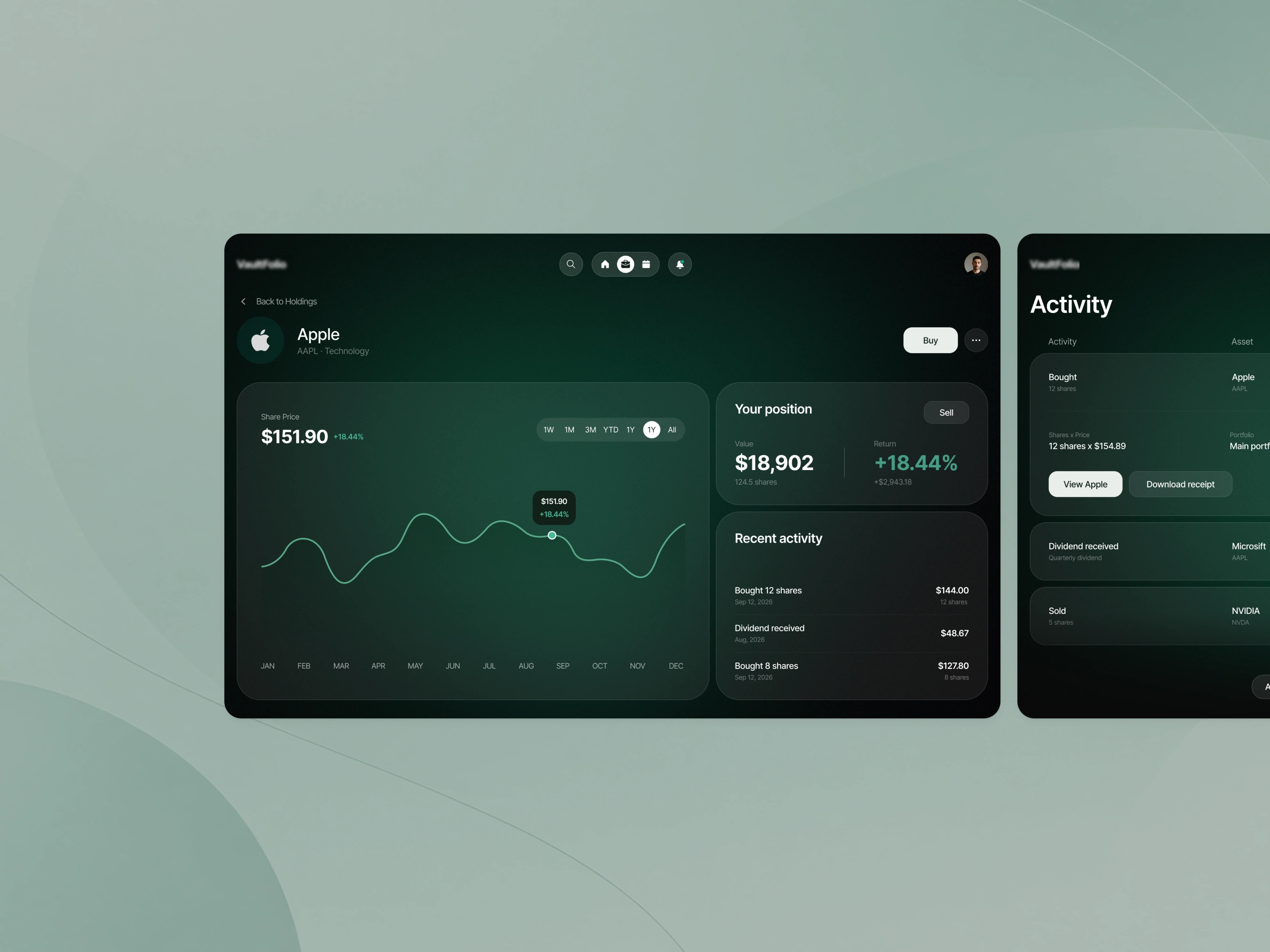
From there, users can open an individual asset to look more closely at performance, their position and recent activity.
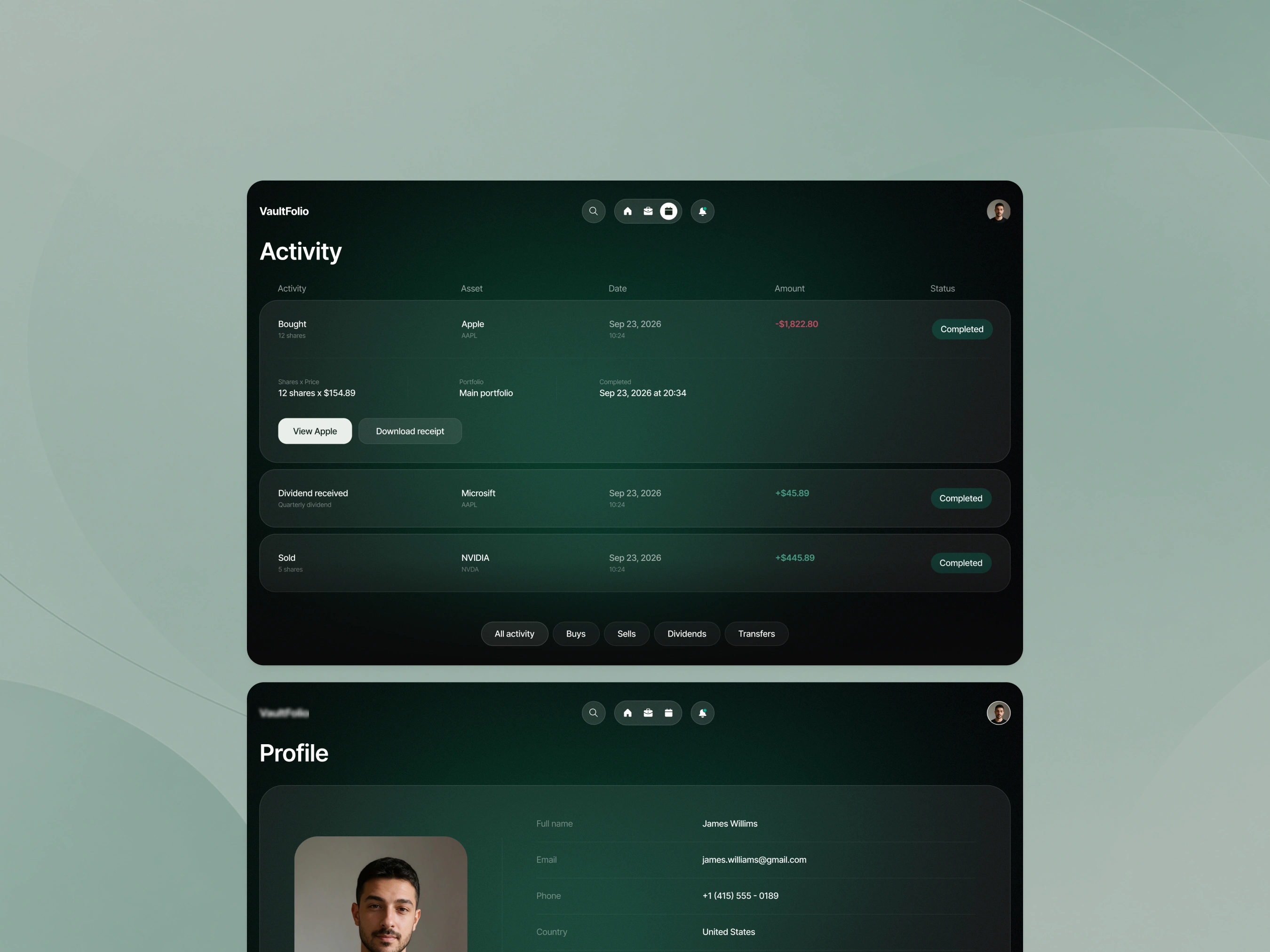
There’s also a separate Activity view for transactions and portfolio events, so the main dashboard doesn’t have to carry everything at once.
Visual direction
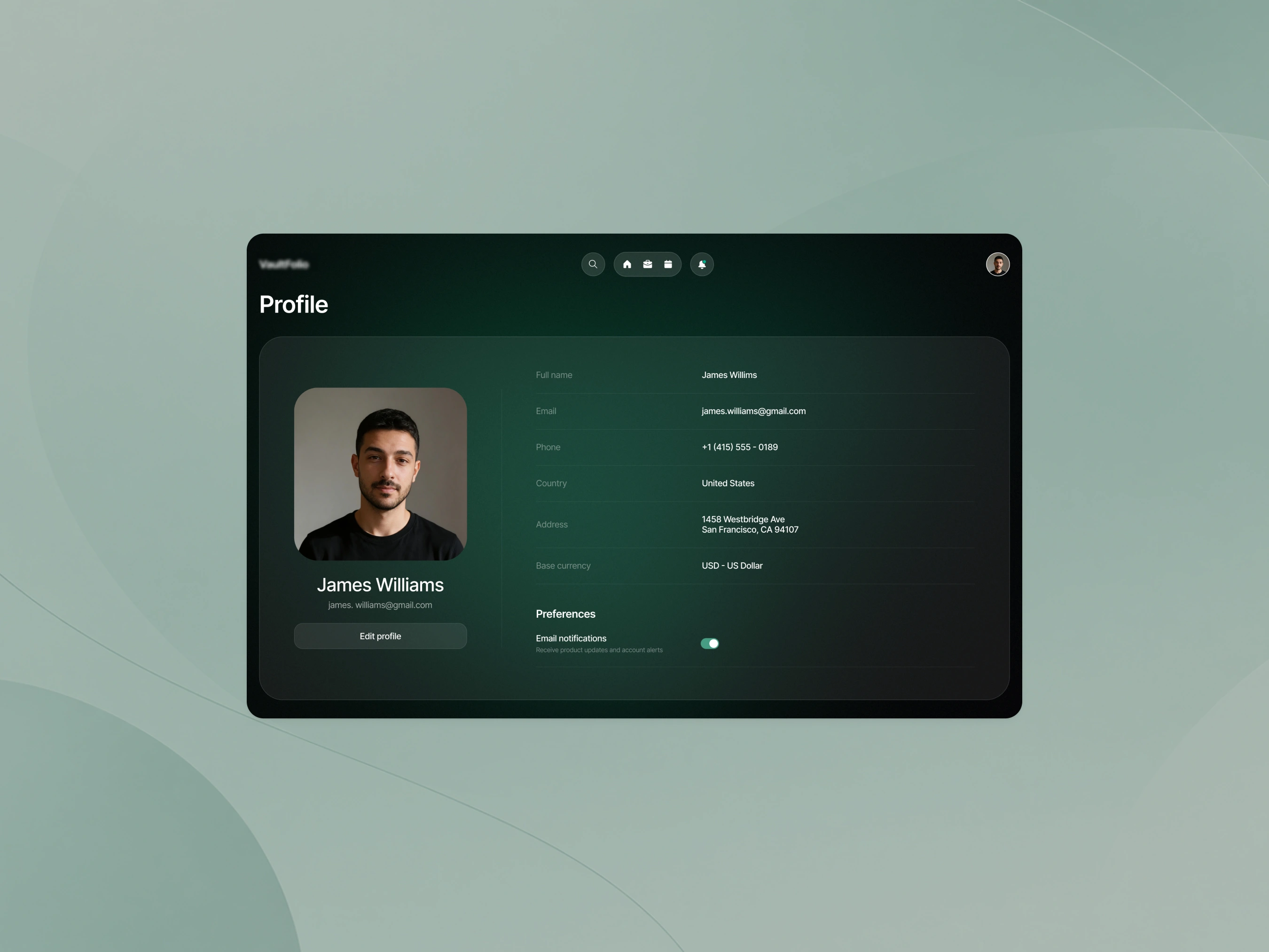
I wanted the product to feel calm and clear, rather than like a trading terminal.
The dark green palette and spacious layout help keep the interface focused, while colour is used more selectively for things like growth, loss and portfolio movement.
Outcome
The final experience is less about simply showing investments and more about helping users understand what is actually happening in their portfolio.
The important changes are easier to spot, and the detail is still there when users want to go deeper.
Like this project
Posted Sep 28, 2026
Redesigned investment portfolio platform for easier user insight.