The network for creativity
Join 1.25M professional creatives like you
Connect with clients, get discovered, and run your business 100% commission-free
Creatives on Contra have earned over $150M and we are just getting started
Back to feedPost

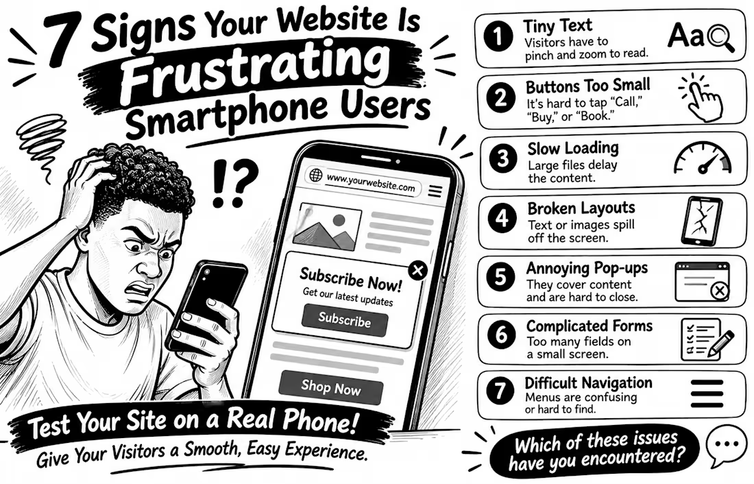
7 Signs Your Website Is Frustrating Smartphone Users
Your website may look perfect on a laptop but feel like hard work on a phone. And that matters: the 2025 Web Almanac found that only 48% of mobile websites achieved good Core Web Vitals, compared with 56% on desktop
Here are 7 warning signs to check
1️⃣ Tiny text Visitors have to pinch and zoom just to read.
2️⃣ Buttons too small People struggle to tap “Call,” “Buy,” or “Book” without hitting something else.
3️⃣ Slow loading Large images and heavy scripts delay the content people came to see.
4️⃣ Broken layouts Text, images, or menus spill off the screen or overlap.
5️⃣ Annoying pop-ups Full-screen offers cover the content and are difficult to close.
6️⃣ Complicated forms Too many fields make enquiries or checkout tiring on a small screen.
7️⃣ Difficult navigation Menus are confusing, links are crowded, or important actions are hard to find.
Don't just shrink your desktop website and call it mobile-friendly. Open it on a real phone and try to complete a task as a customer would
💬 Which of these problems have you encountered on a business website?



Testing on a phone matters.
The network for creativity
Join 1.25M professional creatives like you
Connect with clients, get discovered, and run your business 100% commission-free
Creatives on Contra have earned over $150M and we are just getting started



Related posts

've reviewed 50+ startup websites, and I noticed a pattern.
Their hero sections are often simple. They tell you who the product is for and what it does.
While working on this redesign concept for
@Alloovium, I wanted to explore a different direction.
Their original website already explained the product and its audience.
But what if the hero also used visuals that reflected the world their customers work in?
People often scan websites before deciding what to pay attention to.
Relevant visuals can catch their attention and create a connection with the audience before they start reading.
So I explored a few visual directions inspired by the construction industry.
Building a startup? I'd love to help you explore a new direction for your website.
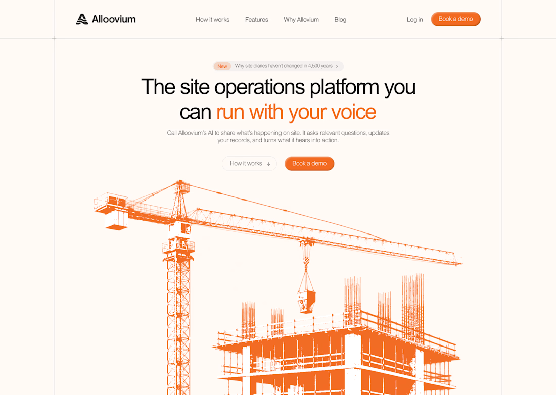
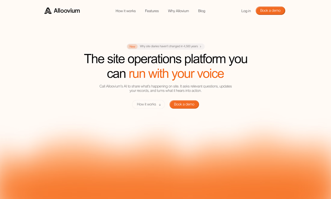
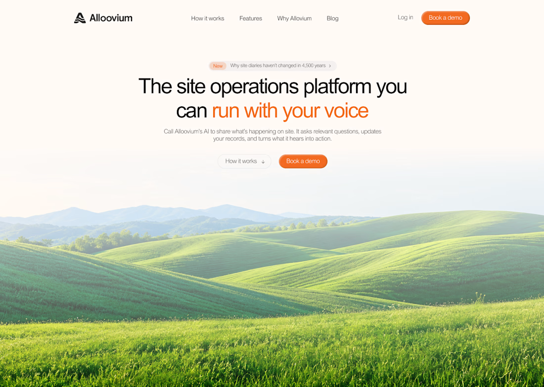
The construction visuals work well.

Which one feels more like a brand you’d buy from?

4 voted
80%
1 voted
20%
5 votes
Closed

Loud and playful for me. The bold prints suit a small run tee brand better than a quiet layout would.

we're going live with our first @Studio /03 website in two days!!!
stay tuned🤩
All the best for the launch!