Freelance Packaging Designers in Lahore
Sign Up
Post a job
Sign Up
Log In
Filters
2
Projects
People
Umar Tanveer
Lahore, Pakistan
Pitch Deck Designer | Packaging Design | Branding | Web
2x
Hired
5.0
Rating
194
Followers
expert
expert
+3
Follow
Message
Pitch Deck Designer | Packaging Design | Branding | Web
1
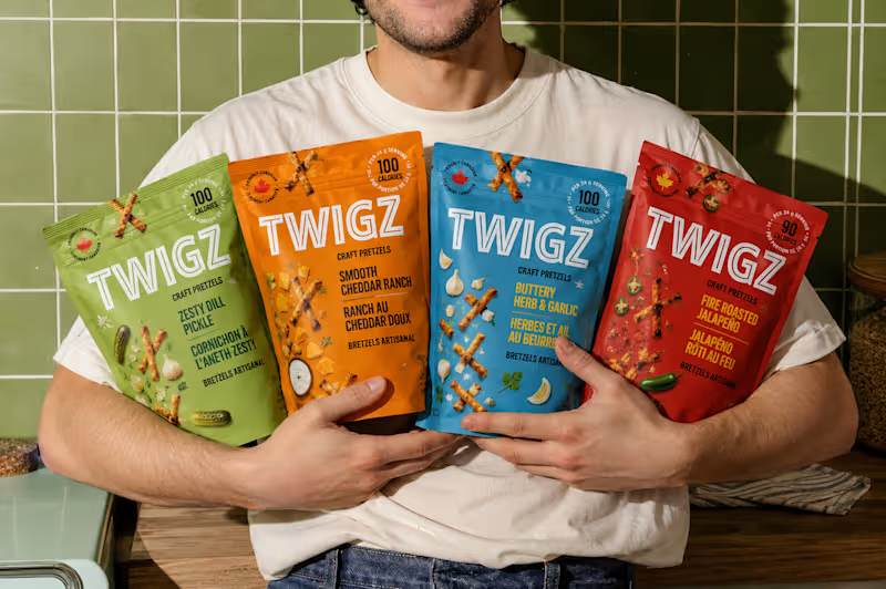
TWIGZ Snack Packaging & Lifestyle Mockups
1
13
10
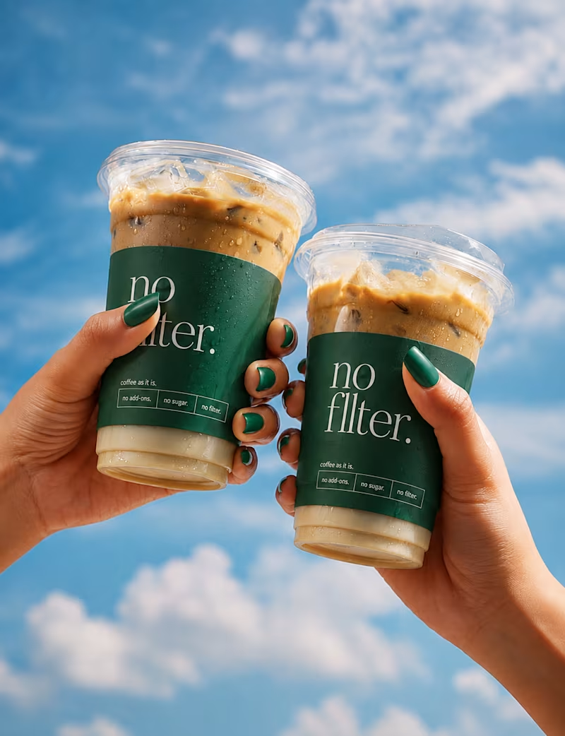
I’ve been wanting to create something that feels as unapologetic as a good cup of coffee — so, meet No Filter. ☕️ A coffee brand built around personality, simplicity, and doing things without unnecessary filters. From the visual identity to the cups, merchandise, and social visuals, I wanted every touchpoint to feel bold, recognizable, and a little bit unexpected. The goal was simple: create a brand that doesn’t just serve coffee, but has its own point of view. So here’s No Filter Coffee — a branding concept I had way too much fun bringing to life. 🌿🤎 No overthinking. No unnecessary extras. Just coffee, as it is. No Filter.
2
10
527
0
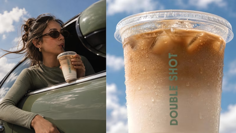
Premium Coffee Brand Identity Design | Double Shot
0
9
0
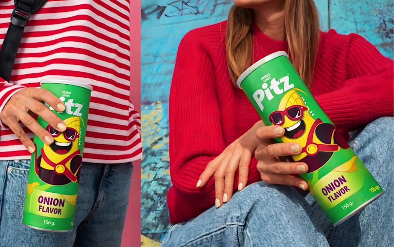
Pitz Chips Packaging Redesign
0
14
Packaging Designer
(9)
Follow
Message
SUBHAN DESIGNS • Identity & Packaging
pro
Lahore, Pakistan
Identity & Packaging Systems Beyond Category Conventions
$1k+
Earned
5.0
Rating
35
Followers
expert
Follow
Message
Identity & Packaging Systems Beyond Category Conventions
4
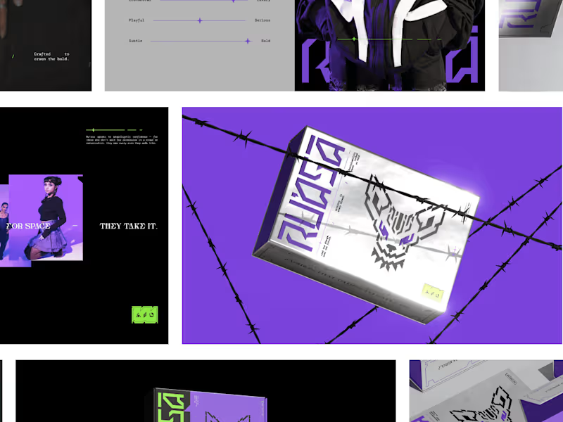
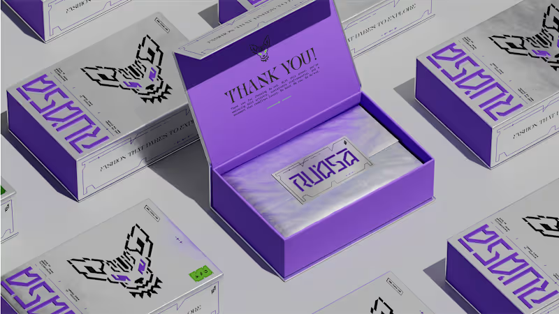
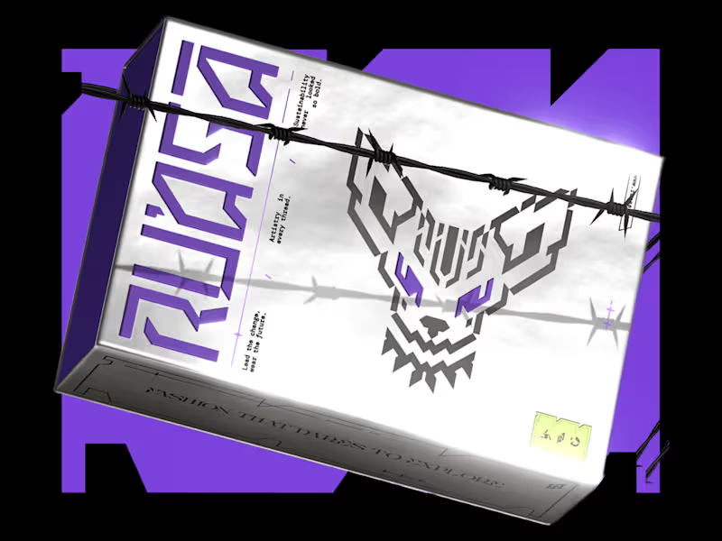
Packaging visuals from our recent Identity & Packaging project for Ru’asā. We built the packaging around silver foil, a raised wordmark and a cyber-gothic visual language, sharpened by Ru’asā’s signature purple accents. Every detail was designed to do two things: elevate the unboxing experience and reinforce the brand’s unconventional character. Premium in execution, rebellious in expression. The complete project is now live, covering Creative Direction, Mascot Logo, Visual Identity, Packaging Experience and Collaterals. Explore the full case study here (https://www.behance.net/gallery/241790871/Techno-Gothic-Branding-Packaging-for-Fashion-Brand) P.S. Is this a box you’d keep long after the unboxing?
1
4
313
14
"We weren’t sure what our brand should look like. They gave us a clear path forward.” That’s how our client described their experience working with us on Ru’asā. They came to us with a clear ambition: build a premium fashion brand that goes beyond category conventions. Derived from the Arabic ra’is, meaning chief or leader, Ru’asā celebrates individuality and rebellion against conformity. We built the complete brand experience across Strategy, Creative Direction, Visual Identity, Packaging Experience and Collaterals. The full project is live. Take a look at how we brought the brand to life here (https://www.behance.net/gallery/241790871/Techno-Gothic-Branding-Packaging-for-Fashion-Brand) Building a brand that aims to set the standard rather than follow one? I’d love to hear from you
4
14
493
3
RU’ASĀ — Identity | Packaging | Collaterals
1
3
28
6
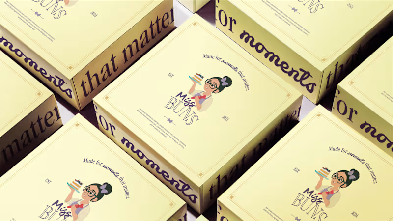
Miss Buns - Rebranding | Packaging | Collaterals
6
90
Packaging Designer
(4)
Follow
Message
Waleed B.
pro
Lahore, Pakistan
I Design What People Remember. Not Just Pretty.
1x
Hired
5.0
Rating
62
Followers
Follow
Message
I Design What People Remember. Not Just Pretty.

0
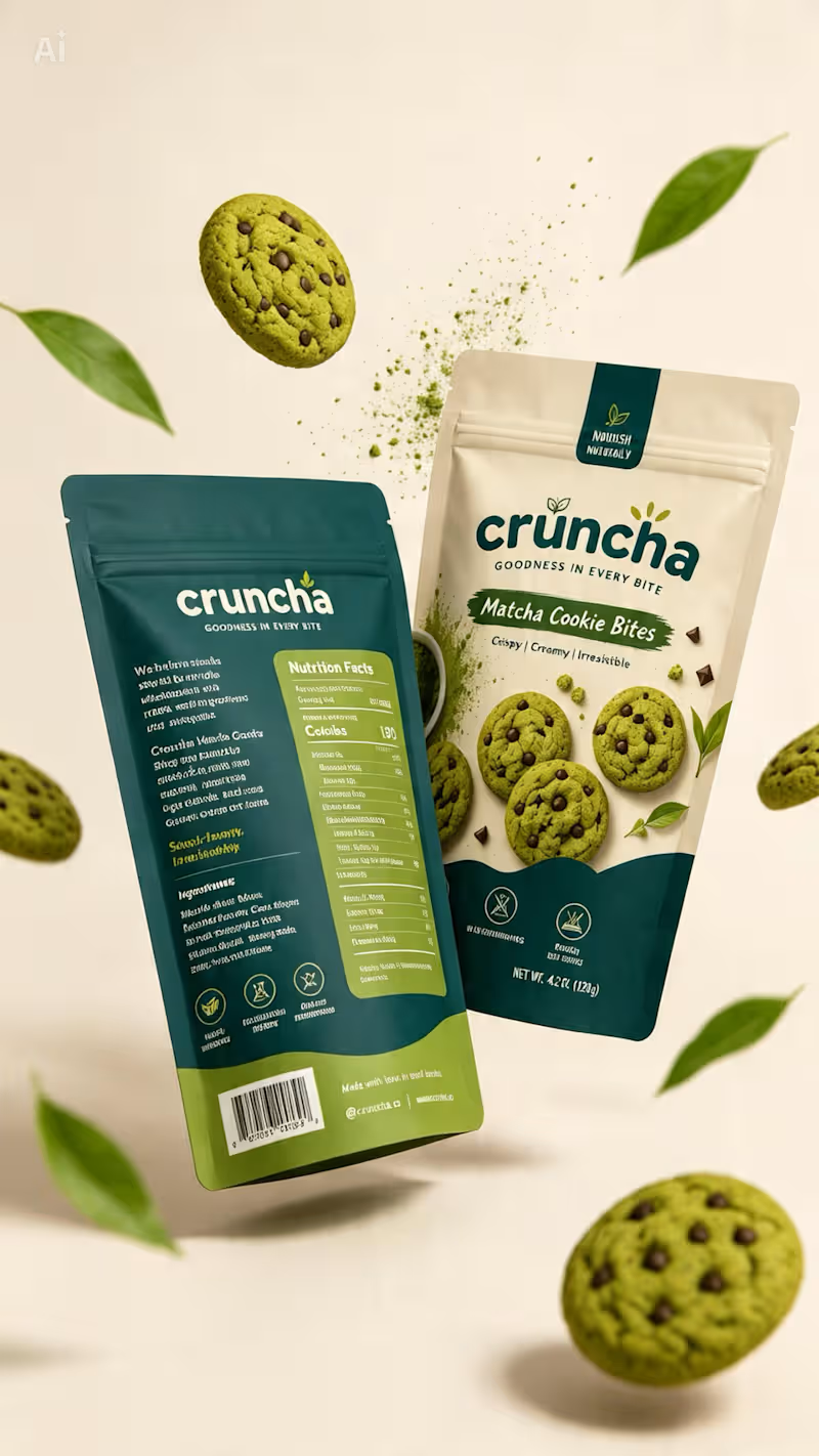
Cruncha was one of those projects I genuinely loved working on. ✦ From exploring the visual direction and color palette to shaping the packaging and bringing the whole concept together, every detail felt intentional. It gave me the freedom to experiment, think beyond the obvious, and turn a simple idea into something that actually feels like a brand. And honestly, the best part? I walked away from this project feeling like I’d actually earned something — not just completed another design.
0
174
2
Behind the Design ✦ This concept started with one goal: make the packaging feel as good as the product itself. I wanted to move away from the usual bright-green matcha aesthetic, so I explored a mix of warm ivory, deep teal, and muted olive — giving it a more premium yet approachable feel. The bold typography adds personality, while the curved color blocks and ingredient photography give the packaging a distinctive shelf presence. Piece by piece, the colors, typography, imagery, and packaging style came together to create something that feels fresh, playful, premium, and memorable. Sometimes the final design looks simple — but there’s a lot of thought behind every detail. ✦
2
267
6
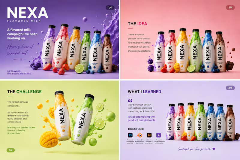
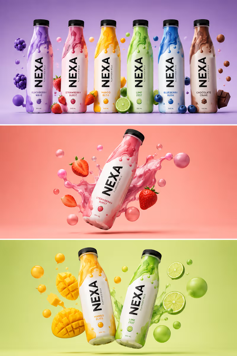
Been working on this one for a while, and I’m finally happy with how it turned out. 🥛✨ This was a fun product design project for a fictional flavored milk brand — NEXA. The goal was simple: make each flavor feel bold and delicious while keeping the entire range visually connected. The challenging part was getting the little things right — the liquid splashes, fruit placement, lighting, shadows, colors, and overall composition. It’s easy to add elements to a design. It’s much harder to make everything feel like it belongs together. One thing I took away from this project: good product visuals aren’t just about making something look good. They’re about making people want to reach for the product. I also experimented with a mix of 3D, Photoshop, Illustrator, and AI-assisted creative exploration to bring the concepts together. Pretty happy with where this landed. 👀 Which flavor would you pick? 🍓🥭🍋🫐🍫 #ProductDesign #PackagingDesign #3DDesign #GraphicDesign #CreativeProcess #BrandDesign #ProductVisualization #VisualDesign #AdobePhotoshop #Blender #DesignerLife
2
6
343
1
𝐁𝐄𝐇𝐈𝐍𝐃 𝐓𝐇𝐄 𝐃𝐄𝐒𝐈𝐆𝐍 𝑨 𝑵𝑬𝑾 𝑷𝑹𝑶𝑱𝑬𝑪𝑻. 𝑨 𝑵𝑬𝑾 𝑪𝑯𝑨𝑳𝑳𝑬𝑵𝑮𝑬. Every project teaches you something. This time, it was about creating a beverage brand that feels bold, playful, and unforgettable. The goal was simple: design a brand that stands out on the shelf and connects instantly with the right audience. 🎯 𝐌𝐘 𝐀𝐏𝐏𝐑𝐎𝐀𝐂𝐇 Bold Contrast – Each flavor has its own identity. Fluid Patterns – Inspired by energy and motion. 3D Visuals – To make the product look alive and irresistible. Storytelling Through Color – Every shade has a purpose and a mood. 💡𝐖𝐇𝐀𝐓 𝐈 𝐋𝐄𝐀𝐑𝐍𝐄𝐃 • Design is not just about looks, it’s about emotion. • The right colors and composition can make a product speak. • Patience, details, and iteration always pay off. 𝐀𝐍𝐎𝐓𝐇𝐄𝐑 𝐒𝐓𝐄𝐏 𝐅𝐎𝐑𝐖𝐀𝐑𝐃. 𝐀𝐍𝐎𝐓𝐇𝐄𝐑 𝐋𝐄𝐒𝐒𝐎𝐍 𝐋𝐄𝐀𝐑𝐍𝐄𝐃. 𝐎𝐧 𝐭𝐨 𝐭𝐡𝐞 𝐧𝐞𝐱𝐭. → TOOLS USED: Adobe Photoshop, Adobe Illustrator FOCUS • Brand Identity • Color Psychology • 3D Composition 𝐓𝐈𝐌𝐄 𝐒𝐏𝐄𝐍𝐓 Concept to Final – 2 Days Grateful for the process. Excited for what’s next. #graphicdesigner #brandidentity #branddesign #packgaing #barnding #designer
1
146
Packaging Designer
(7)
Follow
Message
M Usman
Lahore, Pakistan
Graphic Designer | Packaging Design | Amazon Listing Images
5.0
Rating
6
Followers
Follow
Message
Graphic Designer | Packaging Design | Amazon Listing Images
1
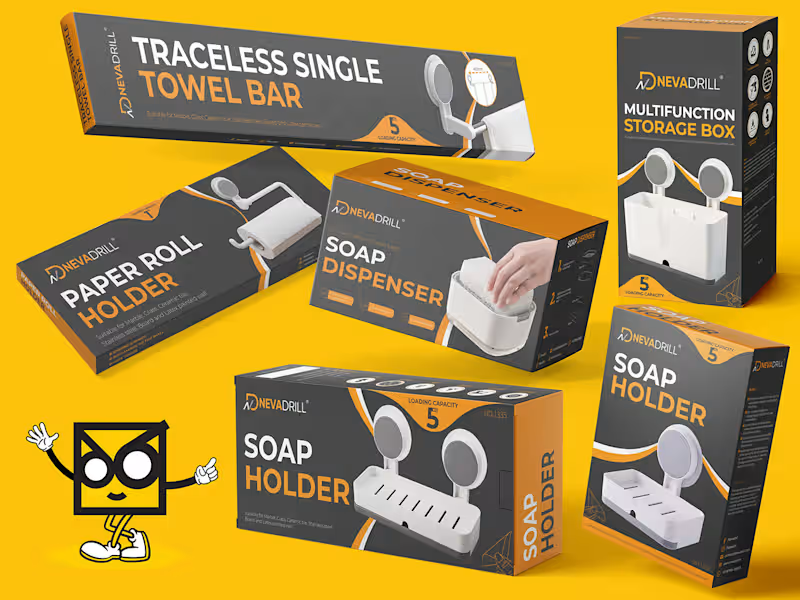
Modern Package Designs for NEVADRILL
1
4
1
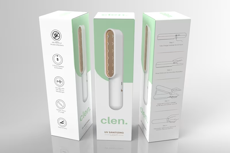
CLEN – UV Sanitizing Light Packaging Design
1
4
1
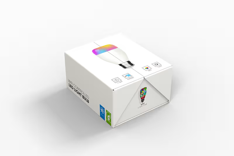
WiFi-Controlled Smart Bulb Box Design – URI Lighting
1
6
1
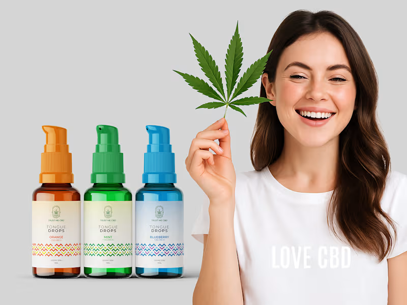
Tongue Drops Label & Visual Branding
1
12
Packaging Designer
(6)
Follow
Message
M Aadil Ali
Lahore, Pakistan
I Design, Build & Monetize Brands®
39
Followers
Follow
Message
I Design, Build & Monetize Brands®
19
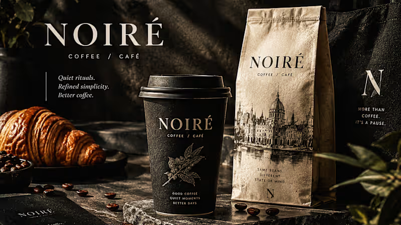
I Just Created NOIRÉ 🔥 A Coffee Brand Built Around the Pause. NOIRÉ is a premium café brand built around a simple idea: Great coffee should feel like a moment of pause, not another part of the routine. The project explores a complete visual identity, packaging system, takeaway cups, coffee bags, tote bags, menu design, café applications and lifestyle campaign direction. Instead of relying on the usual loud coffee aesthetics, I built NOIRÉ around deep charcoal, warm ivory, soft graphite, refined typography, subtle botanical illustrations and quiet editorial compositions. The visual language is intentionally dark, tactile, and understated - giving every touchpoint the feeling of a slow morning, a quiet table, and coffee worth taking your time with. From the cup in your hand to the café around you, every detail was designed to make the brand feel like a ritual. Waiting for your thoughts in the comments 🙌🔥
31
19
997
18
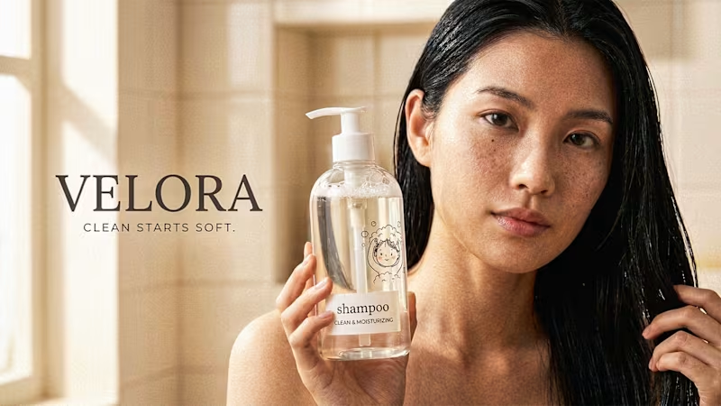
I Just Created VELORA - Luxury Shampoo 🔥 VELORA - Clean Starts Soft. A minimal luxury shampoo branding, packaging design and beauty product photography project for a modern hair care brand. This complete visual identity includes transparent bottle packaging design, clean typographic label design, a hand-drawn hair-wash sticker illustration, and premium art direction built for shelf presence and e-commerce. The campaign pairs ultra high definition product photography with real skin texture beauty portraits, macro hair and water droplet detail, bathroom lifestyle scenes, towel and vanity branding mockups, and minimal poster design layouts. Every frame follows commercial photography rules - soft window light, controlled reflections, glass refraction, deep focus and 4K retouching. Drop your thoughts in cmnts.....!!!!! 🙌
20
18
2K
30
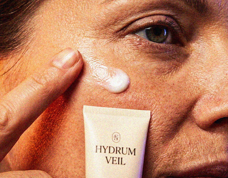
I Just Created HYDRUM VEIL 🔥 HYDRUM VEIL is a skincare brand built around a premium SPF 50+ sunscreen, developed as a complete brand identity, packaging design, and seasonal advertising campaign. The project explores a question most seasonal beauty work gets wrong: how do you make a limited-edition campaign feel festive without making it feel cheap? Instead of stacking decorative props, the campaign holds a strict visual system - vivid pumpkin orange, deep twilight violet, warm cream, and restrained black and lets a single product carry every frame. Drop your replies in cmnts.....!!!!! 🙌
31
30
3.2K
7
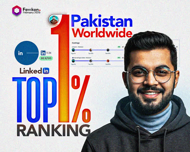
Favikon Top 5 LinkedIn Creator | Global Top 150 (Verified Ranking)
7
563
Packaging Designer
(3)
Follow
Message
M Adil
Lahore, Pakistan
Brand Identity Designer
Follow
Message
Brand Identity Designer
0
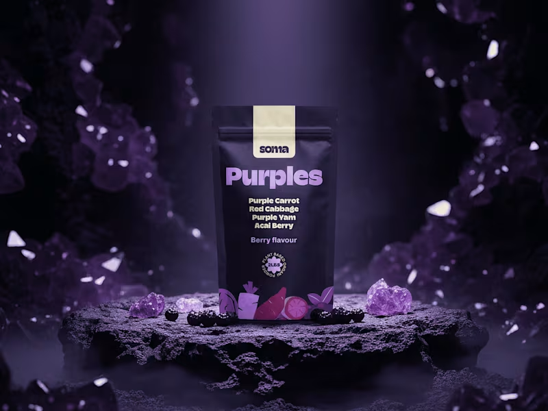
SOMA — The ingredient is the identity.
0
4
0
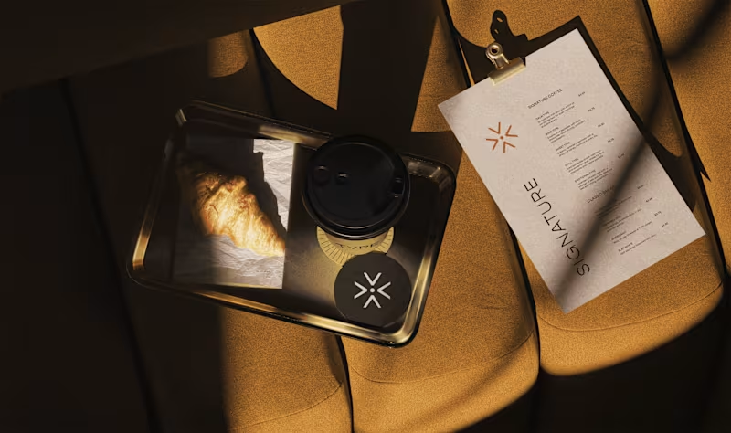
TYPE: A Mood-Based Coffee Identity
0
4
0
She's The One: Made Just For You.
0
4
2
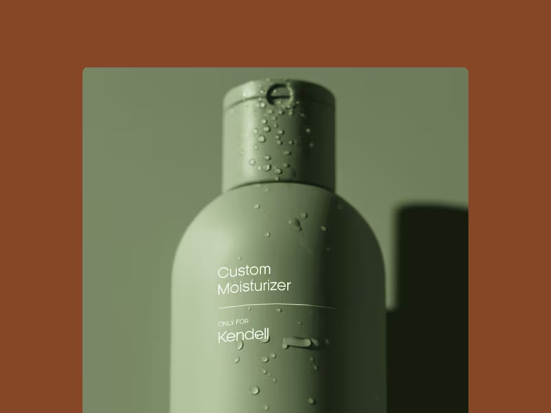
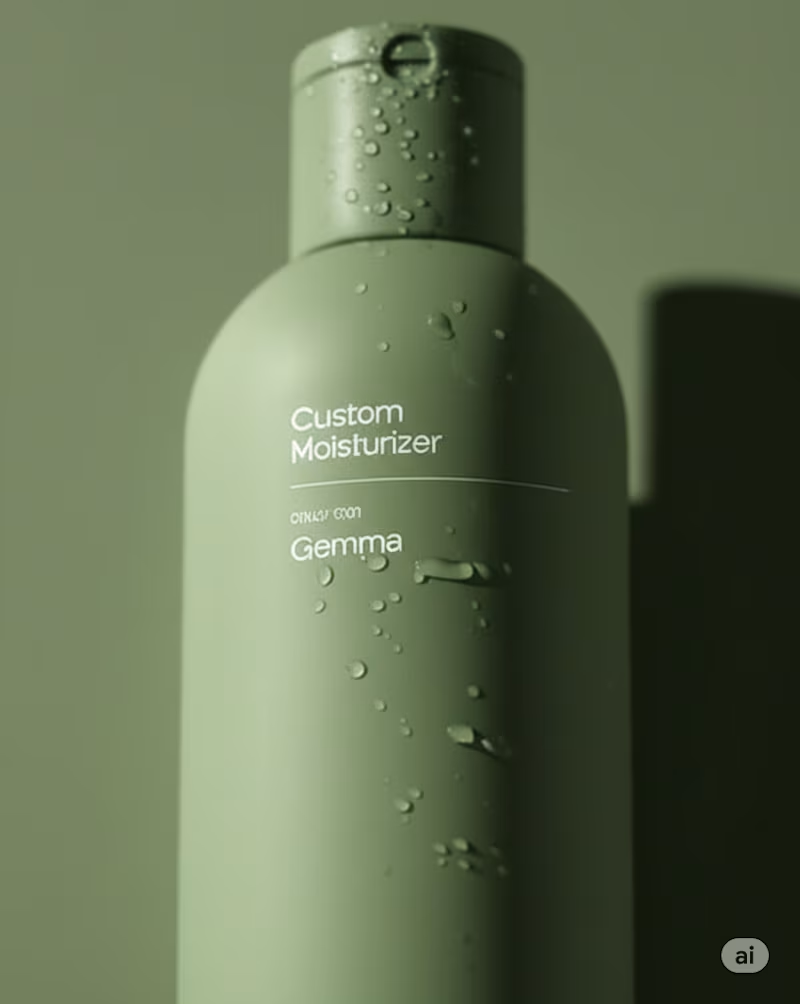
SHE’S THE ONE This project started with a simple idea That self-care should never feel generic. SHE’S THE ONE is a personal care brand that creates custom skin and hair formulas for every individual. But beyond the products, it’s a story about recognition. About giving people the feeling of being truly seen and cared for. ✨ The creative direction Soft tones to represent care. Elegant typography to embody confidence. And a voice that says you’re not just another person in the crowd, you’re the one. This project taught me that branding isn’t just about design, it’s about empathy. It’s about transforming a brand into a feeling someone can recognize as their own. Here is the full project. Full Case Study (https://www.behance.net/gallery/228123111/Shes-The-One-Brand-Identity)
2
55
Packaging Designer
(3)
Follow
Message
Sidra Nadeem
Lahore, Pakistan
Designing Brands That Speak & Sell
16
Followers
Follow
Message
Designing Brands That Speak & Sell
0
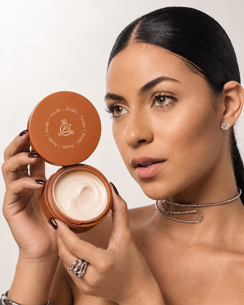
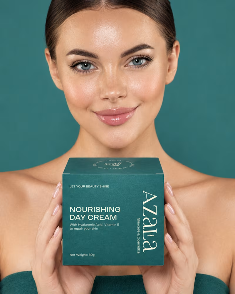
Azala Skincare - Branding and Packaging A more closer look at the visual identity created for Azala 🤍 From the logo and typography to the overall visual language, each element was designed to feel elegant, cohesive, and timeless. Super happy with how this one came together! 🫶🏻 What do you think? 👇🏻 . . . #skincarebrand #brandidentity #skincarebranding #beautybranding #beautybrand #packagingdesign
0
35
1
Azala Skincare - Branding and Packaging A skincare brand designed around simplicity, softness, and modern beauty🫶🏻 For this project, I focused on creating a clean and elevated visual identity with packaging that feels minimal, feminine, and effortlessly premium. From the typography and color palette to the packaging details, every element was designed to create a cohesive and refined brand experience. 🤍 Can’t wait to share more of Azala with you! What do you think of this direction? 👇🏻 #SkincareBrand (https://www.instagram.com/explore/tags/skincarebrand/) #SkincarePackaging (https://www.instagram.com/explore/tags/skincarepackaging/) #BeautyBranding (https://www.instagram.com/explore/tags/beautybranding/) #PackagingDesign (https://www.instagram.com/explore/tags/packagingdesign/) #PackagingDesigner (https://www.instagram.com/explore/tags/packagingdesigner/) #BrandIdentity (https://www.instagram.com/explore/tags/brandidentity/) #BeautyPackaging (https://www.instagram.com/explore/tags/beautypackaging/) #CosmeticPackaging (https://www.instagram.com/explore/tags/cosmeticpackaging/) #GraphicDesign (https://www.instagram.com/explore/tags/graphicdesign/) #BrandDesign (https://www.instagram.com/explore/tags/branddesign/) #DesignInspiration (https://www.instagram.com/explore/tags/designinspiration/) #MinimalBranding (https://www.instagram.com/explore/tags/minimalbranding/) #SkincareDesign (https://www.instagram.com/explore/tags/skincaredesign/)
1
113
2
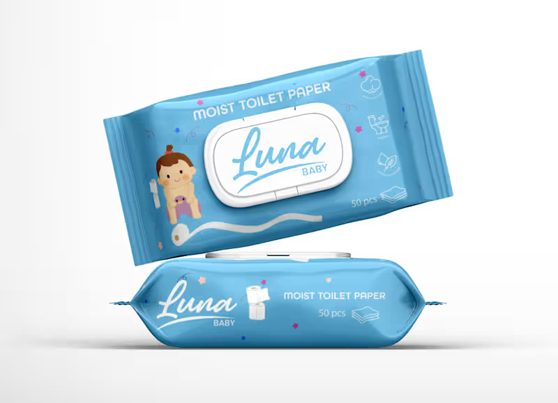
Gentle & Playful Packaging for Luna Baby Wipes: This packaging design was created for Luna Baby, a brand dedicated to caring for little ones with safe, soft, and reliable products. The goal was to reflect the brand’s friendliness, trustworthiness, and focus on gentle care for babies. Hope you all like it! ✨
2
2
210
2
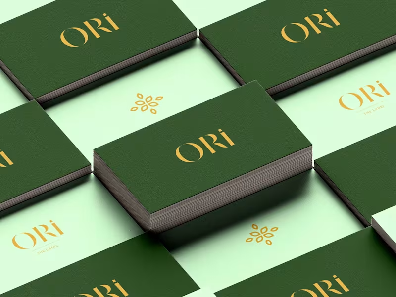
ORI Atelier / Luxury Handbag Design
2
5
Packaging Designer
(7)
Follow
Message
Abrar A. Faiz
Lahore, Pakistan
Senior Designer & Art Director | Premium CPG Brands | Remote
1x
Hired
3
Followers
Follow
Message
Senior Designer & Art Director | Premium CPG Brands | Remote
0
FruitFuel - Launch the Orange
0
8
0
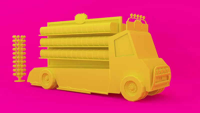
Jojo Candy Van | Retail Kiosk
0
12
0
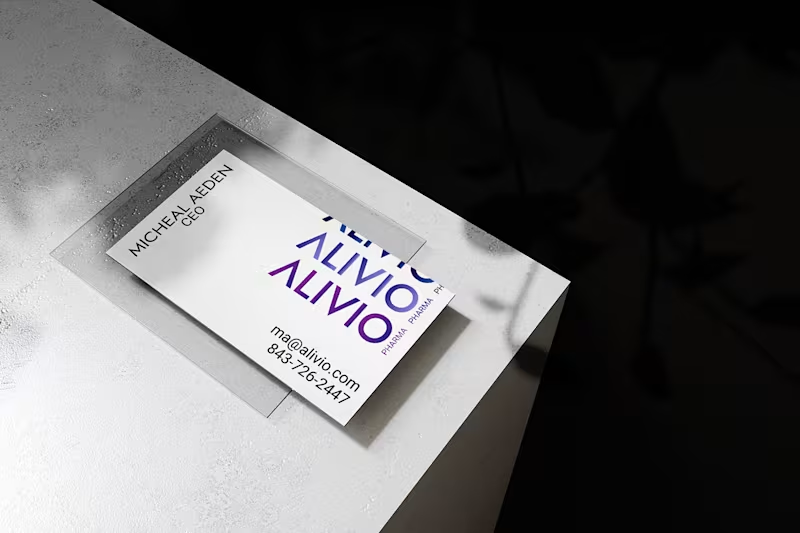
Alivio Pharma - Formation of a Brand
0
11
0
Exalte Consulting - Rebranding
0
7
Packaging Designer
(4)
Follow
Message
Explore people