The network for creativity
Join 1.25M professional creatives like you
Connect with clients, get discovered, and run your business 100% commission-free
Creatives on Contra have earned over $150M and we are just getting started
Back to feedPost


Packaging visuals from our recent Identity & Packaging project for Ru’asā.
We built the packaging around silver foil, a raised wordmark and a cyber-gothic visual language, sharpened by Ru’asā’s signature purple accents.
Every detail was designed to do two things: elevate the unboxing experience and reinforce the brand’s unconventional character. Premium in execution, rebellious in expression.
The complete project is now live, covering Creative Direction, Mascot Logo, Visual Identity, Packaging Experience and Collaterals.
P.S. Is this a box you’d keep long after the unboxing?


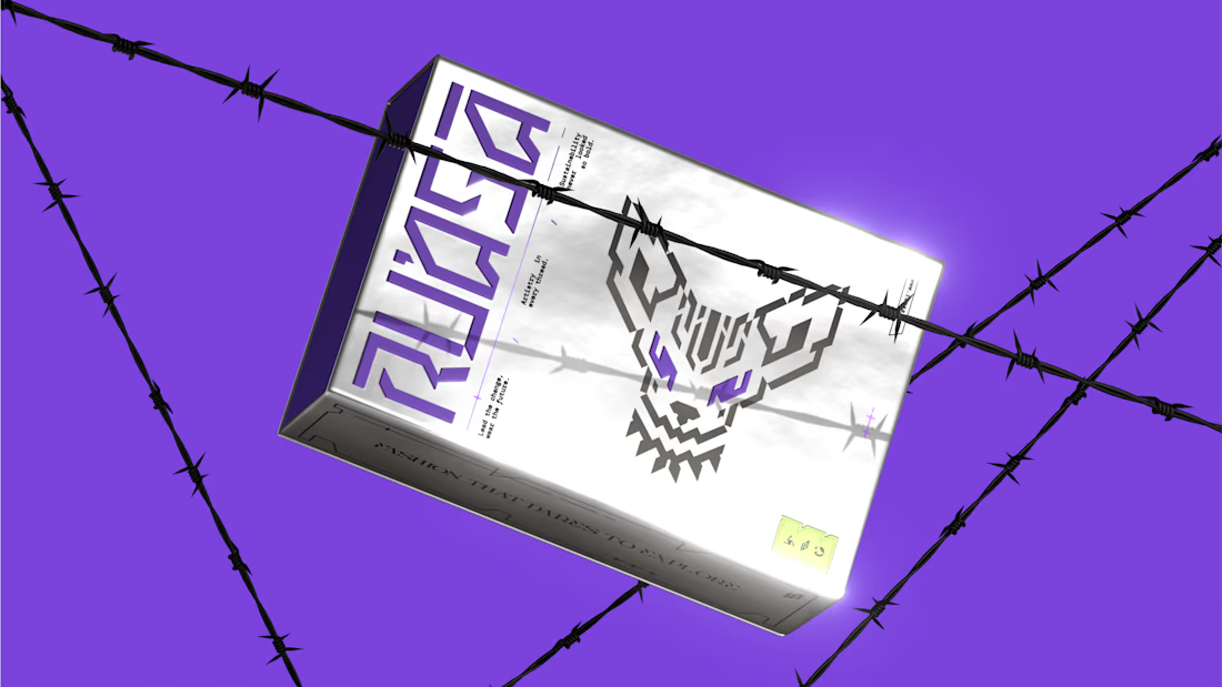
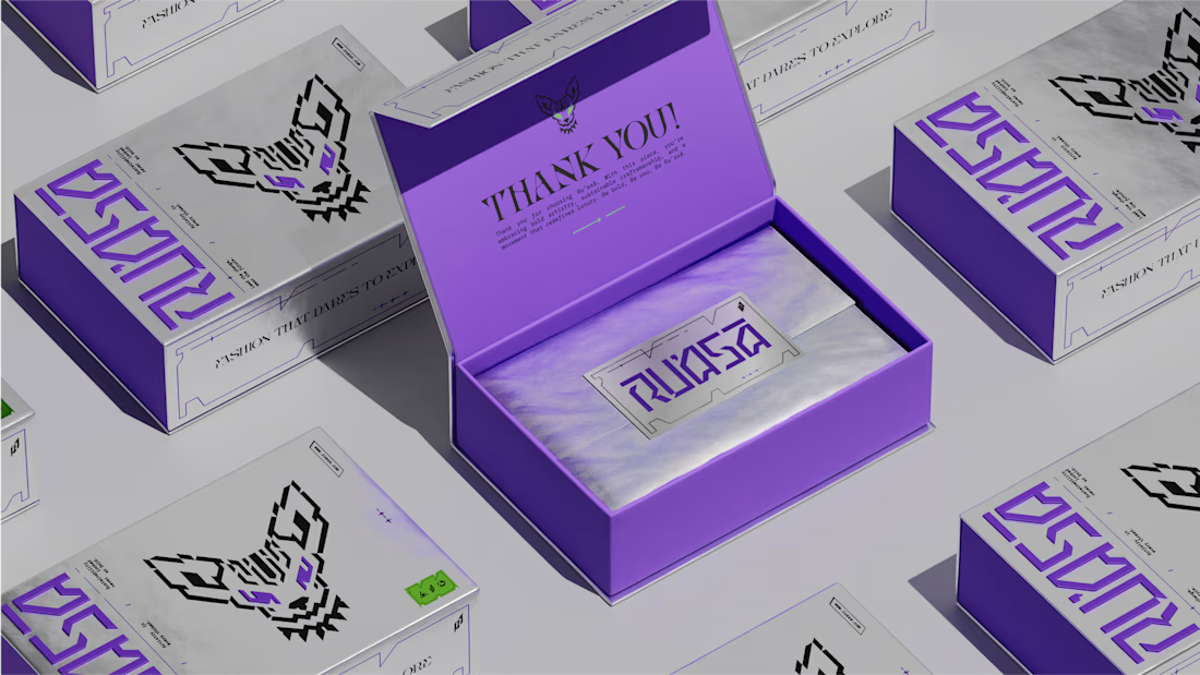
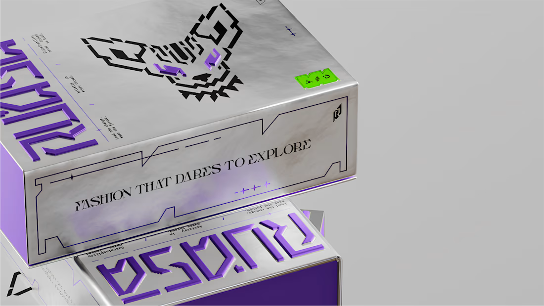

Yes, but for the emboss rather than the foil — foil is what sells it in a photo, the raised wordmark is what makes it worth keeping once it's in someone's hands and off a screen. The barbed-wire staging is carrying most of the rebellious half of that brief; did the same language...
The network for creativity
Join 1.25M professional creatives like you
Connect with clients, get discovered, and run your business 100% commission-free
Creatives on Contra have earned over $150M and we are just getting started







Related posts

Recent work on MAE - Visual identity


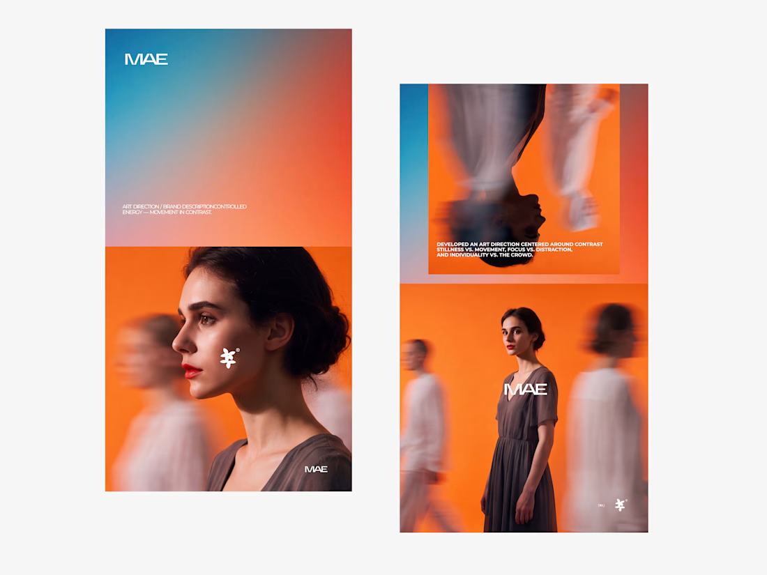
The motion blur on the figures gives the orange-to-blue gradient a reason to be there, and the small star mark stays readable on both the cheek and the shirt. Did the star come first as a standalone mark, or did it grow out of the photography direction?

🌸 A little more calm, a little less noise.
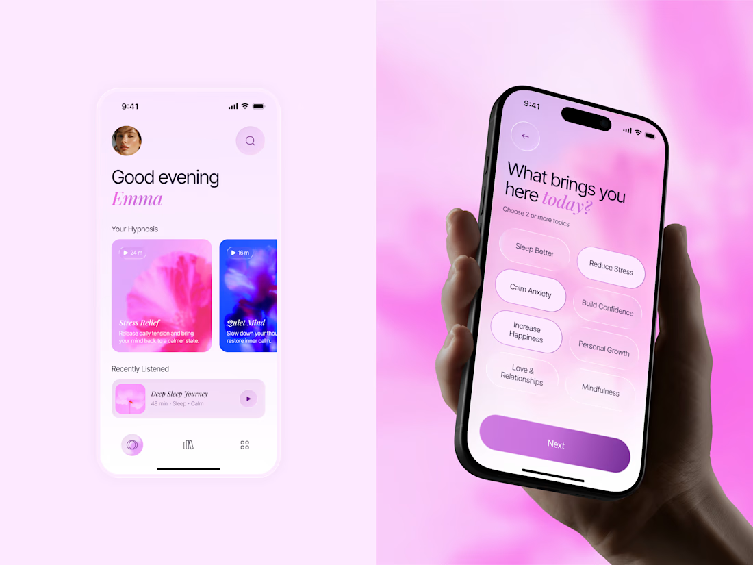
Meet Inner Bloom — a hypnosis app concept designed to help people sleep better, reduce stress, and feel more confident.
For this project, I explored a softer visual direction with dreamy pink and lilac tones, frosted glass, and floral imagery to create a calming experience that feels warm and personal.

Great concept with soft colors ❤️🎉

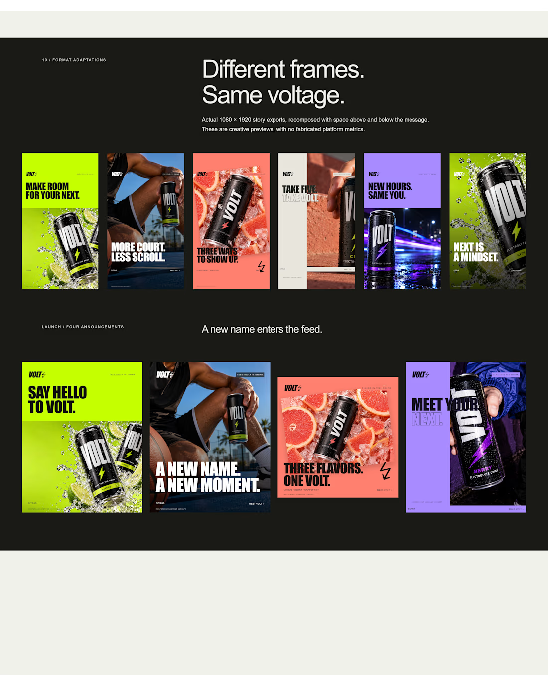
an electrolyte beverage campaign concept I created🚀👇
5 creatives. 20 static ads. One bold visual system built to stop the scroll.


This is genuinely creative! What I love most is how the design manages to stand out while still feeling intentional and well thought out. There’s something about the overall execution that naturally draws your attention and makes you want to take a closer look. It’s always...