Playful Brand Identity & Packaging for Moku Coffee Club

Jerin Nusrat


Moku: Playful Brand & Packaging for a Coffee Club
A coffee brand with a lazy black cat, big colour and a good sense of humour.
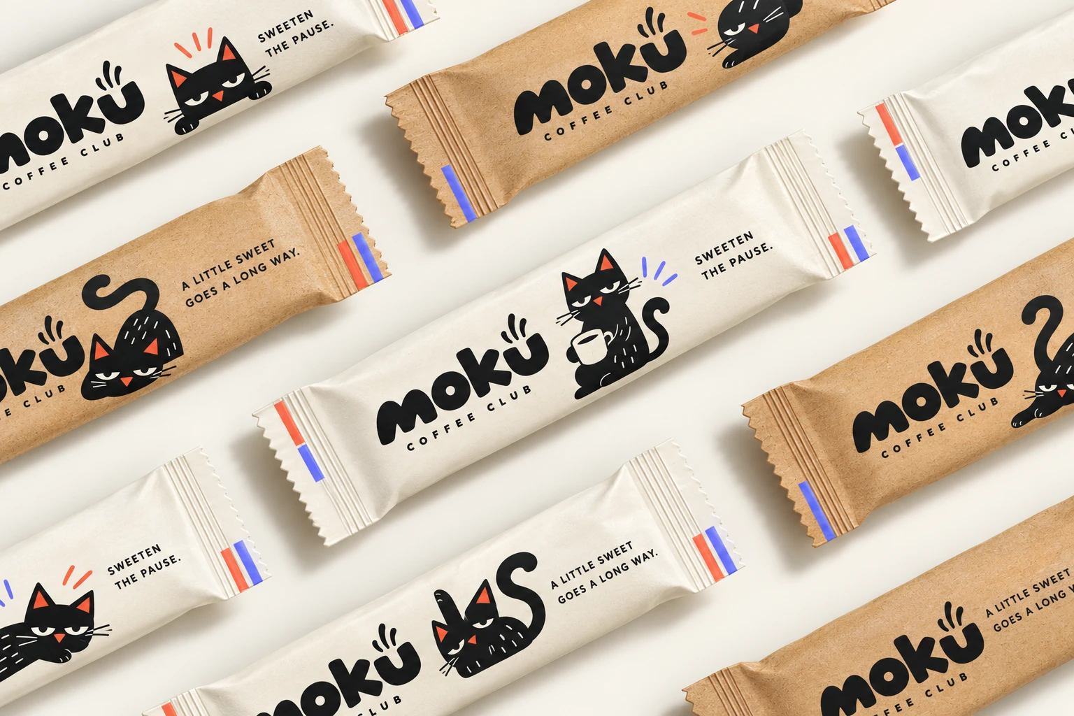
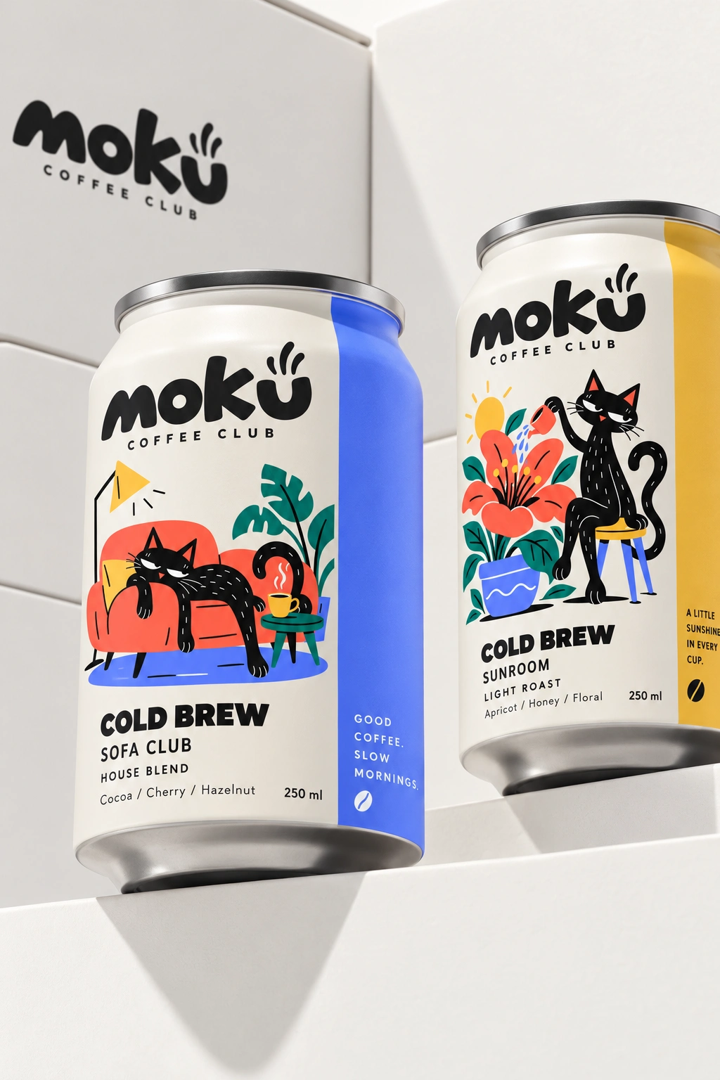
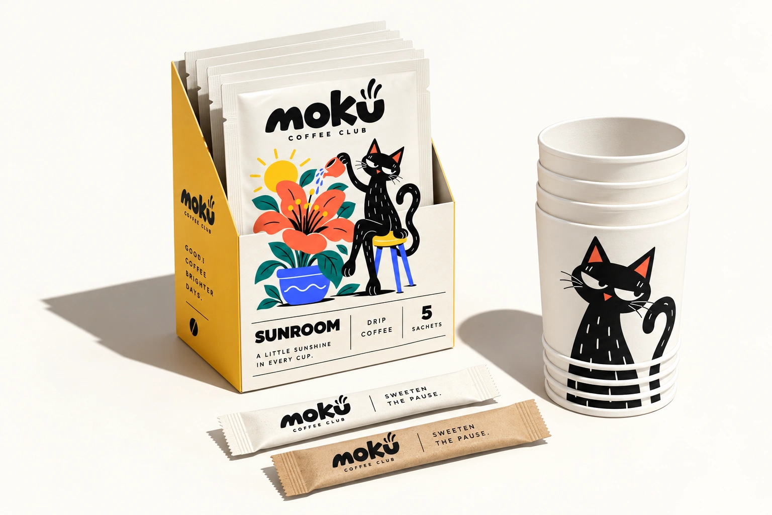
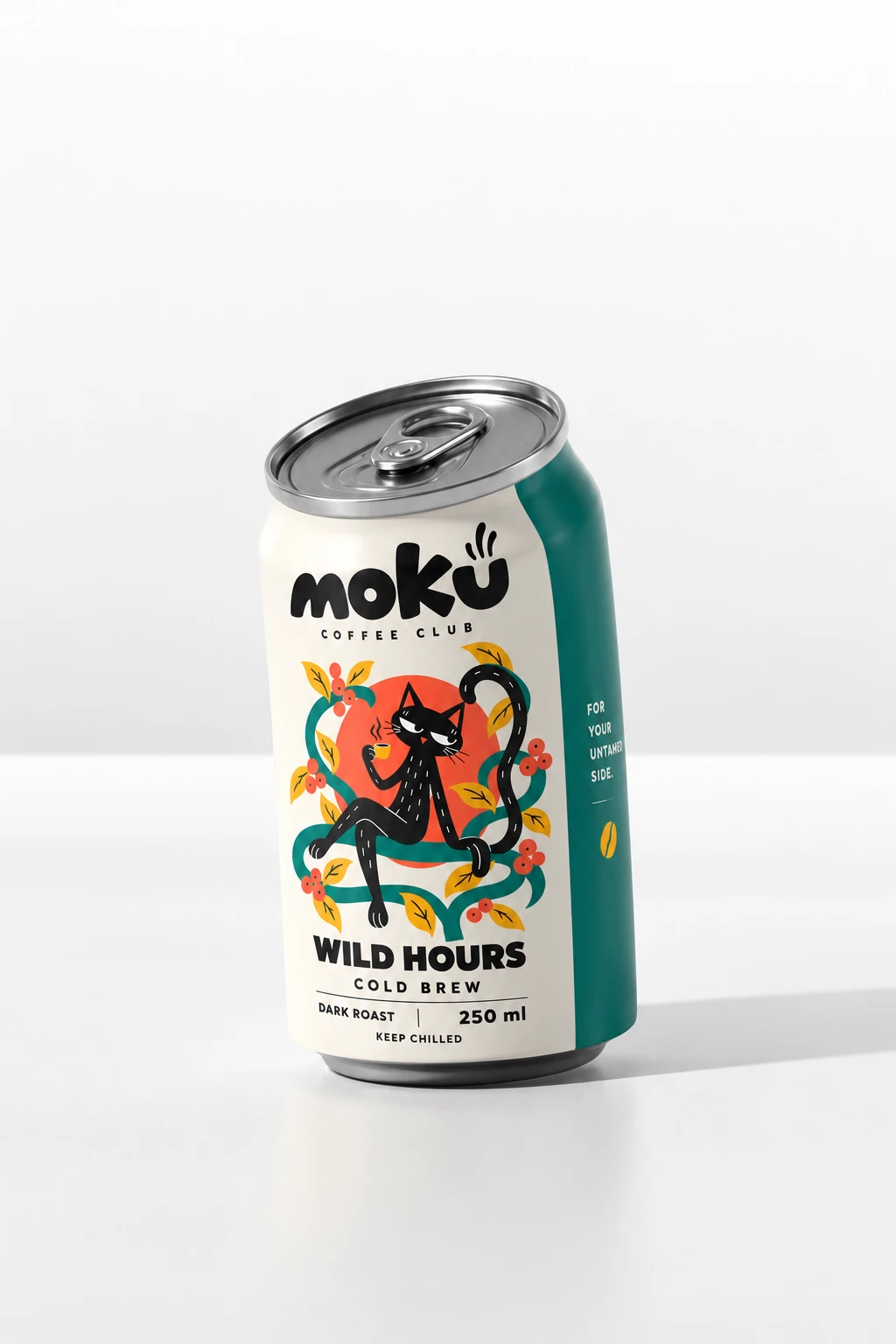
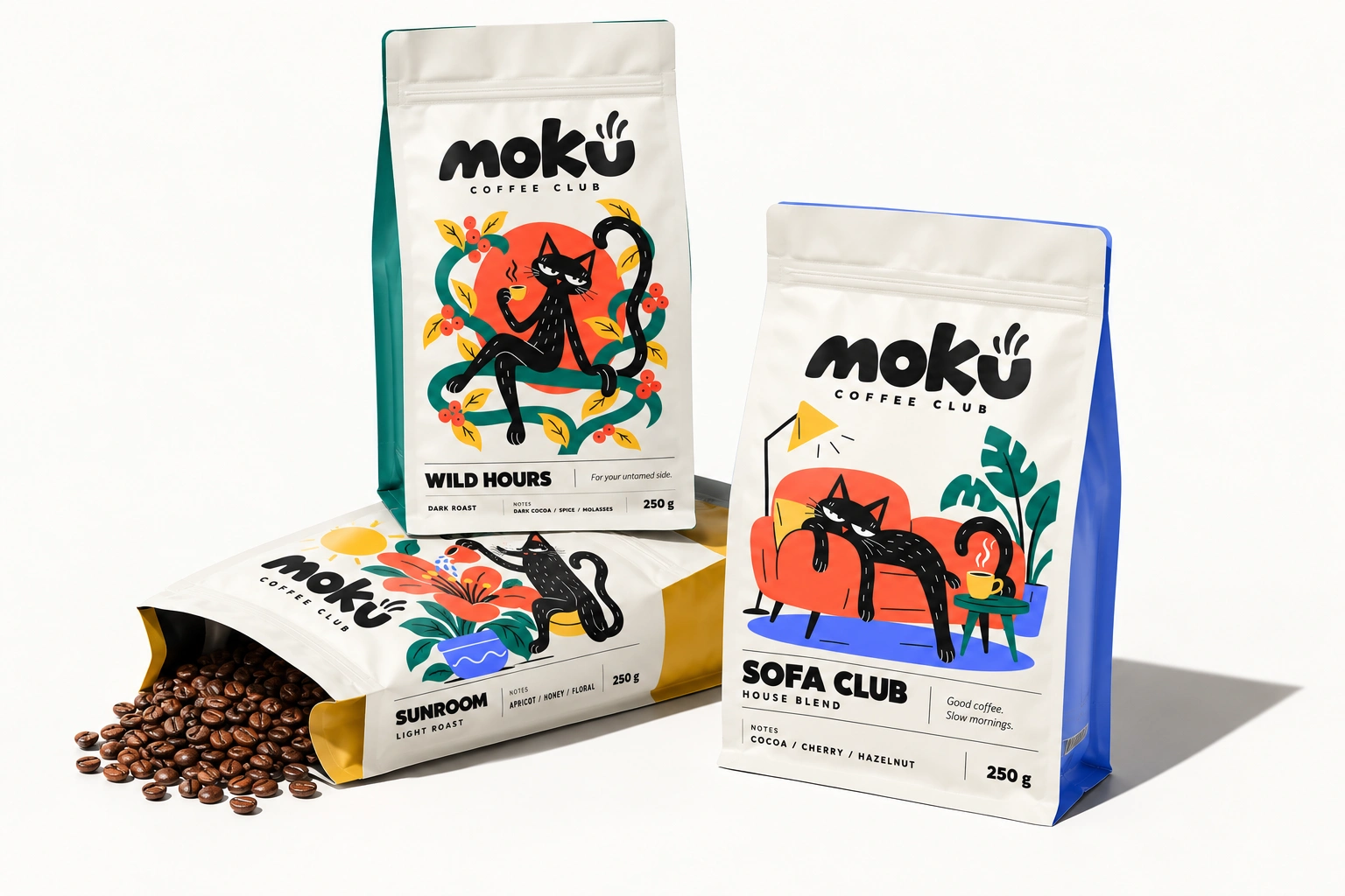
Moku Coffee Club is a coffee brand for people who take their coffee seriously but not themselves. I designed the full identity and packaging system around one unbothered black cat. It lounges in a cup, naps on the moon, waters a flower and sprawls on the sofa. Everything is built around the idea that coffee is better with good company.
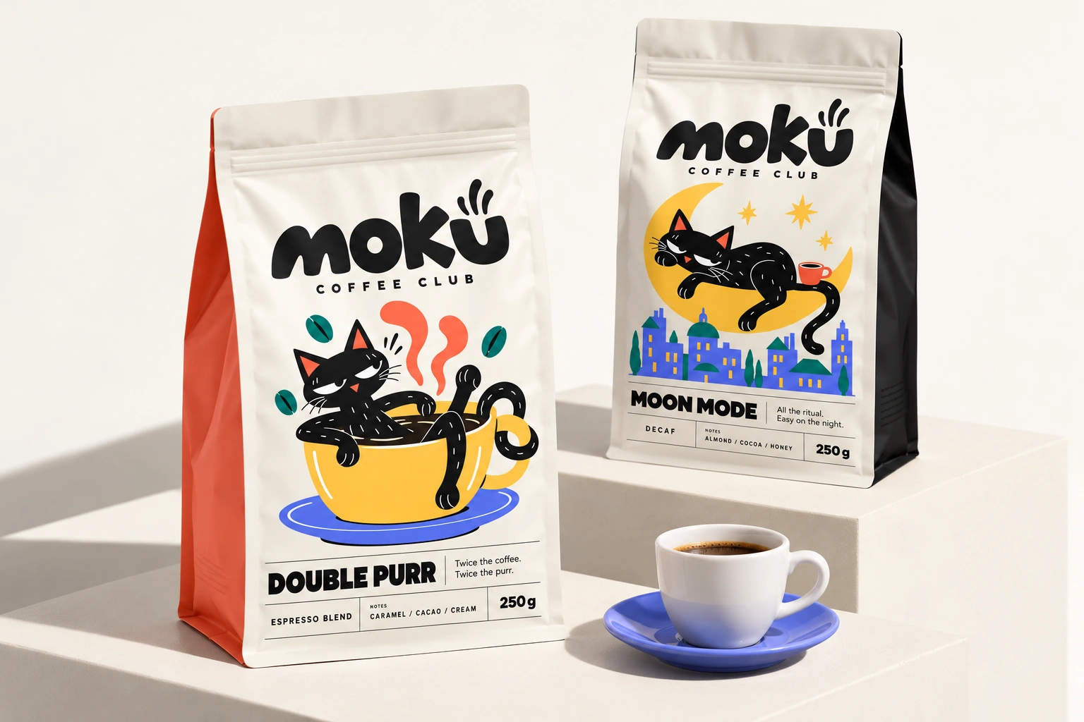
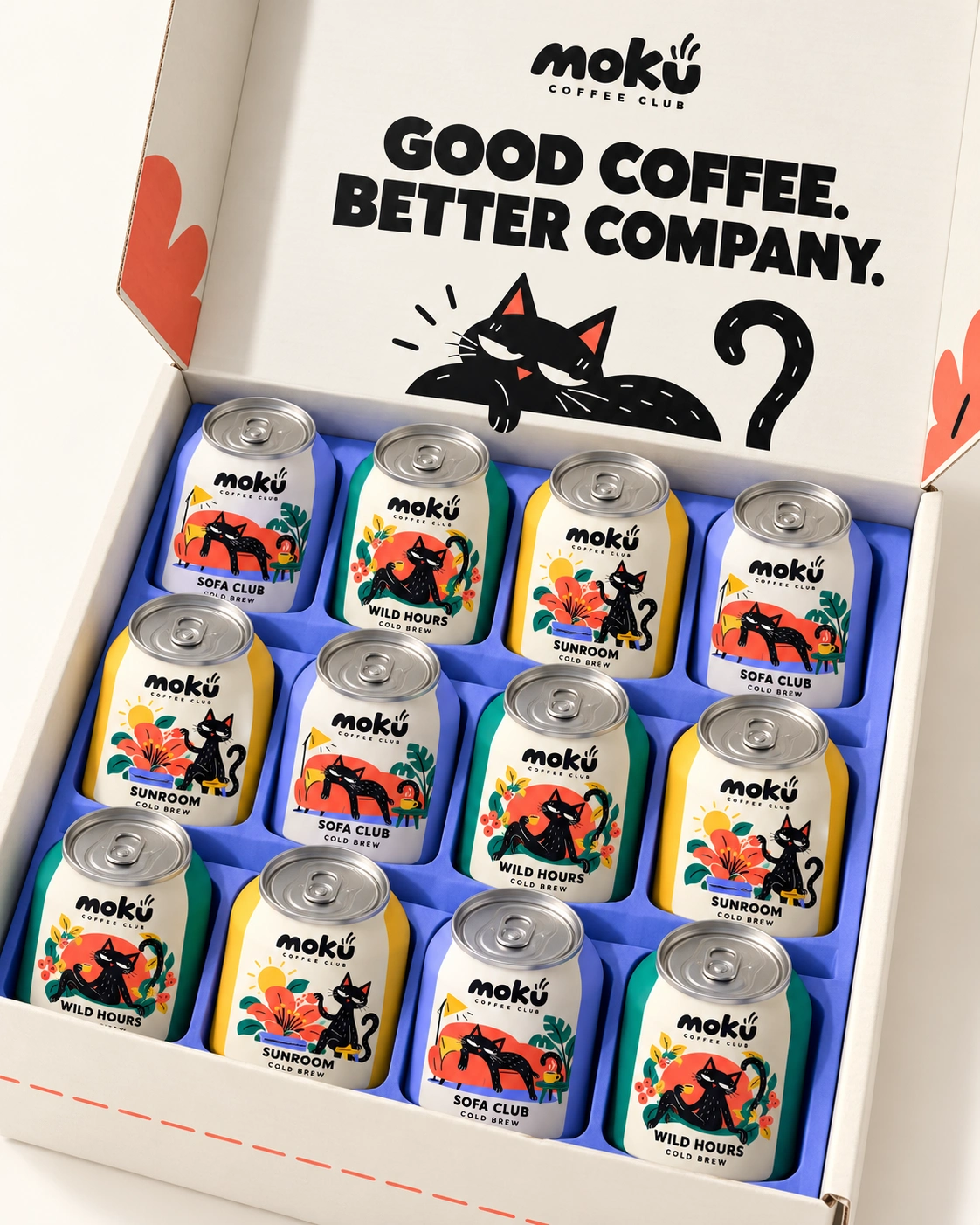
The Challenge
Specialty coffee often looks minimal, serious and a little cold. I wanted Moku to feel like a friend instead: warm, witty and instantly recognisable on a crowded shelf. The brand also had to work across very different formats, including bags, cans, drip sachets, cups and gift boxes, without losing its personality.
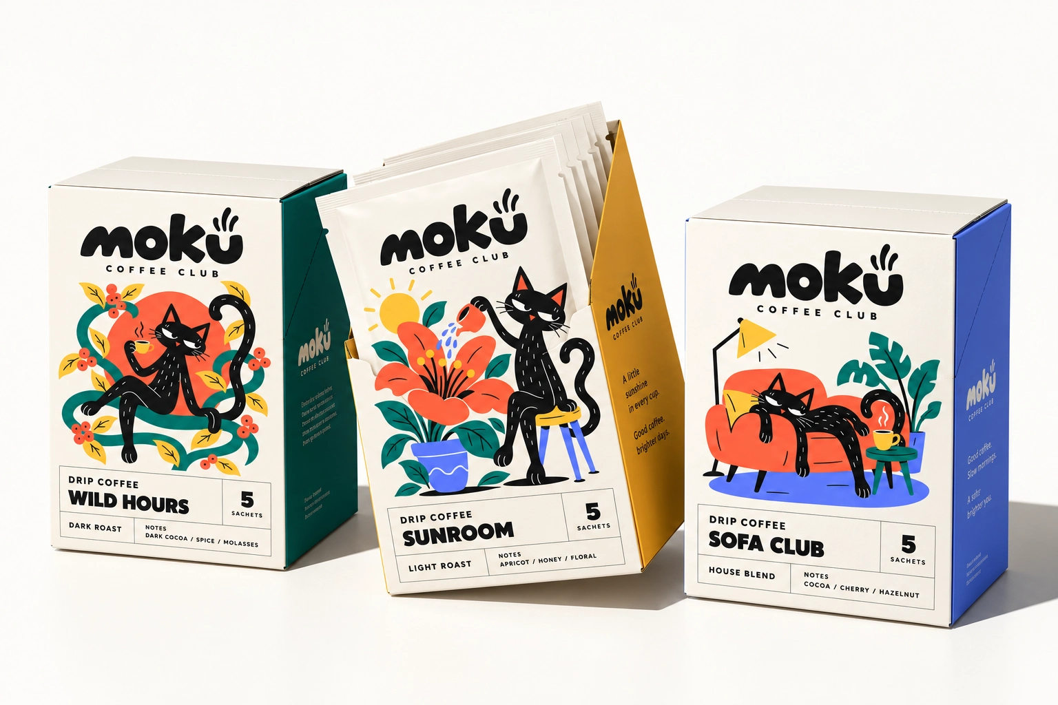
The Concept: Good Coffee. Better Company.
The cat is the heart of the brand. With half-lidded eyes and a curled tail, it carries the whole attitude of the brand, relaxed and slightly smug. Each product gives the cat a different moment of the day, so the range reads like a series of small stories and not just a lineup of SKUs.
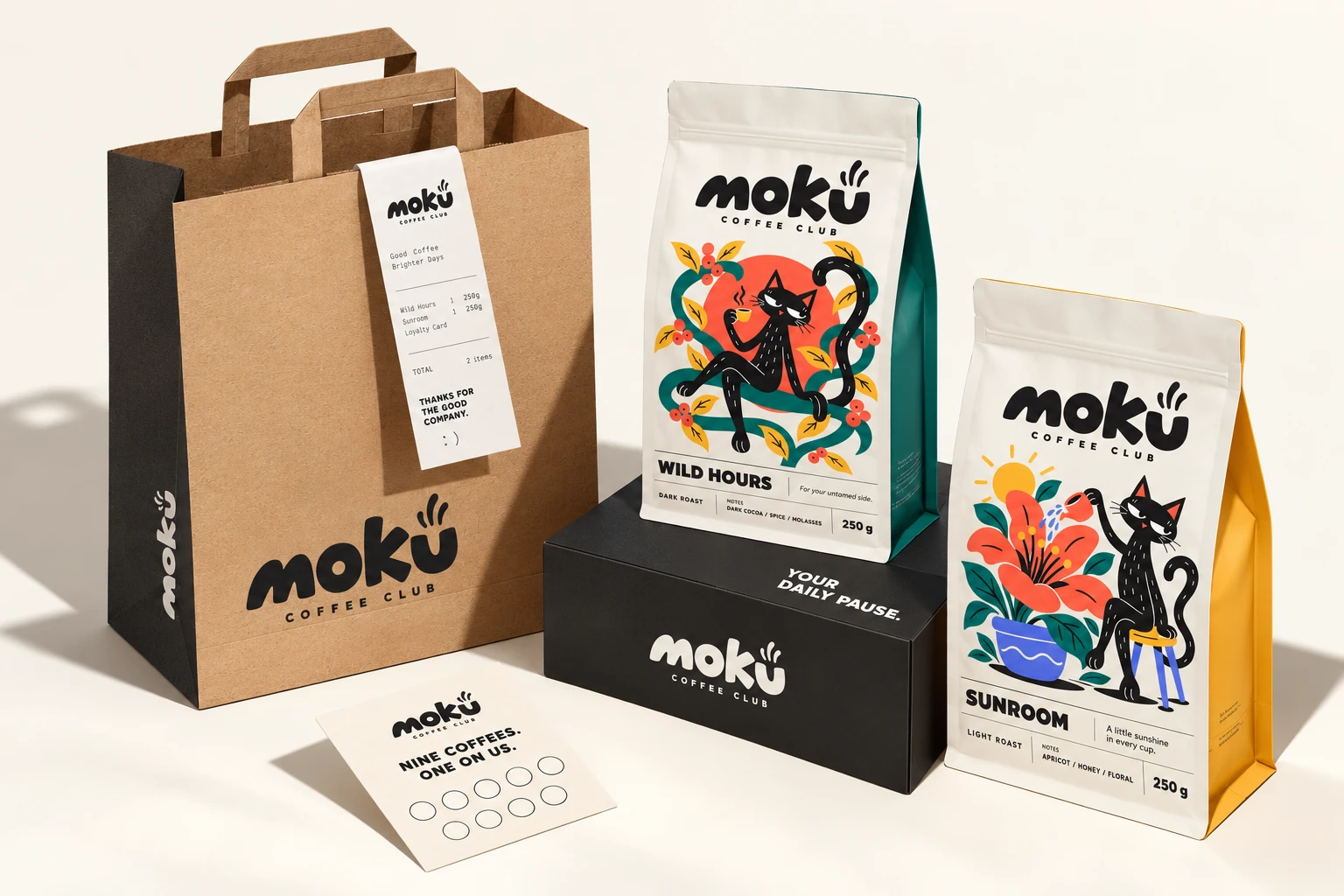
Logo & Wordmark
The wordmark is a heavy, hand-drawn script with soft, bouncy letterforms. A small steam swirl rises from the “u”, so the logo reads as a cup of coffee and as a smile. Beneath it, a small, widely spaced “Coffee Club” keeps things tidy and gives the brand a touch of membership-club charm.
Outcome
Moku is a cohesive identity that feels friendly, collectible and ready for shelf, shipping box and café counter. It is memorable because of its mascot, flexible because of its system and consistent because of its voice.
Services: Brand Identity · Logo Design · Illustration · Packaging Design · Copywriting · Brand Mockups
Like this project
Posted Oct 23, 2026
Designed a playful brand and packaging for Moku Coffee Club, featuring a relaxed black cat mascot. Coffee is better when enjoyed with good company.