TWIGZ Snack Packaging & Lifestyle Mockups

Umar Tanveer

Realistic Snack Packaging & Product Mockup Design
TWIGZ is a craft pretzel brand with a colorful lineup of distinctive flavors. The goal was to take the existing packaging and create a collection of premium, realistic marketing visuals that felt more like a real lifestyle campaign than standard product mockups.
I explored multiple visual directions while keeping the TWIGZ identity, packaging colors, typography, flavor hierarchy, and product details at the center of every composition.
The Challenge:
The packaging already had a strong visual personality, but simply placing the bags on a plain background wasn't enough.
The visuals needed to:
Make the products feel real and tangible
Showcase multiple flavors without making the compositions feel repetitive
Preserve the recognizable TWIGZ packaging
Create a modern, energetic lifestyle aesthetic
Work across different marketing and portfolio applications
Feel like professional commercial photography rather than generic mockups
The key challenge was finding the balance between creative art direction and product accuracy.
The Creative Direction
Instead of creating one repetitive mockup style, I developed a series of lifestyle-inspired scenes based on the visual language of contemporary snack and CPG campaigns.
The compositions explored:
Bold color environments
Using the natural colors of the TWIGZ lineup as visual anchors.
Editorial product photography
Strong composition, controlled shadows, depth, and intentional product placement.
Lifestyle storytelling
Moving beyond isolated pack shots into scenes that suggest how the product actually exists in someone's world.
Realistic textures & lighting
Natural shadows, material reflections, packaging folds, surface texture, and environmental lighting were emphasized to avoid the artificial "3D mockup" appearance.
Product Lineup:
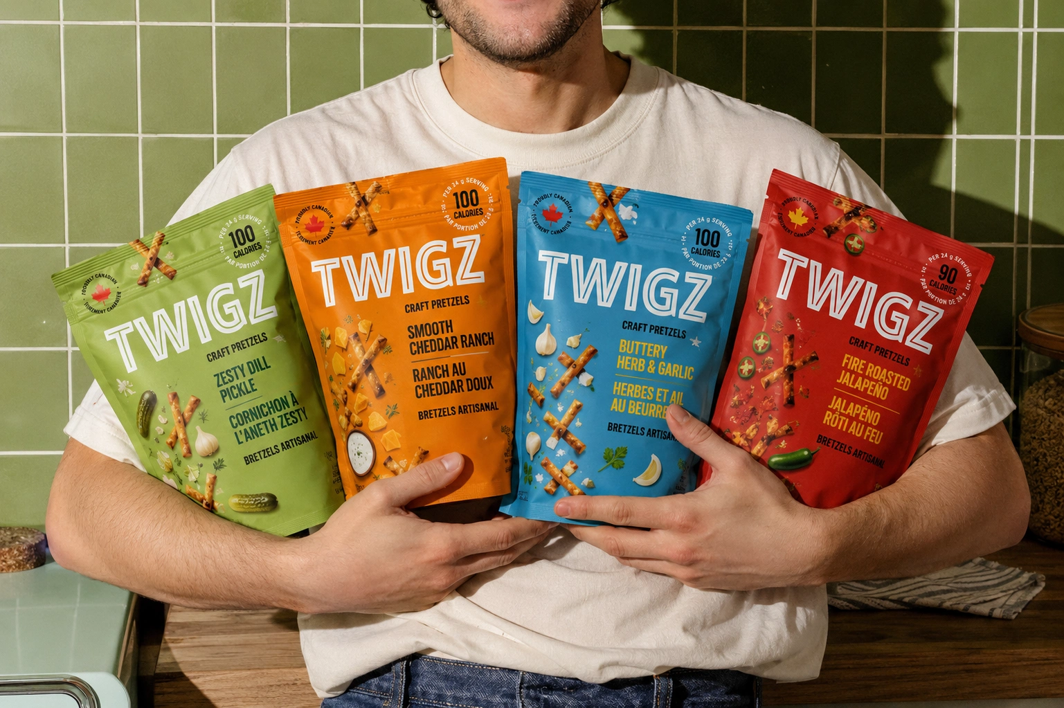
The visual system was designed around the complete TWIGZ range:
🟢 Zesty Dill Pickle
🟠 Smooth Cheddar Ranch
🔵 Buttery Herb & Garlic
🔴 Fire Roasted Jalapeño
Each flavor retains its own recognizable color while contributing to a cohesive overall brand palette.
Visual Exploration:
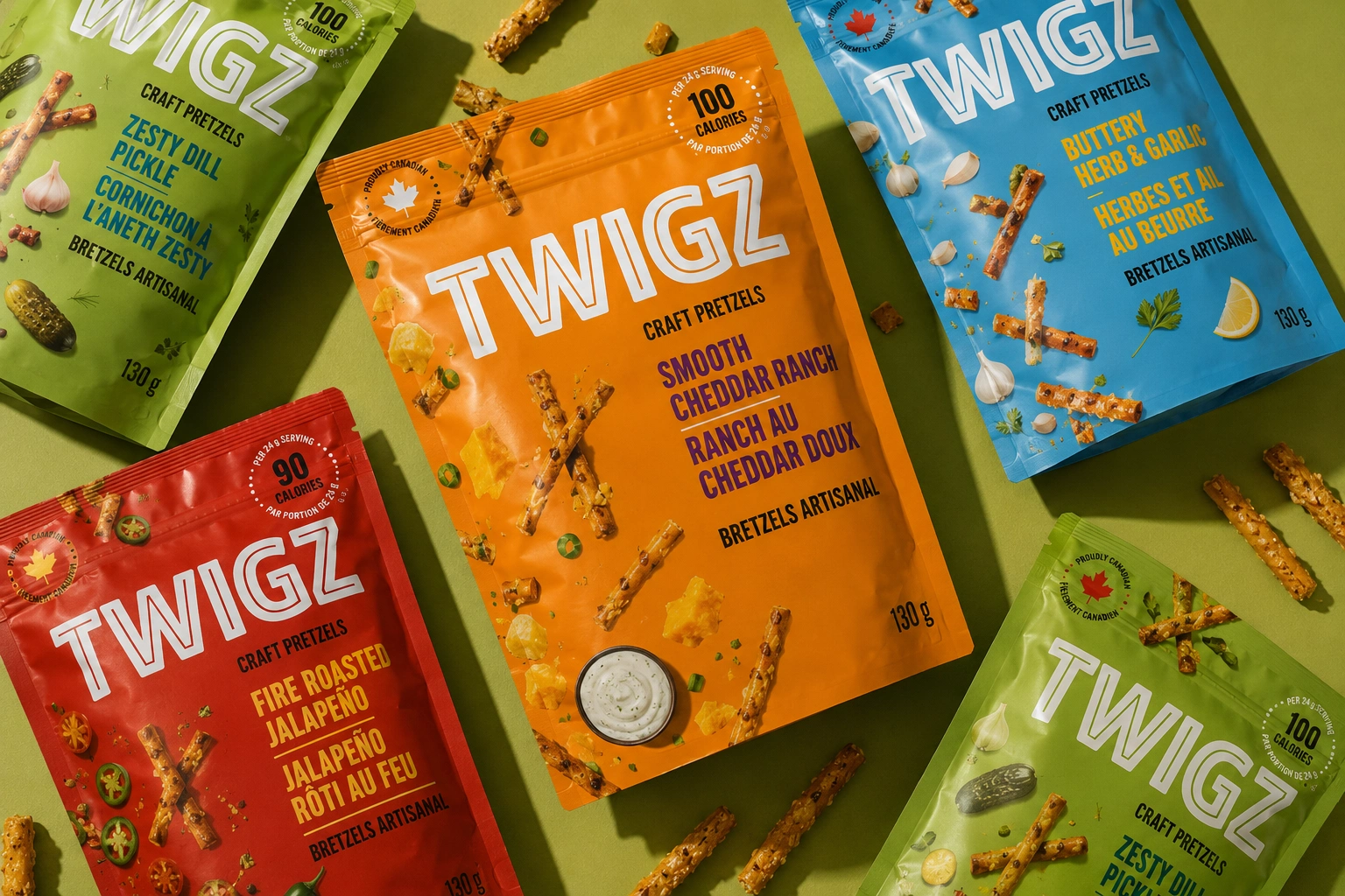
01 — Bold Color Story
A vibrant overhead composition uses the packaging itself as the color palette.
The bags are arranged dynamically across a contrasting surface, creating a playful editorial feel while keeping the products immediately recognizable.
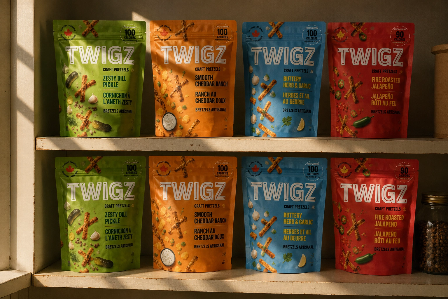
02 — Pantry / Retail Moment
The products were placed into a realistic pantry environment, creating the feeling of an authentic everyday food scene.
Warm directional light, shelf texture, imperfections, and natural shadows were introduced specifically to make the image feel photographed rather than digitally assembled.
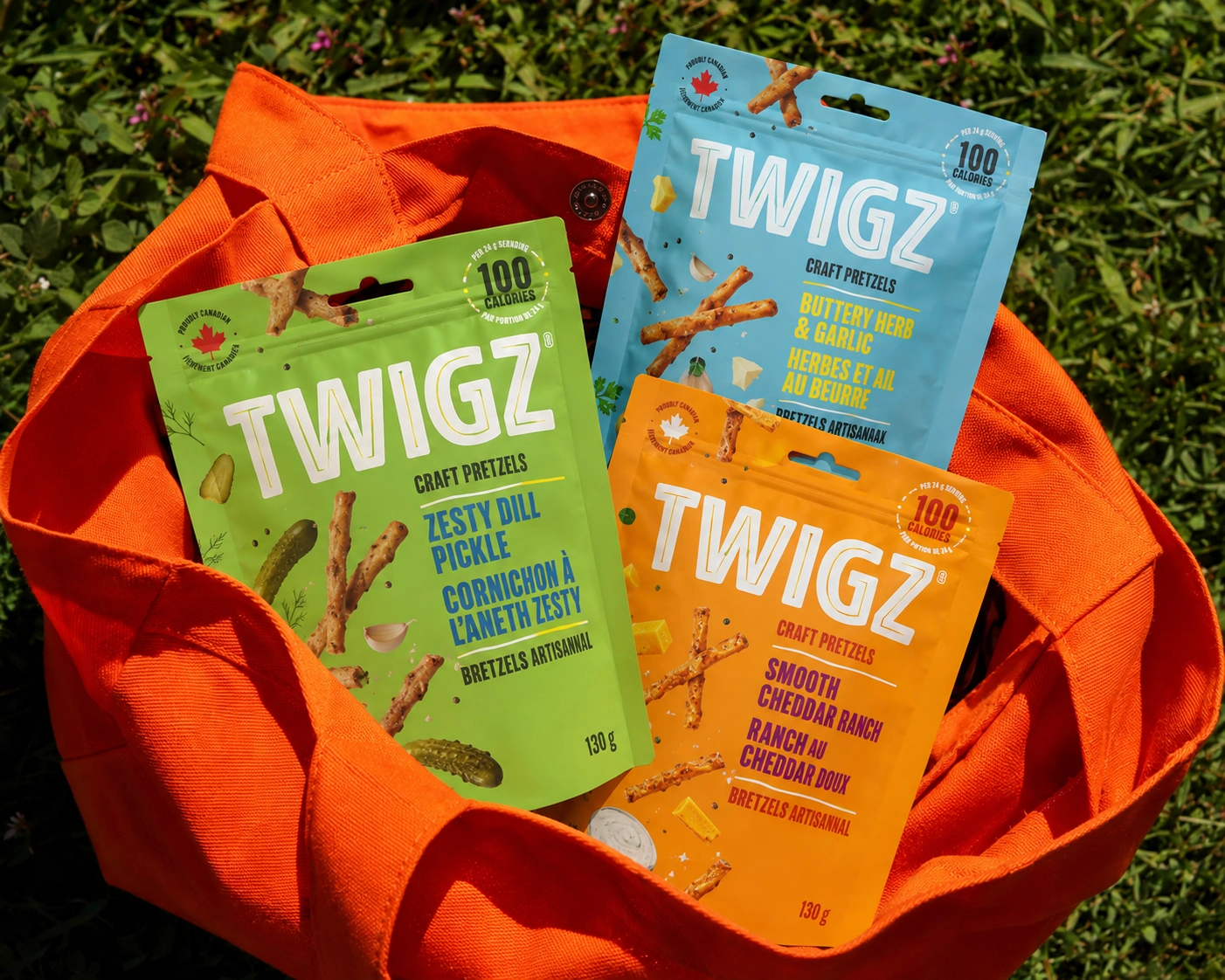
03 — Lifestyle Product Moment
The final direction introduced a human element, showing the full TWIGZ lineup being held together.
This shifts the visual from "product display" to "brand experience" and gives the packaging a stronger emotional context.
The Details Matter:
A major focus throughout the project was realism.
Rather than relying on perfectly symmetrical product placement, I introduced:
Natural perspective
Slight variations in bag angles
Realistic packaging folds
Directional lighting
Contact shadows
Environmental reflections
Surface imperfections
Layered depth
Flavor-specific props and ingredients
The goal was simple:
Make the viewer feel like the photo was actually taken.
Design Approach:
The visual language combines bold CPG branding + contemporary editorial photography + playful lifestyle art direction.
TWIGZ's existing packaging does most of the visual heavy lifting, so the environments were deliberately designed to support the products instead of competing with them.
That meant using controlled backgrounds, strong color relationships, and simple compositions where the packaging remains the hero.
Deliverables:
Creative Direction
Visual concepts and art direction for the TWIGZ product line.
Product Mockups
High-quality lifestyle scenes featuring the complete flavor range.
Campaign-Style Visuals
Multiple environments and compositions for broader marketing use.
Brand Consistency
Maintained the existing packaging identity across every visual direction.
The Outcome:
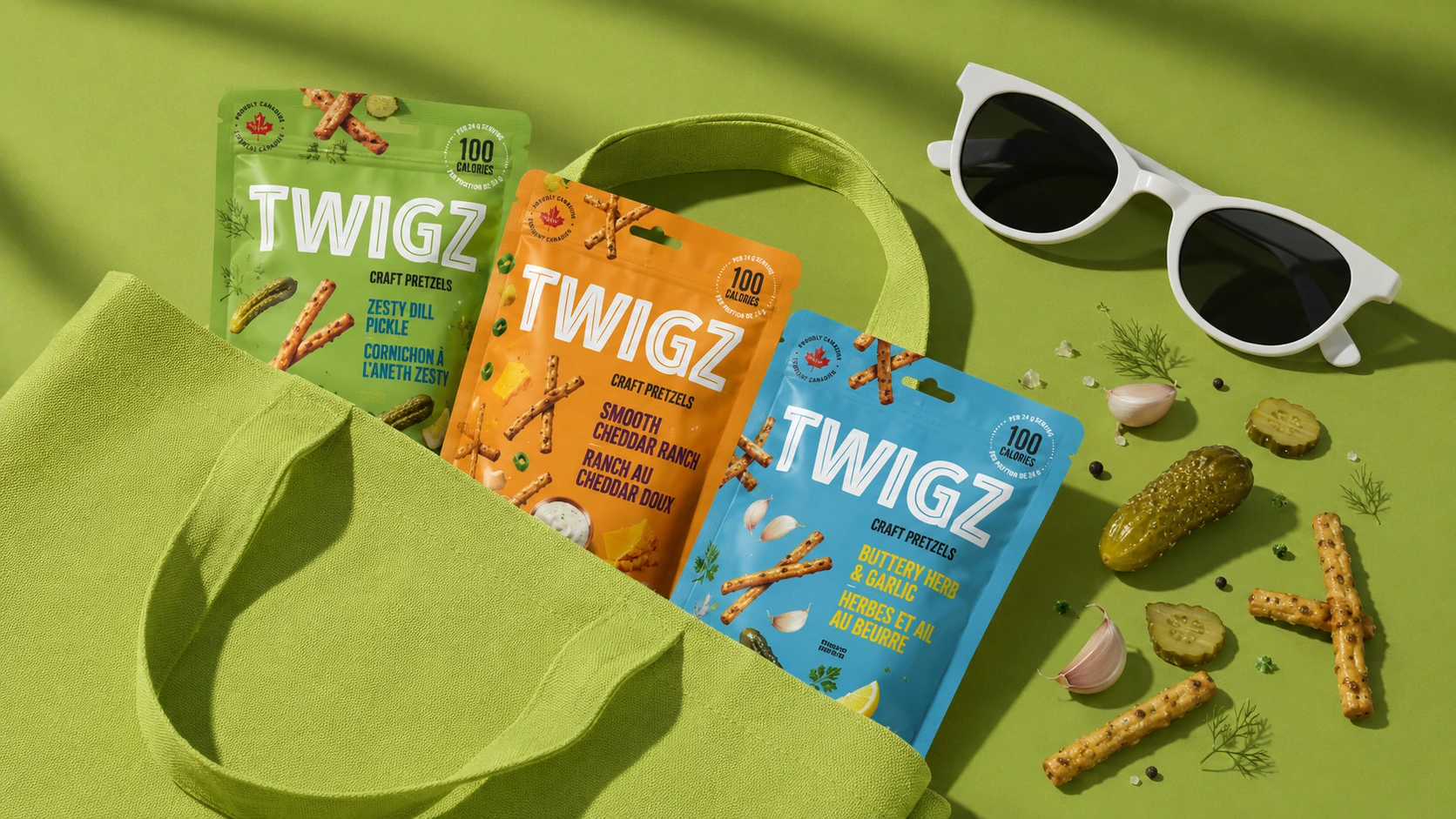
The result is a flexible visual system for TWIGZ rather than a single product mockup.
The same product lineup can now live naturally across different contexts—from bold editorial flat lays and colorful lifestyle scenes to pantry environments and human-centered product photography.
The work demonstrates how strong packaging can be extended into a broader visual brand experience without losing the personality that makes the products recognizable.
Like this project
Posted Aug 21, 2026
A premium TWIGZ product visualization project transforming colorful craft pretzel packaging into realistic, lifestyle-driven campaign imagery.