Built with Lovable
TWIGZ 3D Interactive Website Redesign

Umar Tanveer


TWIGZ — 3D Interactive Snack Brand Website Redesign Using Lovable
I designed and developed a highly visual 3D website concept for TWIGZ Craft Pretzels, transforming a traditional snack product into an immersive digital brand experience.
The goal was to move beyond a standard food website and create something that feels playful, energetic, tactile, and memorable. Instead of treating the packaging as a static product image, I built the experience around depth, motion, oversized product visuals, bold typography, and interactive storytelling.
The result is a creative 3D snack showcase website designed to make the product feel almost tangible on screen.
The Challenge
TWIGZ already has a strong visual identity built around bold flavors and distinctive packaging. The challenge was to translate that personality into a digital experience without making the website feel like a conventional e-commerce template.
A typical snack website can easily become a simple combination of:
Product photography
Flavor descriptions
Brand story
Store information
Basic navigation
I wanted to take a different approach.
The challenge was to create a website that could communicate the personality of the brand before the visitor even reads the copy.
The experience needed to feel:
Bold. Playful. Premium. Interactive. Unexpected.
Most importantly, the products needed to remain the hero.
The Creative Direction
I approached the website as a digital product experience rather than a traditional corporate website.
The creative direction was inspired by the physical qualities of snack packaging — colorful bags, crunchy textures, bold flavors, movement, and the anticipation of opening a snack.
The interface combines:
3D product presentation + immersive motion + editorial typography + playful interactions + strong visual hierarchy.
Rather than filling every section with information, I used visual storytelling to create a journey through the TWIGZ brand.
The website gradually moves the visitor from:
Brand → Product → Flavors → Story → Discovery → Purchase
This creates a more natural relationship between the brand and the product.
Hero Experience
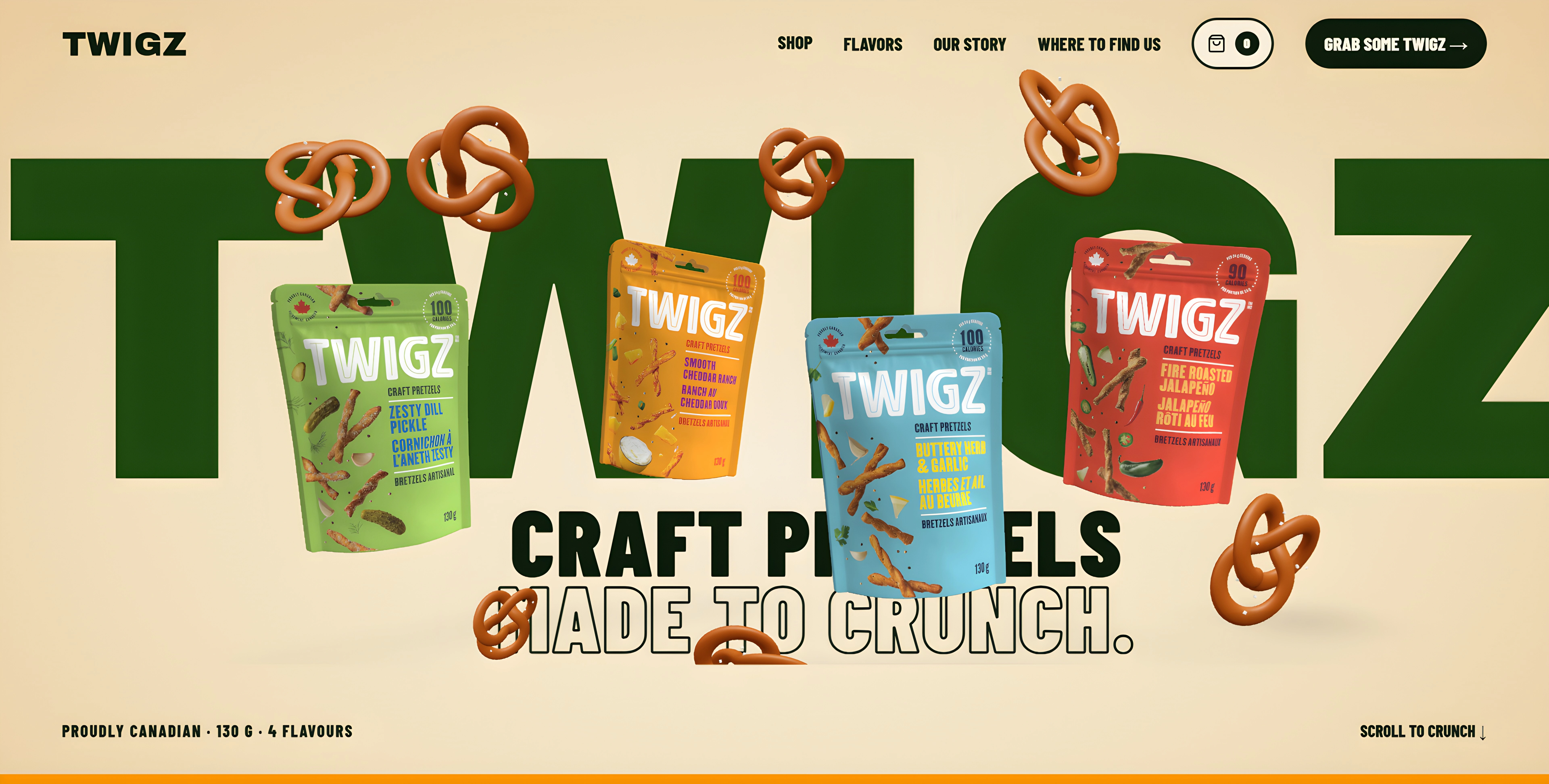
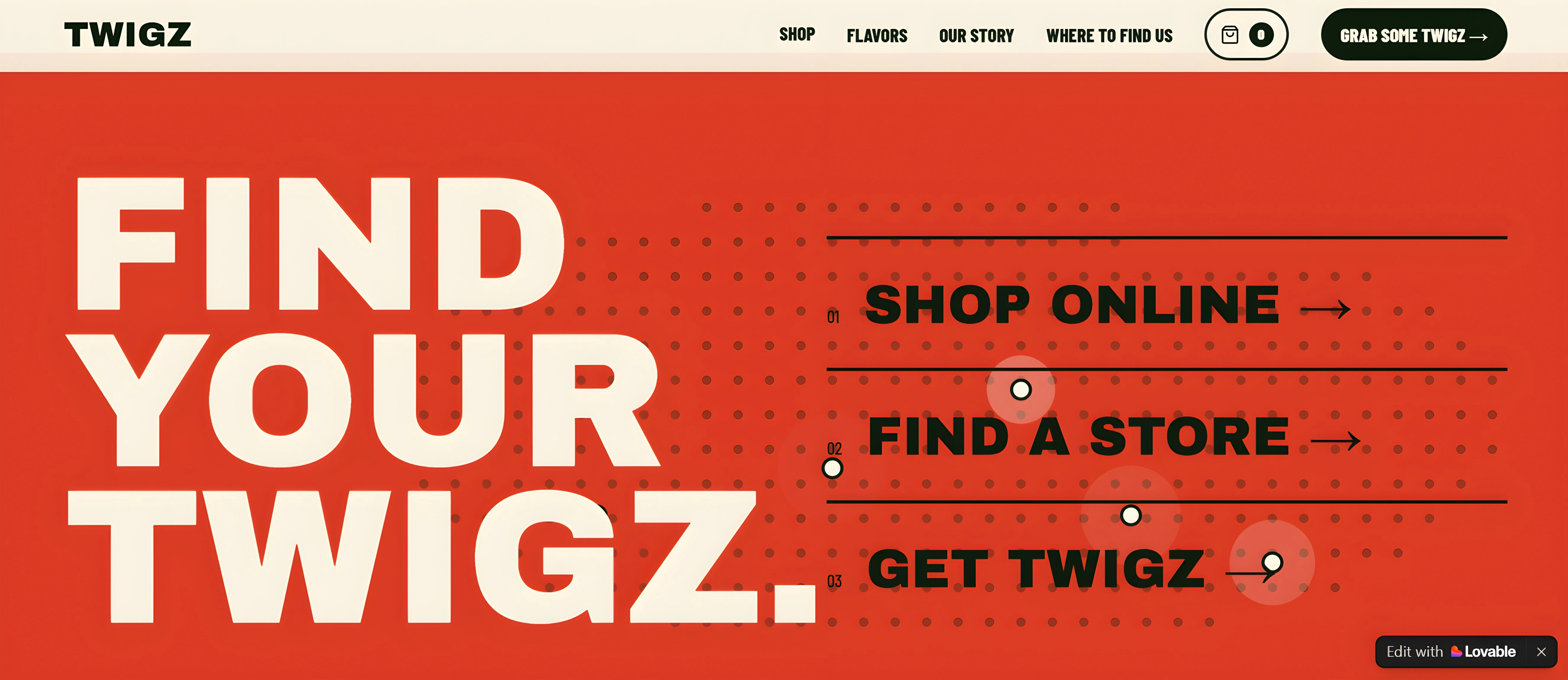
The hero section was designed to create an immediate visual impact.
Instead of opening with a conventional product grid or static banner, the experience puts TWIGZ at the center of the screen with a strong sense of depth and movement.
Large typography establishes the brand personality while the product presentation creates the visual focal point.
The intention was simple:
Make the first few seconds memorable.
The hero acts as a visual introduction to TWIGZ before the visitor starts exploring the rest of the website.
Creative Food Brand Website Design and Development
3D Product Presentation
One of the most important parts of the project was creating a stronger sense of product depth.
Snack packaging is naturally suited to 3D presentation because the physical product has:
Volume
Packaging folds
Perspective
Shadows
Texture
Recognizable silhouettes
Instead of presenting TWIGZ as flat images, the website concept treats the packaging as a 3D visual object.
This creates a stronger connection between the digital experience and the physical product.
The result is closer to a virtual product showcase than a conventional snack landing page.
Flavor Experience
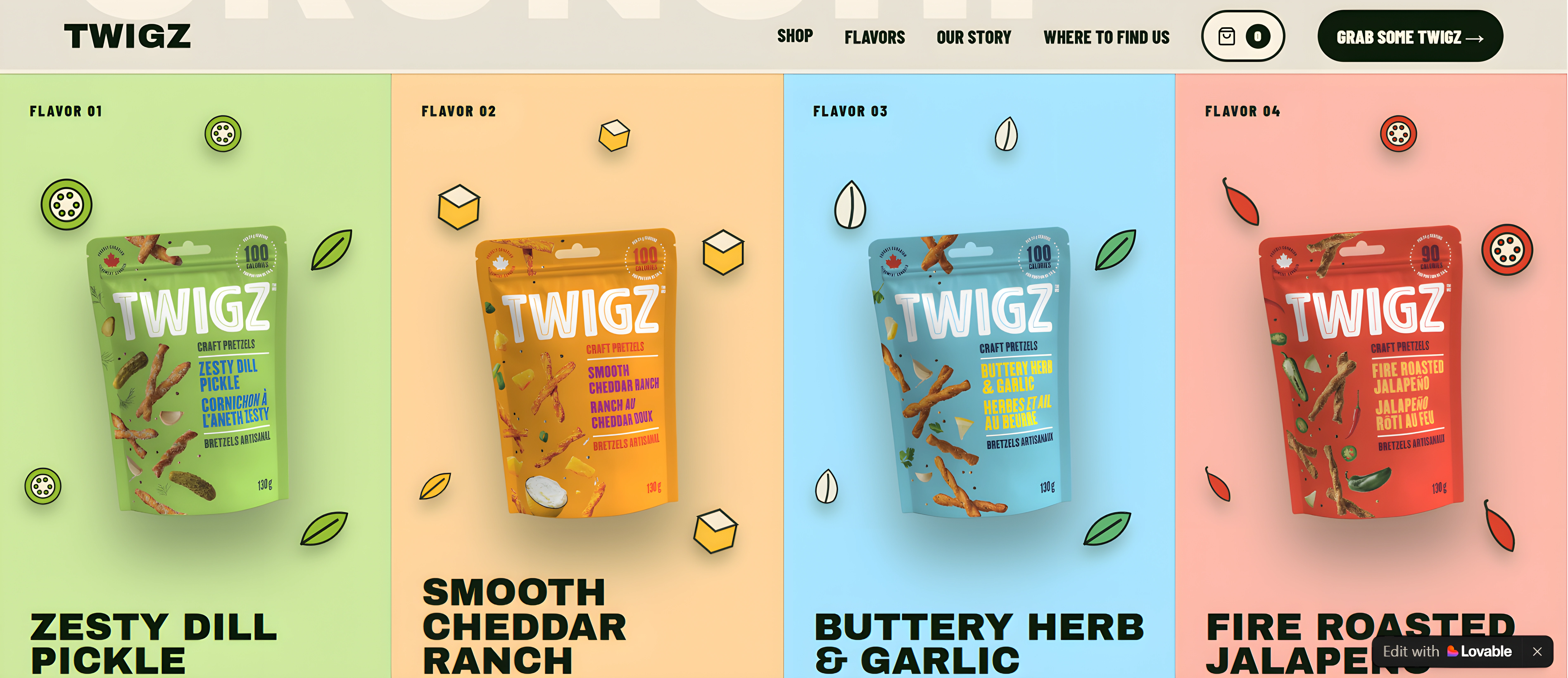
TWIGZ's different flavors provided an opportunity to build a more expressive visual system.
The website treats each flavor as part of the overall experience rather than simply another product card.
The flavor system is designed around recognizable product visuals and distinct color personalities while maintaining consistency across the website.
The current TWIGZ lineup includes Buttery Herb & Garlic, Zesty Dill Pickle, Fire Roasted Jalapeño, and Smooth Cheddar Ranch.
This approach allows visitors to explore the product range while keeping the experience visually engaging.
The Product Showcase
Interactive Storytelling
A major goal was to make scrolling feel like exploration rather than navigation.
Sections transition naturally as the visitor moves through the page, allowing the content, products, typography, and visual elements to work together.
Instead of presenting every piece of information simultaneously, the experience reveals the brand progressively.
This creates a stronger rhythm:
Discover → Explore → Interact → Understand → Act
That structure is particularly useful for consumer brands where emotional connection can be just as important as product information.
Visual Design System
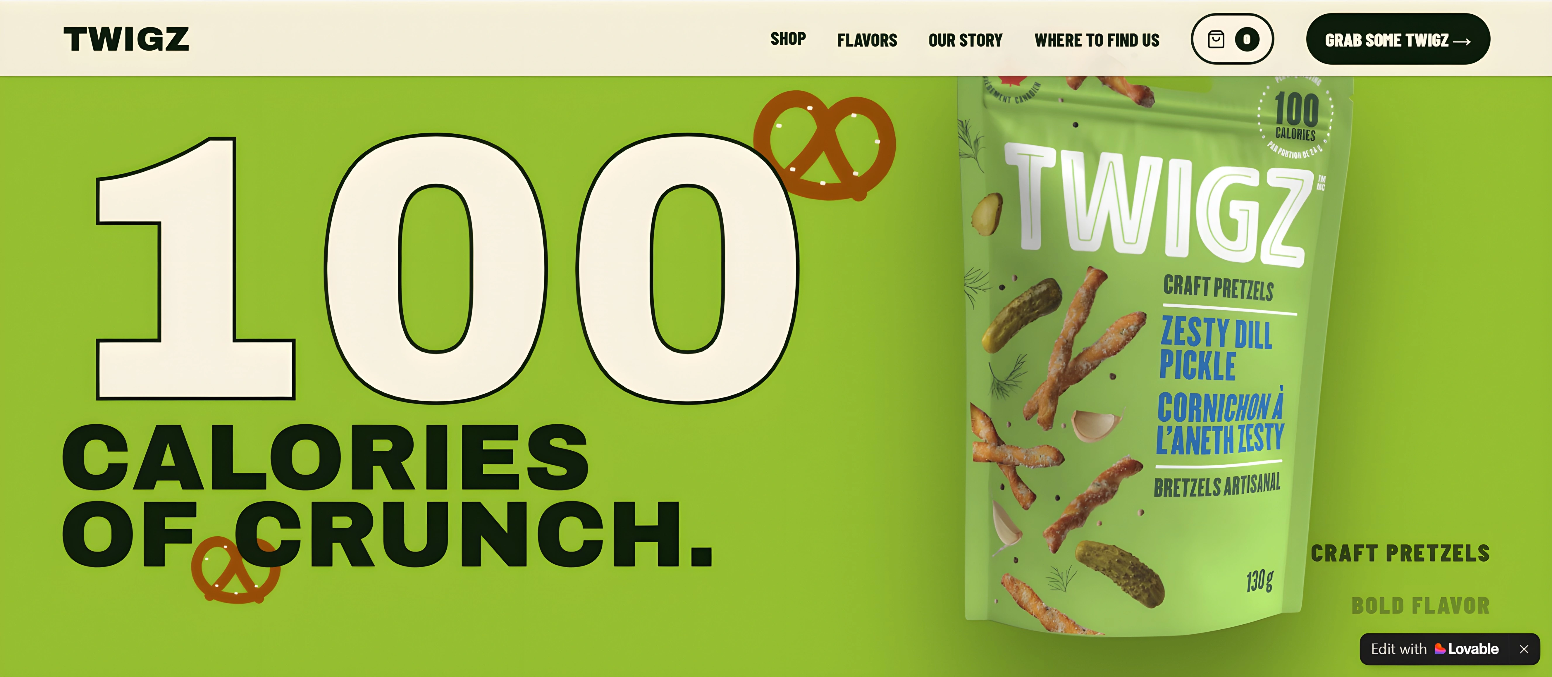
The visual language was deliberately kept bold and expressive.
I focused on:
Oversized Typography
Large headlines create hierarchy and give the website a campaign-like visual presence.
Strong Product Imagery
The products remain visually dominant instead of being buried beneath excessive copy.
Depth and Layering
Foreground and background elements create a stronger feeling of dimensionality.
Motion
Animations and transitions help connect different sections and make scrolling feel more dynamic.
Color
The visual system takes inspiration from the colorful TWIGZ product range while maintaining enough contrast for the interface to remain readable.
Negative Space
Rather than overcrowding the screen, space is used strategically to give the product and typography room to breathe.
Product-First UX
Even though the website is visually experimental, usability remained important.
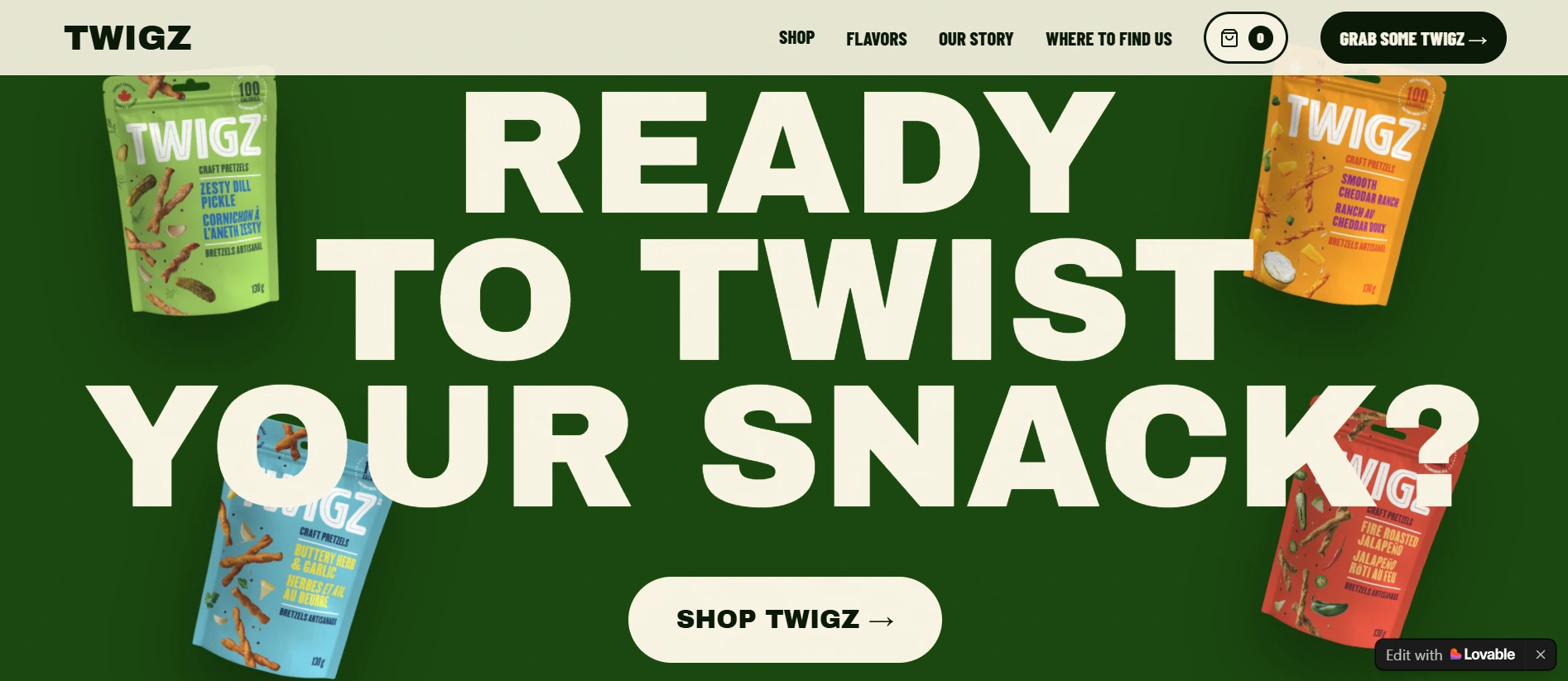
The navigation is intentionally simple, allowing visitors to move between:
Shop → Flavors → Our Story → Where to Find Us
The structure keeps the most important information accessible while allowing the visual experience to remain the main attraction.
This balance between creative web design and practical UX was an important part of the project.
Responsive Experience
The design was also approached with responsive behavior in mind.
The objective wasn't simply to shrink the desktop layout for smaller screens.
The hierarchy was designed so that the most important elements remain clear across different viewport sizes:
Product visibility
Typography hierarchy
Navigation
CTA placement
Section spacing
Interactive elements
Visual storytelling
This makes the concept more suitable for a real consumer-facing website rather than a desktop-only visual experiment.
Development Approach
I built the website concept using Lovable, combining AI-assisted development with a design-led approach.
The focus wasn't simply on generating a website quickly.
I used the development process to translate a visual concept into an interactive experience while maintaining control over:
Layout
Typography
Spacing
Visual hierarchy
Animations
Product presentation
Responsive behavior
Brand consistency
This project demonstrates how AI-assisted web development can be paired with professional visual design direction to create more distinctive brand experiences.
The Result
The final result is a 3D interactive snack website concept that gives TWIGZ a much more immersive digital presence.
Rather than presenting the brand as another packaged-food website, the experience turns the product itself into the centerpiece of the interface.
The project demonstrates how a strong consumer brand can use:
3D design + motion + product visualization + storytelling + interactive UX
to create a website that feels more like a digital campaign than a traditional landing page.
The Design Goal
The goal wasn't to make another snack website.
It was to create a digital experience where the visitor immediately understands that TWIGZ is different.
The website uses design, movement, scale, and product visualization to communicate that difference before the visitor even reaches the product information.
A snack brand with a personality deserves a website with personality too.
Tools & Technologies
Lovable
Web Design
UI/UX Design
3D Web Design
Interactive Web Design
Responsive Design
Motion & Animation
Product Visualization
Creative Direction
Like this project
Posted Sep 30, 2026
Designed a 3D interactive website for TWIGZ, transforming its pretzel packaging into an immersive product experience via 3D visuals, motion & storytelling.
Likes
0
Views
7