The network for creativity
Join 1.25M professional creatives like you
Connect with clients, get discovered, and run your business 100% commission-free
Creatives on Contra have earned over $150M and we are just getting started
Back to feedPost
I Just Created NOIRÉ 🔥
A Coffee Brand Built Around the Pause.
NOIRÉ is a premium café brand built around a simple idea:
Great coffee should feel like a moment of pause, not another part of the
routine.
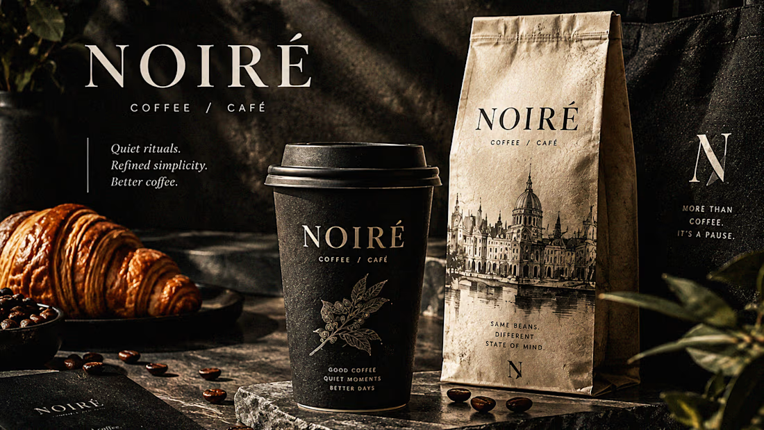
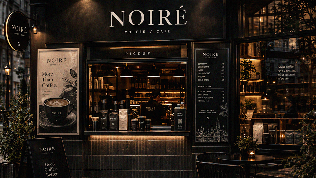
The project explores a complete visual identity, packaging
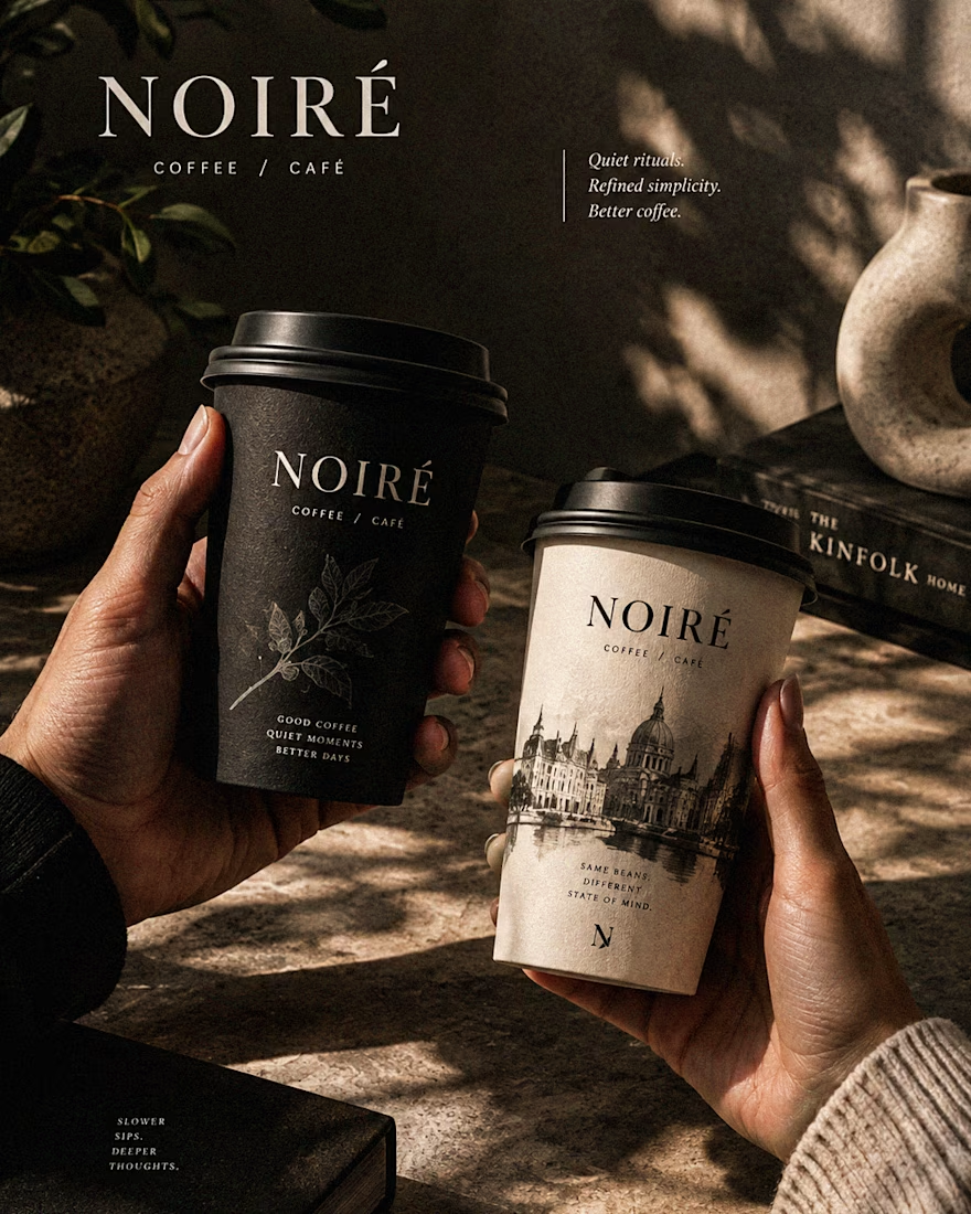
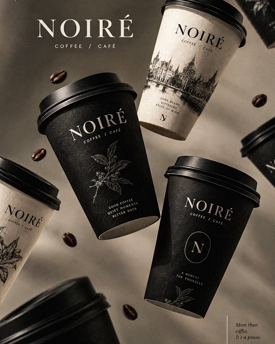
system, takeaway cups, coffee bags, tote bags, menu design, café applications and lifestyle campaign direction.
Instead of relying on the usual loud coffee aesthetics, I
built NOIRÉ around deep charcoal, warm ivory, soft graphite, refined
typography, subtle botanical illustrations and quiet editorial compositions.
The visual language is intentionally dark, tactile, and understated - giving every touchpoint the feeling of a slow morning, a quiet table, and coffee worth taking your time with.
From the cup in your hand to the café around you, every detail was designed to make the brand feel like a ritual.
Waiting for your thoughts in the comments 🙌🔥
branddesignertastetestBrand DesignGraphic DesignPackaging DesignAdobe IllustratorAdobe InDesignAdobe Photoshop



I really loved the warm sand-beige tones in this one. So elegant and premium! 🤎✨

TYSM Pal ... 🔥😍

TYSM Pal ... 🔥😍
TYSM Pal ... 🔥😍

The whole identity feels so intentional.
Every touchpoint speaks the same language.
Really clean work.
TYSM Pal ... 🔥😍
That charcoal + ivory combo hits. 🖤
Super refined.
The packaging is especially strong.
TYSM Pal ... 🔥😍

This is what happens when branding has a real concept behind it.
Beautifully executed.
NOIRÉ feels distinct.
TYSM Pal ... 🔥😍

The “pause” idea comes through instantly.
Nothing feels forced.
Such a thoughtful identity.
TYSM Pal ... 🔥😍

There’s something seriously satisfying about branding with this much restraint.
Nothing competing.
Nothing unnecessary.
Just a clear visual world.
TYSM Pal ... 🔥😍

TYSM Pal ... 🔥😍

TYSM Pal ... 🔥😍

It's a sleek and premium work here....👍
TYSM Pal ... 🔥😍

Love this! The execution is really clean. As a Figma UI Designer, I really appreciate the attention to detail here.
TYSM Pal ... 🔥😍

Just premium
TYSM Pal ... 🔥😍
😊😊

his feels premium without being overdesigned. Nicely done.
TYSM Pal ... 🔥😍

GREAT
TYSM Pal ... 🔥😍

The restraint really works. Charcoal and ivory with subtle botanicals feels like a slow morning. I'd love to see the botanical illustrations bigger on the coffee bags, maybe one per origin or blend. That's often what people remember and photograph.
TYSM Pal ... 🔥😍
The network for creativity
Join 1.25M professional creatives like you
Connect with clients, get discovered, and run your business 100% commission-free
Creatives on Contra have earned over $150M and we are just getting started











Related posts

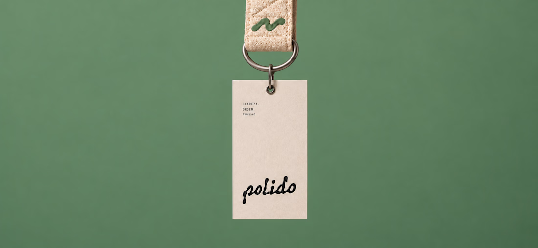
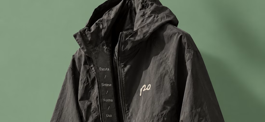
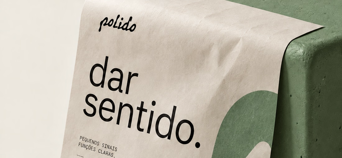
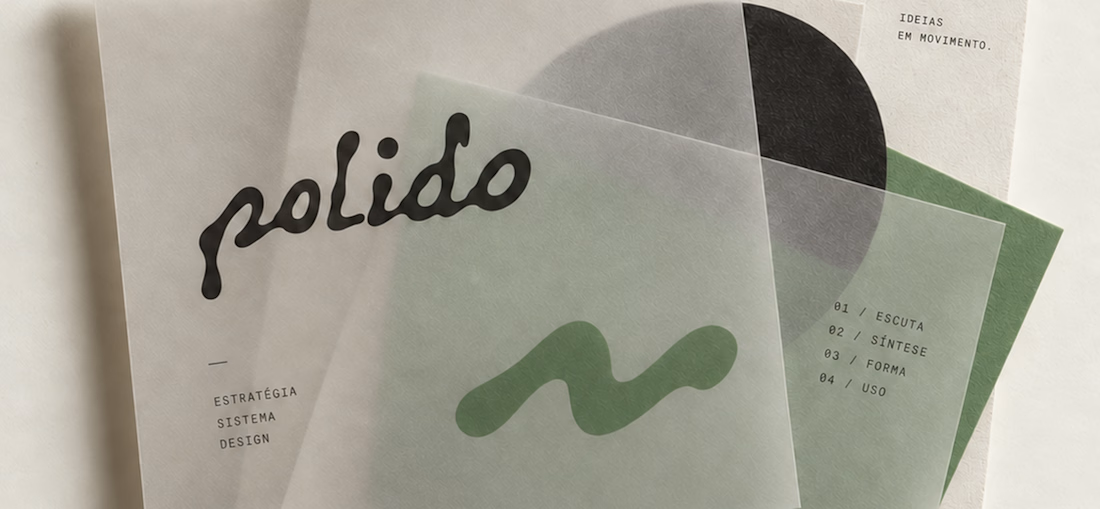
POLIDO — Brand Identity & Visual System
POLIDO is the visual identity of my independent brand design practice, shaped by a process of listening, synthesis, form, and use.
The identity brings together a hand-drawn signature, restrained typography, tactile materials, and a palette of warm paper, graphite, and Basil green.
From printed matter to apparel and physical applications, the project explores how a consistent visual language can adapt to different materials and contexts while maintaining its character.
Scope: Brand Strategy, Visual Identity, Art Direction, and Mockup Design.
High end branding


One letter. Eight personalities. 🔤
I explored the letter S in 8 different directions: soft and rounded, sharp and angular, bold and blocky, and fast like a bolt.
Same letter, same white-on-black treatment. The only thing that changes is the character.
Each mark could suit a different kind of brand, from tech and sports to fintech and lifestyle.
Which S would you pick, and what kind of brand would it belong to? Drop the number below. 👇
Looking for a logo mark or a full brand identity? My services are on my profile.


S letter designs is the best ❤️
Great job Shahwaiz🔥🔥

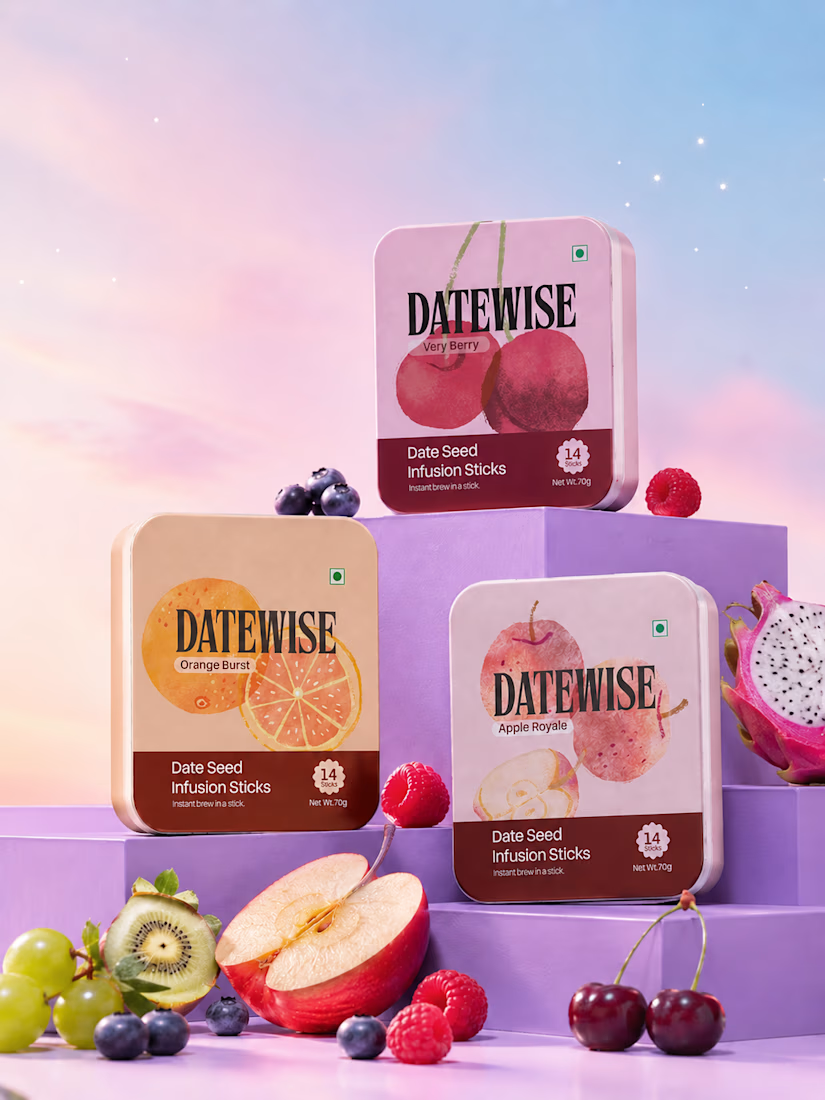
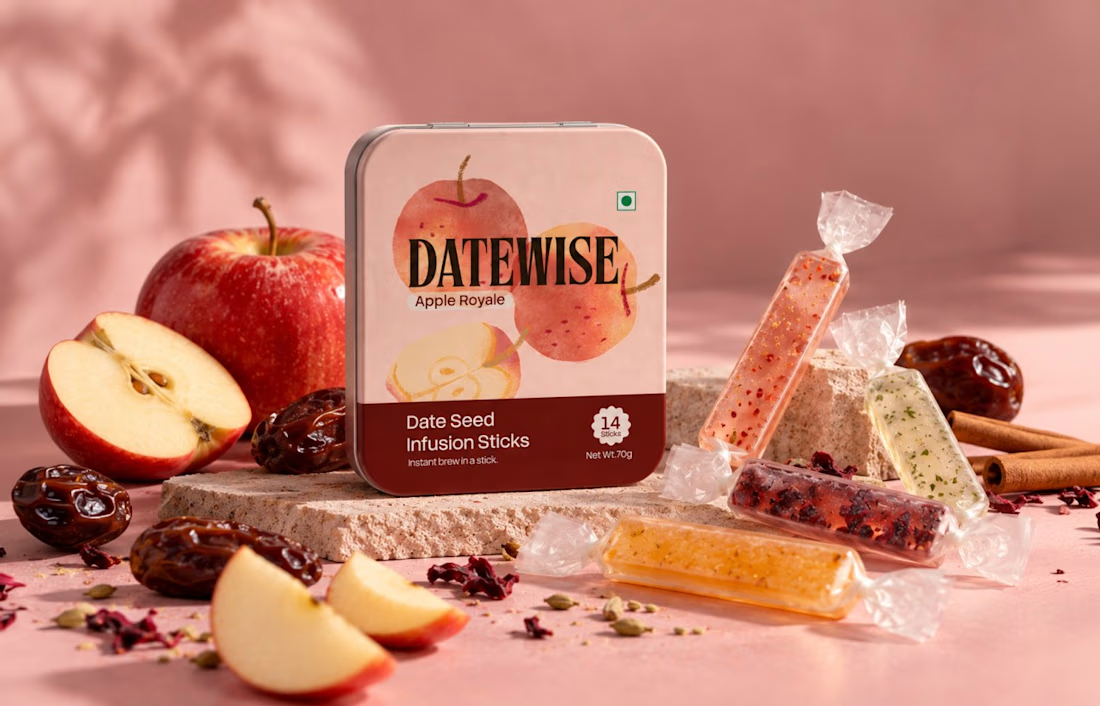
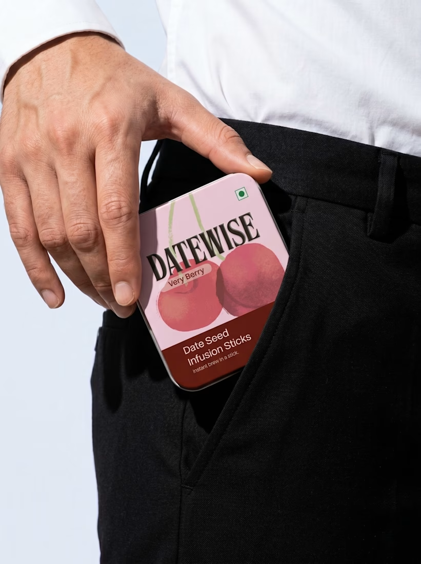
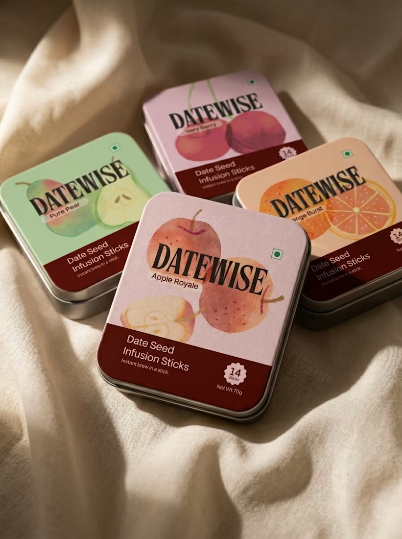
This image showcases a premium fruit-flavoured date seed infusion stick packaging design for a fictional brand called DATEWISE. The design combines modern packaging graphics, realistic 3D tin-can mockups, vibrant fruit photography, and a soft pastel environment to create a high-end commercial product presentation.
The packaging features three flavours: Very Berry, Orange Burst, and Apple Royale. Each rectangular tin has rounded corners, a pastel-coloured background, bold black serif typography, fruit illustrations, and a dark burgundy information panel at the bottom.
The products are arranged on layered purple display platforms, surrounded by fresh fruits such as apples, oranges, raspberries, blueberries, cherries, kiwi, and dragon fruit. The pink-to-blue gradient background, soft lighting, subtle shadows, and glossy surfaces create a luxurious advertising aesthetic.
Design style: Premium FMCG Packaging, 3D Product Mockup, Photorealistic Product Advertising, Pastel Colour Grading, and Editorial Art Direction.


So Good