The network for creativity
Join 1.25M professional creatives like you
Connect with clients, get discovered, and run your business 100% commission-free
Creatives on Contra have earned over $150M and we are just getting started
Back to feedPost
Taste Test
Which hero would you choose — 1 or 2?
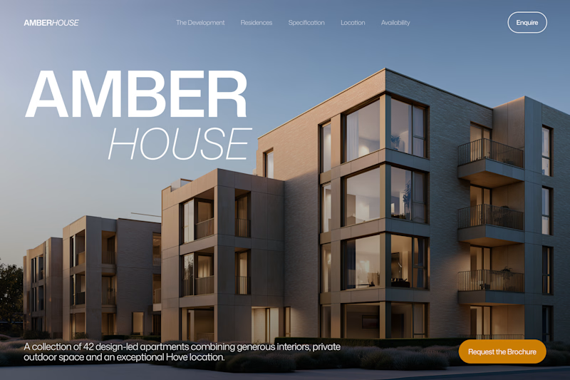
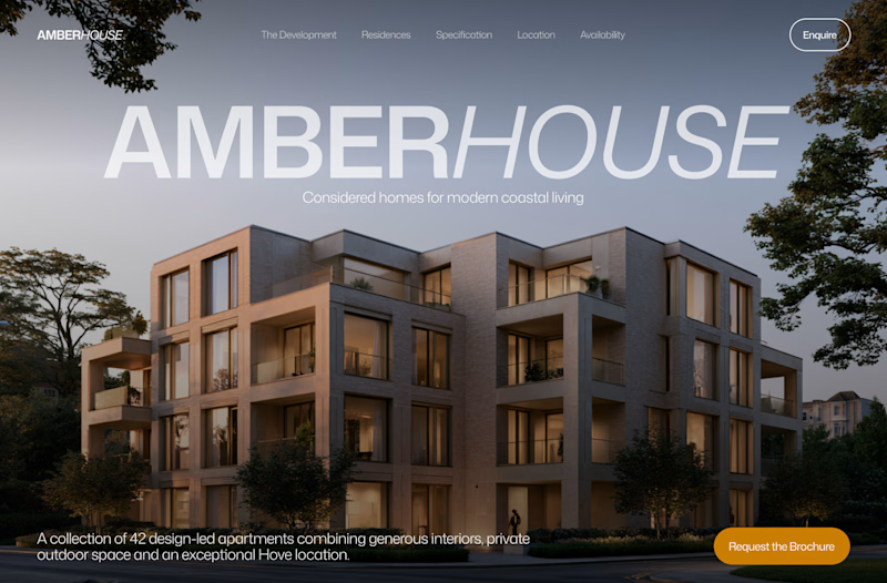
Two directions for Amber House, my real estate website template. The first pairs a closer architectural crop with an asymmetric layout. The second gives the building more breathing room, with a wide view and a centered headline.
Same template, two different first impressions. Which feels stronger to you, and why?
24 voted
59%
17 voted
41%
41 votes
Closed

Asymmetric makes the building stand out more!

Totally agree with you

I hard go for Bold & Asymmetric it looks more promising
Yes. However it's a template so I need another option if business doesn't have a photo with copy space on the top left angle.

Definitely Calm & Centered. The headline right across the top looks so clean and balanced.
I like this option because it's more versatile. It's template so it can work better

I will go with Bold & Asymmetric!
I like it too

Asymmetric for me. On your point about photos without empty space top left, a soft dark gradient behind the headline would let it work on almost any shot. Will buyers be able to switch between the two layouts in the template?
Yes. I want to add both, but I’m trying to choose the one to show in the preview.

To be honest, both options are really nice. I'm leaning a little more toward Bold.
Thanks. I feel the same way
I also posted a test today. I'd appreciate your feedback.

I loved Bold asymmetric!

That's so modern Minimalistic congrats 🎉🎉


I prefer Bold & Asymmetric. The closer crop highlights the architectural details, and the stacked headline gives the composition a distinctive, modern feel while keeping the building prominent.
The network for creativity
Join 1.25M professional creatives like you
Connect with clients, get discovered, and run your business 100% commission-free
Creatives on Contra have earned over $150M and we are just getting started



Related posts

Exploring Brand assets. Which one feels good?
24 voted
80%
6 voted
20%
30 votes
Closed

stack is cool but linear is doing the job better :)

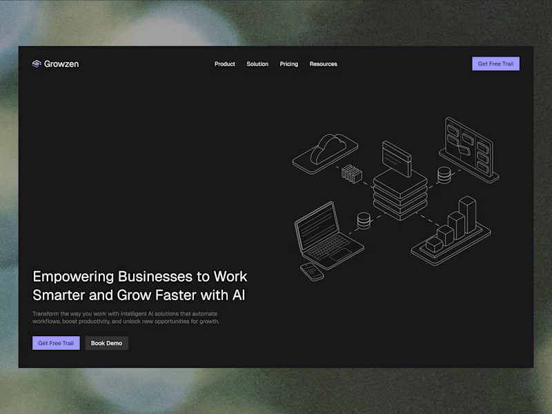
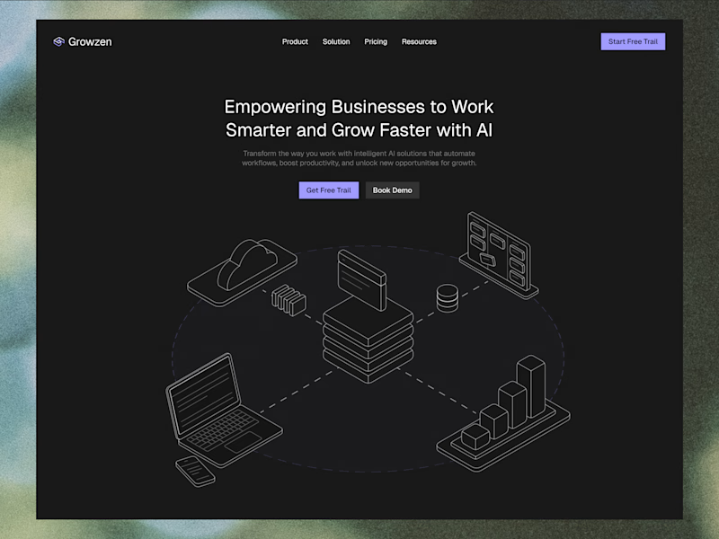
Designed a website concept for AI powered platform.
I wanted to give it a clean, minimal with a custom isometric illustration in the hero section.
Which version do you like better?
19 voted
59%
13 voted
41%
32 votes
Closed


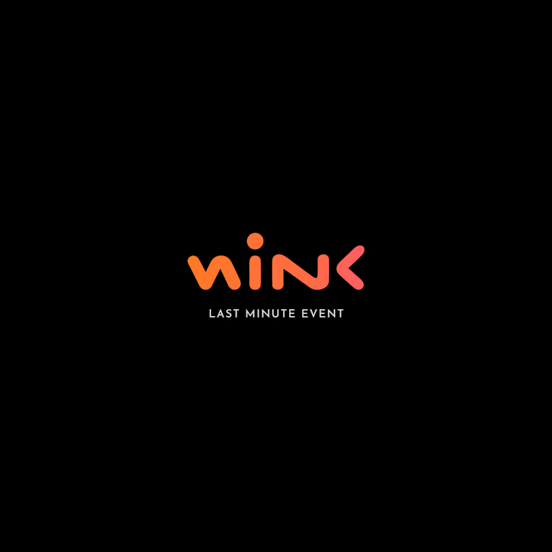
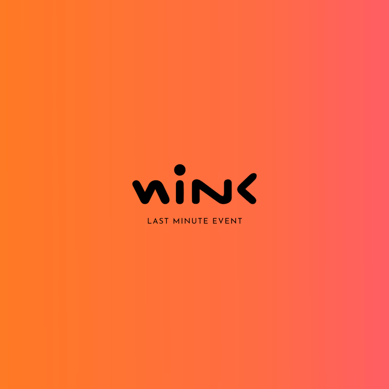
Two different colour directions, one brand identity. 🎨
Which version feels more impactful for this event brand?
🖤 Dark & Bold
🧡 Warm & Vibrant
What's your pick?
5 voted
71%
2 voted
29%
7 votes
Closed

Dark & Bold definitely takes the win for me. For an event brand, that high contrast gives off solid nightlife/exclusive vibes, and the coral accent pops really well against black.