The network for creativity
Join 1.25M professional creatives like you
Connect with clients, get discovered, and run your business 100% commission-free
Creatives on Contra have earned over $150M and we are just getting started
Back to feedPost
Taste Test

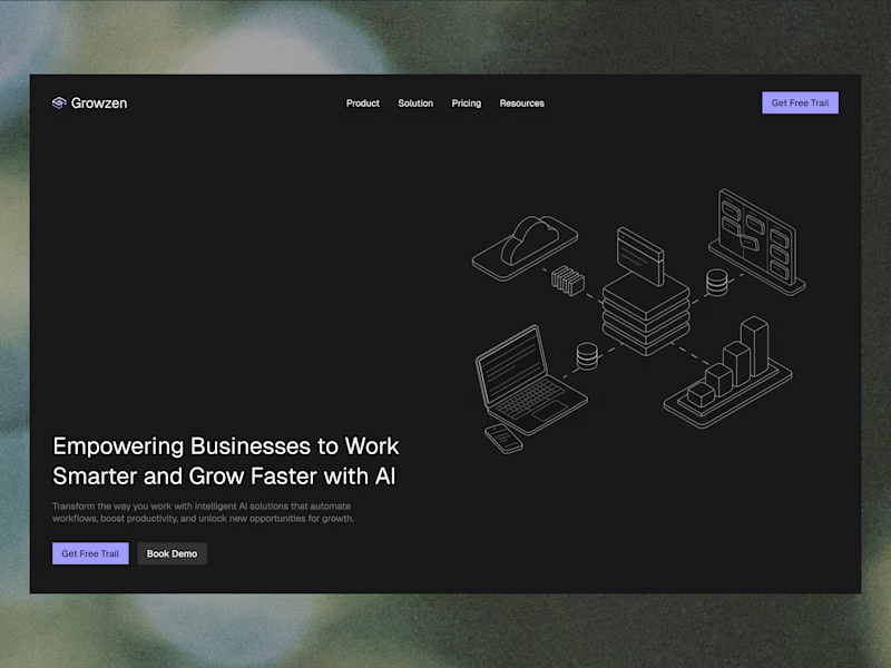
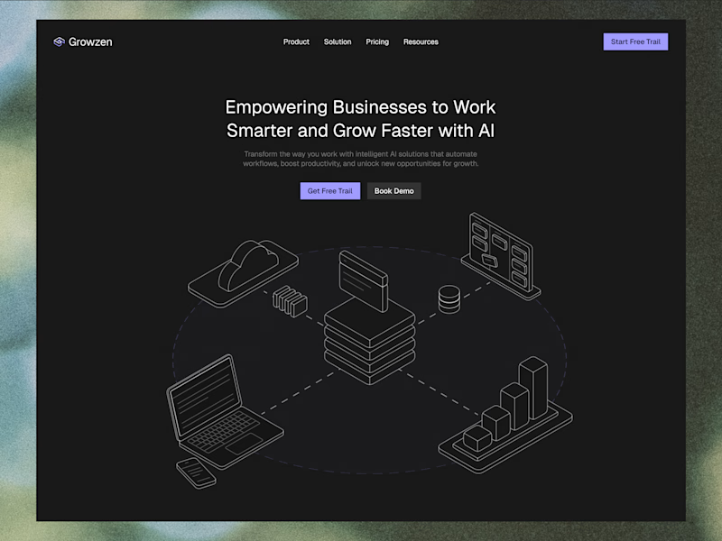
Designed a website concept for AI powered platform.
I wanted to give it a clean, minimal with a custom isometric illustration in the hero section.
Which version do you like better?
4 votes
Ends in 1d
The network for creativity
Join 1.25M professional creatives like you
Connect with clients, get discovered, and run your business 100% commission-free
Creatives on Contra have earned over $150M and we are just getting started
Related posts


We’re testing two filtering layouts for a template library.
Top Filters
The filters are placed above the content. This option feels lighter, leaves more space for the cards, and works well when there are only a few main categories.
Sidebar Filters
The categories remain visible in the sidebar. This makes the available options easier to scan and works better for more complex filtering, but takes up some of the content space.
Which layout would help you find the right template faster?

24 voted
39%
37 voted
61%
61 votes
Closed

Such a clean presentation. You can tell a lot of thought went into this.


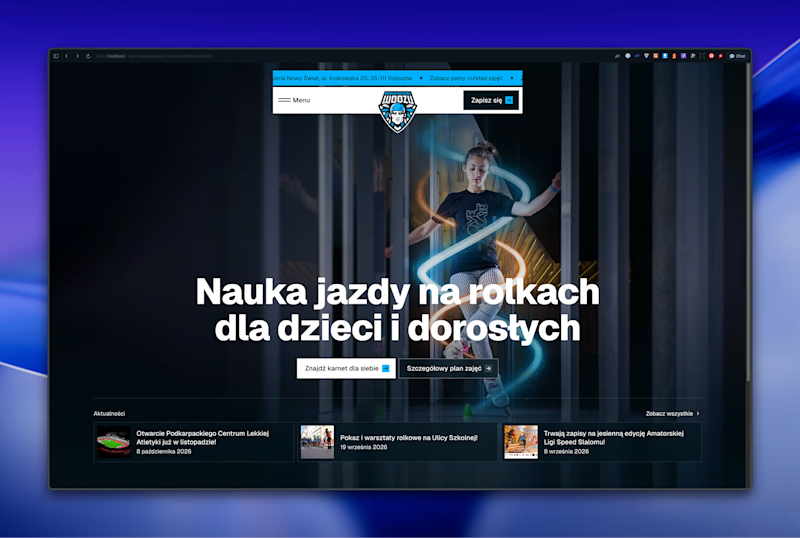
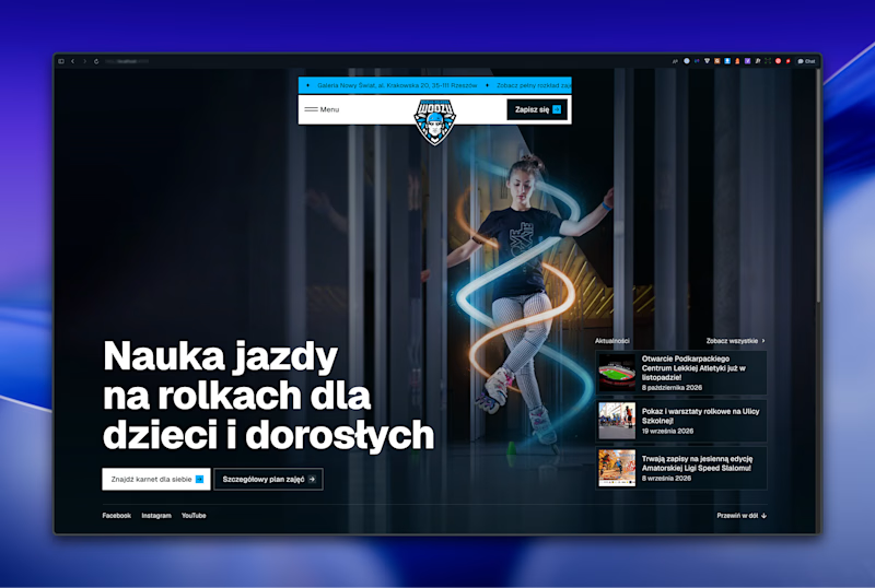

Left aligned for me. With that much body copy next to the headline it reads cleaner.

Same product, three different visual directions.
Exploring alternative concepts for a single product over the weekend.
I started with a simple product shot on a plain background and used Krea 3 to reimagine it in three different settings: playful floating spheres, sculptural glass structures, and a miniature garden.
Which one is your favorite?
