SOMA — The ingredient is the identity.

M Adil
The ingredient is the identity.
The GCC produces only 44% of the vegetables it consumes. Most nutrition brands in the region respond to that gap with stock photography and vague wellness language.
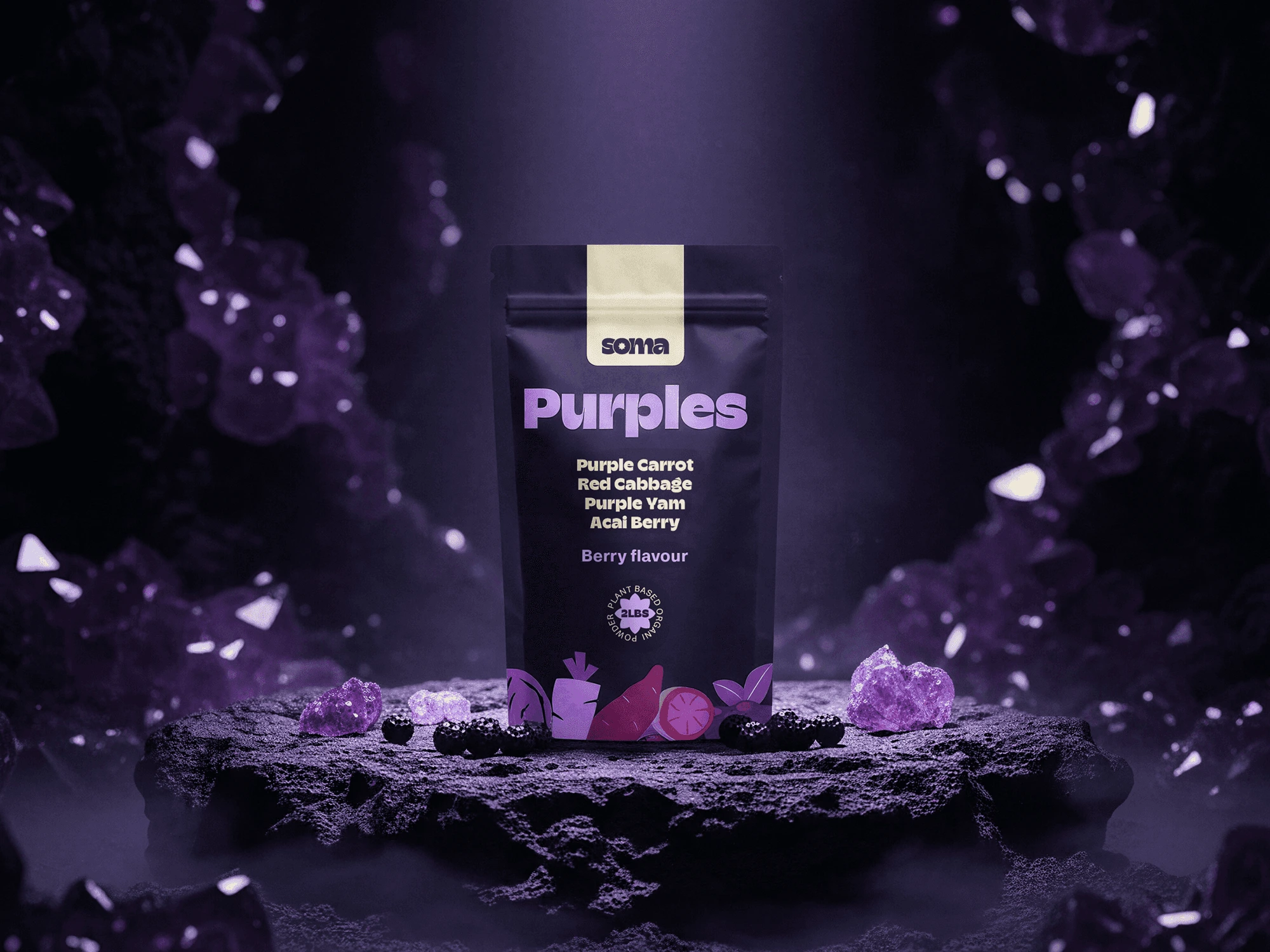
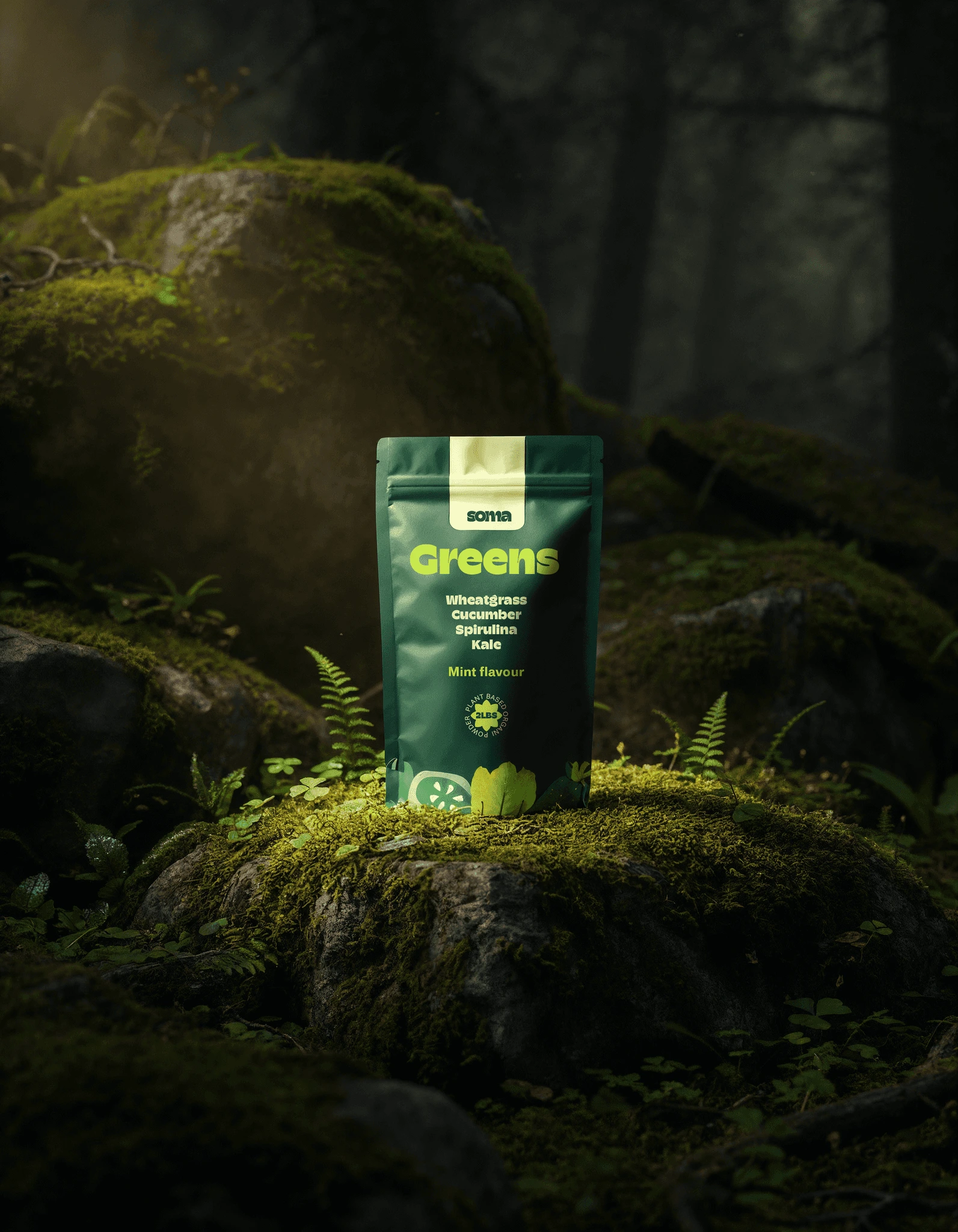
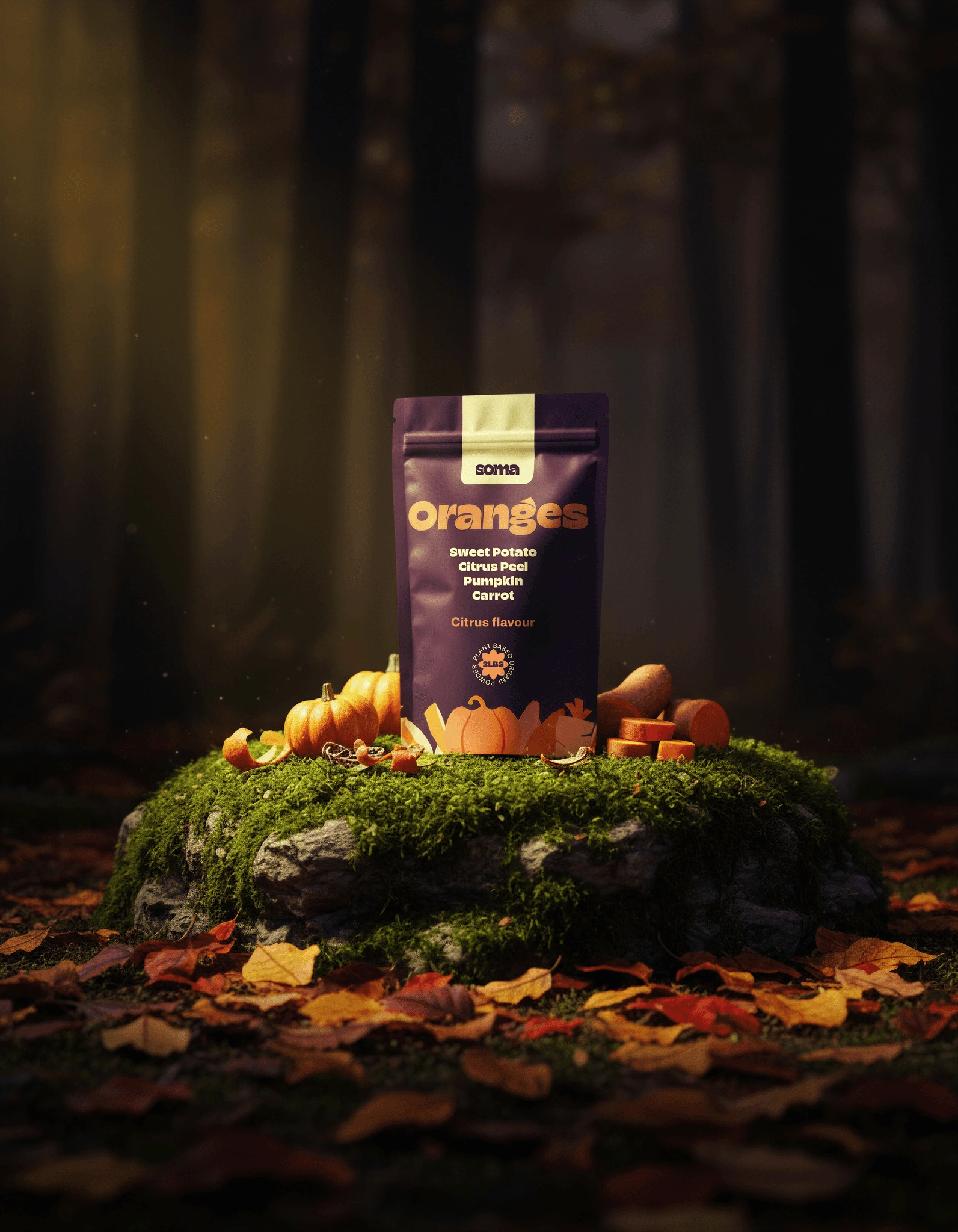
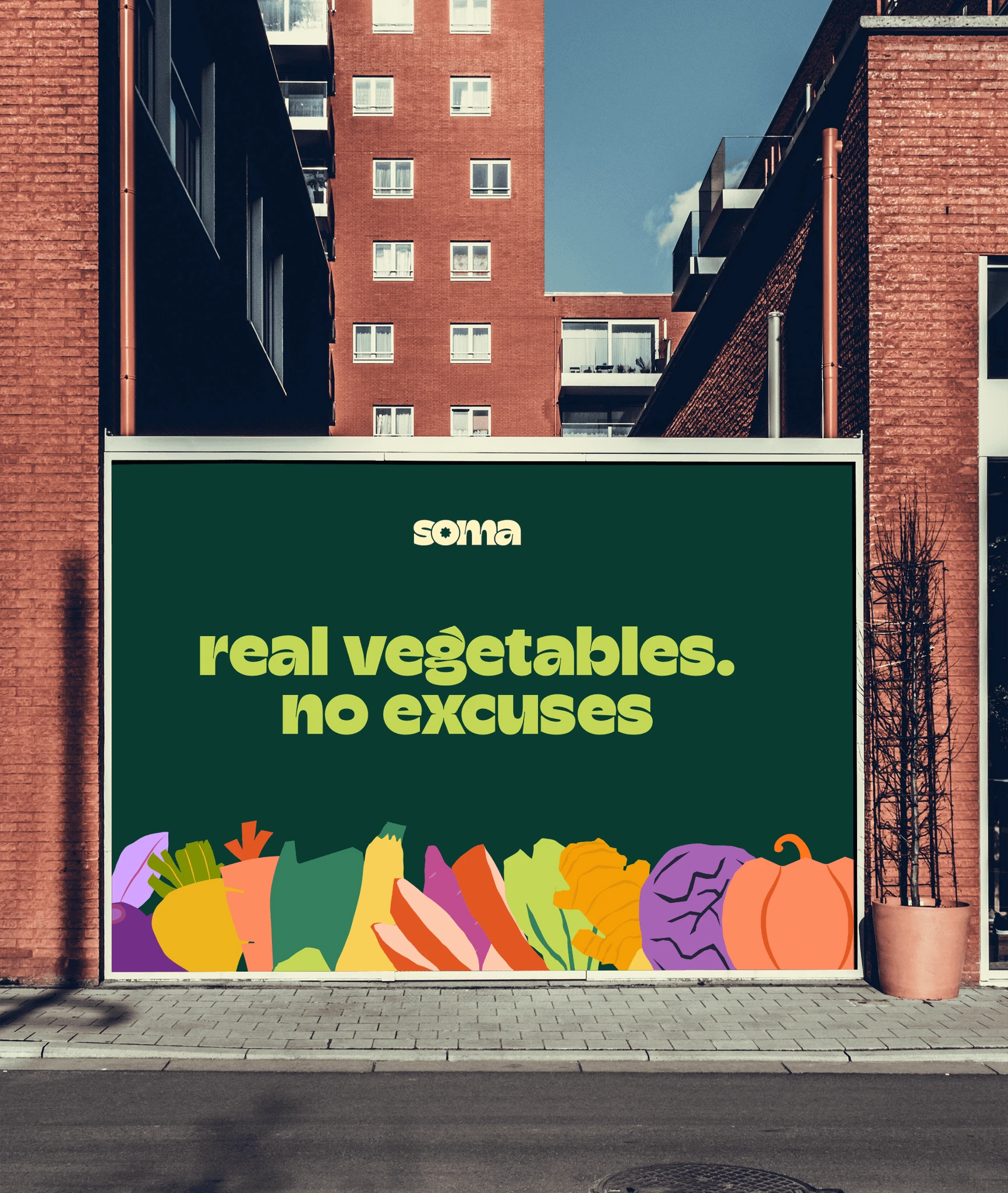
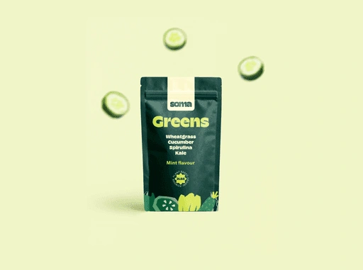
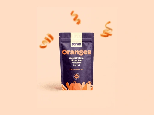
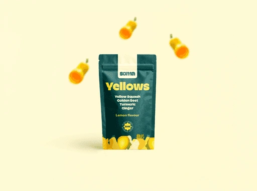
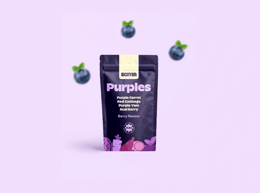
The GCC produces only 44% of the vegetables it consumes. Only 7.5% of Saudi adults meet WHO vegetable intake recommendations. Most nutrition brands in the region respond to that gap with generic wellness language and stock photography of athletic bodies. SOMA made one design decision that changed everything: put the vegetable in the biggest type on the pack. Not the brand name. Not a benefit claim. The ingredient itself. Transparency as the visual argument.
Start a Project
The brief for Soma was deceptively simple:
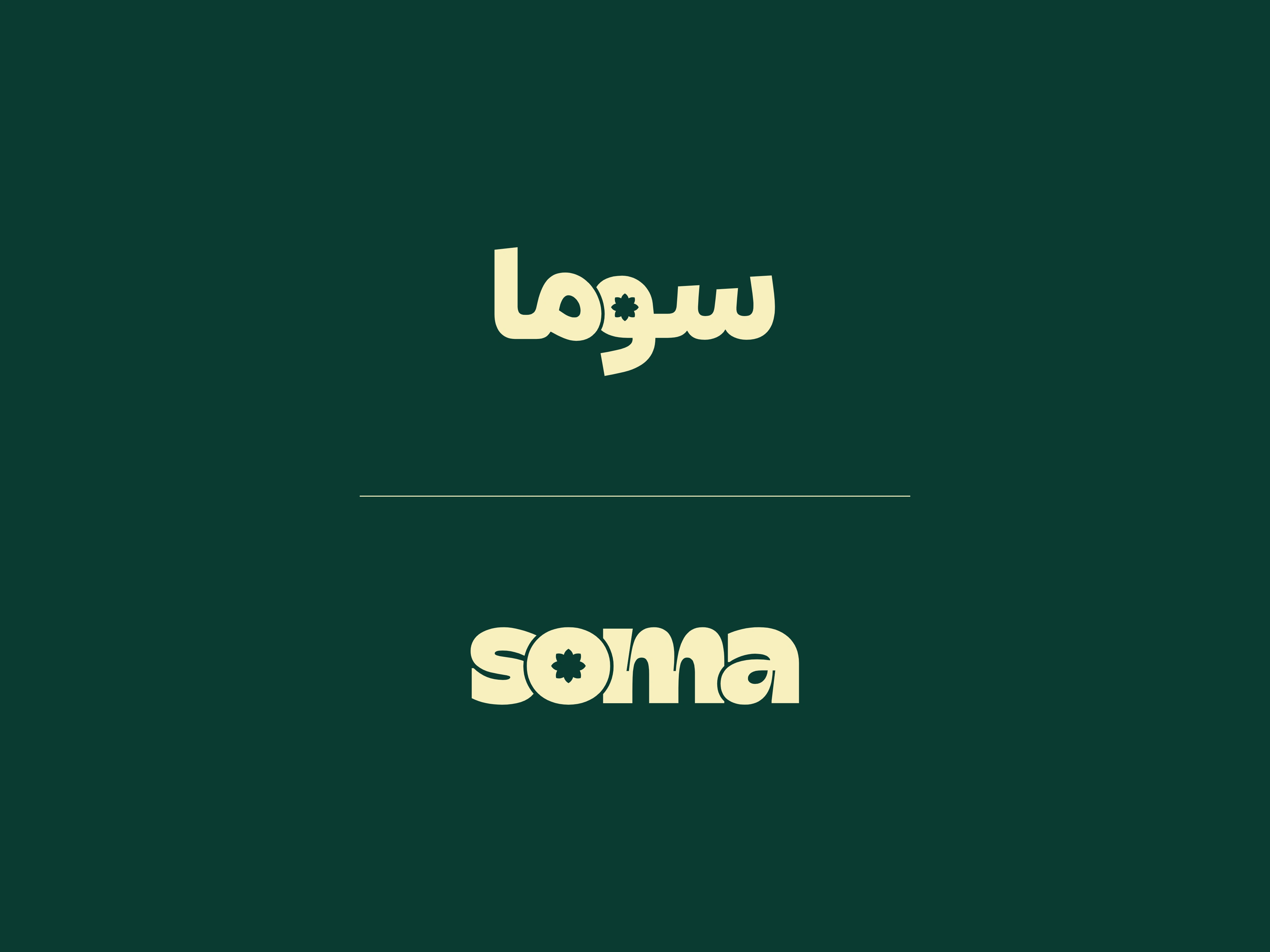
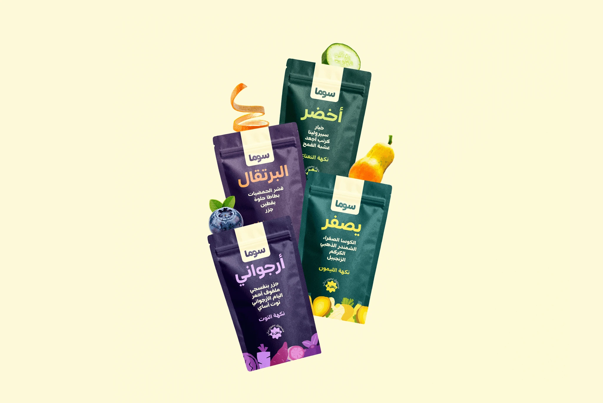
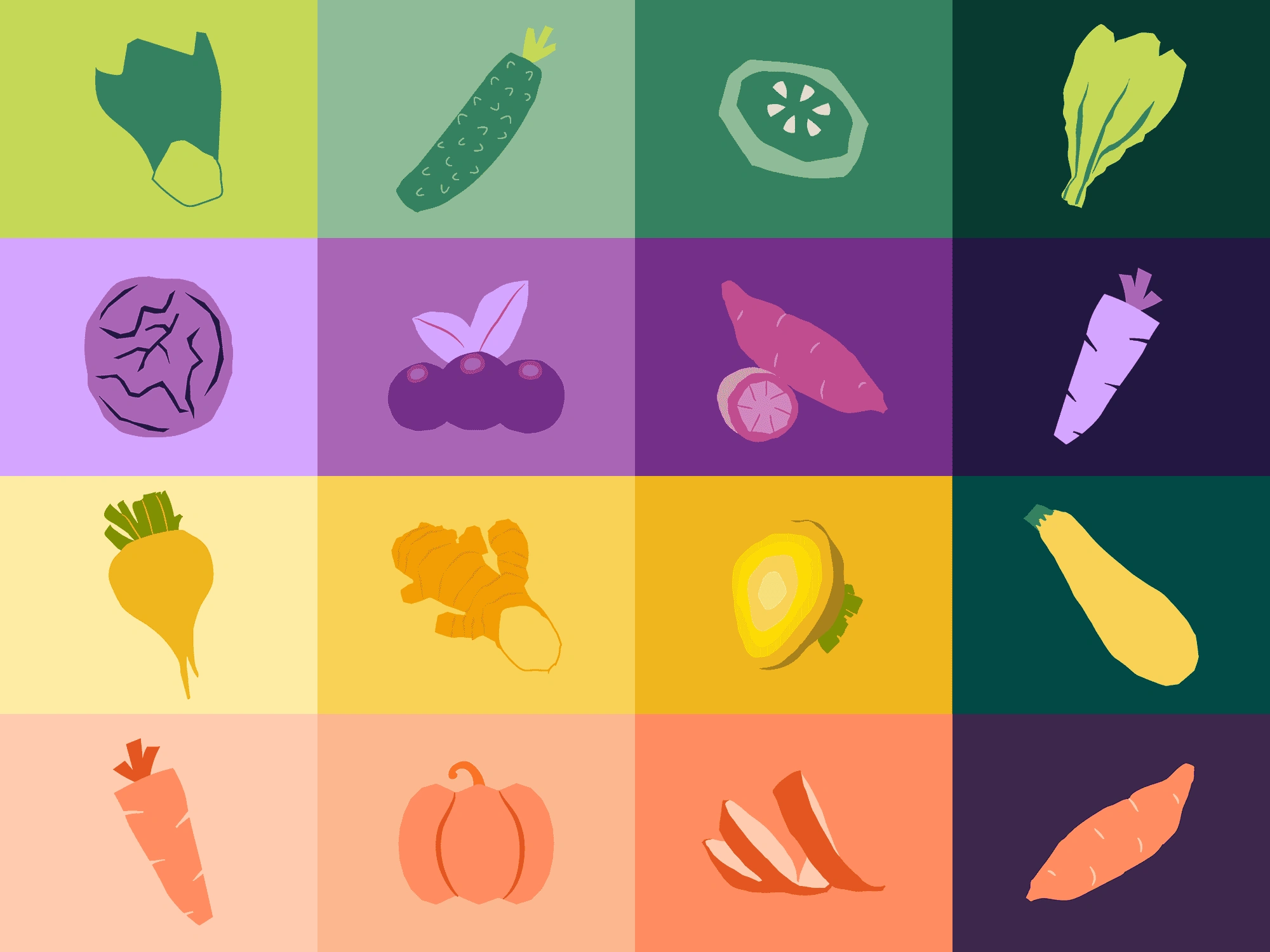
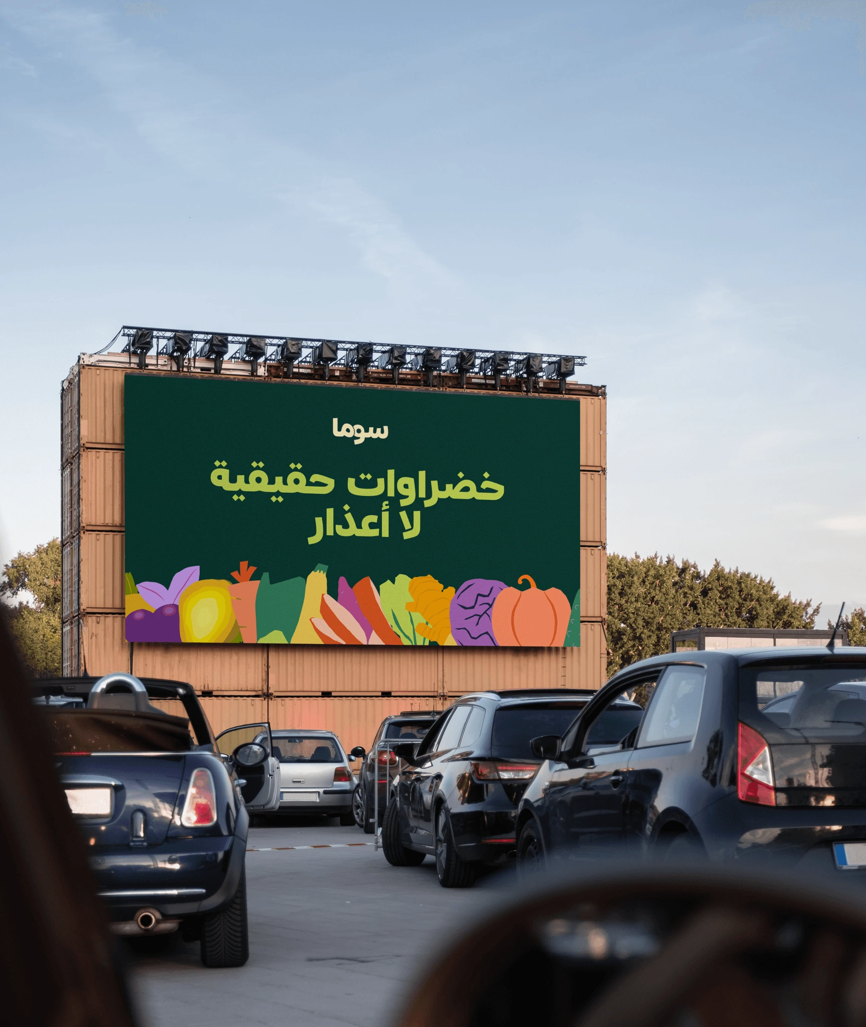
Build a Daily Superfood Ritual brand for someone tired of wellness looking like a pharmacy or a gym. The insight that shaped everything came from a single frustration: the founder had every supplement brand hide its ingredients in fine print on the back. So Soma does the opposite—every ingredient, front and center, in the biggest letters on the pack. The bilingual identity treats Arabic and English as equals, not translations. Both scripts were built with the same weight, the same intention, the same hierarchy from the start. Four SKUs. Each one is honest about exactly what is inside in both directions.
Like this project
Posted Sep 23, 2026
SOMA superfood brand built as a daily ritual that foregrounds ingredients with bold packaging, bilingual identity, and illustrative icons.
Likes
0
Views
0