Freelancers using Microsoft Power BI in India
Sign Up
Post a job
Sign Up
Log In
Filters
2
Projects
People
Ravi chandu Edru
pro
India
Power BI Consultant & Analyst
$50k+
Earned
2x
Hired
5.0
Rating
36
Followers
Follow
Message
Power BI Consultant & Analyst
2
Power BI Dashboard
2
53
1
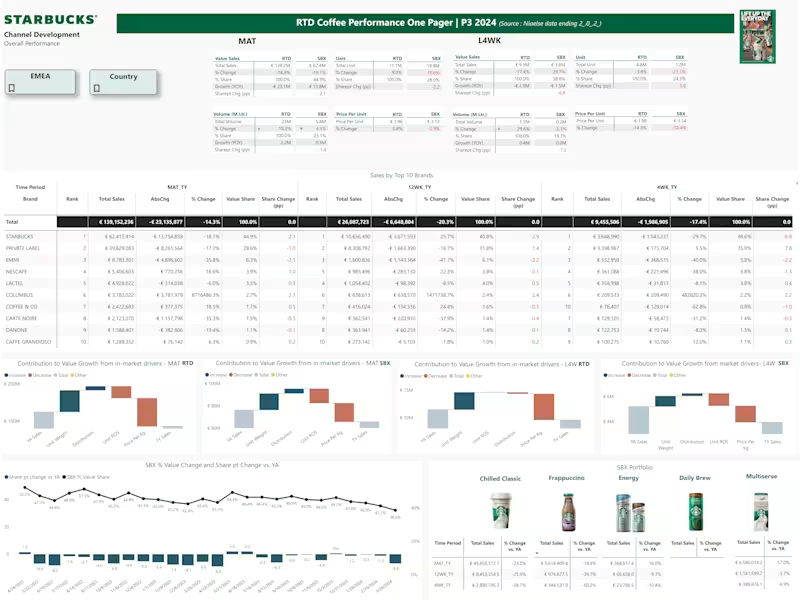
Power BI Dashboard for Starbucks Sales Analysis
1
38
0
HR Recruitment Company Management System
0
38
1
Sales Insights Dashboard
1
38
Microsoft Power BI
(5)
Follow
Message
Srujana Reddy
Bheemunipatnam, India
Business Analyst | Power BI Dashboard Expert | Excel Automat
7
Followers
Follow
Message
Business Analyst | Power BI Dashboard Expert | Excel Automat
0
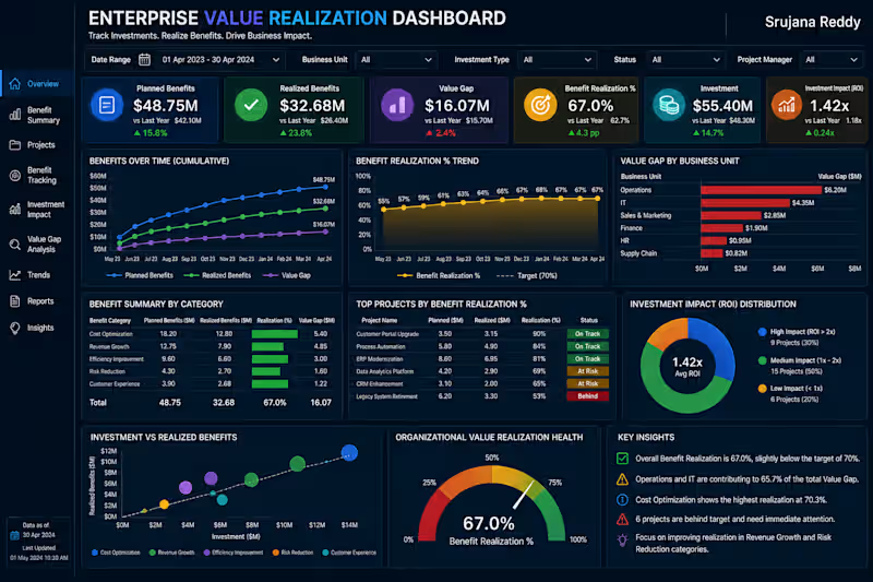
π Enterprise Value Realization Dashboard Track Investments. Realize Benefits. Drive Business Impact. The Enterprise Value Realization Dashboard is a professional Business Intelligence solution designed to measure whether business projects and investments are delivering their promised benefits. It provides a centralized view of planned benefits, realized benefits, value gaps, benefit realization rates, and investment impact, enabling leadership to understand where investments are creating value and where corrective action is required. With interactive analytics, this dashboard helps organizations monitor project outcomes, identify benefit gaps, prioritize underperforming investments, and improve overall return on strategic initiatives. π Key Metrics Planned Benefits Realized Benefits Value Gap Benefit Realization % Investment Impact (ROI) Overall Value Realization Score π Dashboard Features Executive Value Realization KPI Overview Planned vs Realized Benefits Analysis Benefit Realization Trend Business Unit Value Gap Analysis Project Benefit Performance Investment Impact & ROI Analysis Investment vs Realized Benefits Executive Insights & Recommendations πΌ Business Value This dashboard helps organizations: Measure actual benefits against planned outcomes Identify projects with significant value gaps Track investment performance and ROI Prioritize initiatives requiring corrective action Improve benefit realization across business units Support data-driven investment decisions Designed by: Srujana Reddy | Business Analyst Transforming investment and project data into actionable insights that measure realized value, identify performance gaps, and improve strategic business outcomes. πΌ Client Note Thank you for exploring my portfolio. The Enterprise Value Realization Dashboard is a professional Power BI solution designed to help organizations measure whether strategic projects and investments are delivering their expected business benefits. It provides clear visibility into planned versus realized benefits, value gaps, benefit realization rates, and investment impact, enabling leadership to identify underperforming initiatives and focus resources where they can create the greatest value. I specialize in developing modern, interactive Power BI dashboards that transform project, investment, and financial data into actionable insights for strategic decision-making. Services I Offer Enterprise Value Realization Dashboards Investment & ROI Analytics Project Portfolio Analytics Strategic KPI Dashboards Benefit Tracking & Performance Reporting Interactive Power BI Reports Advanced DAX & Data Modeling Custom Business Intelligence Solutions What You Can Expect Executive-Level Dashboard Design Interactive & User-Friendly Reports Advanced DAX & Data Modeling Real-Time Benefit & Investment KPI Monitoring Business-Focused Visualizations Customized Solutions Tailored to Your Business Needs Every dashboard I develop is designed to measure realized business value, identify benefit gaps, evaluate investment performance, and provide leadership with clear insights for better resource allocation and strategic execution. If you're looking for a custom Power BI Enterprise Value Realization Dashboard to measure project outcomes, track investment impact, and improve benefit realization, I'd be happy to collaborate on your next project. Let's transform your investment data into actionable insights that maximize realized value, improve ROI, and drive measurable business outcomes.
0
28
1
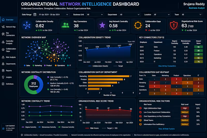
π§ Organizational Network Intelligence Dashboard Understand Connections. Strengthen Collaboration. Reduce Organizational Risk. The Organizational Network Intelligence Dashboard is a professional Business Intelligence solution designed to analyze how information, collaboration, and relationships flow across an organization. It provides a centralized view of collaboration density, key connectors, network centrality, collaboration gaps, and organizational risk, helping leadership understand communication patterns and identify areas that need stronger cross-functional collaboration. With interactive network analytics, this dashboard helps organizations identify influential connectors, detect collaboration gaps, improve information flow, and reduce organizational dependency and communication risks. π Key Metrics Collaboration Density Key Connectors Network Centrality Collaboration Gaps Organizational Risk Score Collaboration Health Score π Dashboard Features Executive Network KPI Overview Interactive Organizational Network Map Key Connector Analysis Network Centrality Trends Department Collaboration Gap Analysis Collaboration Gap Heatmap Organizational Risk Monitoring Executive Insights & Recommendations πΌ Business Value This dashboard helps organizations: Understand collaboration patterns across teams Identify key employees who connect different groups Detect cross-department collaboration gaps Improve information flow and knowledge sharing Identify organizational network risks Support data-driven organizational planning Designed by: Srujana Reddy | Business Analyst Transforming organizational network data into actionable insights that strengthen collaboration, improve information flow, and build a more connected and resilient organization. πΌ Client Note Thank you for exploring my portfolio. The Organizational Network Intelligence Dashboard is a professional Power BI solution designed to help organizations understand collaboration patterns, information flow, and cross-functional relationships. It provides visibility into collaboration density, key connectors, network centrality, collaboration gaps, and organizational risk, helping leadership identify communication bottlenecks and strengthen collaboration across teams. I specialize in developing modern, interactive Power BI dashboards that transform complex organizational data into actionable insights for better workforce planning, collaboration, and business decision-making. Services I Offer Organizational Network Intelligence Dashboards Collaboration & Workforce Analytics Executive KPI Dashboards Cross-Department Performance Analytics Organizational Risk Reporting Interactive Power BI Reports Advanced DAX & Data Modeling Custom Business Intelligence Solutions What You Can Expect Executive-Level Dashboard Design Interactive & User-Friendly Reports Advanced DAX & Data Modeling Collaboration & Network KPI Monitoring Business-Focused Visualizations Customized Solutions Tailored to Your Business Needs Every dashboard I develop is designed to identify collaboration gaps, understand organizational connections, improve information flow, and provide leadership with actionable insights for stronger organizational performance. If you're looking for a custom Power BI Organizational Network Intelligence Dashboard to analyze collaboration, identify network risks, and improve cross-functional connectivity, I'd be happy to collaborate on your next project. Let's transform your organizational data into actionable insights that strengthen collaboration, reduce communication gaps, and drive better business outcomes. π
1
54
1
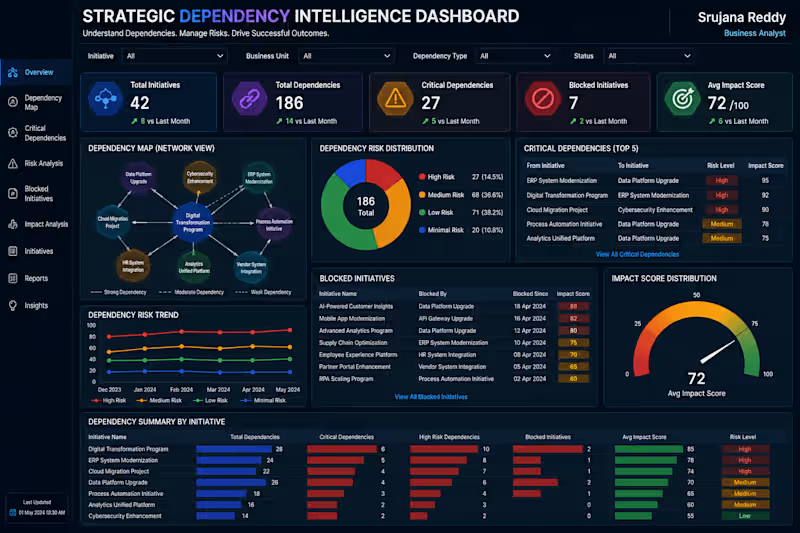
π Strategic Dependency Intelligence Dashboard Understand Dependencies. Manage Risk. Protect Strategic Outcomes. The Strategic Dependency Intelligence Dashboard is a professional Business Intelligence solution designed to help organizations identify how strategic initiatives depend on other teams, systems, projects, and business capabilities. It provides a centralized view of dependency relationships, critical dependencies, dependency risks, blocked initiatives, and overall impact scores. With interactive analytics, this dashboard helps leadership identify high-risk dependencies early, reduce project delays, prioritize critical actions, and improve coordination across strategic initiatives. π Key Metrics Dependency Map Critical Dependencies Dependency Risk Blocked Initiatives Impact Score Overall Dependency Health π Dashboard Features Executive Dependency KPI Overview Interactive Dependency Network Map Critical Dependency Analysis Dependency Risk Trend Monitoring Blocked Initiative Tracking Impact Score Analysis Initiative & Business Unit Comparison Executive Insights & Recommendations πΌ Business Value This dashboard helps organizations: Identify critical dependencies early Reduce initiative delays and blockers Prioritize high-impact risks Improve cross-team coordination Understand dependency-driven business impact Support data-driven strategic planning Designed by: Srujana Reddy | Business Analyst Transforming dependency data into actionable insights that reduce strategic risk, remove blockers, and improve successful execution of enterprise initiatives. πΌ Client Note Thank you for exploring my portfolio. The Strategic Dependency Intelligence Dashboard is a professional Power BI solution designed to help organizations understand and manage dependencies across strategic initiatives, teams, systems, and projects. It provides clear visibility into critical dependencies, dependency risks, blocked initiatives, and impact scores, enabling leadership to identify potential delays and prioritize high-impact actions. I specialize in building modern, interactive Power BI dashboards that transform complex business relationships and operational data into actionable insights for strategic decision-making. Services I Offer Strategic Dependency Dashboards Project & Initiative Analytics Risk & Impact Analysis Executive KPI Dashboards Portfolio Performance Reporting Interactive Power BI Reports Advanced DAX & Data Modeling Custom Business Intelligence Solutions What You Can Expect Executive-Level Dashboard Design Interactive & User-Friendly Reports Advanced DAX & Data Modeling Dependency & Risk KPI Monitoring Business-Focused Visualizations Customized Solutions Tailored to Your Business Needs Every dashboard I develop is designed to identify critical dependencies, reduce blockers, improve cross-functional coordination, and provide leadership with clear insights for faster strategic execution. If you're looking for a custom Power BI Strategic Dependency Dashboard to identify project dependencies, manage risks, and improve initiative execution, I'd be happy to collaborate on your next project. Let's transform your dependency data into actionable insights that reduce strategic risk, remove bottlenecks, and drive successful business outcomes. π
1
49
1
π° Pricing & Revenue Management Intelligence Dashboard Optimize Pricing. Protect Margins. Maximize Revenue. The Pricing & Revenue Management Intelligence Dashboard is a professional Business Intelligence solution designed to help organizations evaluate pricing performance across markets, customer segments, and product categories. It provides a centralized view of price realization, margin impact, discount impact, demand response, and revenue opportunities, enabling commercial teams to identify pricing gaps and improve profitability. With interactive analytics and clear KPI tracking, this dashboard helps businesses understand customer response to pricing changes, optimize discounts, identify high-value markets, and make data-driven pricing decisions. π Key Metrics Price Realization Margin Impact Discount Impact Demand Response Revenue Opportunity Pricing Performance Score π Dashboard Features Executive Pricing KPI Overview Price Realization Trend Analysis Product-wise Margin Analysis Discount Impact Monitoring Demand Response Analysis Market-wise Revenue Opportunity Customer Segment Analysis Pricing Insights & Recommendations πΌ Business Value This dashboard helps organizations: Identify pricing gaps against targets Protect profit margins Optimize discount strategies Understand demand response Discover revenue growth opportunities Improve pricing decisions across markets and customers Designed by: Srujana Reddy | Business Analyst Transforming pricing data into actionable insights that improve margins, unlock revenue opportunities, and drive profitable business growth. πΌ Client Note Thank you for exploring my portfolio. The Pricing & Revenue Management Intelligence Dashboard is a professional Power BI solution designed to help organizations optimize pricing strategies, protect profit margins, and identify revenue growth opportunities. It provides clear visibility into price realization, margin impact, discount performance, demand response, and potential revenue opportunities across markets, products, and customer segments. I specialize in developing modern, interactive Power BI dashboards that transform commercial and financial data into actionable insights, helping businesses improve pricing decisions and maximize profitable growth. Services I Offer Pricing & Revenue Management Dashboards Revenue & Margin Analytics Pricing Performance Reporting Customer & Market Analytics Executive KPI Dashboards Interactive Power BI Reports Advanced DAX & Data Modeling Custom Business Intelligence Solutions What You Can Expect Executive-Level Dashboard Design Interactive & User-Friendly Reports Advanced DAX & Data Modeling Pricing & Revenue KPI Monitoring Business-Focused Visualizations Customized Solutions Tailored to Your Business Needs Every dashboard I develop is designed to identify pricing gaps, optimize discounts, protect margins, uncover revenue opportunities, and support smarter commercial decisions. If you're looking for a custom Power BI Pricing & Revenue Management Dashboard to optimize pricing, improve profitability, and identify growth opportunities, I'd be happy to collaborate on your next project. Let's transform your pricing data into actionable insights that strengthen margins, maximize revenue, and drive profitable business growth. π
1
47
Microsoft Power BI
(85)
Follow
Message
Abu Aasif Ansari
Bhiwandi, India
I build AI agents & internal tools that act on data
13
Followers
Follow
Message
I build AI agents & internal tools that act on data
0
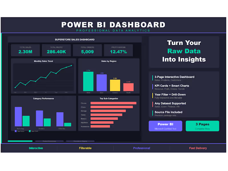
Superstore Sales Dashboard β 3-Page Power BI Report Built an interactive 3-page Power BI dashboard using the Superstore Sales dataset (9,994 orders across USA). Page 1 β Sales Overview: KPI cards, monthly trend, regional breakdown, category performance. Page 2 β Product Performance: Top products, category donut, profit analysis, sales vs profit scatter. Page 3 β Customer & Shipping: Segment breakdown, top 10 customers, monthly growth, ship mode distribution. Tools: Power BI, DAX, Superstore Dataset Theme: Dark professional with interactive year filter.
0
197
1
Sales, Customer & Marketing Analytics Dashboard Project
1
9
0
Iβm a Data Analyst specializing in cleaning, structuring, and analyzing marketing and sales data using Python, Excel, SQL, and Power BI. I help businesses fix broken data pipelines, resolve formatting issues, and turn raw data into accurate dashboards that support decision-making. My work focuses on clarity, reliability, and scalabilityβensuring reports remain consistent as data grows. If youβre struggling with inconsistent data or dashboards that donβt reflect reality, I can help streamline the process end-to-end.
0
473
0
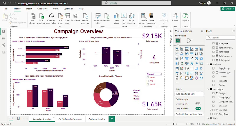
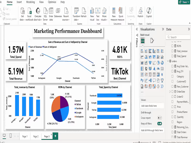
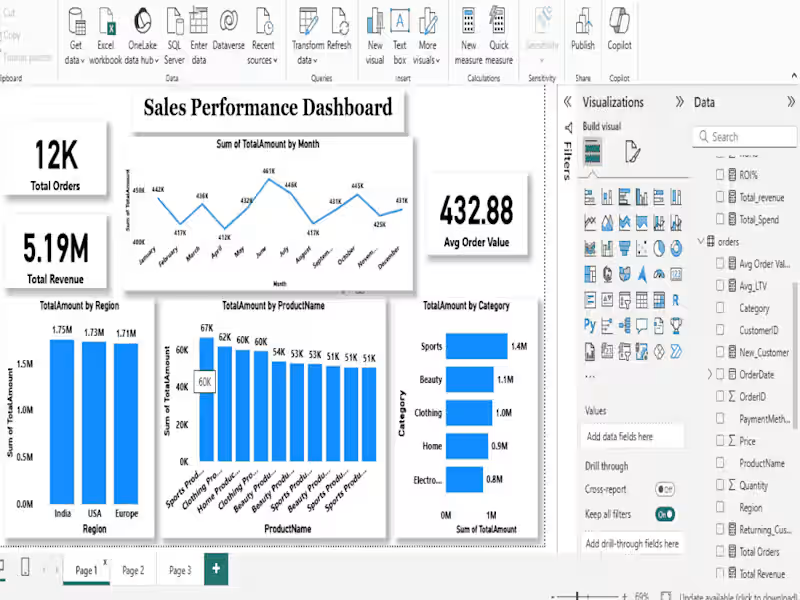
Sales, Customer & Marketing Analytics in Power BI I built a complete 3-page Power BI dashboard to analyze Sales performance, Customer behavior, and Marketing ROIβall in one place. π Sales Overview Revenue trends & top product categories Total Sales, Orders & Average Order Value Region-wise and payment method analysis π₯ Customer Insights New vs Returning customers Customer Lifetime Value (LTV) by region Purchase frequency & repeat behavior using DAX π Marketing Performance Spend vs Revenue across Paid Ads, Social, Referral, Influencer/UGC, Email & Offline Clear ROI comparison to identify winning and underperforming channels π Tools Used: Power BI, SQL, DAX, CSV π‘ Outcome: This project shows how combining Sales, Customer, and Marketing data helps businesses make faster, smarter decisions.
0
335
Microsoft Power BI
(6)
Follow
Message
Sunny Mehta
Pune, India
Data Analyst & BI Dev | Dashboards, SQL, Python & ETL
New to Contra
Follow
Message
Data Analyst & BI Dev | Dashboards, SQL, Python & ETL
0
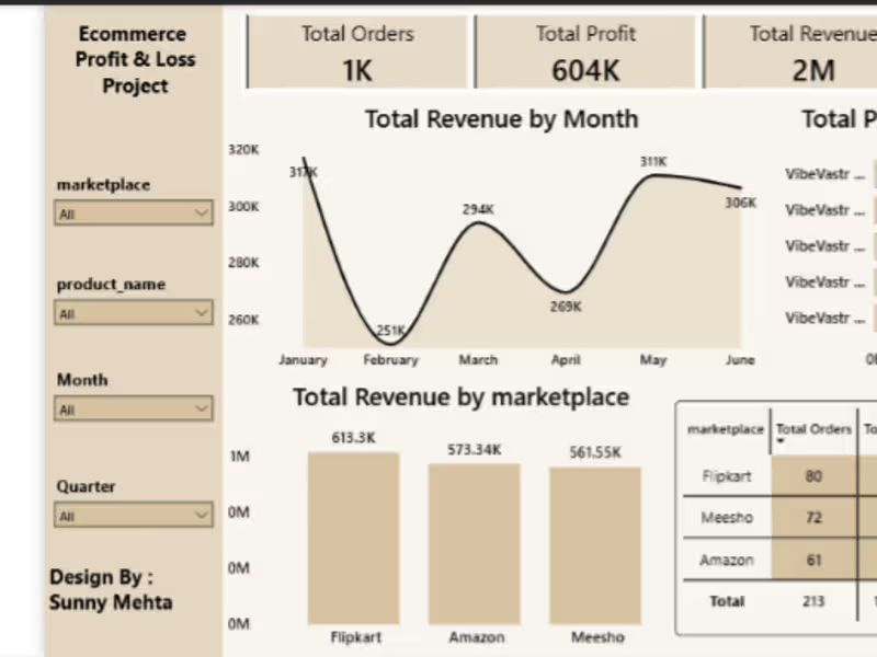
Marketplace Profitability & P&L Engine Overview This project is an end-to-end E-commerce Marketplace Analytics solution built using MySQL, SQL, Power BI, and Excel. The objective of this project is to analyze marketplace profitability across multiple sales channels by calculating revenue, product costs, marketplace commissions, shipping expenses, and net profit. The project simulates a real-world marketplace operations environment where business teams need visibility into product performance, marketplace profitability, and operational KPIs. Business Problem E-commerce businesses often track revenue but fail to understand true profitability. This project helps answer key business questions: Which marketplace generates the highest profit? Which products are most profitable? How do commissions impact margins? What is the overall profit margin? How does shipping cost affect profitability? Tech Stack MySQL SQL Power BI Microsoft Excel Data Sources Products Contains SKU-level product information. Fields: SKU Product Name Category Cost Price Selling Price Orders Contains marketplace order transactions. Fields: Order ID Order Date Marketplace SKU Quantity Marketplace Charges Marketplace commission structure. Fields: Marketplace Commission Percentage Shipping Cost Shipping cost by marketplace. Fields: Marketplace Shipping Cost Returns Order return information. Fields: Order ID Return Status SQL Implementation The project uses multiple SQL tables and joins to create a unified profitability dataset. Key SQL Concepts Used: CREATE TABLE INNER JOIN SQL Views Aggregations Calculated Metrics A consolidated analytical view was created: vw_marketplace_pnl This view combines all business logic and serves as the primary source for Power BI reporting. Profitability Metrics Revenue Revenue = Quantity Γ Selling Price Product Cost Product Cost = Quantity Γ Cost Price Commission Cost Commission Cost = Revenue Γ Marketplace Commission % Shipping Cost Shipping Cost = Quantity Γ Shipping Cost Profit Profit = Revenue β Product Cost β Commission Cost β Shipping Cost Profit Margin % Profit Margin % = Profit / Revenue Power BI Dashboard Executive Summary KPIs: Total Revenue Total Profit Total Orders Profit Margin % Marketplace Analysis Revenue by Marketplace Profit by Marketplace Marketplace Performance Comparison Product Analysis Top Profitable Products Product Revenue Analysis Product Profitability Ranking Trend Analysis Revenue Trend Profit Trend Order Trend Project Architecture Excel β MySQL β SQL View β Power BI Dashboard Key Outcomes Built a scalable marketplace profitability model. Centralized business logic using SQL Views. Automated profitability calculations. Delivered interactive executive dashboards for decision-making. Simulated a real-world marketplace operations analytics workflow. Skills Demonstrated SQL Data Modeling Business Intelligence Power BI E-commerce Analytics Marketplace Operations Profitability Analysis Data Visualization Author Sunny Mehta Open to opportunities in: E-commerce Operations Marketplace Management Business Analytics Operations Analytics Data Analytics
0
15
3
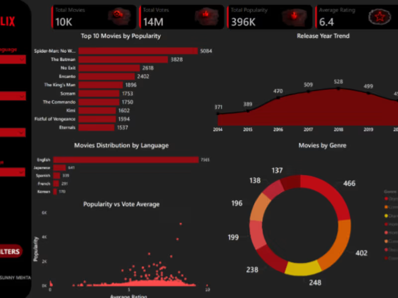
Netflix Movies Analysis Dashboard using Power BI Project Overview Interactive Power BI dashboard analyzing Netflix movie trends, popularity, ratings, genres, and language distribution. KPIs Total Movies Total Votes Total Popularity Average Rating Dashboard Features Top 10 Movies by Popularity Release Year Trend Movies Distribution by Language Genre Analysis Popularity vs Vote Average Tools Used Power BI Power Query DAX Data Modeling
3
79
1
Banking Data Analysis Dashboard Develop a basic understanding of risk analytics in banking and financial services and understand how data is used to minimise the risk of losing money while lending to customers Solution β With our dashboards which are created using Power BI latest tools helps the company to make a decision based on the applicantβs profile like if the applicant is likely to repay the loan then approving the loan otherwise not. About Dataset β This dataset basically contains information about bank details ,various client details which consists of multiple tables which are interlinked with each other through keys like primary key and foreign key. The various tables are Banking Relationship, Client-Banking, Gender, Investment Advisor and Period. KPIβS: In which followings KPIS are present : Total Clients : Total Clients KPI represents total number of clients in banking. Total Clients = DISTINCTCOUNT('Clients - Banking'[Client ID] ) Total Loan : Total Loan gives you information about the bank loan + Business lending + credit cards balance of particular investor , gender. Total Loan = [Bank Loan] + [Business Lending] + [Credit Cards Balance] Bank Loan : Bank Loan gives you information what is the loan amount of loan to be repaid by the client to bank. Bank Loan = SUM('Clients - Banking'[Bank Loans] ) Business Lending : Business lending gives you information about the loan amount given to small business. Business Lending = SUM('Clients - Banking'[Business Lending] ) Total Deposit Total Deposit gives you information about the amount deposited by particular investors in bank Total Deposit = [Bank Deposit] + [Savings Account] + [Foreign Currency Account] + [Checking Accounts] Total Fees : Total Fees is nothing but the amount charged by the bank for account set-up , maintenance charges etc. Total Fees = SUMX('Clients - Banking' , [Total Loan] * 'Clients - Banking'[Processing Fees] ) Bank Deposit : Bank deposit is the money put in the bank. Bank Deposit = SUM('Clients - Banking'[Bank Deposits] ) Checking Account Amount : Checking account amount is nothing but which offers easy access to your money for daily transactional needs. Checking Accounts = SUM('Clients - Banking'[Checking Accounts] ) Total CC Amount : Total CC Amount is a short-term source of financing for a company by a bank. Total CC Amount = SUM('Clients - Banking'[Amount of Credit Cards] ) Saving Account Amount : A savings account is an interest-bearing deposit account held at a bank. Savings Account = SUM('Clients - Banking'[Saving Accounts] ) Foreign Currency Amount : Foreign Currency Account means an account held in a currency that is not the currency of India or Bhutan or Nepal. Foreign Currency Account = SUM('Clients - Banking'[Foreign Currency Account] ) Engagement Account : Engagement Banking is nothing but puts the customer at the center and aims to deliver the digital experiences they expect. Engagment Length = SUM('Clients - Banking'[Engagment Days]) Credit Cards Balance : It is the total amount of money currently owned by a cardholder to their credit card bank. Credit Cards Balance = SUM('Clients - Banking'[Credit Card Balance] ) π Tools Used Excel (Data Cleaning) SQL (Data Processing) Python (EDA) Power BI (Dashboard) π Key Insights Private banks dominate loan distribution European segment shows highest deposits Low-income customers have high loan dependency
1
47
1
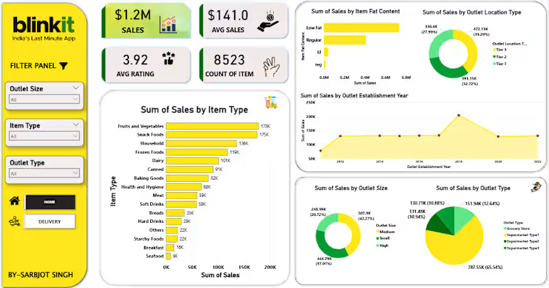
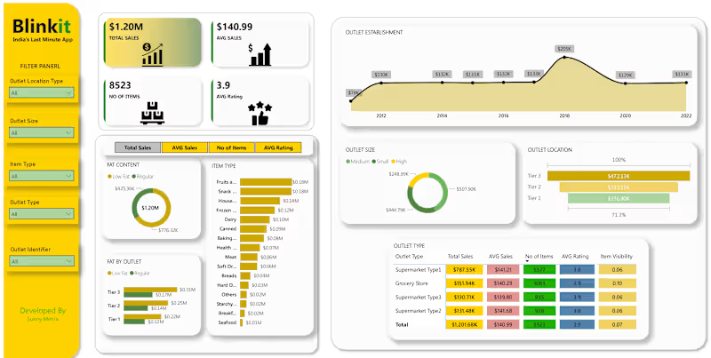
Blinkit-Sales-Dashboard This project is an interactive Power BI dashboard developed to analyse Blinkit's sales performance, outlet operations, product distribution, and customer-related metrics. The dashboard converts raw retail sales data into meaningful business insights through visualisation and KPI tracking. The objective of this project is to monitor business performance, identify sales trends, evaluate outlet efficiency, and support data-driven decision-making. Key KPIs Total Sales: $1.20M Average Sales: $140.99 Number of Items: 8,523 Average Rating: 3.9 Dashboard Features Sales Analysis Tracked total revenue and average sales performance to understand overall business growth. Outlet Performance Analysed outlet sales based on the following: Outlet Size Outlet Location Type Outlet Establishment Year Outlet Type Product Category Analysis Identified top-performing product categories contributing the highest revenue. Customer & Product Insights Compared low-fat and regular products to understand purchasing trends and monitored customer ratings for performance evaluation. Interactive Filters Added slicers for: Outlet Location Type Outlet Size Item Type Outlet Type Outlet Identifier These filters allow users to dynamically explore data and generate business insights. Project Outcome This project demonstrates practical skills in business intelligence, KPI reporting, analytical thinking, and dashboard development using Power BI. It highlights the ability to transform raw business data into business insights for decision-making. Developed By Sunny Mehta
1
59
Microsoft Power BI
(4)
Follow
Message
Smita S
Pune, India
Senior Data Analyst | Business Intelligence Consultant
10
Followers
Follow
Message
Senior Data Analyst | Business Intelligence Consultant
0
Power BI Templates for Self-Service Reporting
0
24
0
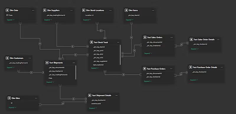
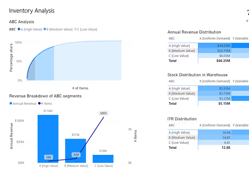
Inventory Optimization with ABC-XYZ Segmentation
0
33
0
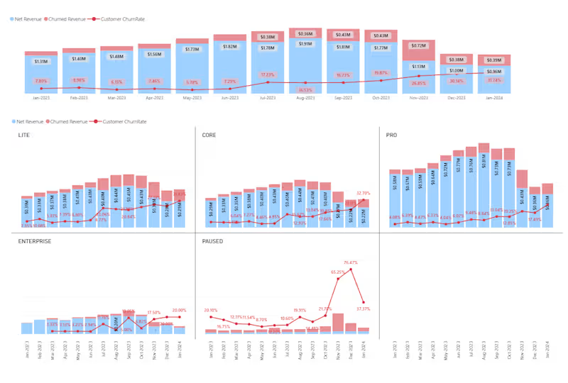
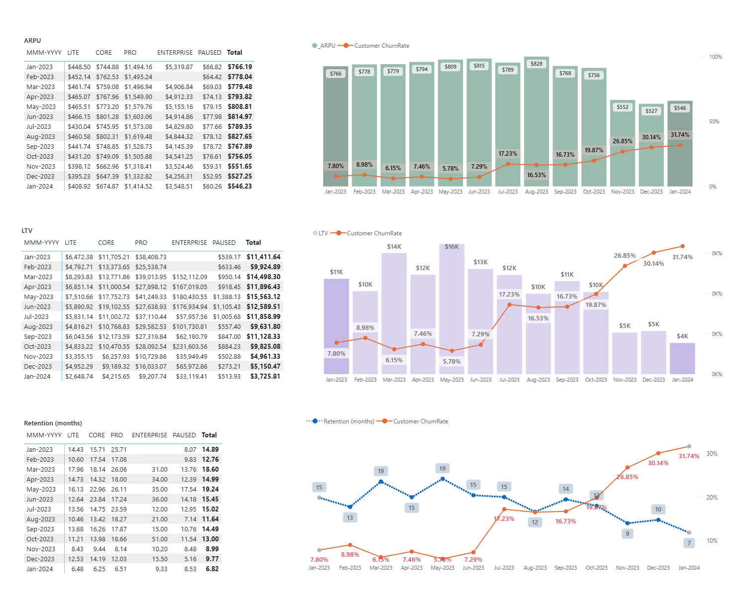
MRR & Churn Analysis Dashboard for SaaS Retention and Growth
0
39
View more β
Microsoft Power BI
(3)
Follow
Message
Vishal Rajput
India
Senior Data Analyst/ Data Scietist
Follow
Message
Senior Data Analyst/ Data Scietist
1
New Member Onboarding & Growth Analytics for Credit Unions
1
3
1
Automated Underwriting & Risk Scoring Analytics
1
2
1
Loan Charge-Off Forecasting Analytics
1
1
1
Member Attrition Prediction for Credit Union
1
0
Microsoft Power BI
(4)
Follow
Message
Vikas Kashyap
Delhi, India
Data visualization engineer, Data Analyst, BI Expert
11
Followers
Follow
Message
Data visualization engineer, Data Analyst, BI Expert
2
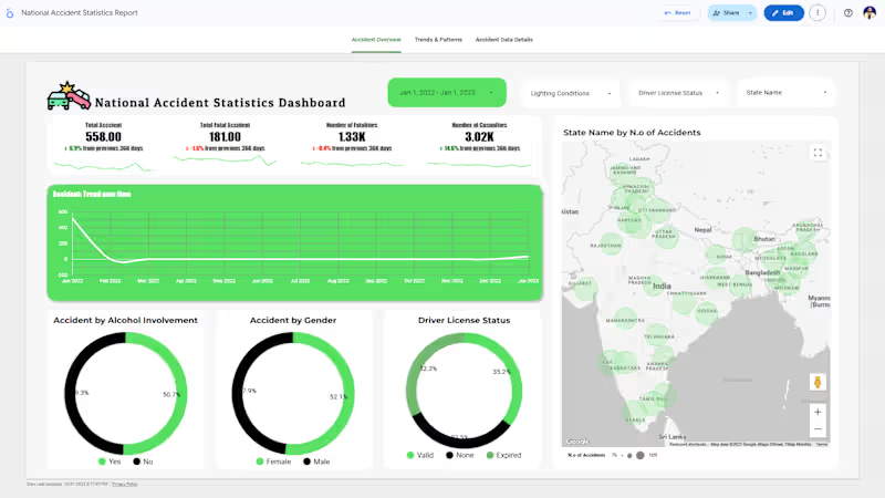
National Accident Statistics Dashboard in Google Looker Studio: I built an interactive Looker Studio dashboard using Google Sheets as the data source to visualize national accident statistics. The report analyzes accidents by region, time, severity, and demographics. A scheduled data re:fresh every 15 minutes keeps the dashboard updated in real time. As a Data Visualization Expert, I combined automation and design to deliver a clean, insightful, and dynamic Looker Studio dashboard for data-driven decision-making. π π― π
2
156
1
Ecommerce Analytics Dashboard in Looker Studio
1
5
0
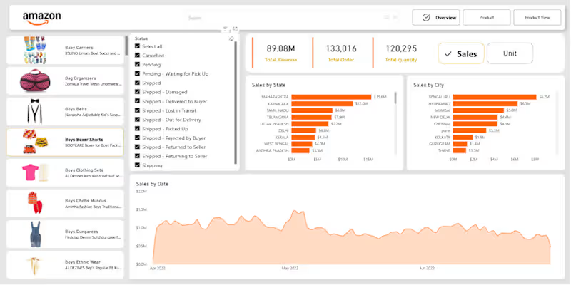
Amazon Sales Dashboard in Power BI
0
10
0
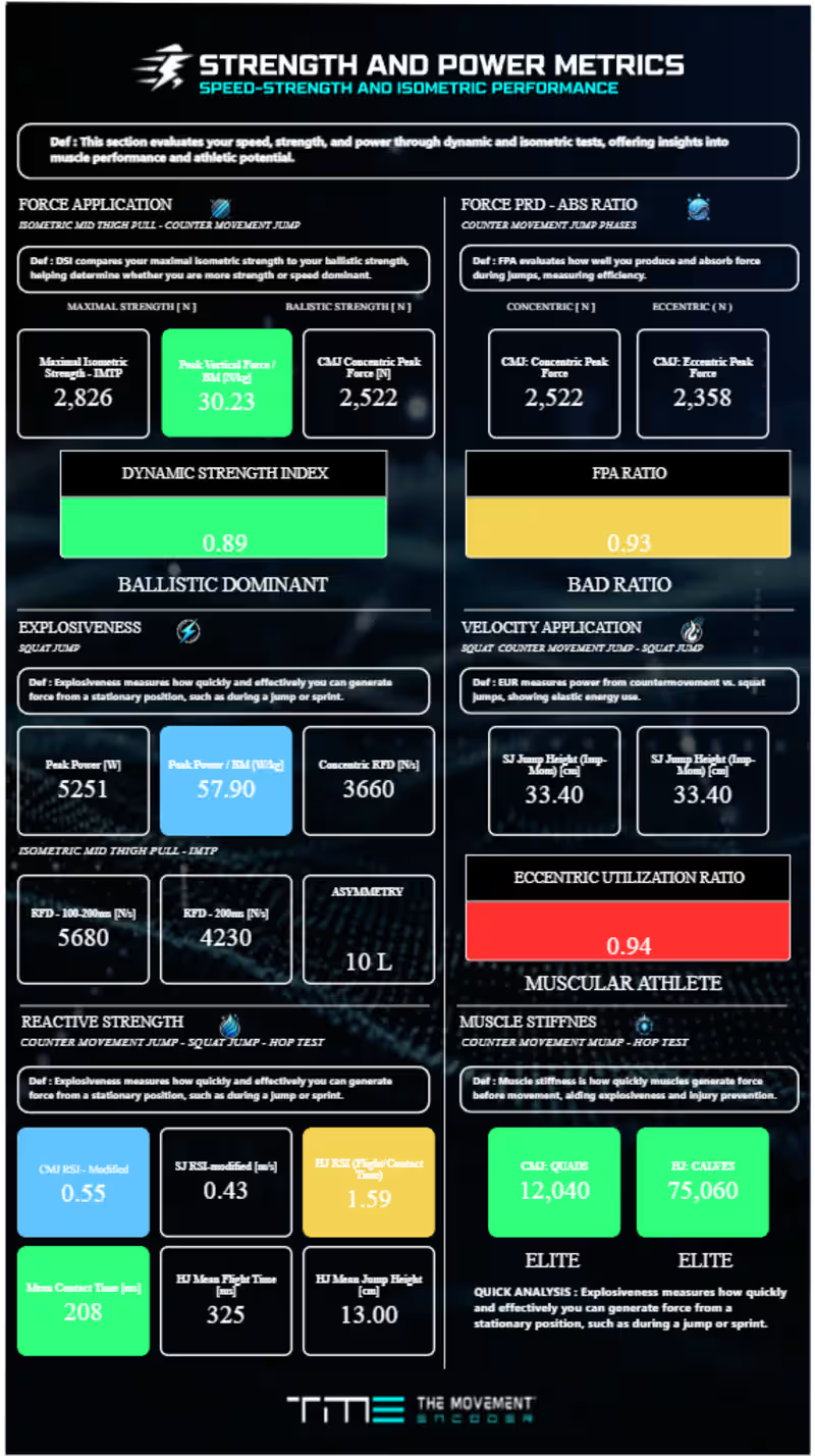
Power BI Dashboard for Full-Body Alignment Assessment
0
5
Microsoft Power BI
(5)
Follow
Message
Sarbjot Singh
Pimpri-Chinchwad, India
Power BI Expert | Turning Raw Data into Actionable Insights
New to Contra
Follow
Message
Power BI Expert | Turning Raw Data into Actionable Insights
1
Data Analytics Project | BlinkIT Grocery Sales Analysis Excited to share my latest Data Analytics project ,where I analyzed BlinkIT Grocery Sales Data and delivery data to uncover meaningful business insights π π What I worked on: Analyzed sales performance across product categories, outlet types, sizes, and locations Identified top-performing item categories and customer preferences Studied the impact of outlet size, establishment year, and visibility on sales Converted raw data into actionable insights and business recommendations π‘ Key Insights: Fruits & Vegetables, Snack Foods, and Frozen Foods drive maximum sales FOR FULL PROJECT VIST GIT HUB β( https://lnkd.in/d34sdAPz )
1
61
2
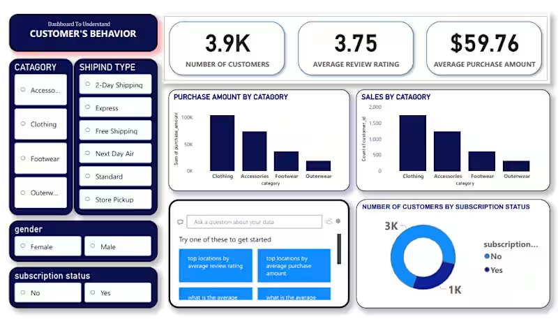
Iβm excited to share my latest Data Analytics project where I analyzed Customer Shopping Behavior to uncover trends in sales, demographics, and purchasing habits.This project was a great exercise in building a complete data pipeline. The Tech Stack: Python (Pandas & NumPy): Used in Jupyter Notebooks for initial data exploration and statistical analysis. PostgreSQL: Utilized for rigorous data cleaning, querying, and structuring the dataset for analysis. Power BI: Built an interactive dashboard to visualize key metrics like seasonal trends, subscription impacts, and category performance. Project Highlights: β Data Cleaning: Leveraged PostgreSQL and Pandas to handle missing values and standardize categorical data.
1
2
92
0
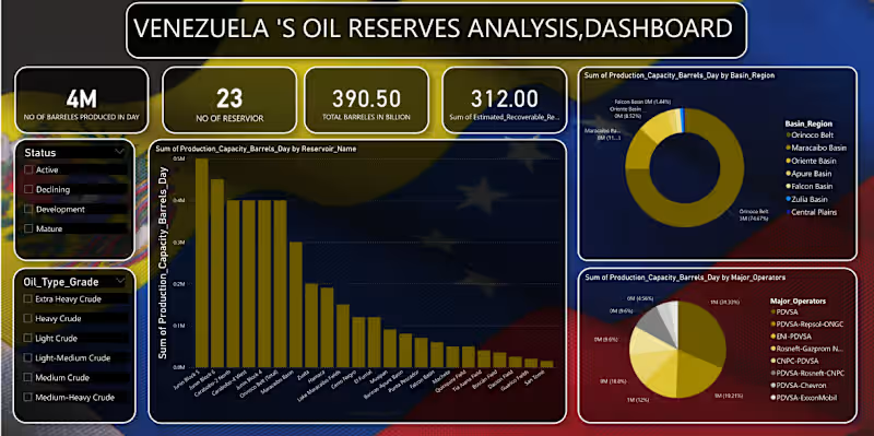
Venezuelaβs Oil Reserves Analysis Dashboard π I am excited to share my latest data analytics project focusing on the energy sector. Using a dataset covering 23 reservoirs, I designed a comprehensive dashboard to track production capacity and resource distribution in Venezuela. Key Features: β Real-time Metrics: Tracking the 390.50 Billion total barrels in reserve. β Granular Analysis: Production capacity breakdown by reservoir name and oil grade (Extra Heavy to Light). β Stakeholder Mapping: Visualizing the production sum by major operators. Tools Used: [pandas(jupyter notebook)/mysql(for analysis and cleaning of data), Power BI / Excel(for building dashboard)] Iβd love to hear your thoughts or feedback on the dashboard design! must visit my github for full project -( https://lnkd.in/dYKdZ8J2 )
0
69
1
Data Analytics Project | BlinkIT Grocery Sales Analysis Excited to share my latest Data Analytics project ,where I analyzed BlinkIT Grocery Sales Data and delivery data to uncover meaningful business insights π π What I worked on: Analyzed sales performance across product categories, outlet types, sizes, and locations Identified top-performing item categories and customer preferences Studied the impact of outlet size, establishment year, and visibility on sales Converted raw data into actionable insights and business recommendations π‘ Key Insights: Fruits & Vegetables, Snack Foods, and Frozen Foods drive maximum sales Medium-sized outlets outperform others in overall revenue FOR FULL PROJECT VIST GIT HUB β( https://lnkd.in/d34sdAPz ) Feedback and suggestions are always welcome!
1
1
89
Microsoft Power BI
(4)
Follow
Message
Explore people