Full-Stack & AI Developer | Next.js, AI Agents
- $50k+
- Earned
- 12x
- Hired
- 5.0
- Rating
- 275
- Followers
Full-Stack & AI Developer | Next.js, AI Agents


Full-Stack & AI Developer | Next.js, AI Agents
- $25k+
- Earned
- 9x
- Hired
- 5.0
- Rating
- 61
- Followers
Full-Stack & AI Developer | Next.js, AI Agents

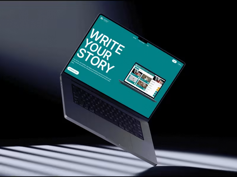


Product Designer & Developer


Product Designer & Developer
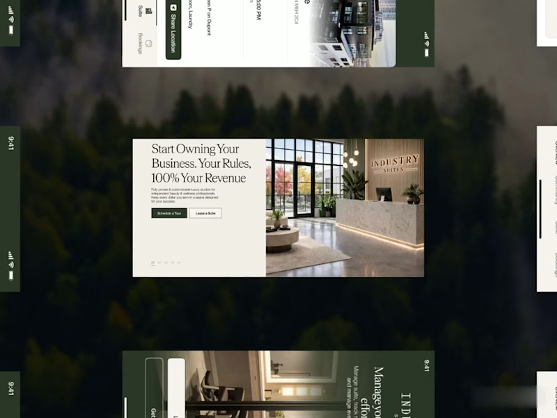
A fresh digital identity, a premium workspace designed for creative professionals.
From an elegant, editorial-style website to a functional mobile app for bookings and studio management, the goal was to make every interaction feel as refined as the space itself.
Clean layouts, timeless typography and a deep green palette bring the whole experience together.
4
21
1.9K
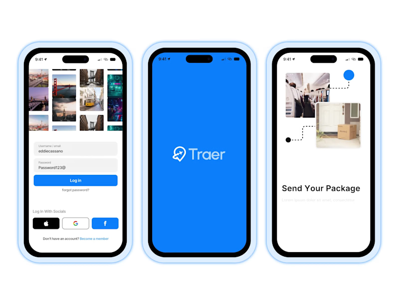
Traer Mobile App Design.
A clean and modern mobile app UI/UX design for Traer, a P2P global package delivery platform.
Designed the experience around package tracking, orders, trips, and delivery management, keeping everything simple and easy to navigate.
Also explored the visual identity, typography, colors, and responsive product experience to keep the app consistent across the brand.
Really enjoyed bringing this one together.
30
35
2.4K

Just shipped Kindred.
Every course template sells information. Kindred sells belonging.
It's a landing page template for coaches, operators, and community
builders running a paid membership on Circle, Skool, Kajabi, or
anywhere else. Founder-voice sections, real transformation proof,
and copy that actually tells you what to say.
Go from blank canvas to live in a weekend, without looking like
you bought a template.
Live now on the Framer Marketplace (https://www.framer.com/community/marketplace/templates/kindred/).
14
25
2.1K
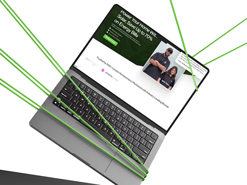
Check out this website redesign I did for Solar Panels London.
I started with Figma to plan the design. Then I built the website in Framer. After that, I did full SEO so the website can rank better on Google and get more solar customers.
This is how I help solar companies get more leads online through good design and SEO.
10
21
2.9K

Top-Rated Independent Design. Develop. Deliver Results

Top-Rated Independent Design. Develop. Deliver Results

Web Designer & Framer Expert

Web Designer & Framer Expert

Business Systems, AI Workflow Automation and MVPs
- $•••••
- Earned
- 36x
- Hired
- 5.0
- Rating
- 91
- Followers
Business Systems, AI Workflow Automation and MVPs

Brand & Framer Designer for Startup Websites That Convert
- $5k+
- Earned
- 6x
- Hired
- 4.9
- Rating
- 44
- Followers
Brand & Framer Designer for Startup Websites That Convert


New brand identity for Curated Kitchens & Bath, a remodeling studio that helps homeowners fall in love with their space again.
The brief was warmth without the clutter. A calm, earthy palette of smoky green, warm taupe and soft greige, paired with a clean editorial wordmark and a house-shaped mark that tucks the kitchen right inside it.
Built out the full system too: logo suite, business cards, door hangers, flyers and merch, so every touchpoint reads as the same brand.
Which application is your favorite? Curious what stands out to you.
0
175
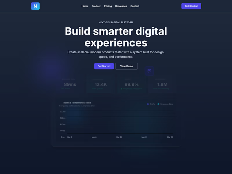
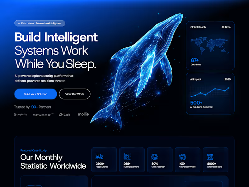
Just doing a simple web page design for a SaaS-based company. Let me know which hero section you think is doing a great job here.
5
430

For this challenge, I wanted to explore something different, turning a simple logo concept into a short brand-style animation.
PIXLWAY is a design agency focused on branding, web design, and development, helping businesses, founders, and growing brands build strong digital identities.
I thought it would be a great chance to go a step further and create a short promotional animation, almost like a mini brand trailer.
I developed two animation concepts in [@Kittl], then refined the final direction with a few tweaks to enhance the motion and overall feel.
Tools used:
Logo & animation concepts: @Kittl
Post-production edits: [@CapCut]
Kittl Project Board
(https://app.kittl.com/project/cmmfenjjw1vut0i9rpr02c6h2)LinkedIn Post (https://www.linkedin.com/feed/update/urn:li:activity:7439486799992795136/)
BTS video in the comments!
9
13
694

UI/UX Designer | Framer & Video Editing
- $1k+
- Earned
- 3x
- Hired
- 5.0
- Rating
- 35
- Followers
UI/UX Designer | Framer & Video Editing