Complete Visual Identity
Atiya Zehra
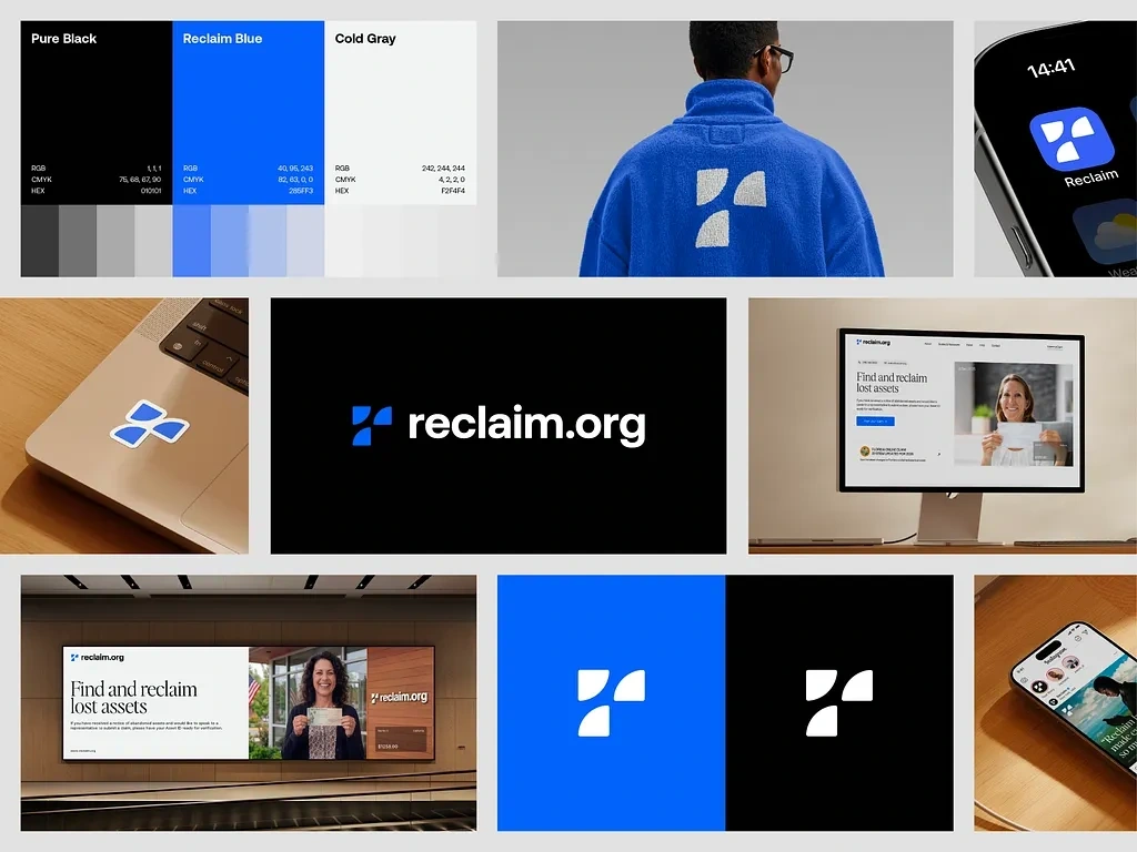
Reclaim Visual Identity
Reclaim.org · Visual Identity
Reclaim.org is a fintech platform that helps people find and recover unclaimed financial assets. The brand needed to feel trustworthy enough for a financial audience yet approachable enough for everyday users a balance between institutional credibility and human warmth.
Color Palette
Three colors carry the entire identity: Pure Black (
#010101) for authority, Reclaim Blue (#265FF3) as the brand's energetic core, and Cold Gray (#F2F4F4) for clean, breathable surfaces. Minimal and precise nothing decorative.Logo & Mark
The icon is a four-part geometric mark built on a strict grid. The fragmented shapes suggest recovery and reunification, abstractly forming an "R." It holds perfectly from app icon size to large-format billboard — a mark engineered as much as designed.
Brand Applications
The identity spans a wide range of touchpoints: a blue fleece hoodie with white embroidered mark, iOS app icon, laptop sticker, responsive website, and transit OOH advertising. Each application uses the same three-color system with complete consistency. The billboard tagline "Find and reclaim lost assets" is short, benefit-driven, and lands the brand's purpose in under five words.
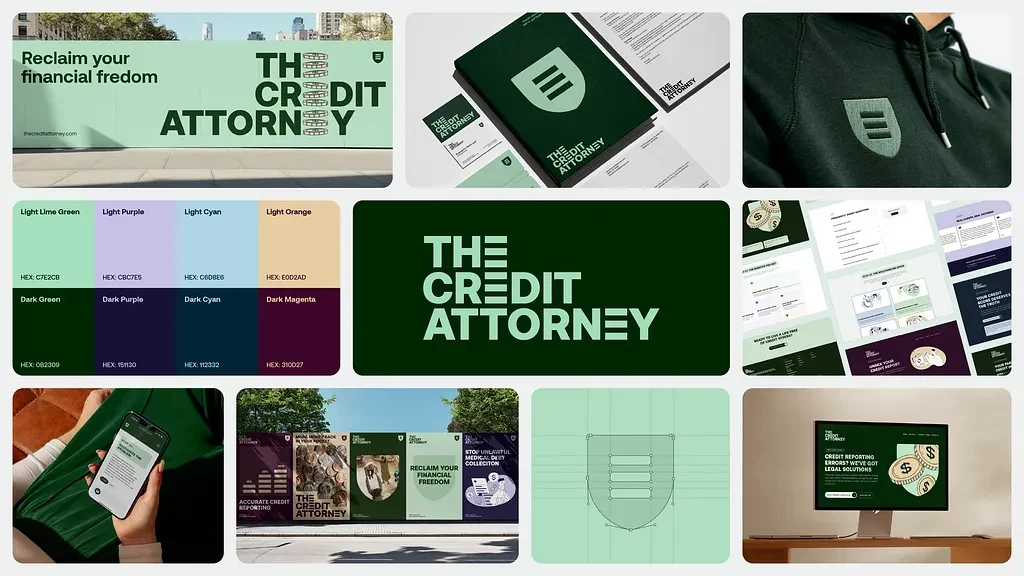
The Credit Attorney
The Credit Attorney · Branding & Visual Identity
The Credit Attorney is a legal services firm fighting for consumer financial rights — credit reporting errors, unlawful debt collection, and predatory lending. The brand had to feel like a serious legal practice while remaining clearly on the consumer's side.
Color Palette
The system runs a dual register: a light palette (Lime Green
#C7E2CB, Purple #CBC7E5, Cyan #C0DBE6, Orange #E0D2AD) paired with deep dark counterparts (Dark Green #082309, Dark Purple #151130, Dark Cyan #112332, Dark Magenta #310D27). The primary brand presence is deep forest green — authoritative, stable, and far removed from typical legal navy.Logo & Mark
The typographic logo stacks "THE CREDIT ATTORNEY" in a bold, all-caps extended sans-serif with a custom horizontal-break letter treatment that makes it unmistakably designed. The shield icon — a clean rounded shield with three horizontal bars — abstracts legal protection into something modern and geometric. Construction grids confirm every detail is mathematically considered.
Brand Applications
Executions include wide-format OOH billboards, a full stationery suite (letterhead, business cards, envelopes), embroidered hoodie, transit campaign posters, mobile UI, and website. The tagline "Reclaim your financial freedom" threads through every format with consistency. The website headline — "Credit reporting errors? We've got legal solutions" — speaks directly to the client's frustration.
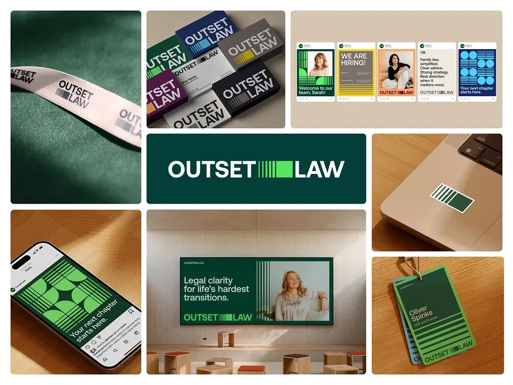
Outset Law
Outset Law · Branding
Outset Law is a Canadian family law firm founded by Oliver Spinks. The brand is built on the idea that legal help during life's hardest transitions — divorce, custody, separation — should feel human and empowering, not cold and transactional.
Color Palette
A multi-color system: Forest Green, Bright Lime Green, Purple, Yellow, Navy, and White. Rather than a single brand color, each shade reflects a different emotional dimension of the brand — growth, clarity, empathy, warmth. The colors rotate across applications without ever losing cohesion.
Logo & Mark
The wordmark pairs "OUTSET" and "LAW" with a distinctive visual device between them — vertical bars alongside a solid green square. The bars function as the brand's signature graphic element, appearing as a pattern across stickers, hang tags, and environmental graphics. Clean, bold, and immediately ownable.
Brand Applications
The business card suite is one of the strongest executions — each card in a different brand color, all sharing the same typographic system. Additional touchpoints include a fabric wristband, Instagram social templates, laptop sticker, conference name badges, and a large-format OOH billboard reading "Legal clarity for life's hardest transitions." Every application reinforces the same core message: a fresh start is possible, and this firm will help you get there.
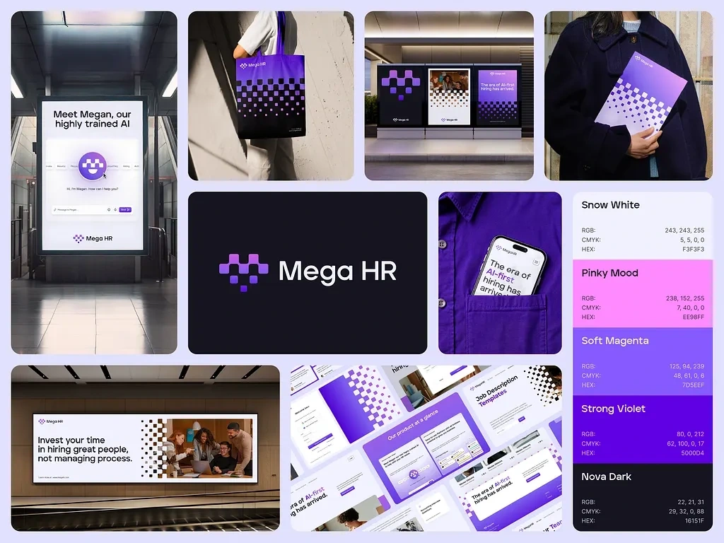
Mega HR
Mega HR · Visual Identity
Mega HR is an AI-first HR and recruitment platform centered on Megan — the platform's intelligent AI assistant. The brand had to feel smart and tech-forward without losing the approachability that HR professionals actually need day-to-day.
Color Palette
Five colors build a gradient-native system: Snow White (
#F3F3F3), Pinky Mood (#EE98FF), Soft Magenta (#7D5EEF), Strong Violet (#5000D4), and Nova Dark (#16151F). The gradient flow from pink through violet is the brand's signature — it appears in the mark, across print materials, and as a textural pattern throughout every touchpoint.Logo & Mark
The icon is a pixelated cross/plus shape built from scaled dots in the brand gradient. The structure references data and AI processing while the plus form communicates growth and positive impact. The dot pattern extracts from the mark and becomes a brand texture — used as a full-bleed fill on the tote bag, billboard margins, and digital backgrounds.
Brand Applications
Executions include metro station advertising (featuring Megan's chat UI directly on the billboard), a gradient dot-print tote bag, outdoor double-sided billboards, branded apparel, product UI screenshots, and a phone-in-pocket lifestyle shot. The campaign taglines — "The era of AI-first hiring has arrived" and "Invest your time in hiring great people, not managing process" — position the platform as the clear answer to an industry-wide problem.
Like this project
Posted May 13, 2026
Full visual identity for a fintech platforms helping users find and recover unclaimed assets. Logo, color system, web, apparel & packaging.