Skincare & Healthcare Landing Page Design for Nuvé
Atiya Zehra
Nuvé — AI Skincare & Healthcare Landing Page Design
UI/UX · Healthcare Web Design · AI Product · Landing Page · SaaS
Project Overview 🚀
Skincare has always been personal. But for most people, finding the right routine has meant guesswork — buying products based on marketing promises, following generic advice, and hoping for the best. Nuvé is built to end that guesswork. It's an AI-powered skincare platform that scans your face, analyzes your skin across dozens of conditions, and builds a personalized routine backed by real dermatological science.
The landing page needed to do something genuinely difficult: take a concept that sounds technical — AI facial scanning, skin condition analysis, personalized routines — and make it feel warm, approachable, and deeply human. Healthcare and beauty design often fail each other. Healthcare is cold and clinical; beauty is soft but shallow. Nuvé sits between them, and this landing page design is built to hold that space with confidence.
The primary conversion goals are twofold: drive App Store downloads and get visitors to initiate an AI skin analysis. Everything on the page — every layout decision, every copy line, every visual choice — is oriented around making those two actions feel like the obvious, natural next step.
Visual Direction & Aesthetic 🎨
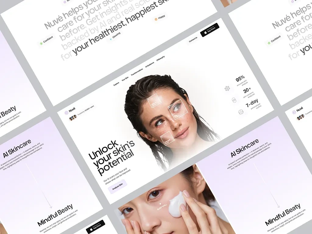
The design palette is one of the most considered aspects of this project. It uses a predominantly white and off-white base — clean, clinical without being cold — broken by soft lavender and lilac purple accents. This purple isn't decorative. It carries specific psychological weight: calm, intelligence, trust, and a gentle femininity that doesn't alienate. In a market where skincare brands often default to aggressive pinks or sterile medical whites, this palette finds a third space that feels simultaneously sophisticated and approachable.
Photography is central to the visual system. The hero image — a close-up of a woman's face, natural skin texture visible, AI scan overlay markers sitting on her cheekbone, forehead, and jawline — is the single most important visual on the page. It communicates the product's core functionality in one image. The scan markers (small labeled squares: Cheek Tone, Texture, and additional analysis points) overlay the photography in a UI-integrated way that blurs the line between product interface and editorial image. The viewer understands immediately: the AI looks at your face this way.
Throughout the page, photography maintains this naturalistic, skin-first approach. No heavy retouching, no artificial perfection. A second large image shows a woman applying moisturizer — soft, intimate, routine. These images tell the visitor: Nuvé is for real skin, real people, real routines.
Floating micro-labels — "Confident," "Glowing," "Happy" — appear as small pill-shaped elements drifting near the hero photography. These are emotional outcome markers. They don't describe the product's features; they describe how the user will feel after using it. It's a subtle but powerful copy device that shifts the brand conversation from functional to emotional at exactly the right moment.
Page Structure & UX Flow 💻
Hero Section
The page opens with authority and warmth simultaneously. The headline — "Unlock your skin's potential" — is set in a large, confident serif-adjacent typeface with generous weight. Below it, a single explanatory line: "Our AI scans your face and shows what can be improved." No jargon, no overexplaining. The product is complex; the value proposition is simple.
Two conversion elements sit immediately in the hero: a primary "Analyze skin" CTA button and an App Store download badge. The dual CTA structure is intentional — it captures both the user who wants to start on web and the user who immediately wants the mobile experience. Neither path is prioritized over the other; both are equally accessible.
Trust is established inside the hero with a single social proof element: "Trusted by 10,000+ users" with user avatar thumbnails alongside it. Small, unobtrusive, but enormously effective. A visitor who might hesitate sees that 10,000 real people have already done exactly what they're being asked to do.
Statistics Bar
Immediately following the hero, three performance statistics are displayed in a clean vertical stack on the right side of the composition:
95% — accurate skin analysis
30+ — skin conditions analyzed
7-day — personalized routine
These numbers are displayed at a scale that lets them function as both data and design. They anchor the product's credibility in measurable outcomes. A visitor wondering whether the AI is actually reliable sees 95% accuracy and 30+ conditions analyzed — the kind of specificity that generic marketing claims can't match.
Full-Width Headline Section
A wider viewport section carries the brand's full value proposition in flowing editorial type: "Nuvé helps you care for your skin like never before. Get insights and real science backed by AI for your healthiest, happiest skin." The scale is generous, the line breaks are designed — this isn't body copy, it's typographic architecture. The words "healthiest, happiest skin" are set in a heavier, more expressive style, creating emphasis that pulls the emotional promise forward.
AI Skincare Feature Section
A dedicated section introduces the product's AI intelligence layer with honesty and precision. The headline — "AI Skincare" — is followed by copy that positions the technology correctly: "AI doesn't promise perfection — it observes, learns, and adapts. Every scan interprets the natural passage of your skin's time, highlighting areas for thoughtful care and gentle personalization."
This copy choice is strategically important. It doesn't oversell the AI. It frames it as a thoughtful tool rather than a miracle solution — which is precisely the framing that builds long-term user trust. It also introduces language around "natural passage of time" and "gentle personalization" that resonates with a health-conscious, mindful audience.
Mindful Beauty Section
A lower section introduces the "Mindful Beauty" philosophy that underpins the brand: "Meaning, we can't stop aging, but we can guide it with awareness, insight, and gentle personalization." This is the brand's emotional core made explicit. It acknowledges reality — aging is real, perfect skin isn't the goal — and reframes the product's purpose around guidance, awareness, and self-knowledge rather than transformation or correction.
This section matters deeply for conversion because it addresses the hidden objection that sits beneath many skincare purchase decisions: will this just make me feel worse about how I look? Nuvé answers that objection directly, and the design gives it enough space and visual weight to land properly.
Navigation System
The navigation — Explore, Your Skin, Transformations, AI Guidance, Philosophy — maps the user journey across the platform's key content areas. Each menu item is a commitment: "Your Skin" promises personalization, "Transformations" promises results, "AI Guidance" promises intelligence, "Philosophy" promises values alignment. The navigation doesn't just help users find content; it communicates what the brand believes in.
Typography System ✍️
The type system operates across two distinct registers. Display headlines use a warm, confident typeface with character — enough personality to feel premium, enough legibility to feel accessible. The weight variations within the display system (regular for supporting text, bold for key phrases) create natural reading hierarchy without requiring constant size changes.
Body copy and UI labels use a clean geometric sans-serif at comfortable reading sizes. The contrast between the expressive display type and the neutral utility type creates a page that feels both designed and functional — a balance that's genuinely difficult to achieve in healthcare digital products where readability requirements often flatten personality.
The floating sentiment labels ("Confident," "Glowing," "Happy") use the pill/tag format in the brand's lavender palette — small, rounded-corner containers that feel native to the app's UI system. Using these same visual elements on the marketing page creates visual consistency between the website and the product experience.
Mockup Presentation 📱
The project is presented in a dynamic angled-grid mockup layout — multiple page frames arranged in a rotated, overlapping composition that shows the full design system without a conventional single-scroll presentation. This presentation choice communicates the breadth of the design work: the repeating frames and staggered angles show layout consistency, typographic hierarchy, and visual system coherence across all viewport states simultaneously.
The lavender background behind the mockup frames is pulled directly from the brand palette — even the presentation environment is on-brand. The mockup orientation (slight clockwise rotation across the grid) creates visual energy and a sense of movement, which suits a product built around dynamic, ongoing skin analysis rather than a static one-time assessment.
Conversion Strategy 📈
Nuvé's page conversion strategy is built on progressive trust building. The page doesn't ask for anything immediately — it earns the ask through a carefully sequenced experience:
First, it shows the product in action (AI scan on the hero image). Then it proves the product works (95% accuracy, 30+ conditions, 10,000+ users). Then it articulates what the product does in simple language. Then it builds philosophical alignment (mindful beauty, gentle personalization). By the time the visitor reaches the App Store CTA at the bottom of the page, they've been through a complete emotional and rational journey. The download feels less like a conversion event and more like a natural conclusion.
The dual CTA structure — both "Analyze skin" and App Store download buttons appearing in the hero and recurring through the page — ensures that the conversion path is always visible without ever feeling aggressive. The product sells itself; the page just clears the way.
Healthcare Design Considerations 🏥
Designing for health-adjacent products carries responsibilities that purely commercial design doesn't. Users interacting with a skincare AI are sharing data about their physical appearance — an act that requires genuine trust. The design responds to this through visual choices that consistently prioritize calm over urgency: the lavender palette reduces anxiety, the honest photography normalizes real skin, the copy rejects perfection language in favor of care language, and the social proof (community, not celebrity) signals peer validation rather than aspirational pressure.
The result is a healthcare landing page that respects its user — and in a market where most skincare advertising does the opposite, that respect is itself a conversion strategy.
Nuvé — AI Skincare Platform · Healthcare Web Design · Landing Page UI/UX
Mobile App · AI Product · Beauty Technology · Conversion Design
Like this project
Posted May 13, 2026
AI-powered skincare design, clean healthcare UI, facial scan hero, personalized routine flow & App Store conversion. Clean UI and conversion-focused page design