Landing Page Designs | Figma UI/UX
Atiya Zehra
Bike Community Landing Page
Statement. · Bike Community Landing Page 🚴
Project Overview
Statement. is a premium cycling community platform founded in 1997 — built for serious riders who want more than just a place to track miles. The platform brings together route design, gear curation, training resources, and a global community of cyclists under one roof. The landing page needed to communicate all of that while doing one specific job above everything else: making a visitor feel like they're already part of something worth joining.
This is a membership and community conversion page. Every section, every visual decision, every line of copy works toward a single outcome — getting a rider to stop scrolling and commit to joining.
Visual Direction & Aesthetic
The design language is dark, editorial, and high-contrast. A near-black background dominates the entire page — not a default dark mode choice, but a deliberate creative decision that mirrors the experience of pushing through a ride before dawn or after dusk. The limited color palette (off-white type, warm photography, selective green accents) gives the design room to breathe while keeping the atmosphere intense and focused.
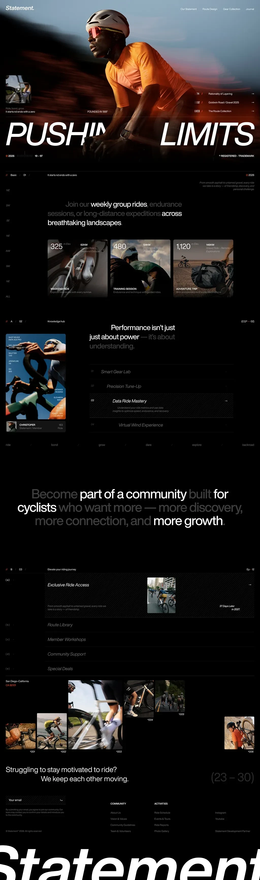
The hero section is the most powerful visual statement on the page. A full-bleed action photograph of a cyclist in motion — orange jersey, aerodynamic posture, camera blur suggesting raw speed — is overlaid with a massive display headline: "PUSHING LIMITS." The type is set at an extreme scale with tight tracking, cropped deliberately at the viewport edges to create tension. It doesn't just describe the brand's ethos; it performs it. The headline isn't decorative — it's architectural. The page is built around it.
Throughout the design, numbered indicators, small utility labels, technical coordinates, and catalog-style metadata (founding year, registration marks, route codes) are scattered with precision across sections. These micro-details reward the kind of person this brand is built for: someone who notices the details, who cares about specs, who approaches riding like a discipline.
Page Structure & UX Flow
Hero Section
The page opens with maximum impact — full-height hero, cinematic photography, and the oversized headline landing the brand identity in under two seconds. Supporting text ("Ride bold, grow. It starts not ends with a zero") sits below the fold line, visible enough to intrigue without competing for the hero's visual dominance. The navigation — Our Statement, Route Design, Gear Collection, Journal — is minimal and horizontally arranged, staying out of the hero's way.
Social Proof & Community Scale
Three stat cards immediately follow the hero, each representing a ride category: Weekend Ride (325 riders, 52KM), Training Session (480 riders, 54KM), Adventure Trip (1,120 riders, 140KM). The card design is editorial — dark-toned photography, bold numeric display, and brief descriptive copy. These numbers aren't vanity metrics. They're proof of community density. A visitor who's been riding solo in their city sees 1,120 people on an adventure trip and feels something they can't ignore.
Knowledge Hub Section
A mid-page editorial section positions Statement. not just as a rides platform but as a performance intelligence resource. Four features are listed: Smart Gear Lab, Precision Tune-Up, Data Ride Mastery, Virtual Wind Experience. The layout uses a split-column approach — imagery on the left, feature list on the right — with a headline that reframes the value proposition: "Performance isn't just just about power — it's about understanding." This is a critical conversion point. It elevates the platform above a simple social club and positions it as a legitimate training tool.
Community Value Proposition
The emotional peak of the page arrives here. A full-width typographic statement: "Become part of a community built for cyclists who want more — more discovery, more connection, and more growth." No image. No decoration. Just the words at scale. It's a deliberate pause in the visual rhythm — stripping everything back to the single most important message the brand needs to land.
Membership Benefits Section
Following the emotional beat comes the rational argument. An accordion-style or list-format benefits section outlines: Exclusive Ride Access, Route Library, Member Workshops, Community Support, Special Deals. Clean, scannable, and direct. Each benefit is a line item — no fluff, no padding. A rider making a membership decision can assess the value in under 30 seconds.
Community Photography Grid
A mosaic of real cycling photography — group rides, individual shots, various terrain and conditions — runs horizontally across the page, anchored by a San Diego, California location marker. This section does the work that testimonials and reviews often fail to do: it shows the actual people inside the community. Diversity of riders, geography, and experience level — all communicating that the community is real, active, and welcoming.
Closing CTA
The page closes with a line that might be the most honest conversion copy on the entire page: "Struggling to stay motivated to ride? We keep each other moving." Placed just before the email capture and footer, this addresses the real objection that sits beneath every potential member's hesitation. It's not a feature. It's an emotional hook, and it's perfectly timed. The massive footer wordmark — "Statement" set at display scale across the full page width — closes the page with brand confidence.
Typography System
The typographic hierarchy is aggressive and deliberate. Display headlines use an extended heavy sans-serif at extreme sizes — the kind of type that feels physical, like it has weight. Section headers shift to a more controlled editorial weight. Body copy sits light and airy, creating breathing room between the denser visual sections. The mix of type scales creates natural page rhythm — moments of intensity followed by moments of clarity.
Conversion Strategy
This page understands its audience deeply. A cyclist committed enough to consider a membership platform is already motivated. The page's job isn't to convince them cycling matters — they know. Its job is to convince them that this community is where they belong. Every section answers a different version of that question: the hero says it's serious, the stats say it's active, the knowledge hub says it's intelligent, the community copy says it's human, and the closing CTA says it understands what you actually need.
Looked Eyewear
Looked Eyewear · Landing Page Exploration 👓
Project Overview
Looked is a performance eyewear brand built at the intersection of athletic precision and everyday wearability. The product line — centered on the IR-14/5 Performance Frame and the SD-21 series — is engineered for clarity, motion, and all-day comfort. The landing page exploration is a bold, conversion-focused design that targets active consumers, performance-oriented buyers, and eyewear enthusiasts who make purchasing decisions based on technical credibility as much as aesthetic appeal.
This is a direct-to-consumer e-commerce landing page with a secondary layer of brand storytelling. The conversion goal is product purchase, but the strategy is brand belief — making the visitor feel that Looked isn't just selling eyewear, it's selling a different way of seeing.
Visual Direction & Aesthetic
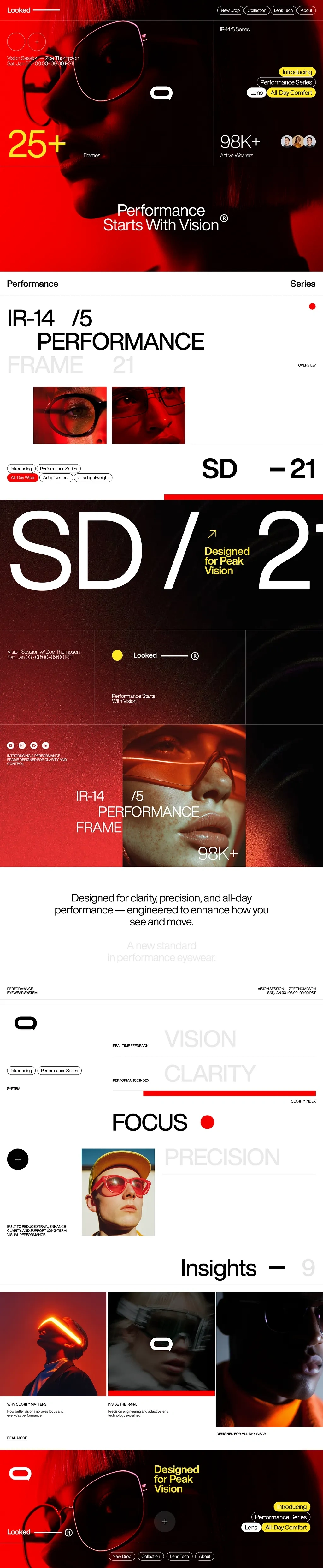
The design is built on a three-color system so strict it becomes the identity itself: deep black, performance red, and clean white. The red isn't used decoratively — it's used functionally. It marks emphasis, signals interactivity, indicates active states, and creates visual urgency throughout the scroll. Red dot accents, red typographic highlights, red product lighting in photography — every red element on the page earns its placement.
The photography direction is cinematic and high-contrast. Models are shot under dramatic lighting conditions — deep shadow and intense highlight — that make the eyewear frames glow against dark skin and golden tones. This isn't catalog photography. It's editorial photography pressed into service for e-commerce, and it elevates the entire page's perceived value.
Large-scale typographic elements — "SD / 21," "VISION CLARITY," "FOCUS," "PRECISION" — are used as structural design elements, not just copy. They divide sections, create visual depth, and communicate the product's technical positioning without needing a single bullet point.
Page Structure & UX Flow
Hero Section
The page opens with a split composition: a close-up portrait shot, bold red-lit photography, and the hero headline "Performance Starts With Vision" delivered in confident, high-contrast type. Two social proof anchors sit in the hero: 25+ Frames and 98K+ Active Wearers — both positioned as credibility signals within the first viewport. A product series callout (IR-14/5 Series) with feature tags (All Day Comfort) sets the technical context immediately.
Product Introduction Block
The first product section introduces the IR-14/5 Performance Frame 21 with a clean typographic hierarchy that feels closer to a high-end magazine spread than an online store. The model number, series designation, and performance descriptors (Introducing, Performance Series, All Day Wear, Adaptive Lens, Ultra Lightweight) are arranged with editorial precision. Two close-up product photography frames sit below — cropped tightly to highlight frame detail, lens curvature, and fit.
SD-21 Feature Section
A full-bleed dark section introduces the SD-21 line with a statement: "SD / 21 — Designed for Peak Vision." The typographic scale here is dramatic — "SD / 21" runs at a near-display size with a diagonal orientation that creates energy and momentum. The supporting copy is tight and technical: the frame is positioned as a precision instrument, not a fashion accessory.
Brand Positioning Section
A clean white section cuts against the darkness: "Designed for clarity, precision, and all-day performance — engineered to enhance how you see and move." Below it, in oversized ghost type, the words VISION, CLARITY, FOCUS, and PRECISION are stacked vertically — fading in and out of the background as structural type. This section does critical conversion work: it articulates the product's benefit in the language the target audience uses to describe their own performance goals.
Performance Metrics Section
Real-time Feedback, Performance Index, and Clarity Index are introduced as product system features — treating the eyewear as a performance platform rather than a passive accessory. This framing is smart for a performance-conscious buyer who evaluates products against functional criteria.
Insights Section
Three editorial photography panels run horizontally, each carrying a short content label: "Why Clarity Matters," "Inside the IR-14/5," "Designed for All Day Wear." These function as both content and visual texture — breaking the high-intensity product sections with a more editorial, magazine-style moment that reinforces the brand's authority in the performance eyewear space.
Closing CTA
The page closes with the brand's core positioning statement returned in full: "Designed for Peak Vision" — accompanied by the Performance Series and All Day Comfort product tags in pill format. Clean, confident, and conversion-ready.
Conversion Strategy
Looked's landing page is a masterclass in using visual intensity to communicate product intensity. The red-black-white palette creates urgency without resorting to discount banners or countdown timers. The social proof (98K+ active wearers) sits high in the page, establishing market validation early. The technical product language throughout — frame designations, performance indices, adaptive lens technology — speaks directly to a buyer who wants to feel like they're making an informed, intelligent purchase. The editorial photography gives them permission to also feel like they're buying something beautiful.
Nulense · Futuristic Eyewear Landing Page
Nulense · Futuristic Eyewear Landing Page 🔭
Project Overview
Nulense is not simply an eyewear brand. It's a vision-tech experience — a conceptual product brand that sits at the intersection of adaptive optics, human perception, and design philosophy. The 34° Nulense Series is its flagship collection, and the landing page for its Vision Launch is as much an exhibition as it is a product page. The primary audience includes design-forward consumers, technology enthusiasts, luxury fashion buyers, and retail buyers attending the brand's hybrid launch experience.
This page is less a conventional e-commerce landing page and more a digital brand installation. The conversion goals are multi-layered: drive registrations for the Vision Launch event, generate product interest for the 34° collection, and establish Nulense as a legitimate player at the high-end intersection of eyewear and wearable technology.
Visual Direction & Aesthetic
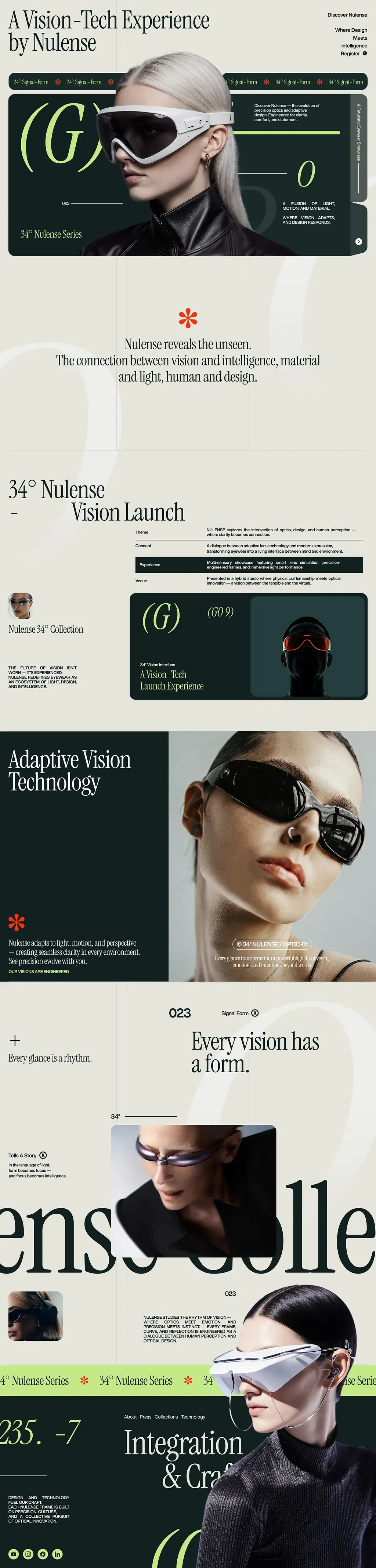
The design lives in a palette that feels entirely its own: warm cream and muted beige backgrounds, deep forest green as the structural dark, red asterisk marks as recurring accent symbols, and ghost-white display typography at extreme scale. It's a palette that signals luxury without signaling familiarity — it doesn't look like any other eyewear brand, which is precisely the point.
The photography direction features models wearing radical, architectural eyewear forms — visors, wraparound frames, futuristic shields — shot in ways that make the products feel less like accessories and more like interfaces. The models are styled severely, the lighting is precise, and the cropping is unexpected. Everything tells the visitor: this is not ordinary eyewear.
Large ghost typography — words like "lens," "colle" (collection), and numeric identifiers like "235. -7" — bleeds off the viewport edges, creating depth and layering that makes the page feel three-dimensional. This isn't a flat web page; it's a spatial design experience.
Page Structure & UX Flow
Hero Section
The page opens with the brand statement front and center: "A Vision-Tech Experience by Nulense." The hero marries an extreme close-up of a model in the 34° visor against a structured layout of navigation labels, product series identifiers, and the brand's poetic positioning copy: "A fusion of light, motion, and material. Where vision adapts and design responds." The ticker-style label bar — "34° Signal-Form" repeating horizontally — creates a scrolling text element that signals digital-native, fashion-forward brand awareness.
Brand Philosophy Section
Separated from the hero by generous white space, the manifesto lands in clean, centered type: "Nulense reveals the unseen. The connection between vision and intelligence, material and light, human and design." No image accompanies this. The white space around it is intentional — it demands the visitor read it without distraction. This is where the brand's conceptual identity is established.
34° Vision Launch — Event / Product Section
A structured table-style layout presents the Vision Launch across four dimensions: Theme, Concept, Experience, and Venue. Each entry is written with the precision of an exhibition brief:
Theme: Where clarity becomes connection
Concept: Adaptive lens technology meets modern expression — eyewear as a living interface between mind and environment
Experience: Smart lens simulation, precision-engineered forms, immersive light performance
Venue: A hybrid studio where physical craftsmanship meets optical innovation
This section functions simultaneously as a product description, an event invitation, and a brand positioning statement. It respects the intelligence of its audience enough to give them something to think about, not just something to buy.
Product Feature: Adaptive Vision Technology
The GO9 model — designated "(G)" in the brand's alphanumeric system — is introduced in a dark card format against the cream background. Below it, the Adaptive Vision Technology feature section deploys the brand's key functional claim: "Nulense adapts to light, motion, and perspective — creating seamless clarity in every environment. See precision evolve with you." The photography accompanying this section shows a model in profile wearing a sleek wraparound frame — the eyewear barely distinguishable from the face's contour at first glance.
Editorial Typography Sections
Sequential sections use oversized ghost type to deliver conceptual micro-copy: "Every glance is a rhythm." / "Every vision has a form." These aren't headlines in a conventional sense — they're statements that build a philosophical framework for the product. A buyer who connects with these lines isn't just buying eyewear; they're buying into a way of thinking about vision, design, and experience.
Collection Scroll Section
The words "lens" and "colle" (collection) run at extreme display scale across the full page width, partially cropped, partially off-screen. A horizontal scroll of product photography carries product variants and collection items. This section is primarily a brand texture moment — reinforcing the editorial, gallery-like quality of the page experience.
Integration & Craft Section
Near the footer, a content section frames the Nulense design process around the intersection of technology and craft: "Design and technology fuel our craft — from a Nulense frame is built from an exploration of light, materials, and a collective pursuit of optical innovation." The technical credibility built earlier in the page is here grounded in the making process — ensuring the brand doesn't read as purely conceptual.
Registration CTA & Navigation
The page's conversion goal — registration for the Vision Launch — is held through the persistent right-side navigation element: "Discover Nulense / Where Design Meets Intelligence / Register ●." The registration CTA is never aggressive, never forced. It sits in the navigational structure as an ambient invitation throughout the scroll, converting visitors who have been warmed by the entire page experience rather than pushed at a single pressure point.
Conversion Strategy
Nulense takes a long-game conversion approach. The page doesn't push product above the fold — it builds a world first, then invites the visitor into it. This strategy works because the target audience for a product at this price point and concept level doesn't respond to urgency tactics. They respond to belonging: the feeling that this brand understands something they understand, sees something they see, and that owning the product is a natural extension of that alignment. Every design decision — the palette, the typography scale, the philosophical copy, the architectural photography — is in service of creating that feeling.
Like this project
Posted May 13, 2026
A collection of conversion-focused landing pages, cycling community, performance eyewear, vision-tech & real estate. UI/UX & Web Design Collection
Likes
2
Views
17