MESHKLOUD – Architect Dashboard UI
Atiya Zehra
MESHKLOUD — Architect Dashboard UI
A dual-mode project management interface designed for architecture firms, built to bring clarity and precision to complex floor plan workflows.
Role UI/UX Designer
Platform Web App (SaaS)
Tools Figma Industry Architecture & AEC
Overview
The brief
MESHKLOUD is a cloud-based platform built for architects and construction teams who manage large-scale floor plan projects. The client needed a full dashboard experience that could support both light and dark working environments, accommodate dense technical data, and still feel refined enough for professional presentation contexts.
Architects work long hours on screen. The interface had to be visually neutral enough to reduce fatigue, yet structured enough to surface the right project information at a glance.
Challenge
Designing for technical density
Architecture software traditionally favors function over form. CAD tools and project management dashboards in this space tend to be cluttered and intimidating for non-technical stakeholders, while being overly simplified for the professionals who rely on them daily.
The goal was to design something that felt as precise as the work it supported, without sacrificing usability for the people who had never opened a floor plan before.
Key challenges included organizing panel-heavy navigation without overwhelming the viewport, displaying technical metadata alongside spatial drawings, and creating a consistent design language across both light and dark modes.
Approach
A dual-mode system built around the drawing
I centered the entire layout around the floor plan canvas, treating it as the primary element that everything else supports. The left sidebar houses tool controls, keeping them accessible without competing with the drawing itself. The right panel surfaces project metadata, sheet information, and file details in a structured but readable format.
For the color system, I used a dark base with a single high-contrast accent for the dark mode variant, and a clean white background with precisely weighted typography for light mode. Both modes share the same layout logic, so switching between them requires zero relearning.
Navigation labels, tool icons, and data fields were all reviewed for hierarchy. Secondary information recedes visually while primary actions stay prominent, which is critical when someone is deep in a review session and needs to find things fast.
Outcome
A system that scales with the work
The final design delivered a cohesive dual-mode dashboard that architects could use across different working environments. Light mode supports client-facing reviews and daytime work, while dark mode reduces eye strain during extended evening or night sessions.
The layout system was built to be scalable, meaning new tool panels or data views can be added without disrupting the existing visual hierarchy.
3
Distinct panel zones with independent hierarchy
2
Complete mode variants designed, light and dark
1
Unified design language across all screen states
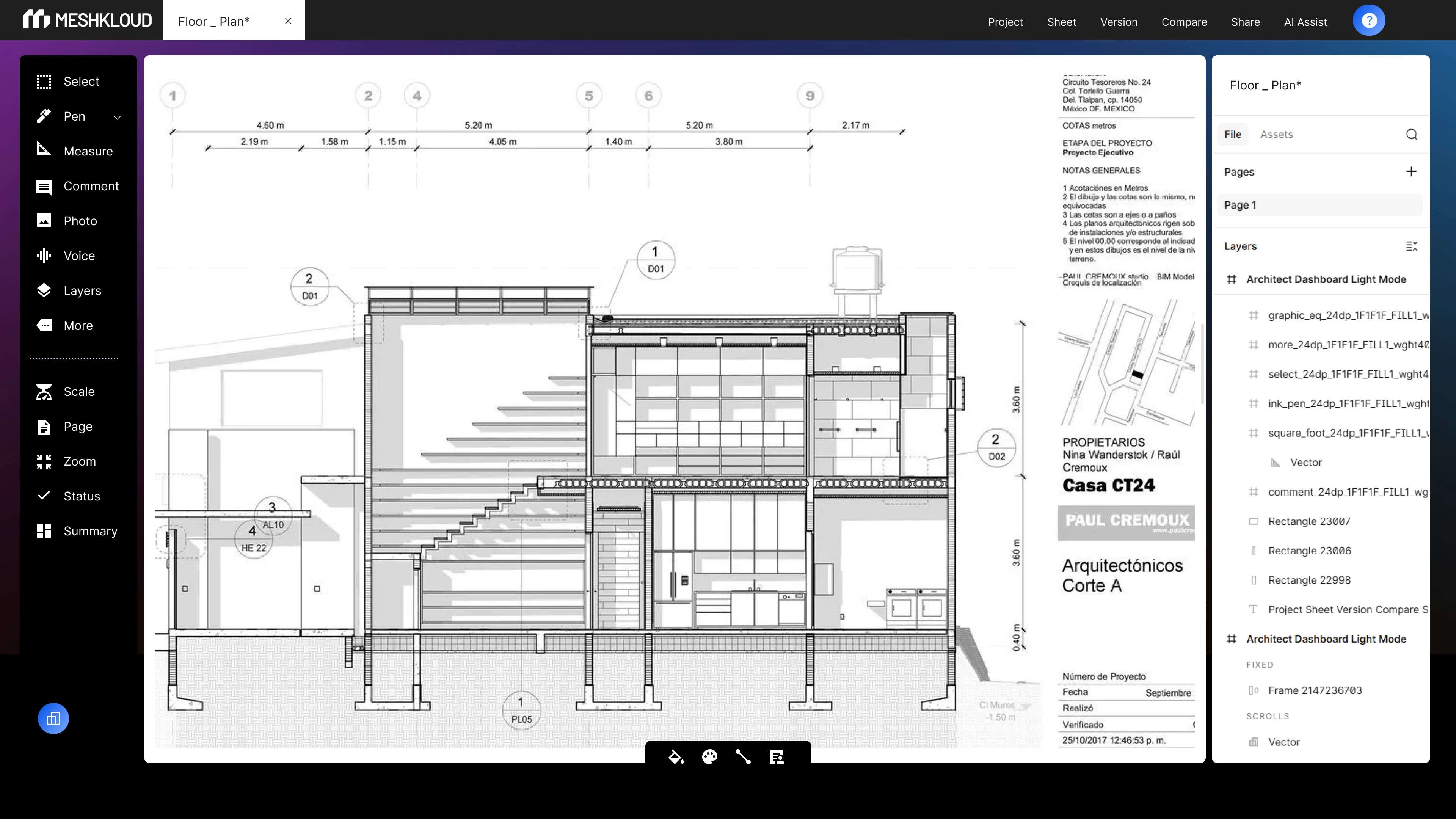
Dark Mode UI
Dark Mode Animated
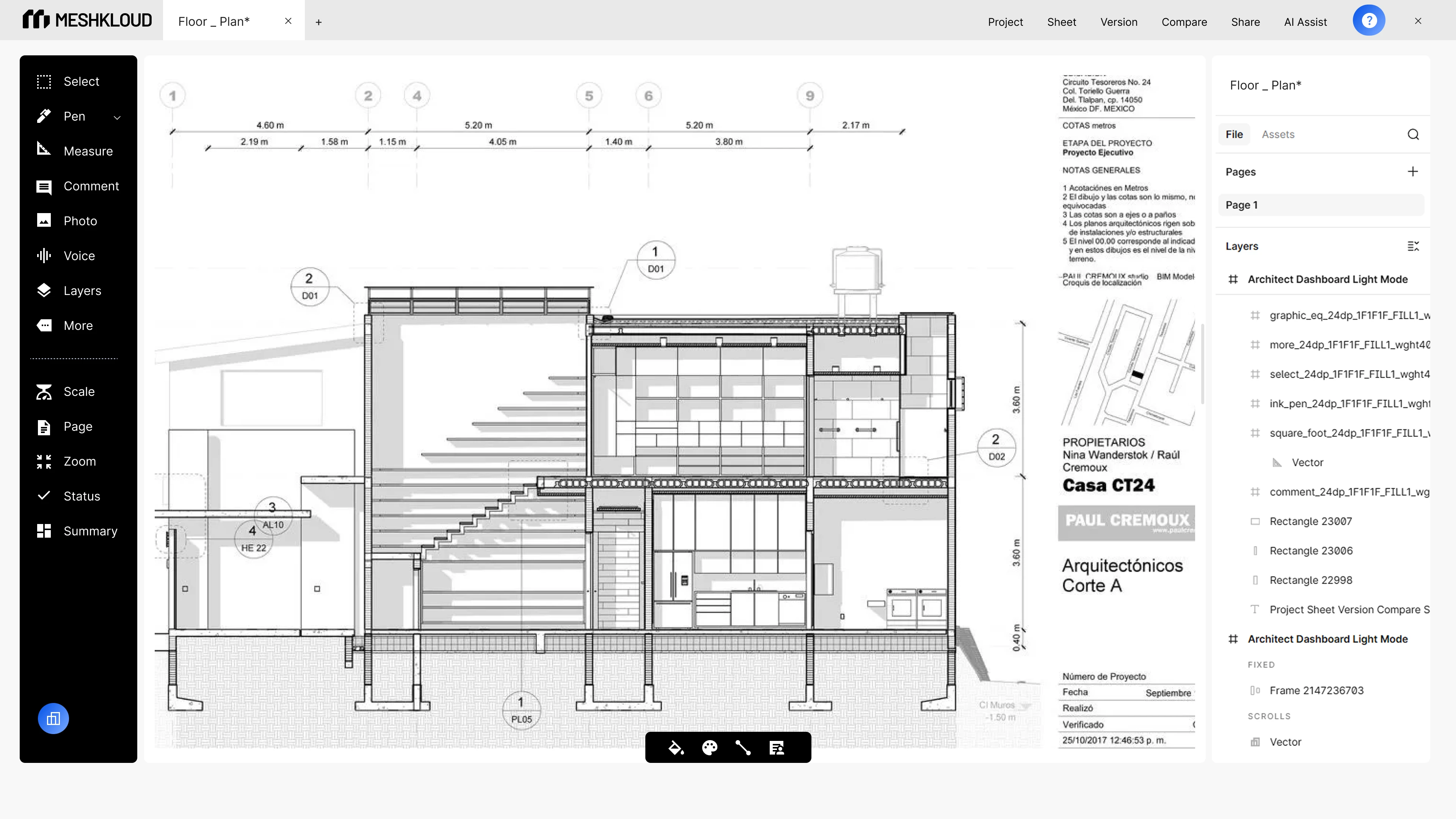
Light Mode UI
Light Mode Animated
Like this project
Posted Jun 1, 2026
Designed a dual-mode dashboard UI for an architecture SaaS platform, covering light and dark variants, tool panels, and project metadata layout in Figma.