Brand Identity Development for Captain's Essentials
Portfolio project

Verified paid workView completed work
About
Logo Mark & Monogram
Logo
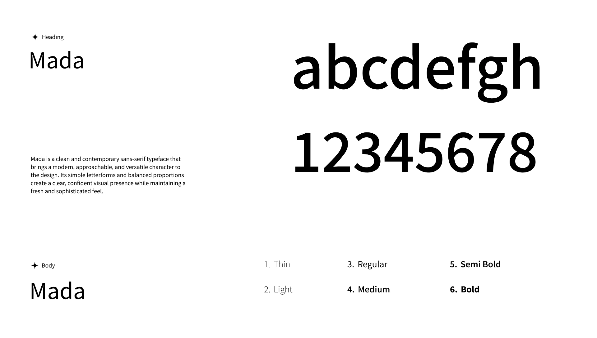
Typography
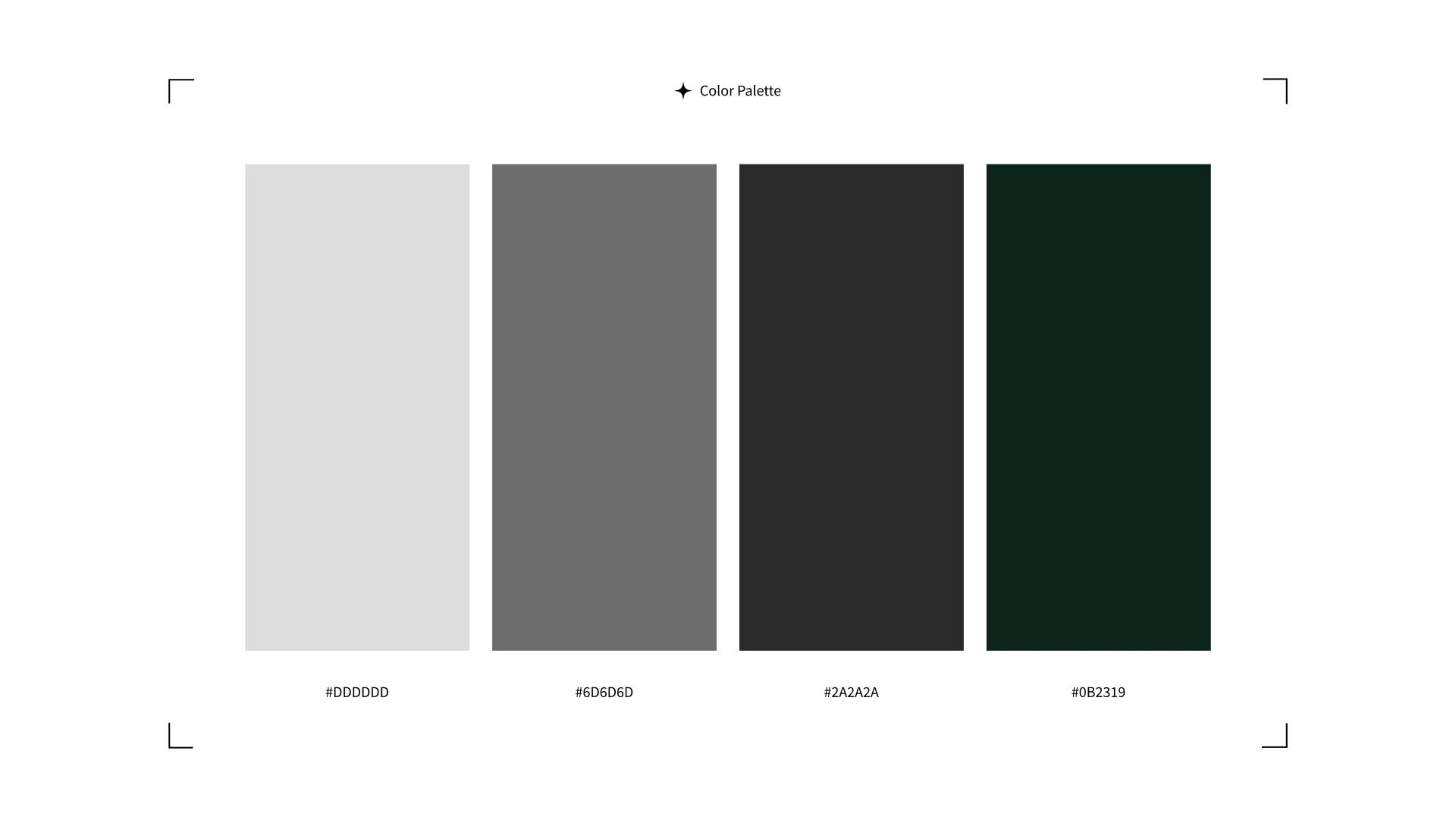
Color Platte
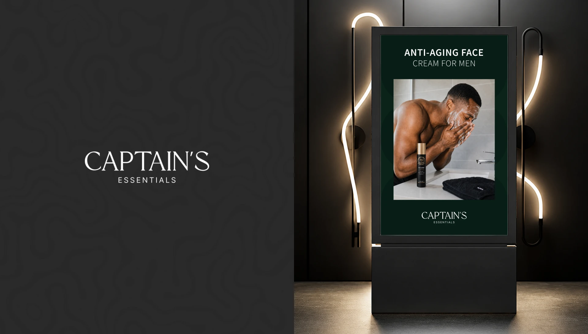
Standy
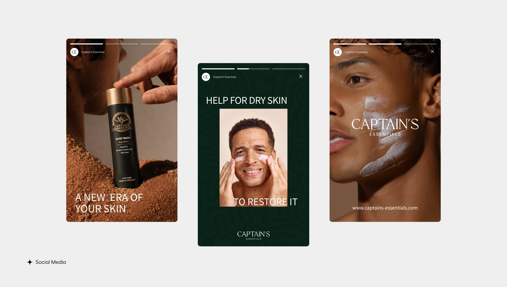
Social Media
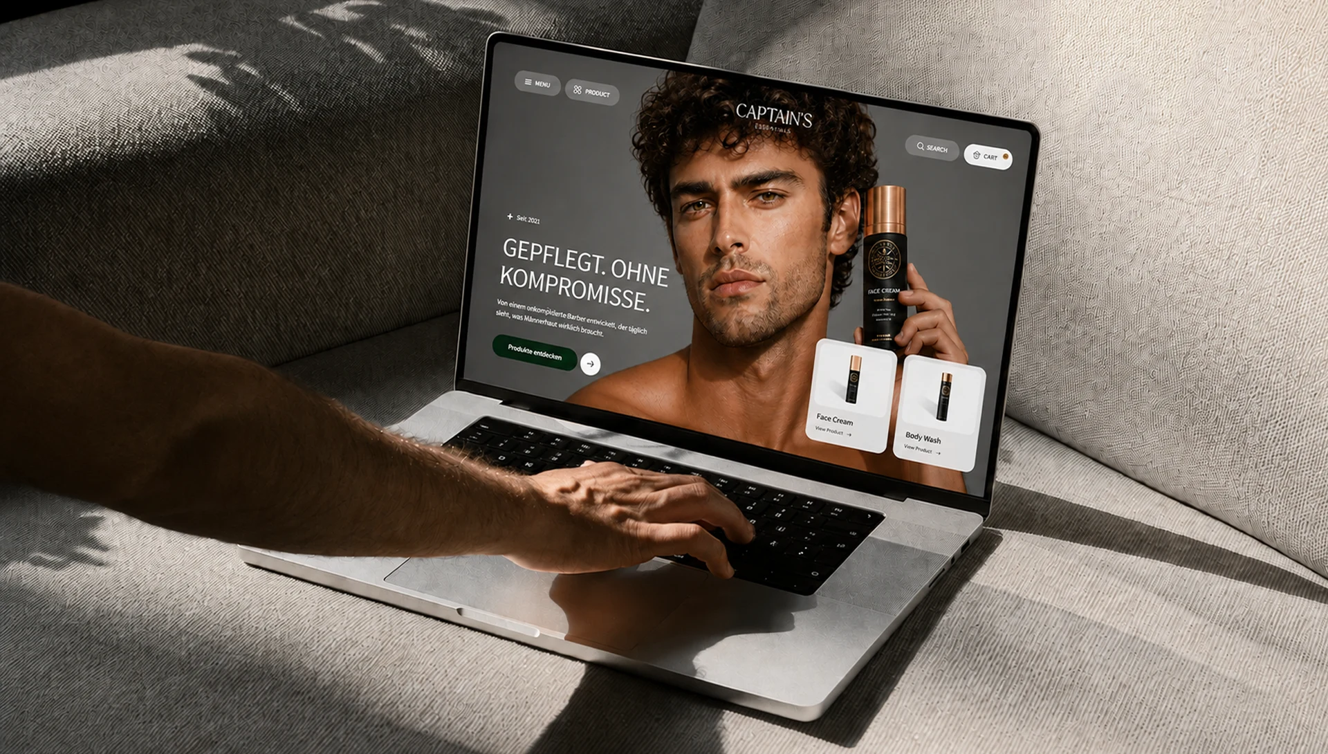
Website Mockup
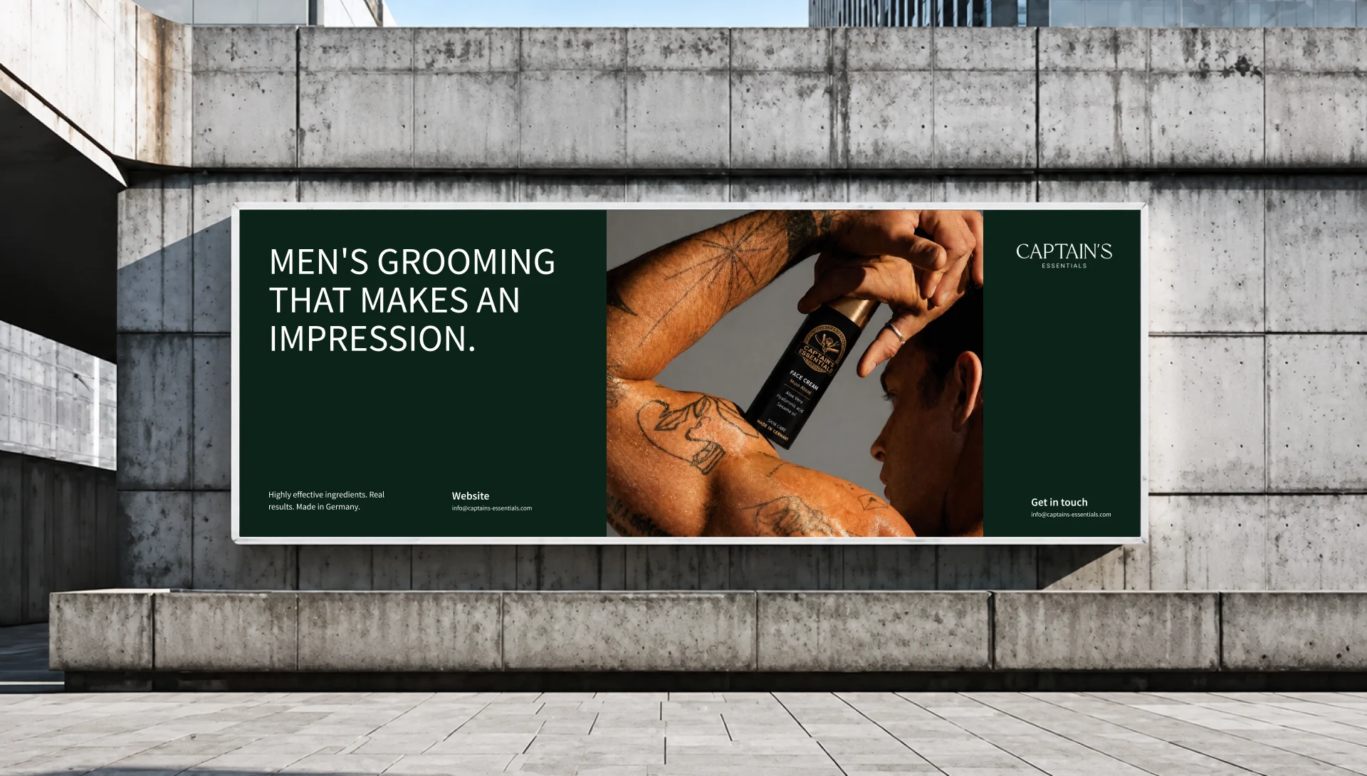
Marketing Banner
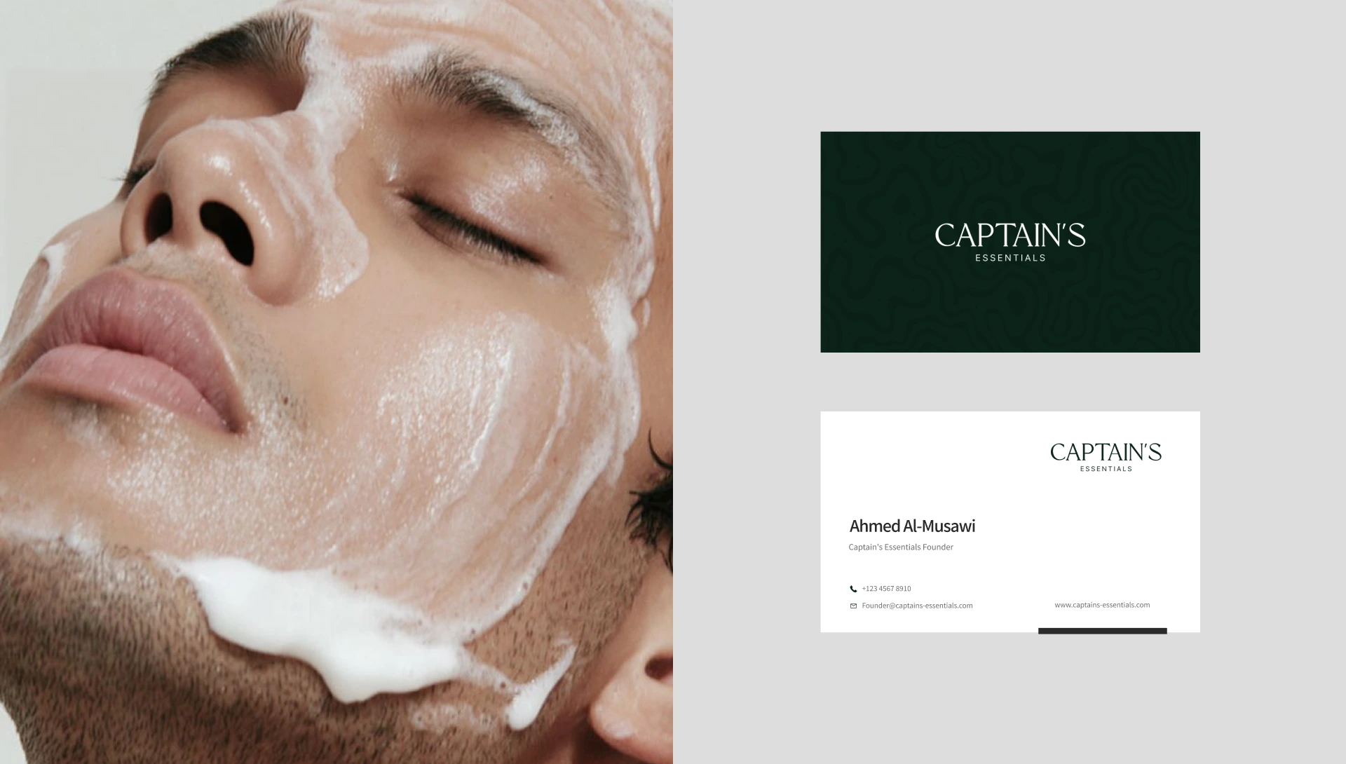
Business Card
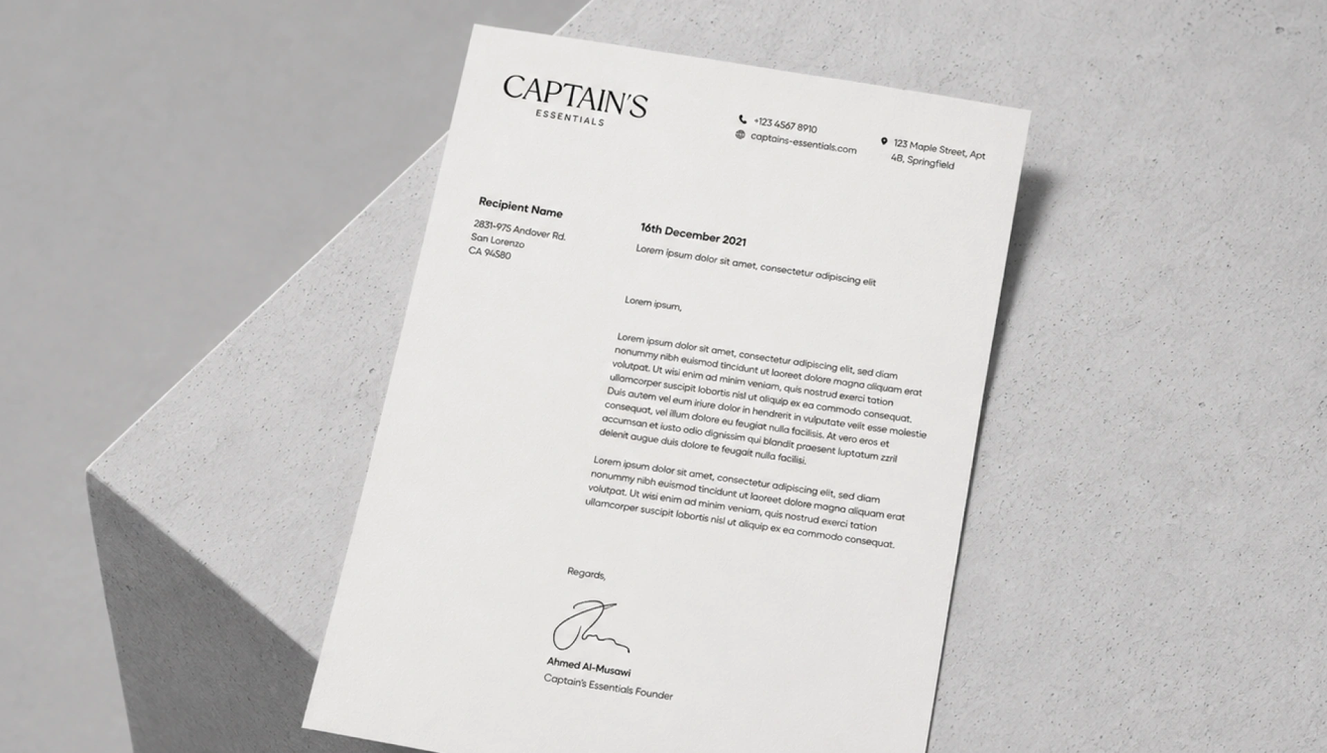
Letter head
Thank you
Captain’s Essentials — Full Brand Identity for a Premium Men’s Grooming Line
Client: Captain’s Essentials
Scope: Brand identity, visual guidelines, packaging direction, marketing collateral
Industry: Premium men’s grooming and skincare
The Challenge
Captain’s Essentials needed a brand identity that could justify a premium price point in a crowded grooming category, built on twenty years of real barbershop expertise and German manufacturing, but with no visual language to communicate that positioning yet. The identity had to work across everything from product packaging to billboards to social content, while staying distinct from the clinical, sterile look so common in men’s skincare.
The Approach
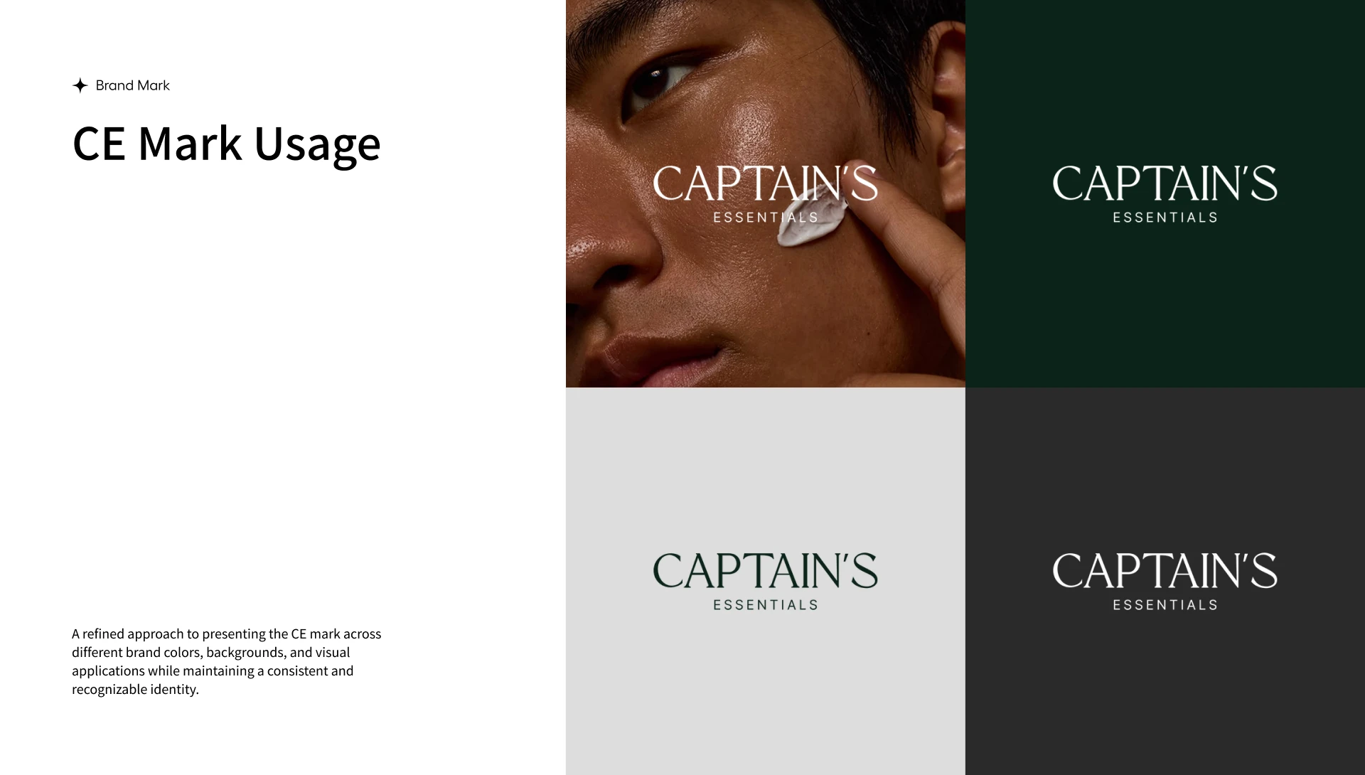
A refined, editorial wordmark. The Captain’s Essentials logotype uses a classic serif for “Captain’s” paired with a lighter, spaced out “Essentials,” giving the brand an established, confident feel rather than a trend driven startup look. The mark was tested across dark green, black, white, and photographic backgrounds to confirm it held up consistently everywhere it would appear.
A grounded, premium color palette. Rather than relying on the clichéd blacks and blues typical of men’s grooming, the palette centers on a deep forest green alongside charcoal, grey, and off white, giving the brand warmth and depth without losing its premium feel.
Typography built for clarity. Mada was selected as the brand’s primary typeface for its clean, confident letterforms, giving headlines and body copy a modern, approachable character across six weights.
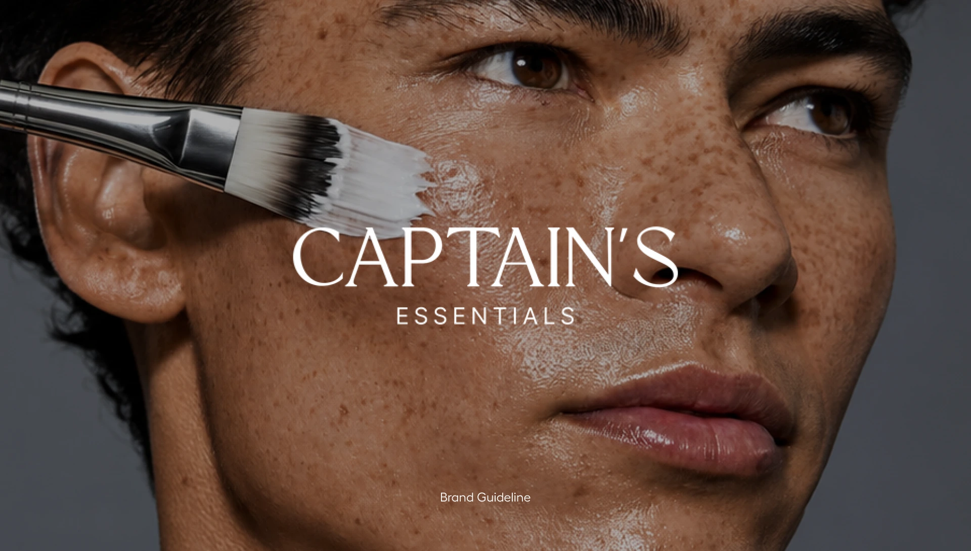
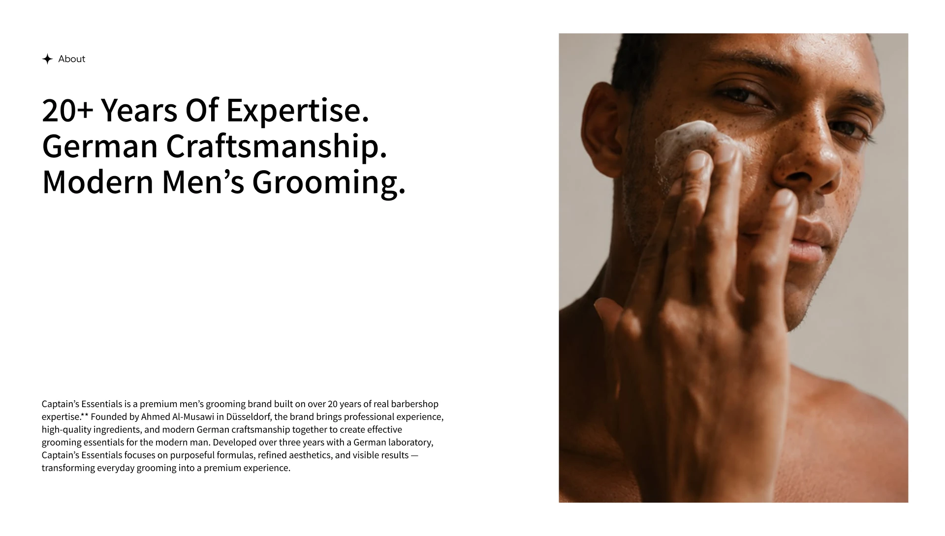
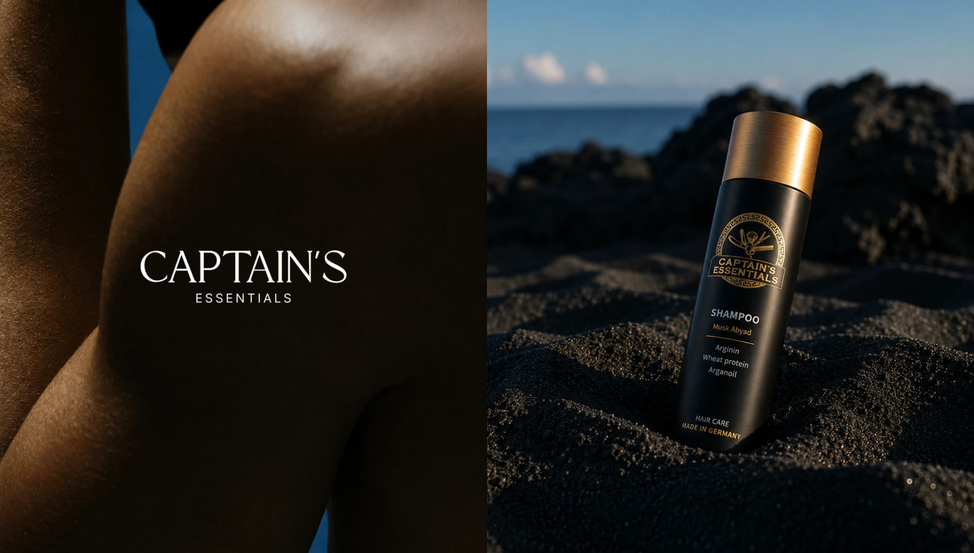
Photography driven storytelling. Close up, texture focused photography, skin, product, hands in motion, became the core visual asset across the brand, used consistently from the cover of the guideline deck through to billboards, social posts, and digital signage. This kept the brand feeling tactile and result focused rather than purely decorative.
Collateral built for real use. The identity was extended into practical business assets, letterhead, business cards, a billboard concept, out of home digital signage, and a website homepage mockup, so the brand could be tested in context rather than existing only as isolated logo marks.
A founder story to anchor the brand. The guideline includes the brand’s origin, founded by Ahmed Al Musawi in Düsseldorf and developed over three years with a German laboratory, giving the identity a credible narrative foundation rather than just a visual system.
The Result
Captain’s Essentials now has a complete, cohesive brand identity system covering logo usage, color, typography, photography direction, and real world applications, giving the client a premium, unified presence ready to launch across web, social, print, and out of home.
My Role
I led full brand identity development for the project, defining the logo, color palette, typography system, photography direction, and collateral design, and compiled everything into a comprehensive brand guideline.
1 like · 3 views · Oct 18, 2026
Developed brand identity for Captain's Essentials, a premium grooming line.


