DashClip Shopify Store Redesign

Atiya Zehra



Hero
DashClip - Shopify Store Design
A minimalist, premium wallet brand needed a storefront that felt as considered as its product.
The Brief
DashClip makes RFID protected, slim profile wallets for people who carry less but expect more from what they carry. The product itself is quiet and precise, machined edges, tight tolerances, no wasted material. The existing store did not reflect that. It read like a generic Shopify theme with product photos dropped in, and it was losing the story of why the wallets cost what they cost.
The goal was a full redesign that let the product's craftsmanship carry the page, built on Shopify so the client's team could keep managing inventory and orders without friction.
Approach
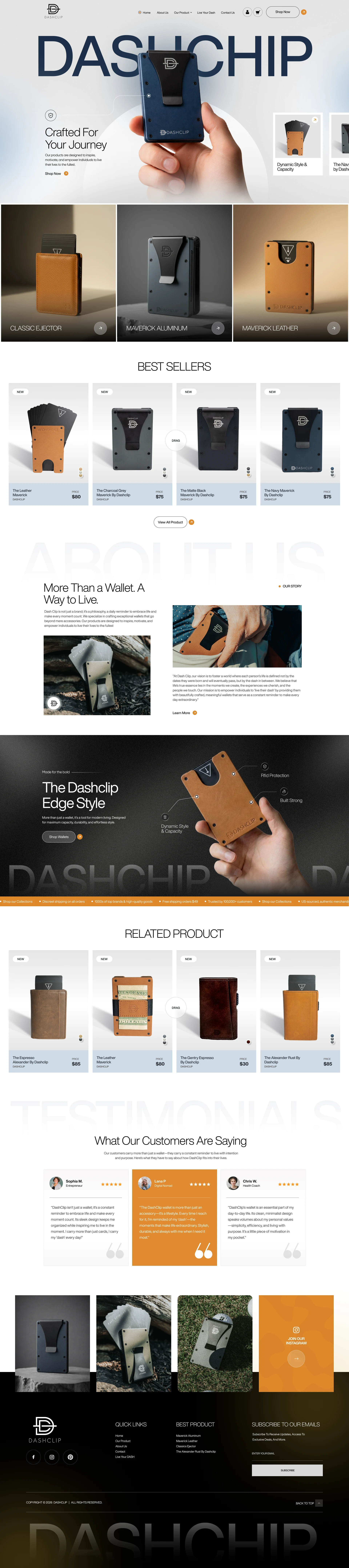
Let the hero do the selling. The DashClip logotype is blown up large behind the hero product shot, with the wallet itself photographed mid-use, in someone's hand, mid-journey. It signals scale and confidence in the first second, before a single word of copy is read.
Structure around collections, not just products. Rather than a flat product grid, the homepage is built around three named lines, Classic Ejector, Maverick Aluminum, Maverick Leather, each with a full bleed lifestyle image and a single clear entry point. This gives returning customers a fast way to land on the right family of product instead of scrolling a wall of thumbnails.
Best Sellers as a dedicated, scannable rail. New arrivals are tagged and priced clearly, with a drag interaction on the carousel so the section feels alive rather than static. Pricing sits close to the product name with no visual noise competing for attention.
Brand story with restraint. The About section, "More Than a Wallet. A Way to Live," pairs a short philosophy statement with a founder style quote and a single supporting image. It is enough to build trust without turning the homepage into a manifesto.
A dark, technical showcase section. The "Dashclip Edge Style" panel switches to a dark background with callout labels, RFID Protection, Built Strong, Dynamic Style and Capacity, pointing directly at the product. This is where the engineering story gets told visually instead of in a paragraph of copy.
Social proof placed where doubt would otherwise creep in. Testimonials sit after the product and story sections, right before the footer, with a highlighted middle card to draw the eye without needing a slider.
Consistent commerce mechanics throughout. Related products, an Instagram feed strip, and a newsletter capture in the footer round out the funnel, all built on Shopify Online Store 2.0 so sections are editable by the client without touching code.
Outcome
A store that matches the tone of the product itself, unhurried, precise, and confident enough to let large type and full bleed photography do most of the talking. The client's team retained full control over merchandising and content through native Shopify sections, with no dependency on a developer for day to day updates.
Stack
Shopify (Online Store 2.0, Liquid), custom section architecture, Figma for design and prototyping.
Like this project
Posted Sep 12, 2026
Redesigned DashClip's Shopify store to align with its premium wallet brand, rebuilding the homepage around collection storytelling, technical showcase section.
Likes
4
Views
10