SKN Inc. Website Redesign: Beauty Growth Agency Concept

Atiya Zehra


Beauty Brand
SKN Inc. Website Redesign, Concept Case Study
A self-initiated redesign exploring how a growth agency for beauty brands could look and feel
Unofficial concept. This project was not commissioned by, or affiliated with, SKN Inc.
Overview
SKN Inc. is a growth and automation partner for med spas, aesthetics clinics, and modern beauty and wellness brands. I designed this website as a personal portfolio exercise, using the brand as a real-world subject. It was made independently, without a brief, feedback, or involvement from the company.
I chose it because the challenge is a good one: the business sells strategy, systems, and automation, which are hard to make tangible, and the audience judges a brand by how it looks before reading a word.
The Brief I Set Myself
Agencies serving the beauty industry often fall into one of two traps. Some look like generic marketing consultancies, cold and corporate, with nothing to signal they understand the aesthetics world. Others look like the spas themselves, pretty but light on proof that real business thinking sits behind the visuals.
I set out to solve both at once: a site that feels like a natural extension of the luxury beauty space, while clearly communicating results, services, and a low-friction path to booking a call.
Design Approach
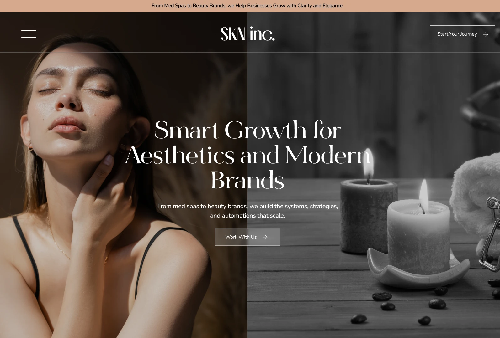
A split-tone hero that tells the story instantly. The opening screen divides into a warm, sunlit portrait on one side and a desaturated candlelit spa scene on the other. The contrast quietly says what the agency does: taking something beautiful and giving it structure and strategy. The headline sits centered across both halves, so the message stays unified while the imagery does the emotional work.
Editorial serif typography. A high-contrast display serif carries every major heading, paired with a clean, readable sans serif for body copy and navigation. The result feels closer to a fashion or skincare magazine than an agency site, which is the visual language this audience already trusts.
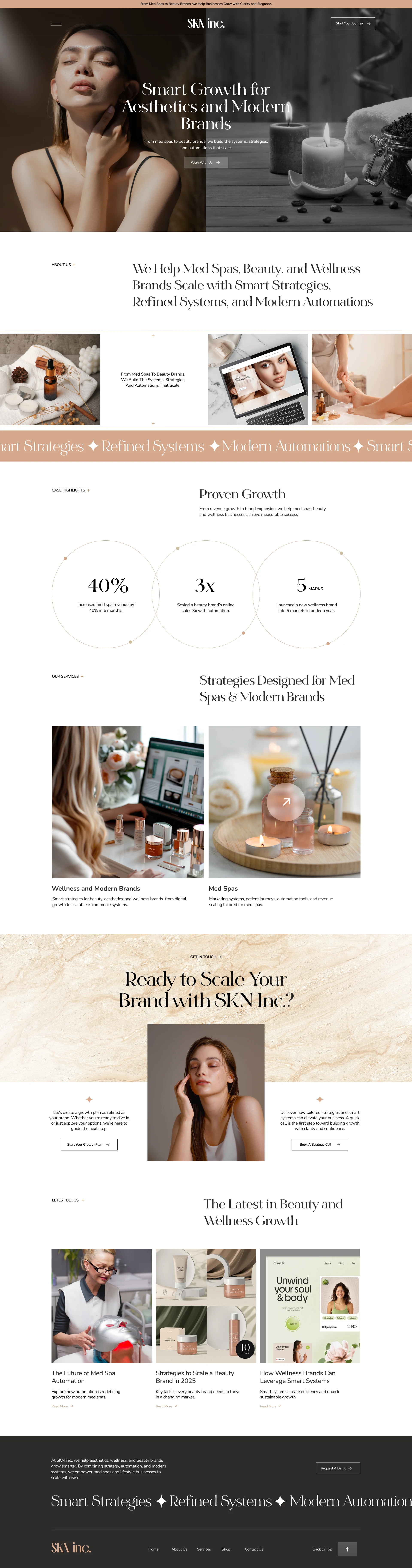
A restrained, warm palette. Soft cream, sand, and champagne tones are grounded by deep espresso brown in the hero and footer. A single peachy accent runs through the announcement bar, the scrolling marquee, thin outlines, and small star ornaments. Limiting the palette keeps the site calm and luxurious while still guiding the eye.
Proof presented with elegance. The "Proven Growth" section turns three headline figures into large, thin-line circular stat blocks. The numbers are used here to design the layout, and I make no claim about their accuracy. Big numbers in a light serif feel confident rather than salesy, and the circles echo the soft, rounded shapes found in beauty packaging.
Imagery that speaks the client's language. Product flat lays, treatment moments, and lifestyle photography appear throughout, including a filmstrip near the top that shows the brand's world at a glance. A laptop mockup in that strip quietly reinforces that the agency builds digital experiences, not just campaigns.
Movement with purpose. A scrolling marquee repeating "Smart Strategies, Refined Systems, Modern Automations" restates the core offer as a brand rhythm. It returns in the footer to bookend the page and keep the experience consistent from top to bottom.
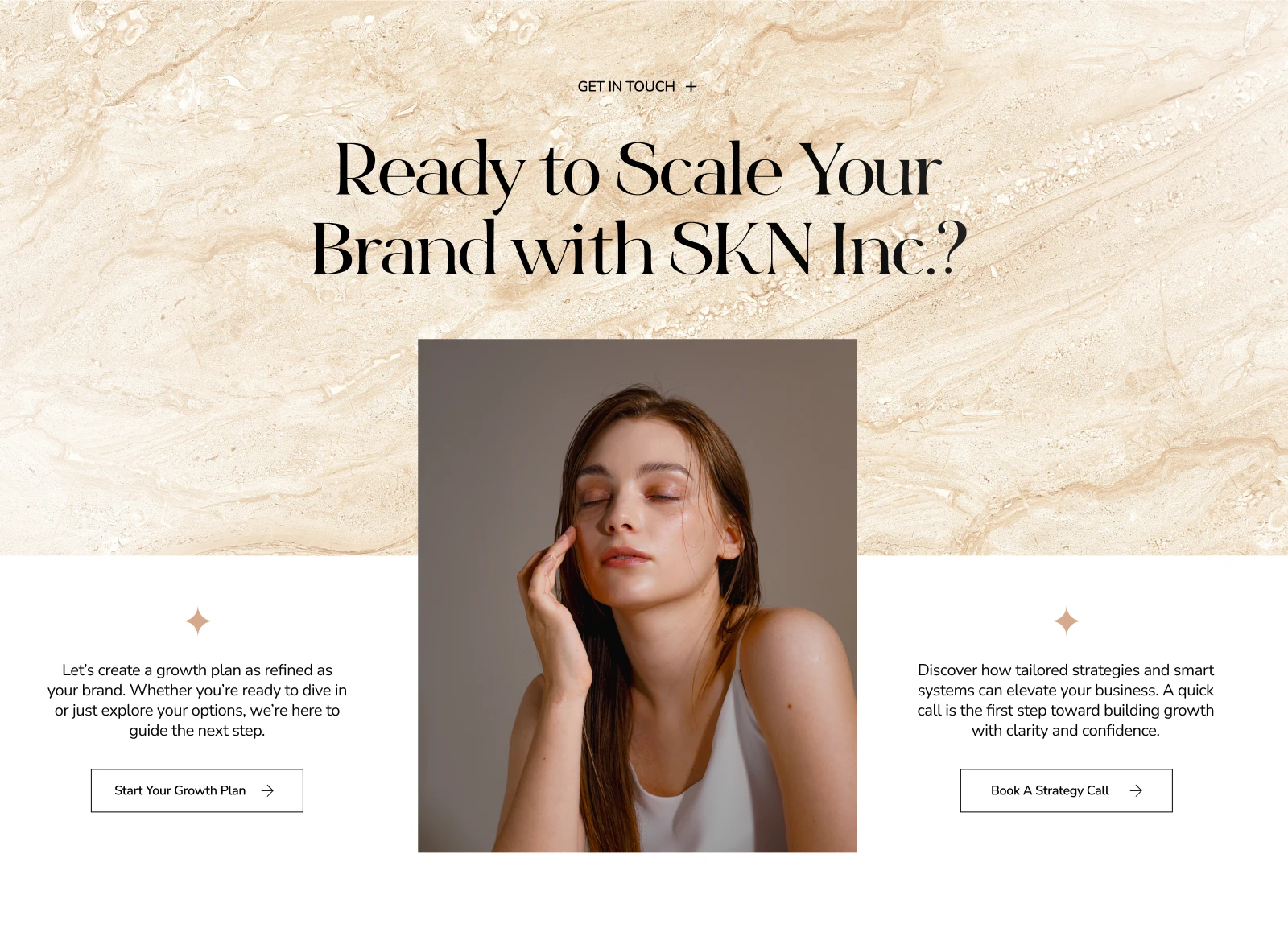
Clear, uncluttered navigation. A minimal menu icon, a centered logo, and a persistent "Start Your Journey" button keep the header simple while always offering a next step. Calls to action such as "Work With Us," "Start Your Growth Plan," and "Book A Strategy Call" appear at natural decision points without feeling pushy.
What I Designed
Announcement bar and split-tone hero with dual calls to action
About section with a clear positioning statement
Image filmstrip and branded scrolling marquee
Case highlights section with three headline results
Services split across Wellness and Modern Brands, and Med Spas
Full-width "Ready to Scale Your Brand" conversion section with a marble texture background
Blog preview grid for thought leadership
Footer with a repeated marquee, navigation, and a demo request button
What This Project Shows
This redesign demonstrates how I approach a brand from positioning through to page layout. It shows my ability to pair luxury editorial styling with a clear conversion structure, to keep a palette disciplined, and to use white space and typography to build trust.
The layout is generous with white space, restrained with colour, and consistent in tone, so the whole experience feels premium without becoming heavy. It is a design exercise in making strategy, refinement, and modern systems feel like one cohesive brand.
Like this project
Posted Sep 28, 2026
A self-initiated concept redesign for SKN Inc., a growth agency for med spas and beauty brands. Editorial design, split-tone hero. Independent, not client work.