Logo Design & Visual Identity for mybuckit

Minhal Jafar



Wordm
mybuckit — Logo Design & Visual Identity for a Bucket List App
Overview
mybuckit is a bucket list app built around a simple idea: the things people most want to do rarely get written down, and the ones that do get written down rarely get done. The product needed an identity that felt like encouragement rather than admin — closer to a nudge from a friend than a productivity tool.
I designed the full core identity: a custom-tuned lowercase wordmark, a standalone app icon built on a negative-space concept, a two-colour brand palette, and the usage rules that hold the two together across app stores, social profiles, and marketing surfaces.
Role: Brand identity design, logo design, visual system
Deliverables: Primary wordmark, icon / app mark, colour palette, usage guidelines, full file kit
Tools: Figma, Adobe Illustrator
The challenge
Bucket-list and goal-tracking apps tend to land in one of two visual camps. Either they lean into aspiration with stock sunsets and mountain-summit photography, which ages badly and says nothing specific, or they borrow the flat, cool-grey language of task managers, which makes a list of dreams feel like a list of chores.
The brief was to find a third position: warm and human enough to feel personal, but structured enough to survive at 32 pixels on a home screen. The identity also had to work with a name that reads as one word but contains two ideas — my and buckit — without becoming a pun that wears thin.
Three constraints shaped every decision:
The icon had to be legible at app-icon scale. Nothing intricate, nothing dependent on fine linework.
The mark had to work on a dark background first. Most usage would be in-app, on a dark UI, and on app-store listings.
The identity had to carry warmth without illustration. No mascots, no photography, no scenery — the brand needed to hold up as pure typography and shape.
The wordmark
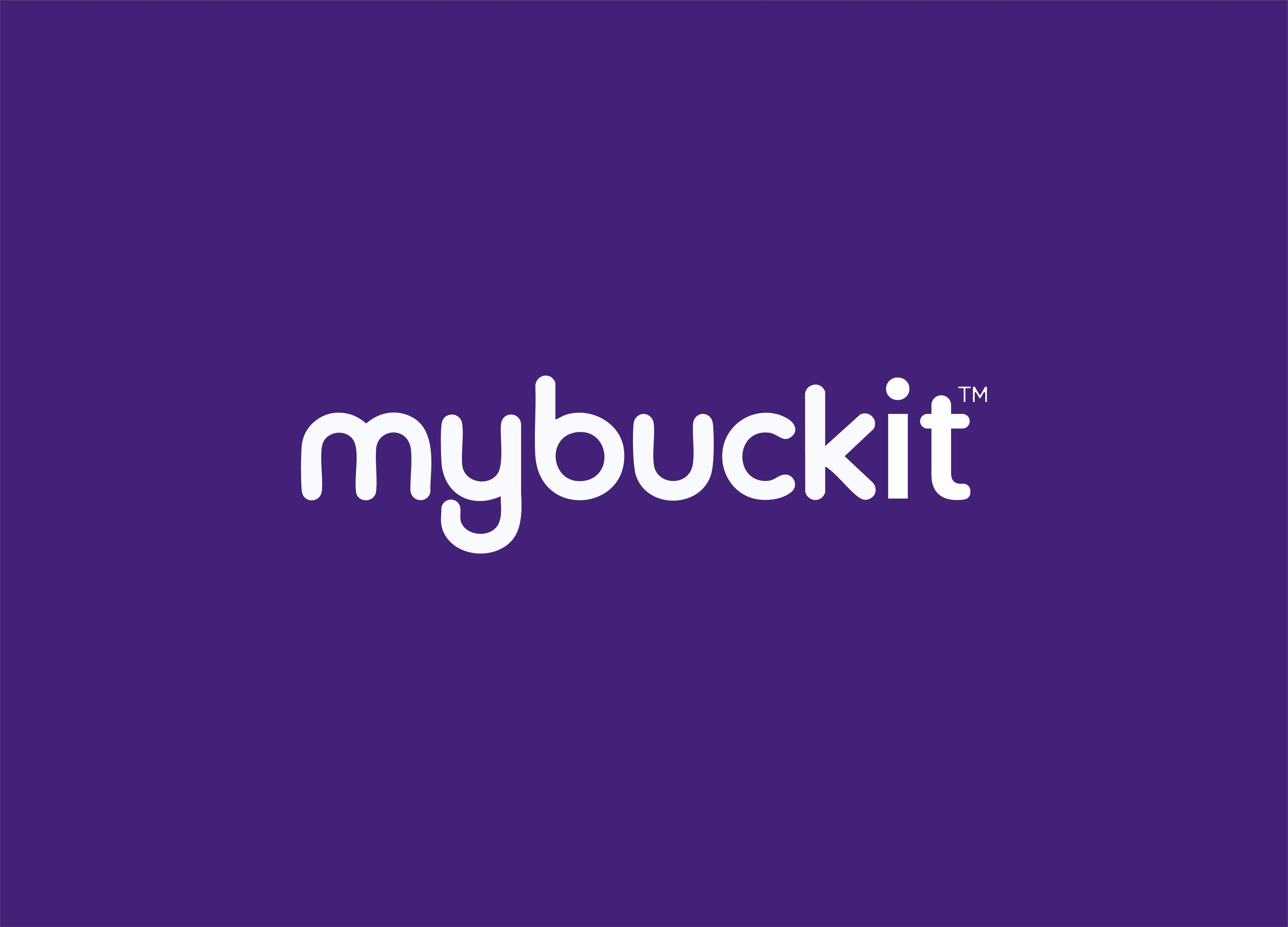
The wordmark is set entirely in lowercase, in a rounded geometric sans with full circular bowls and softened terminals. Lowercase does a lot of work here: it lowers the register of the name, keeps my and buckit reading as a single unit, and matches the tone of a product that asks personal questions.
The letterforms are built on near-perfect circles, which gives the mark an even, unhurried rhythm across its length. Terminals are rounded rather than cut flat, so the mark reads as approachable at any size without tipping into childishness.
Two refinements matter most:
The dotted "i" and the descender of the "y" are the only two vertical events in an otherwise horizontal mark. Both were tuned so the eye travels cleanly from left to right rather than snagging in the middle of the word.
Spacing was optically corrected, not mathematically set — particularly the tight junctions around b–u–c where the round bowls create the illusion of extra air.
The trademark symbol sits at cap height on the upper right, small enough to disappear at a glance and precise enough to signal a real, protected brand.
The icon
The icon is where the concept lives. It takes the lowercase b from the wordmark and hides a bucket inside the counter — the enclosed white space of the letter — so the shape does double duty. Read it as a letter and it's a clean monogram. Read it as an image and it's a bucket, filled and glowing.
Light radiates from inside the bucket outward through the letterform, which was the point: a bucket list isn't a container of unfinished tasks, it's a container of things worth wanting. The glow gives the mark an emotional register that a flat monogram couldn't reach.
The gradient runs from a saturated orange at the outer edge to a warm amber at the core, so the light appears to originate from the bucket rather than sitting on top of it as an effect. The bucket itself is cut in the brand's deep violet, tying the icon back to the primary background colour rather than introducing a third value.
At small sizes the letterform holds and the bucket reads as a simple silhouette. At large sizes the gradient detail rewards a closer look. That range was the test the icon had to pass, and it's the reason the concept survived to final.
Colour
The palette is deliberately narrow: two brand colours and a near-white.
Deep Violet —
#4A2183 — rgb(74, 33, 131) — Primary / backgrounds
Warm Orange — #FF8A00 — rgb(255, 138, 0) — Accent / icon gradient start
Amber — #FFC24D — rgb(255, 194, 77) — Accent / icon gradient core
Off-White — #F7F5FA — rgb(247, 245, 250) — Type on darkDeep violet does the heavy lifting as a background rather than an accent, which is unusual and part of why the brand doesn't look like its competitors. It's a night colour — dusk, possibility, the hour when people actually think about what they want to do with their lives. The orange is the counterweight: energy, warmth, the light in the bucket. Held against violet, it reaches near-maximum contrast without either colour feeling shouty.
Applications
The system was delivered in two lockups. The horizontal wordmark carries marketing surfaces, website headers, and email — anywhere the name needs to be read. The icon carries app stores, favicons, social avatars, and any square or circular container.
Both were supplied in light and dark variants, with clear-space rules and minimum-size specifications so the brand stays consistent as the product grows.
Like this project
Posted Aug 29, 2026
Developed logo and visual identity for mybuckit app using Figma and Illustrator.