Freelance Brand Designers in Colombia
Sign Up
Post a job
Sign Up
Log In
Filters
2
Projects
People
Keileth Castillo
pro
Barranquilla, Colombia
Branding, strategy & design.
$25k+
Earned
9x
Hired
5.0
Rating
223
Followers
Follow
Message
Branding, strategy & design.
35
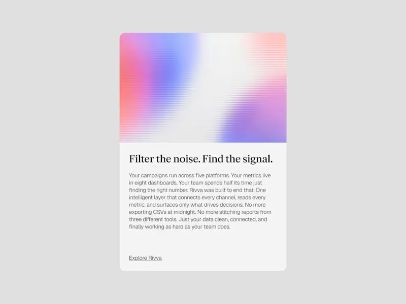
Rivva — A brand exploration. Built a full visual system and direction around an AI data management concept. Light palette, layered compositions, and gradient textures. A brand that feels approachable without losing technical credibility.
3
35
621
35
A brand exploration for a DevOps Infrastructure.
5
35
563
8
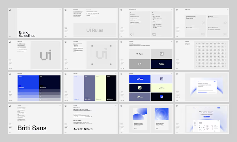
UI Roles - Branding
8
74
54
A brand concept for Creators Cabal. Exploring creativity as presence, not performance. Built around observation, restraint and silence
16
54
941
Brand Designer
(14)
Follow
Message
Daniel Castellanos
pro
Bogota, Colombia
Brand Identity & Content Creation | Video & Motion
5.0
Rating
22
Followers
Follow
Message
Brand Identity & Content Creation | Video & Motion
3
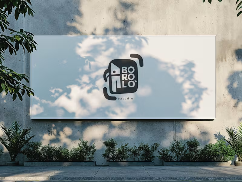
There are design decisions that don't come from the client. They come from within—and sometimes, that is exactly the problem. The previous logo for Boroló Estudio had soul. It had pre-Columbian roots, a hand-drawn stroke, and an indigenous character. It evoked drums, authenticity, and the Chocó—one of the most biodiverse and culturally rich regions in Colombia, a land of jungle, rivers, and a visual identity unlike any other. I loved it. And precisely because of that, I failed to evaluate the challenges the logo would face on real-world platforms: on a website, as an Instagram avatar, or in digital spaces. The redesign wasn't about letting go of the logo. It was about letting go of the attachment. The problem wasn't aesthetic—it was one of coherence. The studio’s brand had evolved, but the logo hadn't. A composition with too many elements in tension made the icon struggle to be memorable; what people saw didn't connect with who Boroló truly is. The new system retains the bird—now geometric, set in negative space within the icon. The inner container references the studio’s actual architectural blueprint: the diagonal of the cyclorama ceiling and the two zones of the space. The brackets refer to photographic framing. No layer imposes itself over the other—they are discovered. The result is a versatile system: imagotype, vertical logo, and wordmark. It works on a sticker, a billboard, an avatar, or a website. It scales without losing its identity. Redesigning doesn't mean the initial design was bad. It means communication needed to evolve. And from that point of view, the change isn't a correction—it’s a decision.
3
166
4
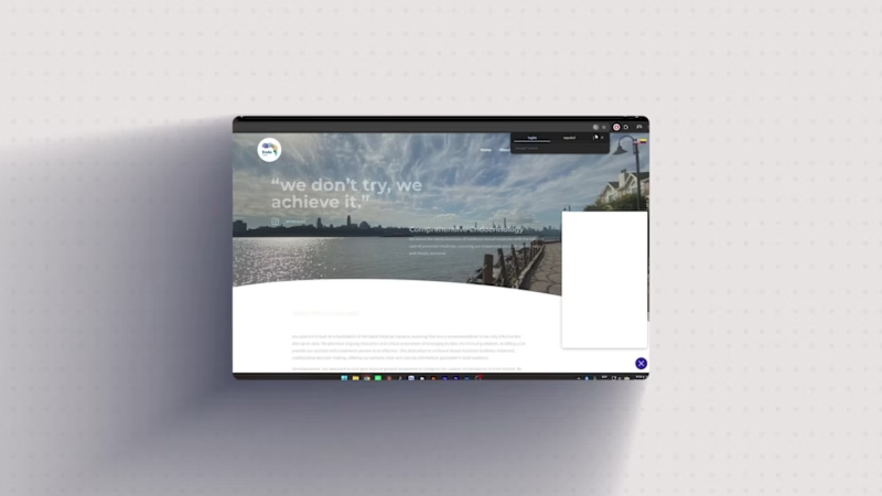
THREE WEBSITES. THREE INDUSTRIES. ONE RULE: THE TOOL FOLLOWS THE BRIEF. Landing pages are not a single discipline. The visual decisions, the information architecture, the build method — all of it changes depending on who the client is, what they need to communicate, and how much control they'll need after delivery. These three projects made that clear. The Challenge EndoWell is a comprehensive endocrinology practice based in New York. Impuestos & Soluciones is a tax advisory firm. NiAuditor is a financial audit software platform. Three different industries, three different audiences, three different definitions of what "trust" looks like on a screen. The brief for each was the same at its core: build a web presence that communicates authority and converts. The execution was not. The Solution EndoWell — WordPress + Elementor The brand identity was already defined — clouds as a metaphor, lavender and teal as the color system, a visual language built around calm and precision. The website's job was to translate that into a functional medical site without losing the warmth. The architecture decision was straightforward: WordPress with Elementor. The client needed to manage her own content after delivery. A custom build would have created dependency. Elementor gave us precise control over spacing, typographic hierarchy, and section structure — while keeping the backend accessible for a non-technical user. Every section was sequenced around a single conversion path: who she is, what she treats, how to book. Impuestos & Soluciones — Built with Claude An accounting firm needs to feel rigorous without feeling bureaucratic. The visual challenge here was making fiscal services readable to a non-specialist audience — people who are intimidated by the subject before they even read the first line. Building with Claude meant starting from zero on every component. No inherited theme styles to override, no default spacing to fight. The layout was designed section by section with deliberate intent: a clear hero that names the service directly, a services block structured for scannability, and a contact section that removes friction. The typography stays conservative. The grid is tight. Nothing decorative that doesn't carry information. NiAuditor — Built with Claude A B2B software platform for financial auditors. The audience here is technical and detail-oriented — they'll read the fine print and notice if something feels off. The design language had to match that standard. Same build method as Impuestos & Soluciones, different visual logic. The hierarchy leans harder into precision: more negative space, stricter alignment, a restrained color palette that signals software rather than service. The information flow was structured around the product's core value first, features second, and conversion last — because this audience doesn't respond to pressure, they respond to clarity. The Result Three live sites. Each one built with the method that fit the project, not the method that was most convenient. The technical difference between a WordPress build and a Claude build isn't a preference — it's a decision that affects everything from delivery timeline to client autonomy to design flexibility. Knowing which stack to use is part of the work. What I delivered: Information architecture · Visual design · WordPress / Elementor development · AI-powered custom web development · Copywriting structure endo-well.com (http://endo-well.com) · impuestosysoluciones.com (http://impuestosysoluciones.com) · niauditor.com (http://niauditor.com)
4
196
1
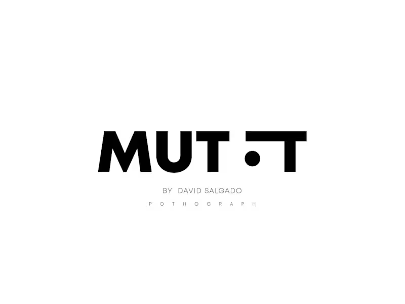
THE BRIEF WAS A NICKNAME. David had been called MUTT for years. It stuck from a period of his career shooting street, festivals, raves — places where the camera goes where it fits, not where it's planned. The name carried texture. The problem was communicating it visually without it looking rough. The tension in the logo comes from that constraint. MUTT as a word reads raw, underground, unfinished. The mark had to hold that energy without letting it spill over into something that looked cheap. I kept the typography bold and geometric — no serifs, no decorative cuts, full weight. The letterforms needed to feel confident and urban at the same time. The decision to break "MUTT" into "MUT" and "T" with a centered dot in between was structural, not decorative. The dot reads as a lens at first glance, which works for photography. It also functions as a pause, a breath inside the name, which gives the wordmark rhythm without adding any visual noise. Black on white. No gradients, no texture overlays, no effects trying to approximate the street quality of the work. The cleanliness of the mark is the contrast — David's photography lives in chaotic environments, so the brand sits at the opposite end. Controlled. Precise. Recognizable at any size. "POTHOGRAPH" in spaced light caps anchors the bottom. The letterspacing there does the work that a heavier font would overdo. The whole mark fits on a business card or a festival screen with the same read. Deliverable: Logo design · Brand mark · Typography system Working on identity projects for creatives, artists, and photographers. Let's talk.
1
224
1
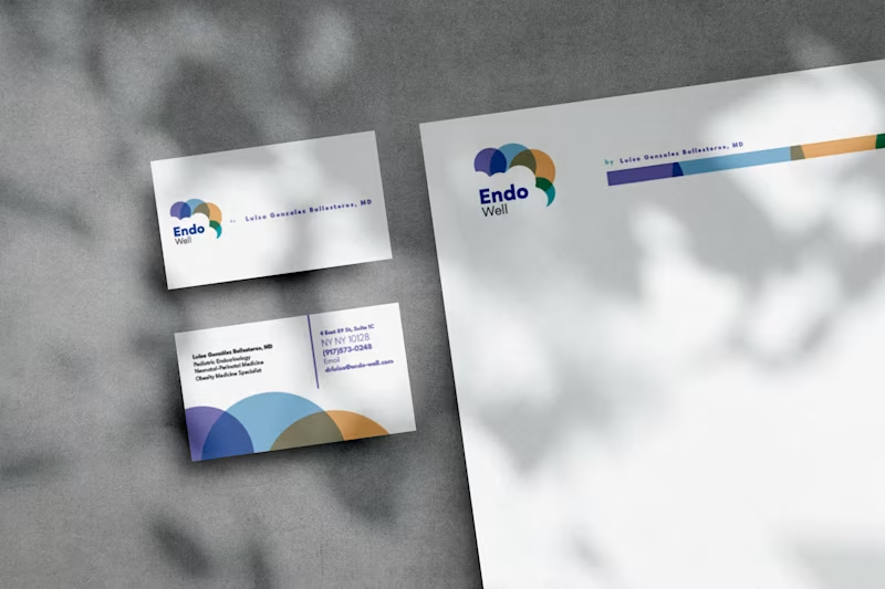
From a cloud to a brand. EndoWell started with a single image: clouds. Not as decoration, but as a metaphor. The doctor behind the brand, an endocrinologist based in New York, described her work as learning to adapt to what you can't control, the way weather changes and you adjust. That became the foundation for everything. I built the full brand identity from that idea. The logo grew from the abstraction of clouds into a stethoscope, the symbol of endocrinology hidden inside something familiar and soft. The color palette — lavender, sky blue, warm peach, and teal — was chosen to communicate calm, trust, and healing without feeling clinical or cold. From there, the visual system expanded across every touchpoint: corporate manual, typography hierarchy, pictogram system, business cards, letterheads, and print-ready files. Then the website. Then a logo animation built in After Effects, where the colored circles travel through light, pass behind a cloud, and settle into the brand mark as the name appears. Every piece was designed to hold together. The kind of consistency where a business card and a social post feel like they came from the same place, because they did. "We don't try, we achieve it." That's the EndoWell slogan. It's also the standard I held the work to. What I delivered: Brand identity and strategy · Logo design + animation · Corporate manual · Typography system · Pictogram library · Business cards · Letterheads · Print-ready files · Website design Open to branding projects. If you're building something from scratch or need a visual system that holds across formats, let's talk.
1
243
Brand Designer
(12)
Follow
Message
Juan Carmona
pro
Colombia
Visual Designer Crafting Brands and Websites.
$5k+
Earned
2x
Hired
26
Followers
Follow
Message
Visual Designer Crafting Brands and Websites.
2
Part 2 of the TechFoundersHub logo. Once the mark was defined my goal was to show the client how this logo would live in the real world without creating a full identity. Same logo. Different contexts. That's how you know it works. A brand mark isn't just a pretty shape. It needs to hold up on a website, on social, on a product. If it breaks in any of those places, it's not ready.
2
80
2
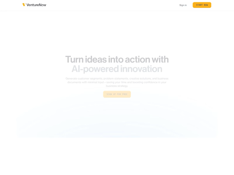
VentureNow Landing Page Design & Development
2
13
2
Hyrum Palmero Visual Identity
2
21
1
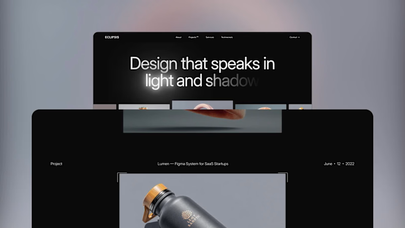
Meet Eclipsis, a free portfolio template for designers available in: → Framer Template (https://www.framer.com/marketplace/templates/eclipsis/)→ Webflow Template (https://webflow.com/templates/html/eclipsis-website-template)Built it because most portfolio templates take forever to customize. This one is minimal and ready to make yours in a couple of hours.
1
158
Brand Designer
(3)
Follow
Message
Daniel Muller
Medellin, Colombia
From the first spark to their brightest form.
$1k+
Earned
11x
Hired
5.0
Rating
41
Followers
Follow
Message
From the first spark to their brightest form.
0
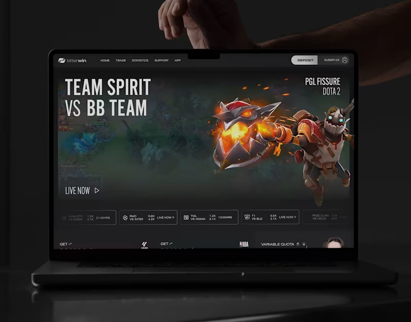
Btterwin
0
8
0
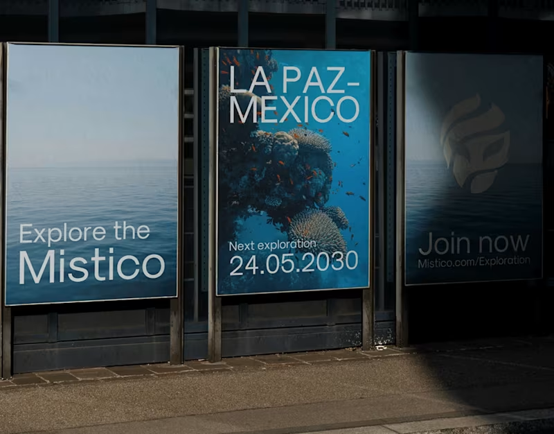
Mistico
0
2
0
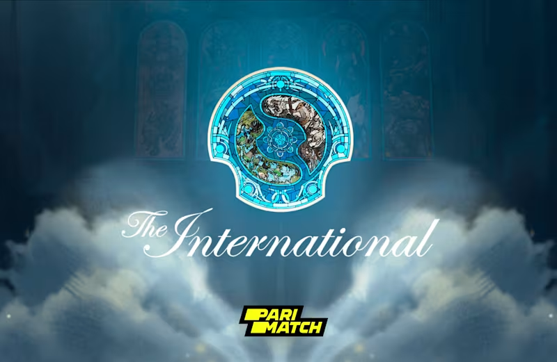
Dota 2 The International 12
0
2
0
Waves
0
4
Brand Designer
(19)
Follow
Message
Angelica Cubides
Colombia
Visual Identities That Showcase Your Brand's Unique Story
5.0
Rating
2
Followers
Follow
Message
Visual Identities That Showcase Your Brand's Unique Story
1
Psychologist Brand Design – Holistic Wellbeing
1
5
1
Lumina's Flash Logo Design
1
3
1
Freelance Attorney Brand Starter Kit
1
9
View more →
Brand Designer
(3)
Follow
Message
Kevin Zapata
Medellín, Colombia
Graphic Designer and Illustrator, for Print and Digital
$10k+
Earned
1x
Hired
5.0
Rating
6
Followers
Follow
Message
Graphic Designer and Illustrator, for Print and Digital
0
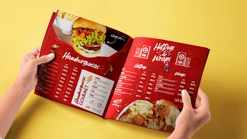
JAM's Food Restaurant Menu
0
3
0
Branding Scouting America
0
1
0
Branding for Angelina Hernández Trucco
0
6
0
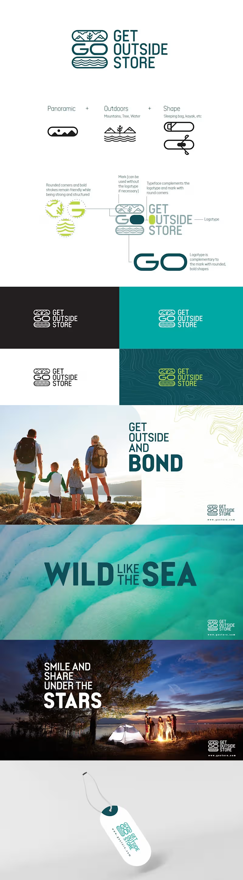
Branding for Get Outside Store
0
3
Brand Designer
(4)
Follow
Message
José Tovar
pro
Bogota, Colombia
Creating what matters, for brands with vision.
29
Followers
Follow
Message
Creating what matters, for brands with vision.
86
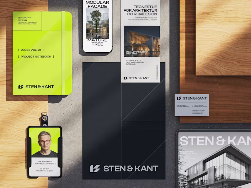
I was working on the stationery for Sten & Kant, an architectural identity project, and couldn’t decide between these two mockups. The designs are identical, but the camera angles create a completely different feel! Which one do you prefer? Feedback is always appreciated.
35
86
3.2K
1
Sten & Kant — Logo Design
1
6
1
Wisp — Brand Identity Design
1
3
1
Autip — Brand Identity Design
1
1
Brand Designer
(4)
Follow
Message
Max Martinez
pro
Colombia
Shipping ambitious brands and digital experiences
Certified Partner
Follow
Message
Shipping ambitious brands and digital experiences
0
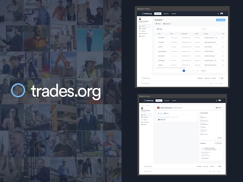
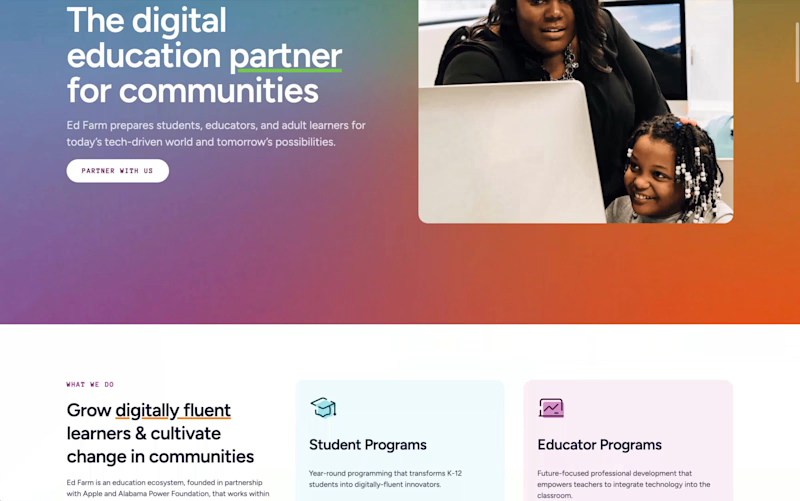
Website for a tech education ecosystem for communities
0
0
0
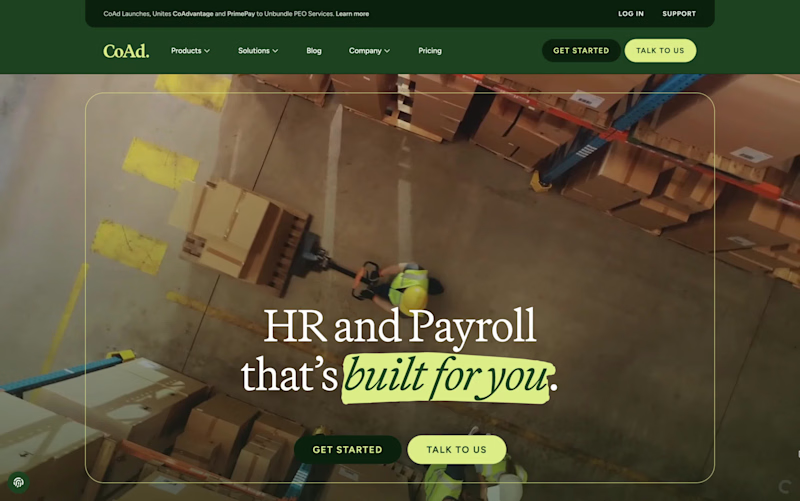
Website, Brand, and Creative for Global Employment Platform
0
19
0
Website and Brand Refresh for Cybersecurity Platform
0
20
0
Website & App UI/UX for a platform to manage AI agent characters
0
1
Brand Designer
(3)
Follow
Message
Explore people