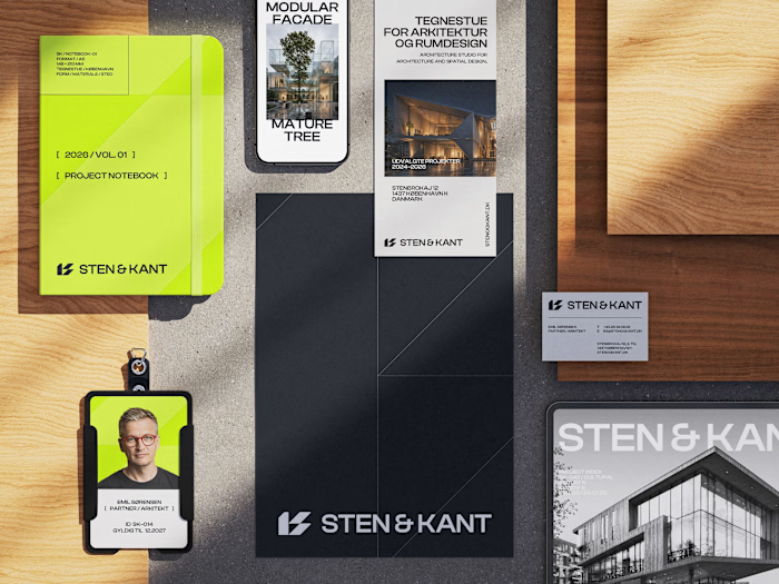
Senses — Brand Identity Redesign
Approve request to show earnings
View

José Tovar
Verified


Senses — Brand Identity Design
The Goal
SENSES needed to evolve beyond its existing visual identity and establish a clearer position within a crowded wellness market.
The goal was not simply to make the brand look more premium. It was to create a system that could communicate trust, efficacy, and sensory experience at the same time, while giving SENSES enough flexibility to expand into new products and applications.
The Challenge
Wellness branding often falls into one of two extremes. It can feel overly clinical and functional, or overly soft and lifestyle-driven.
SENSES needed to sit somewhere between the two.
The identity had to communicate that the products are intentional and effective, while still feeling warm, human, and desirable. It also needed enough visual character to remain recognizable without relying on oversized logos or excessive graphic elements.
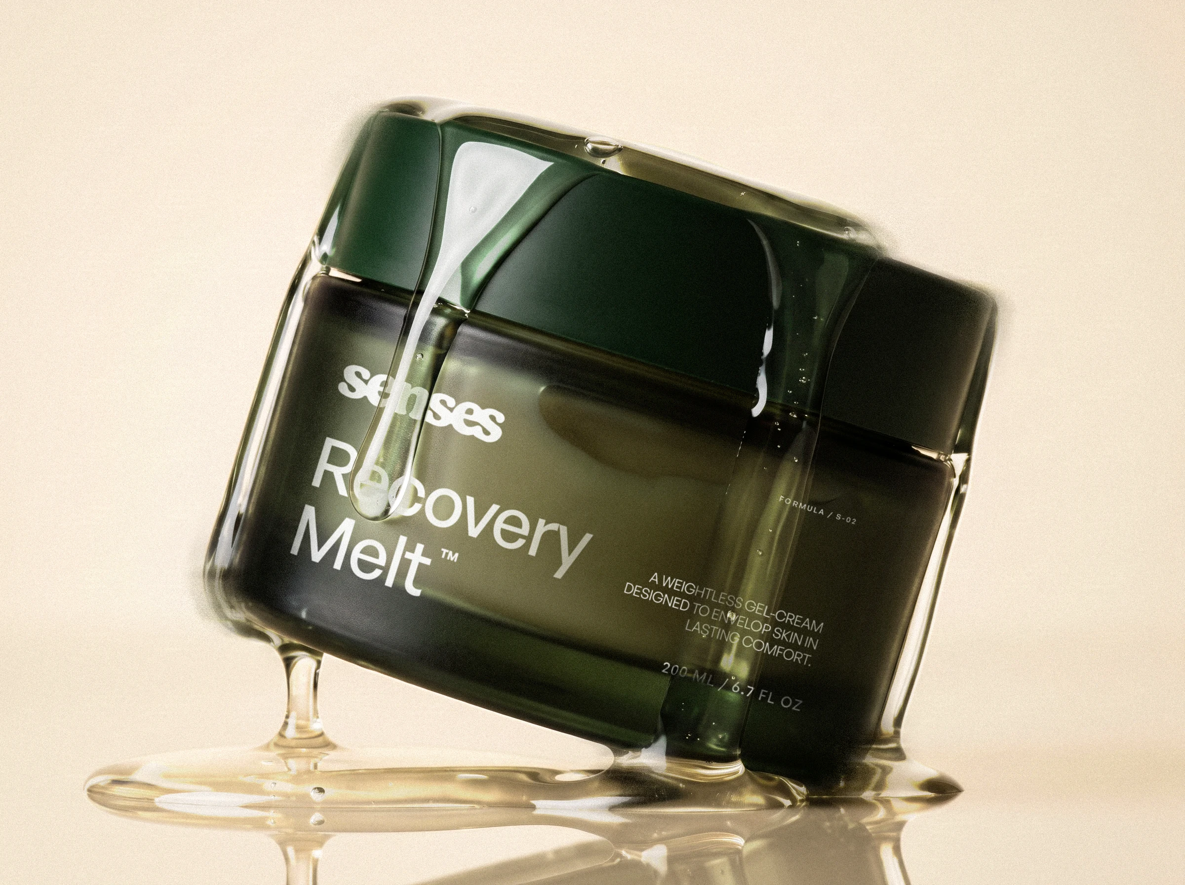
The Strategic Approach
The project began by simplifying the brand around a few core ideas: clarity, sensory experience, and confidence.
Rather than treating CBD and wellness as the main visual story, the identity was developed around how the products fit into everyday routines and how they make the user feel.
This led to a system built on contrast. Precise typography and structured layouts create credibility, while photography, materiality, color, and motion introduce a more emotional and tactile layer.
The result is a brand that feels considered rather than decorative.
The Visual Approach
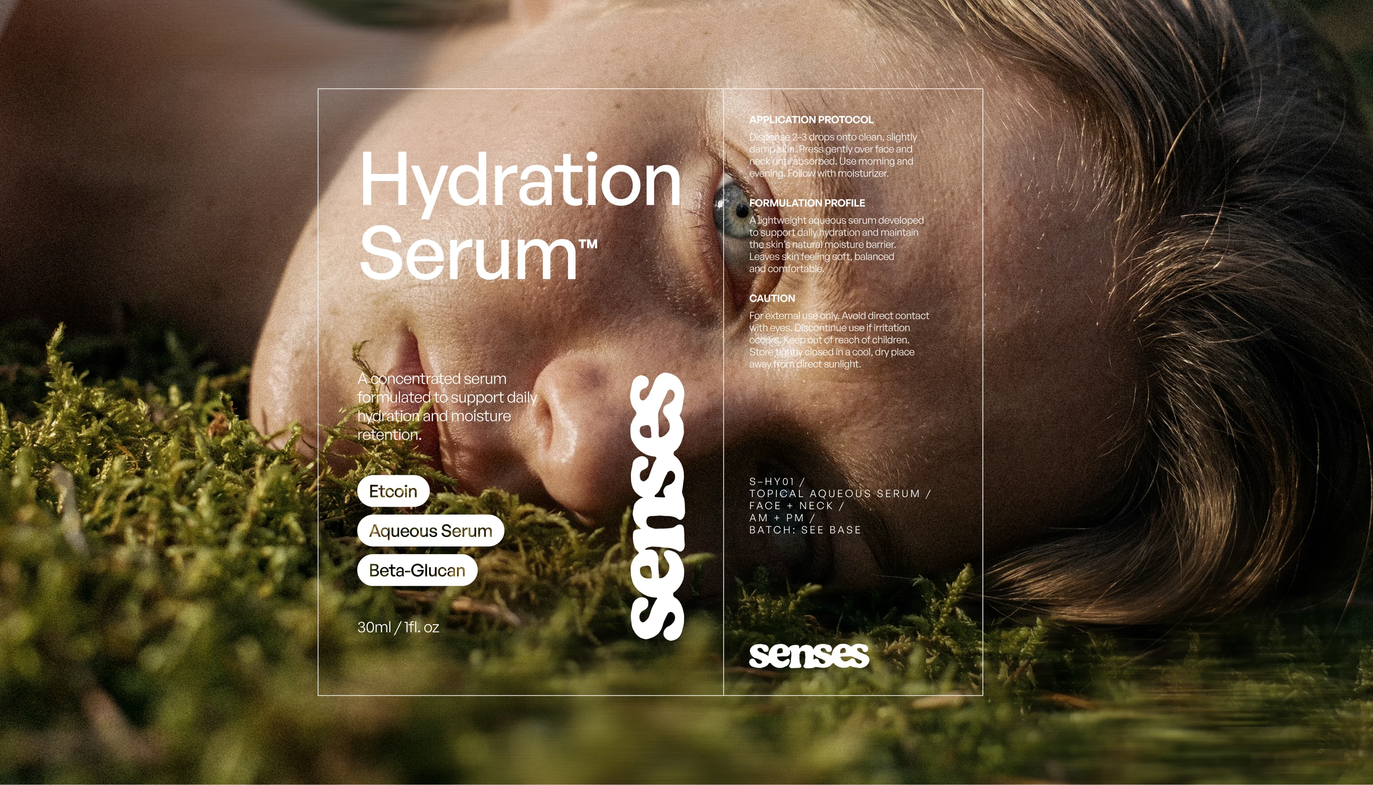
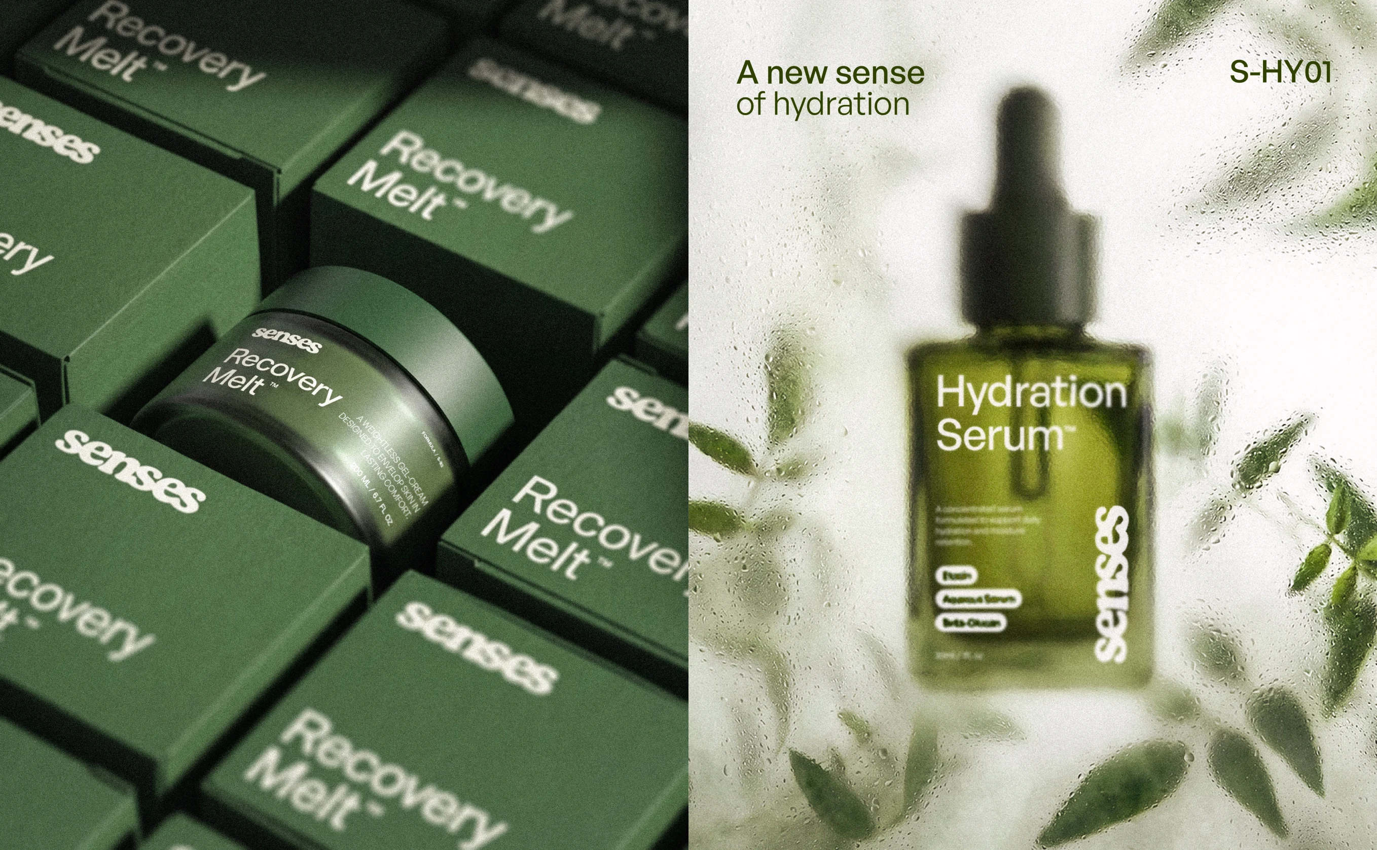
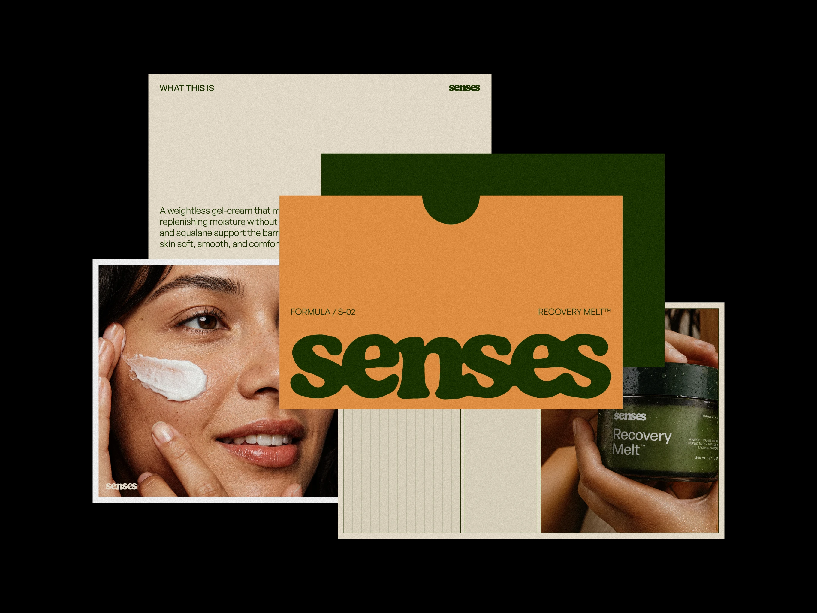
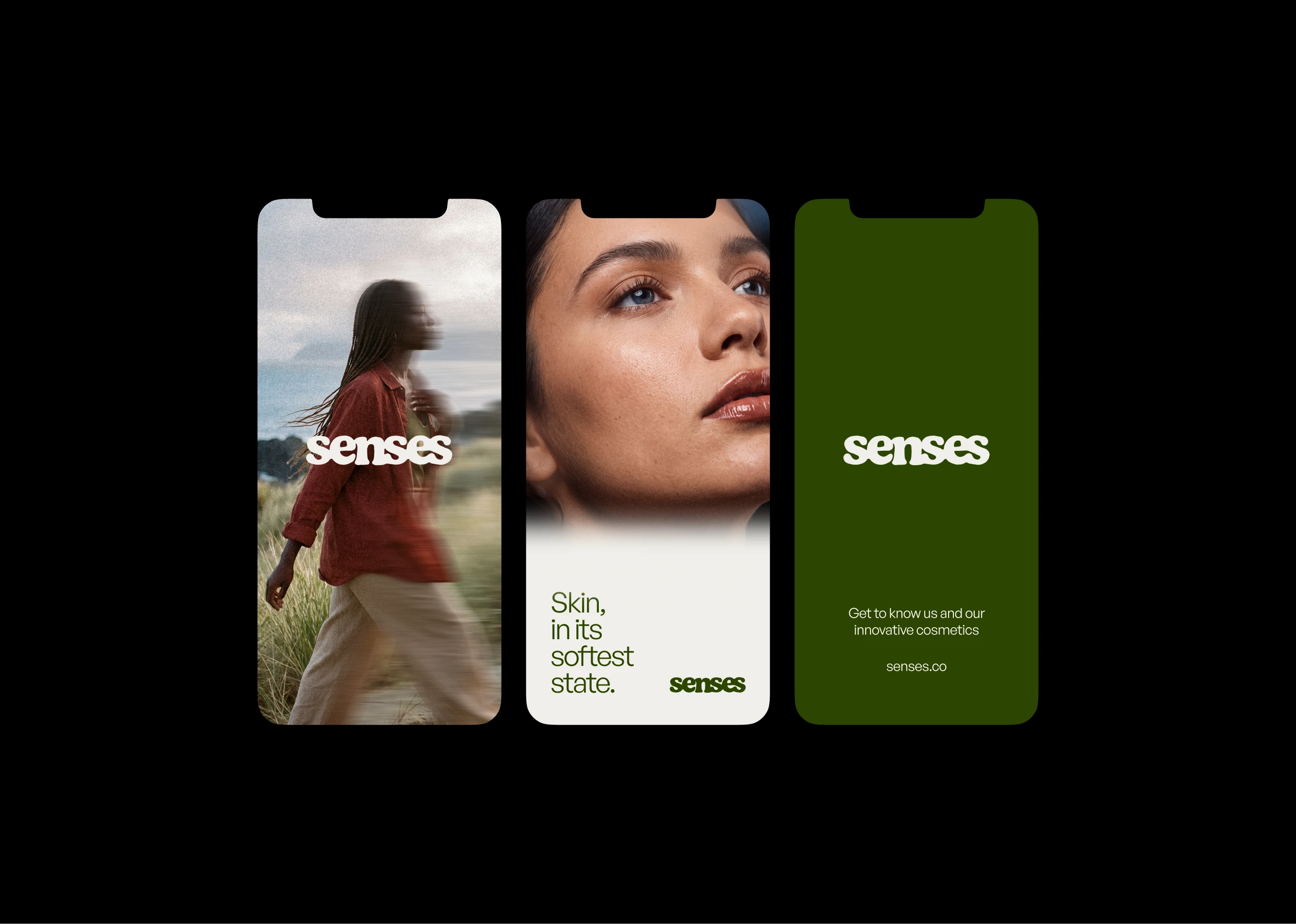
The visual identity uses a restrained typographic system, compact information layouts, and a muted natural palette to create a sense of precision and calm.
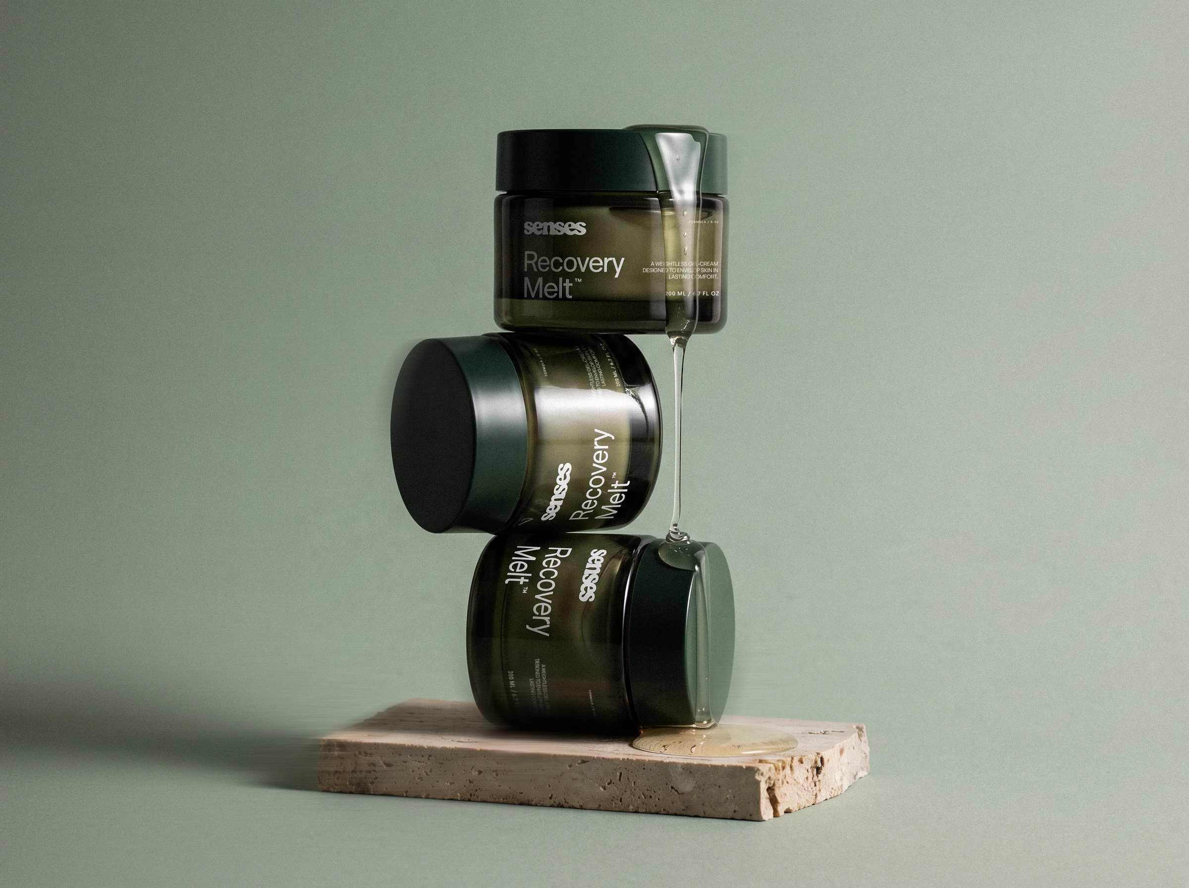
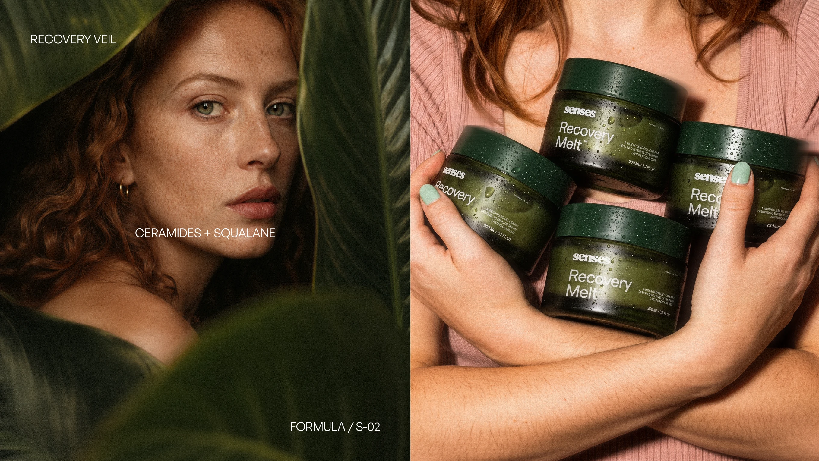
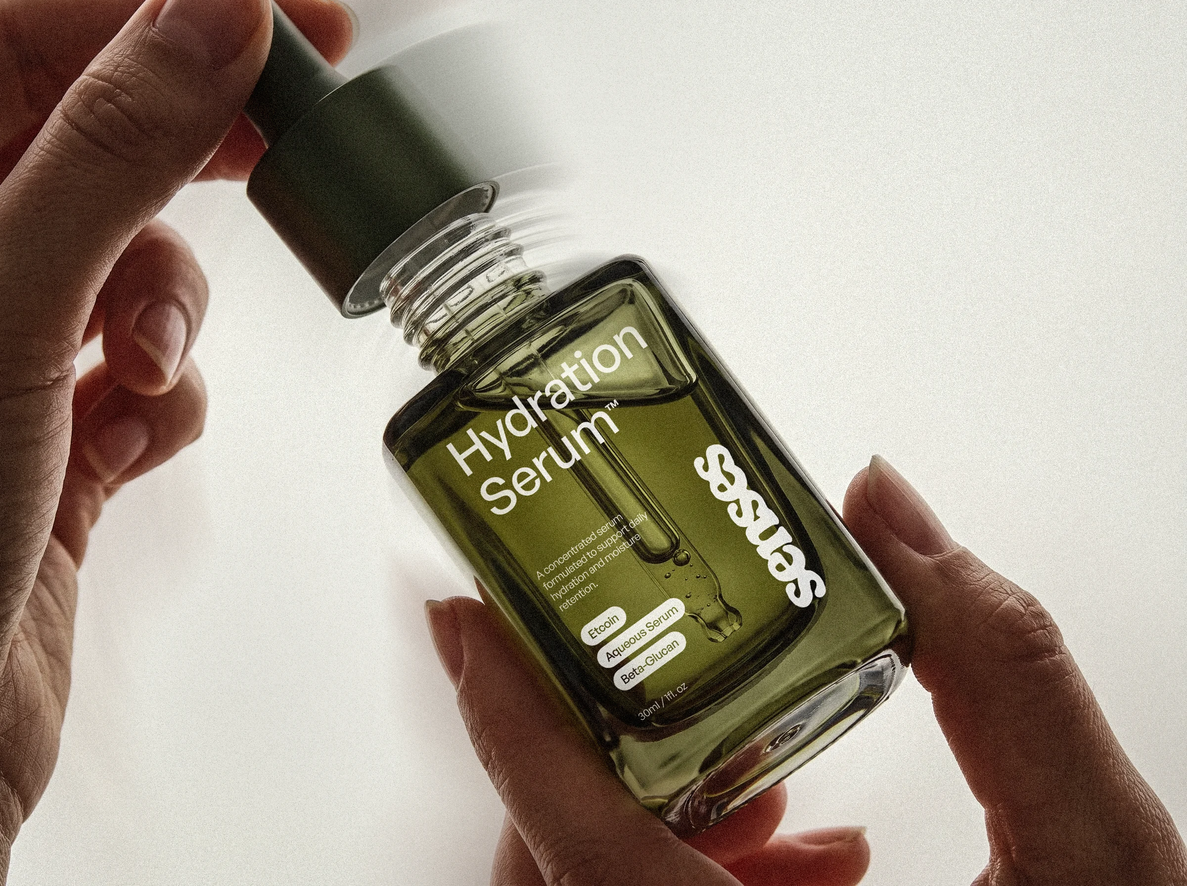
Packaging was intentionally kept minimal. Small-scale typography, subtle technical information, and carefully controlled hierarchy allow the product forms and materials to become part of the identity itself.
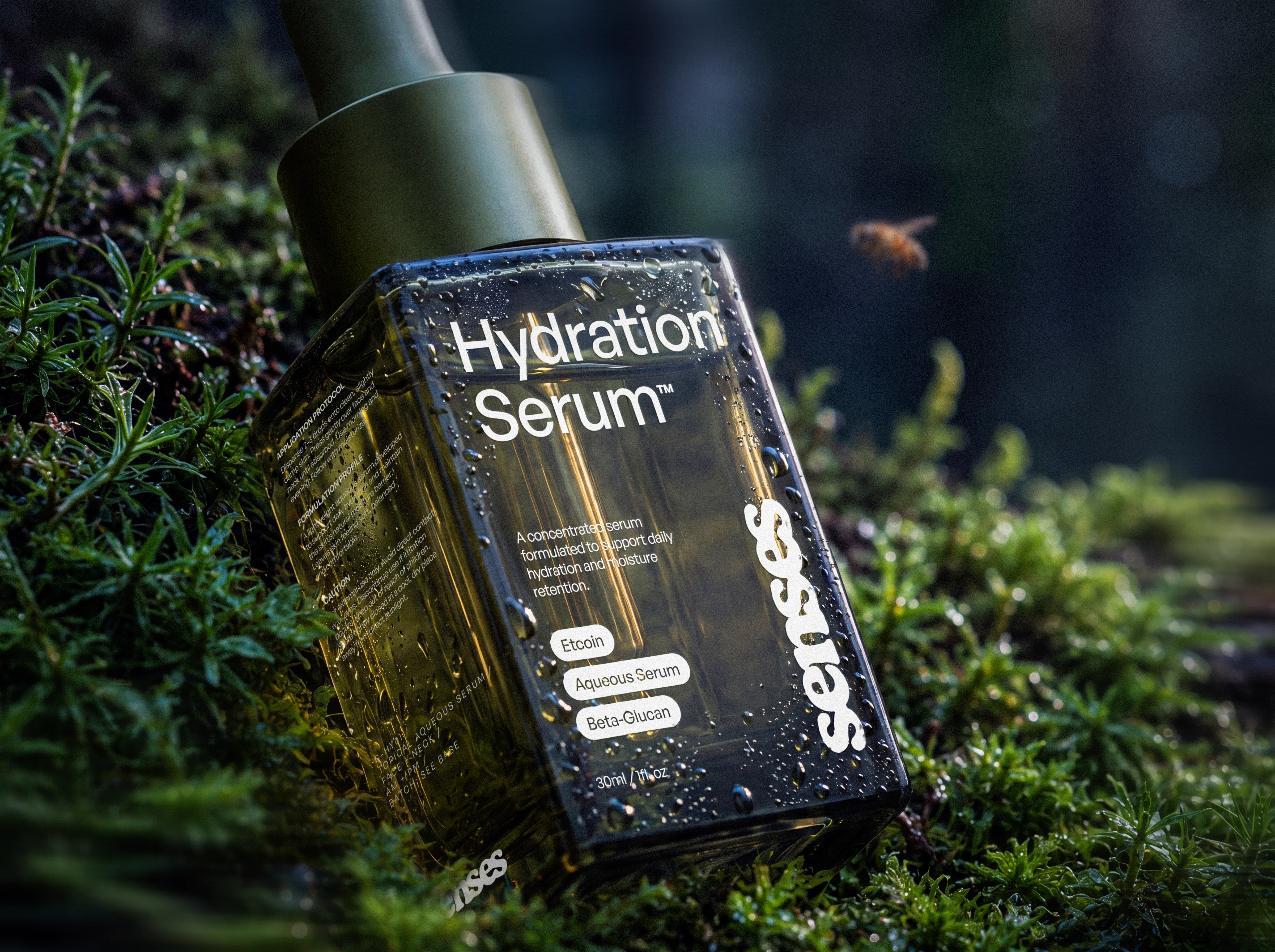
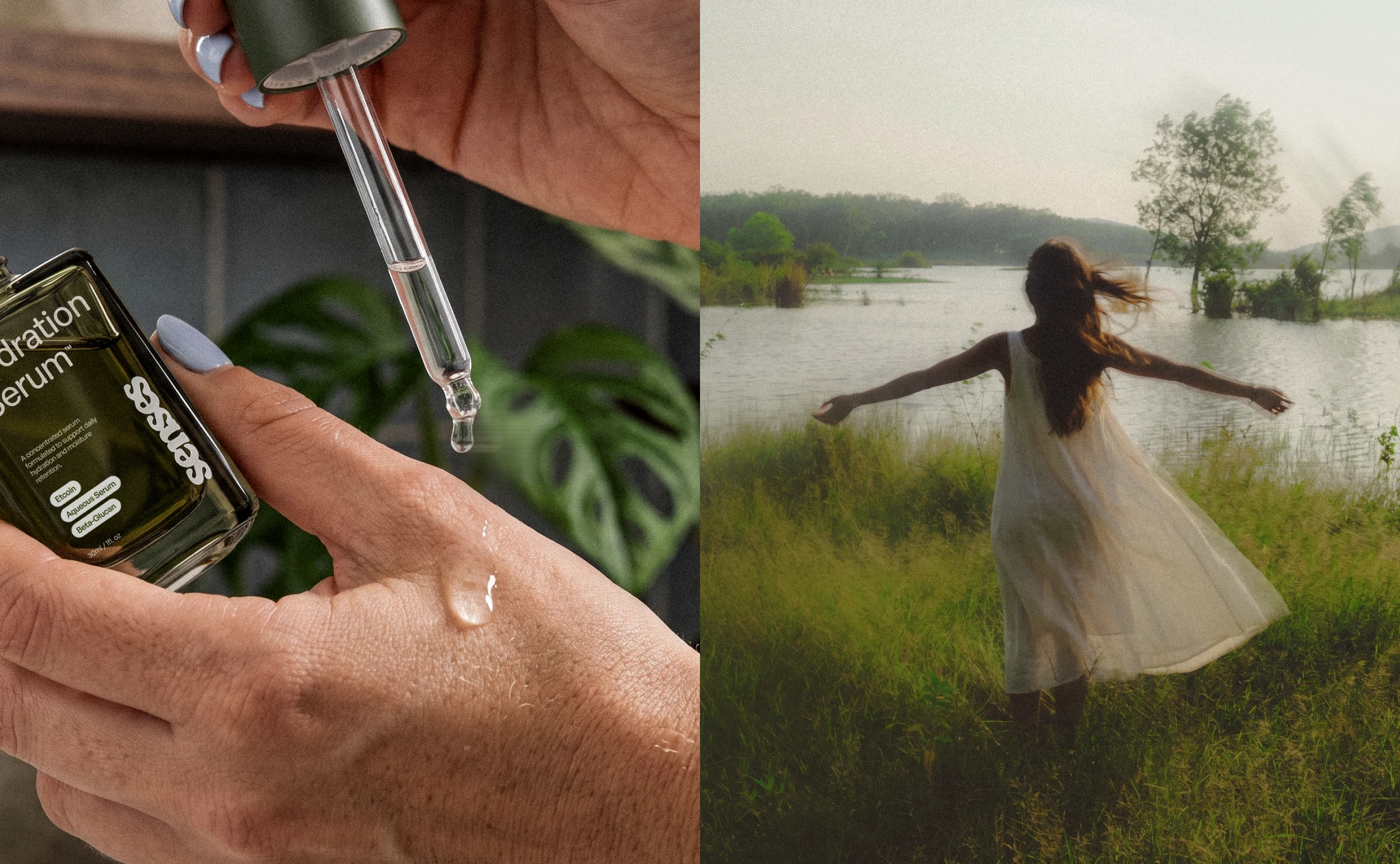
Photography introduces the more expressive side of SENSES. Close crops, natural textures, condensation, skin, plants, glass, and liquid create a world that feels physical and sensory rather than overly polished.
Let's design a brand that matters together.
Like this project
What the client had to say
José is amazing to work with. He has great taste and materialized my vision exactly.

Aurora García
Aug 19, 2026, Client
Posted Aug 20, 2026
What started as a redesign eventually became a much larger exploration of how SENSES could live across packaging, campaigns, digital, and future products.
Likes
2
Views
20
Timeline
Aug 6, 2026 - Aug 19, 2026