The network for creativity
Join 1.25M professional creatives like you
Connect with clients, get discovered, and run your business 100% commission-free
Creatives on Contra have earned over $150M and we are just getting started
Back to feedPost
THREE WEBSITES. THREE INDUSTRIES. ONE RULE: THE TOOL FOLLOWS THE BRIEF.
Landing pages are not a single discipline. The visual decisions, the information architecture, the build method — all of it changes depending on who the client is, what they need to communicate, and how much control they'll need after delivery.
These three projects made that clear.
The Challenge
EndoWell is a comprehensive endocrinology practice based in New York. Impuestos & Soluciones is a tax advisory firm. NiAuditor is a financial audit software platform. Three different industries, three different audiences, three different definitions of what "trust" looks like on a screen.
The brief for each was the same at its core: build a web presence that communicates authority and converts. The execution was not.
The Solution
EndoWell — WordPress + Elementor
The brand identity was already defined — clouds as a metaphor, lavender and teal as the color system, a visual language built around calm and precision. The website's job was to translate that into a functional medical site without losing the warmth.
The architecture decision was straightforward: WordPress with Elementor. The client needed to manage her own content after delivery. A custom build would have created dependency. Elementor gave us precise control over spacing, typographic hierarchy, and section structure — while keeping the backend accessible for a non-technical user. Every section was sequenced around a single conversion path: who she is, what she treats, how to book.
Impuestos & Soluciones — Built with Claude
An accounting firm needs to feel rigorous without feeling bureaucratic. The visual challenge here was making fiscal services readable to a non-specialist audience — people who are intimidated by the subject before they even read the first line.
Building with Claude meant starting from zero on every component. No inherited theme styles to override, no default spacing to fight. The layout was designed section by section with deliberate intent: a clear hero that names the service directly, a services block structured for scannability, and a contact section that removes friction. The typography stays conservative. The grid is tight. Nothing decorative that doesn't carry information.
NiAuditor — Built with Claude
A B2B software platform for financial auditors. The audience here is technical and detail-oriented — they'll read the fine print and notice if something feels off. The design language had to match that standard.
Same build method as Impuestos & Soluciones, different visual logic. The hierarchy leans harder into precision: more negative space, stricter alignment, a restrained color palette that signals software rather than service. The information flow was structured around the product's core value first, features second, and conversion last — because this audience doesn't respond to pressure, they respond to clarity.
The Result
Three live sites. Each one built with the method that fit the project, not the method that was most convenient. The technical difference between a WordPress build and a Claude build isn't a preference — it's a decision that affects everything from delivery timeline to client autonomy to design flexibility.
Knowing which stack to use is part of the work.
What I delivered:
Information architecture · Visual design · WordPress / Elementor development · AI-powered custom web development · Copywriting structure
The network for creativity
Join 1.25M professional creatives like you
Connect with clients, get discovered, and run your business 100% commission-free
Creatives on Contra have earned over $150M and we are just getting started
Related posts
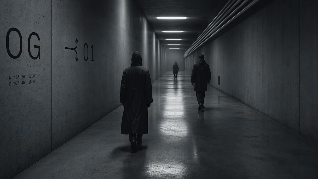
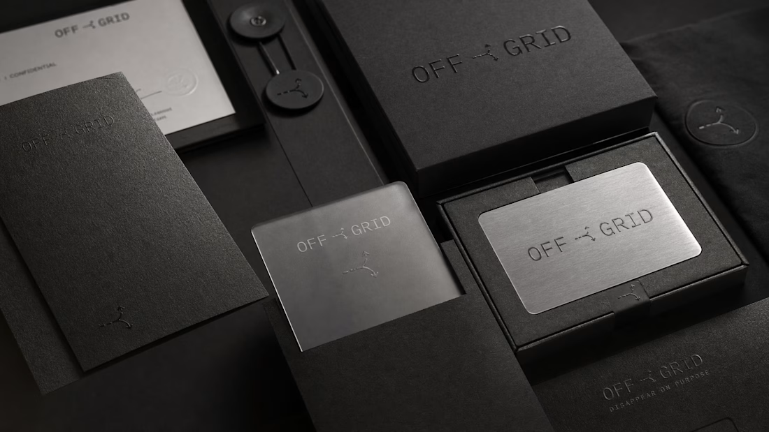
Built OFF GRID around a problem a lot of founders quietly have:
the company evolved faster than the perception around it.
Good branding won’t fix a bad product —
but it can completely change how ambition, trust, and value are perceived.
Especially when you’re building for high-level clients.

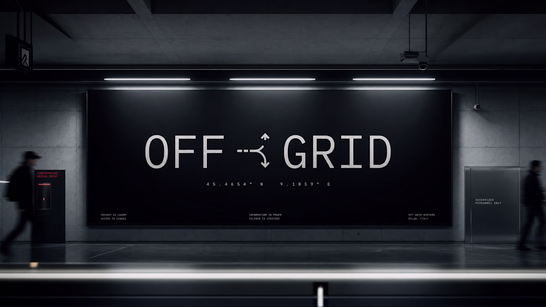
Has some dark, almost "dystopian" vibe (I know that's intentional, especially for a designer/artist like you) but that's some great art for sure! 👍
The best designers right now are crushing it on the full stack scenario.
Helping clients with product design, visual design, web design, and development tools like Framer, for example
The era of design work and creativity paired with AI: it's the winning formula.
This is the way
A recent project I’ve been working on a full brand and website system for a logistic consultancy company.
Honestly, this was one of those projects where getting the balance right mattered more than making things look “fancy”.
The industry is highly technical, so the challenge was creating something that felt modern and premium while still maintaining trust, professionalism, and credibility.
A lot of focus went into structure, clarity, user experience, and simplifying complex information without stripping away the expertise behind the company.
Really enjoyed working on this one: Check it out
Really solid approach. For a logistics consultancy especially, clarity and structure matter way more than flashy design. The balance between professionalism, trust, and modern presentation really comes through in the way you’ve described the system.
Trending
Claude
Claude has entered the design space. How are you using Claude Design?
Contra University
Learn from expert creatives how to earn more using next-gen AI tools.
creativeaiflow
Creative AI workflows are evolving. What tools do you use, and what are their strengths and weaknesses?
portfolioreview
The best portfolios tell a story, not just show a grid. Share yours for feedback.
freelancerlife
Freelancer life is wins, pivots, and everything in between. What’s yours right now?