The network for creativity
Join 1.25M professional creatives like you
Connect with clients, get discovered, and run your business 100% commission-free
Creatives on Contra have earned over $150M and we are just getting started
Back to feedPost
Taste Test

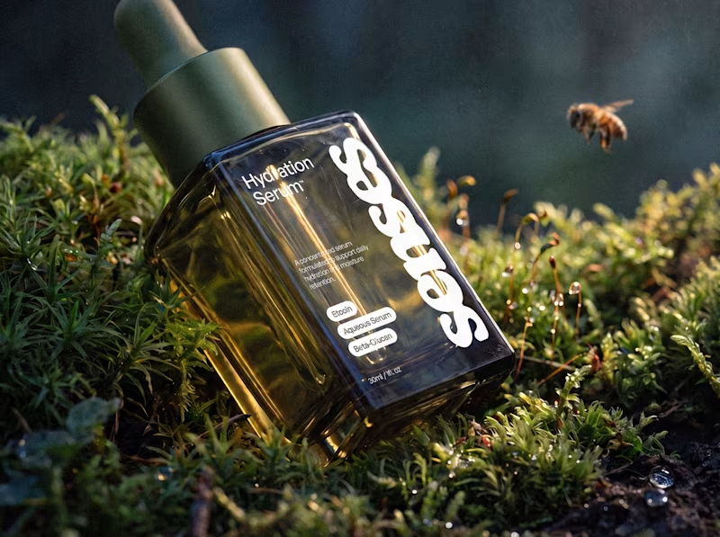
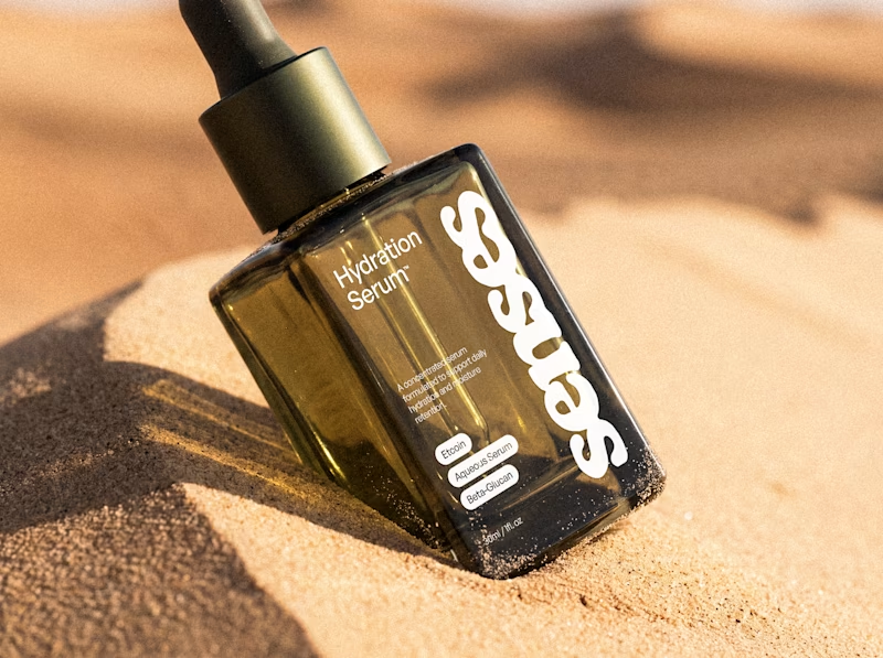
An early taste of Senses, a skincare identity built around the shift from overstimulation to comfort. The system pairs a fluid wordmark with clinical typography and an olive-glass form designed to feel precise, tactile, and quietly luxurious.
For this Hydration Serum study, I placed the same object between two sensory extremes: humid moss and sun-warmed sand. One speaks to replenishment; the other, to the need for it. Which world draws you in?


63 voted
59%
44 voted
41%
107 votes
Closed

both are lovely, but the desert image provides a beautiful contrast!
I agree with you, I actually love the conceptual contrast between the dessert and the hydration serum. And the fun part is I realized when I posted it and saw them both side by side.
Thank you!

Both are lovely, but the moss got my vote

love the bee detail in the moss shot

the bees is an impeccable touch here🔥


The moss one for me. Feels calm and fits the skincare vibe really well.

Desert


Moss personal choice

cool.

The moss fit the packaging bottle the most.

Thank you so much! Moss won for a reason, the client thought it was a really nice outcome and the brand was built around that idea.

Great work

Will go for Moss


Desert 🔥

I like the desert direction. The warmth gives the serum a more unexpected feel, and I think that contrast makes the product stand out without losing the identity. It feels like a direction that could translate really well into a wider campaign system too.
It is unexpected 100% I loved that about it, unfortunately for the desert, moss won but I think the possibility for a wider campaign or commercial using the desert idea is open!

Moss suits the product color better than dessert

Moss is good too, however Desert is making good contrast

Moss is the vibe


Moss

Moss winning for the pack while Desert stays on the table for a campaign is the right split — the pack has to promise the outcome shelf-side, but a campaign can afford to dramatize the problem first. Different jobs, different register.
Couldn't agree more!

I really like the left one—the darker, natural setting makes the product feel more premium and authentic. 🔥
The network for creativity
Join 1.25M professional creatives like you
Connect with clients, get discovered, and run your business 100% commission-free
Creatives on Contra have earned over $150M and we are just getting started





Related posts

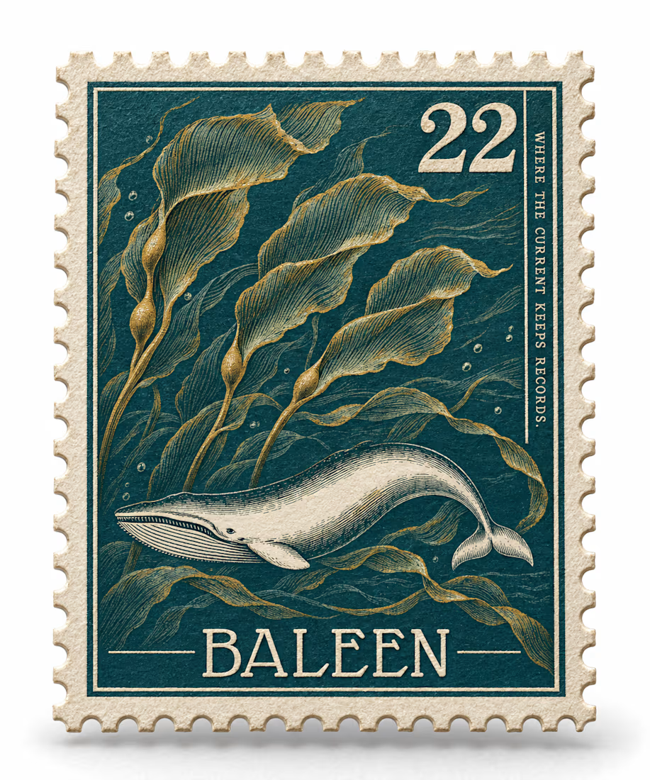
What if a salvage company's brand looked like it belonged in a stamp album, not a treasure map?
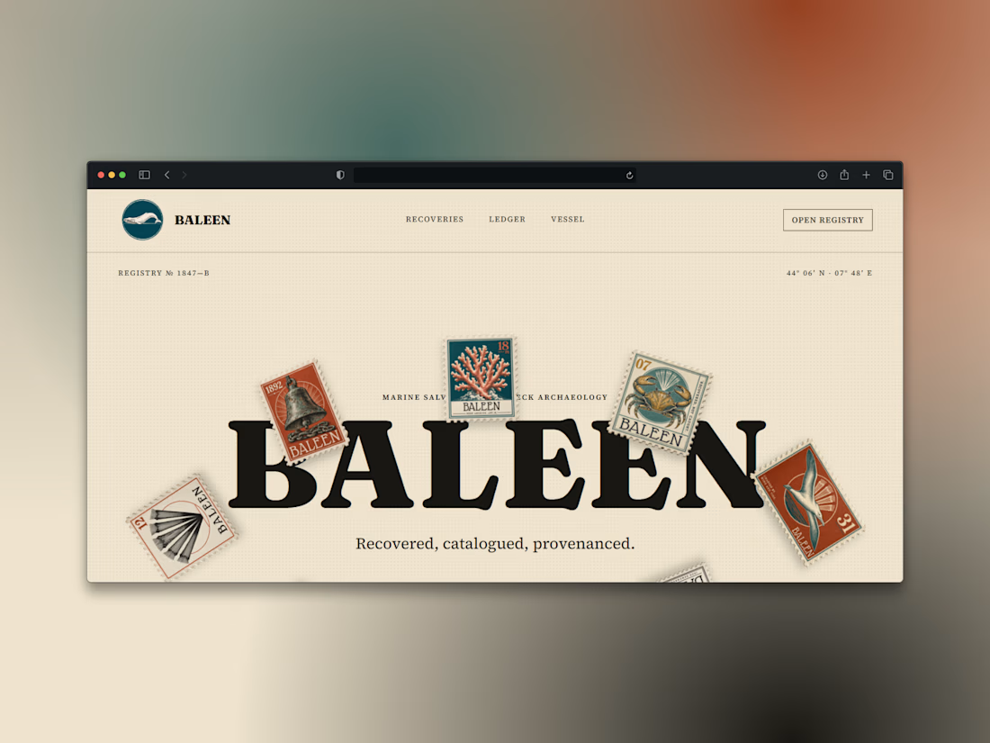
Introducing BALEEN — marine salvage & shipwreck archaeology, built on vintage natural-history stamp DNA. Every object recovered, catalogued, provenanced.
Website here


Working on this contact form for my own portfolio. Do you like it with or without the line of dots?
7 voted
44%
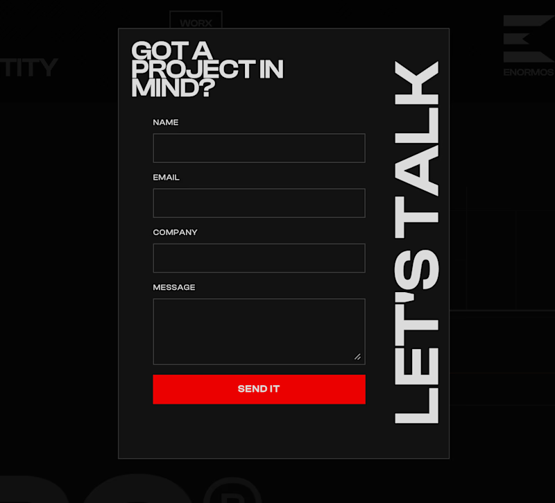
9 voted
56%
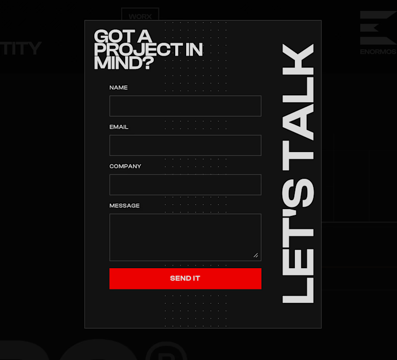
16 votes
Closed

Just shipped the BALEEN site — a marine salvage brand's home isn't a brochure, it's a registry.
A draggable archive of hyperrealistic specimen stamps as the hero. A live ledger of recovered objects. A vessel section with working depth and call sign.
Every object catalogued, never sold as treasure. 🐋⚓️

100% brochure, from layout, typography, sections, color palete and the description 100% AI generated. I use AI as well, but it seems like you did not put any human output anywhere.