Samson Akintunde
Client-focused Logo & Branding


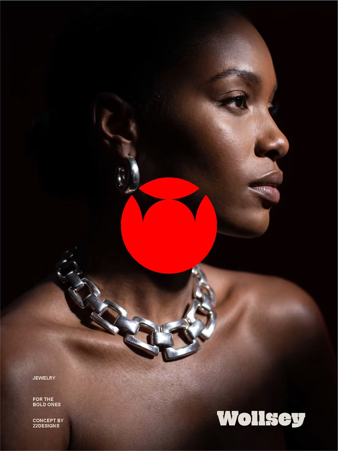
WOLLSEY - Jewelry for the Bold Ones
Wollsey is a jewelry brand built on one idea: bold jewelry should never blend in.
The identity centers on two interconnected principles; presence and permanence. The symbol takes the form of a solid, self-contained mark: a circular silhouette holding a crown-like negative space at its center, representing a piece of jewelry as an object of its own weight and status, not an accessory borrowed from someone else's trend cycle.
This concept carries through the entire visual system. The custom wordmark is built in a bold, condensed sans — compressed, confident letterforms that read as a stamp rather than a script, echoing the same solidity as the symbol itself.
The color palette pairs deep matte black with a controlled, high-impact red, balanced by warm cream and stone tones across packaging and supporting materials — a system built for contrast and attention rather than quiet luxury.
Full casestudy is coming soon
17
19
2.3K
Here's a short commercial I made for Wollsey, a brand that's into making and selling of bold jewelry.
I made sure to preserve every single detail of the character while showcasing all the jewelry pieces using light.
And yes, I made it using AI
More on this project is coming.
6
15
858
Here's a short commercial I made for Wollsey, a brand that's into making and selling of bold jewelry.
The aim is to showcase the jewelry in actual use cases so as to have an idea of the jewelry look like in real time.
I made sure to preserve every single detail of the character while showcasing all the jewelry pieces using light. And yes, I made it using AI
More on this project is coming.
1
209
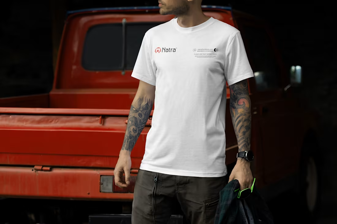
I always have it at the back of my mind that every branded merch should be designed in a way that everyone will want to be part of it, I mean designing it in a way that everyone will want a piece of the merch.
Here are some of my most recent branded shirt design collections.
Frame 1: Blevox Logistics
Frame 2: Natra Furniture
Frame 3: FIREWOX Studios
2
2
303