Samson Akintunde
Client-focused Logo & Branding
Ready for work
Samson is ready for their next project!
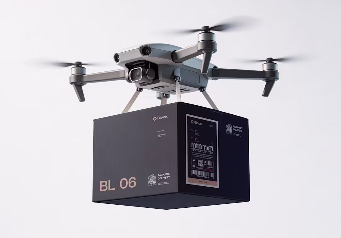
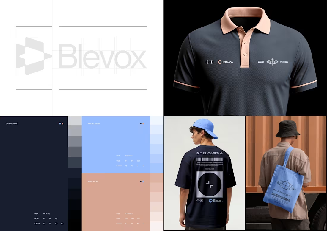
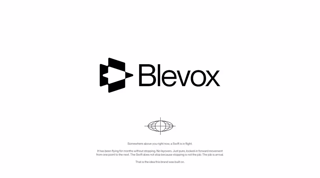
Blevox is a freight and logistics brand built to move across land, sea, and air without stopping. The brief was straightforward. My approach was not.
I started with a Swift. A bird that spends months in the air without touching the ground once. Scientists have tracked them crossing continents and oceans on a single flight. No layovers. No detours. Just locked-in forward movement until arrival. I did not want a mascot. I wanted a standard. So I reverse-engineered that standard into a brand identity.
The colors came from the three worlds this brand operates in. Dark Knight for the sky it moves through at night. Pastel Blue for the horizon where sky and sea become one body. Apricotta for the earth; warm and human where every shipment finally lands.
Most freight companies look like freight companies. I built Blevox to look like the thing freight companies are compared to.
Available for sale. Full project here: https://www.behance.net/gallery/250824121/Blevox-Logistics
1
77
Blevox is a freight and logistics brand built to move across land, sea, and air without stopping. The brief was straightforward. My approach was not.
I started with a Swift. A bird that spends months in the air without touching the ground once. Scientists have tracked them crossing continents and oceans on a single flight. No layovers. No detours. Just locked-in forward movement until arrival. I did not want a mascot. I wanted a standard. So I reverse-engineered that standard into a brand identity.
The colors came from the three worlds this brand operates in. Dark Knight for the sky it moves through at night. Pastel Blue for the horizon where sky and sea become one body. Apricotta for the earth; warm and human where every shipment finally lands.
The style is dark. Precise. Industrial. Every alphanumeric code, every dock marker, every grid line is a brand decision. Nothing decorative. Nothing arbitrary. A cap, a truck, a drone delivery box, a phone UI, the identity does not break on a single surface because I did not let it.
Most freight companies look like freight companies. I built Blevox to look like the thing freight companies are compared to.
Available for sale. Full project here: https://www.behance.net/gallery/250824121/Blevox-Logistics
2
2
110
Logistics is not a boring category. It just keeps getting boring designs.
Blevox is a freight and logistics brand built to move across land, sea, and air without stopping. The brief was straightforward. My approach was not.
I started with a Swift. A bird that spends months in the air without touching the ground once. Scientists have tracked them crossing continents and oceans on a single flight. No layovers. No detours. Just locked-in forward movement until arrival. I did not want a mascot. I wanted a standard. So I reverse-engineered that standard into a brand identity.
The colors came from the three worlds this brand operates in. Dark Knight for the sky it moves through at night. Pastel Blue for the horizon where sky and sea become one body. Apricotta for the earth; warm and human where every shipment finally lands.
The style is dark. Precise. Industrial. Every alphanumeric code, every dock marker, every grid line is a brand decision. Nothing decorative. Nothing arbitrary. A cap, a truck, a drone delivery box, a phone UI, the identity does not break on a single surface because I did not let it.
Most freight companies look like freight companies. I built Blevox to look like the thing freight companies are compared to.
Available for sale.
Full project here: https://www.behance.net/gallery/250824121/Blevox-Logistics
3
93
Work in progress for Blevox; a logistics and freight services provider brand.
Every color in this palette has a reason.
Dark Knight: The base. The weight. The authority.
Pastel Blue: The sky and sea the Swift passes through.
Apricotta: The earth it finally lands on.
I picked no color for aesthetics.
This is Blevox. Nature-driven.
2
1
120
Most logistics companies move packages. This one move with purpose.
There is a difference between a brand that operates across land, sea, and air and a brand that is driven across all three. Any company can put a truck on a road, a vessel on water, or cargo on a plane. What most cannot do is carry the same relentless energy across every single one of those routes without losing a step.
I built this brand around one conviction: every route deserves the same urgency as the last mile. I put that into consideration while making the brand's logo; I combined letter B which is the brand's first letter with a Swift Bird.
It does not matter if your shipment travels by road through Lagos, by sea through the Atlantic, or by air across five time zones. From the moment it leaves your hands, it is in motion. Deliberately. Precisely. Without pause.
More on this project is coming soon.
2
84
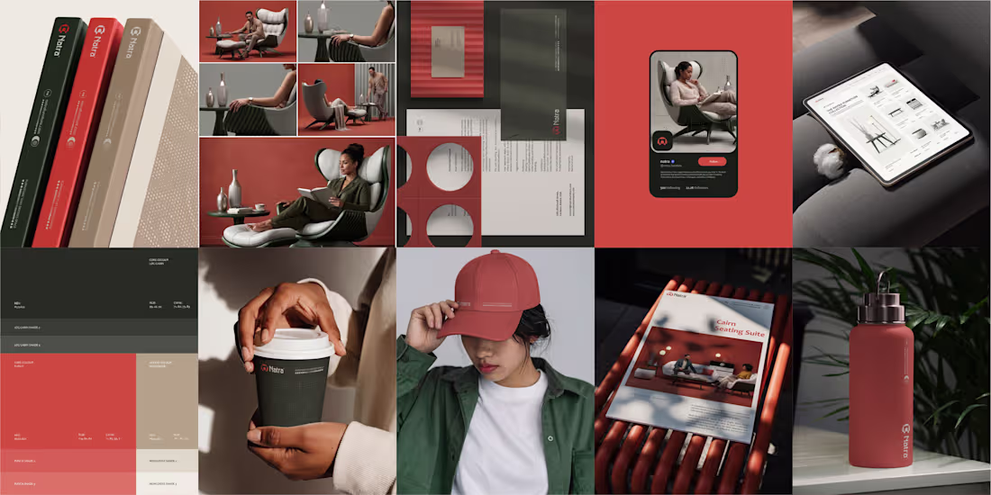
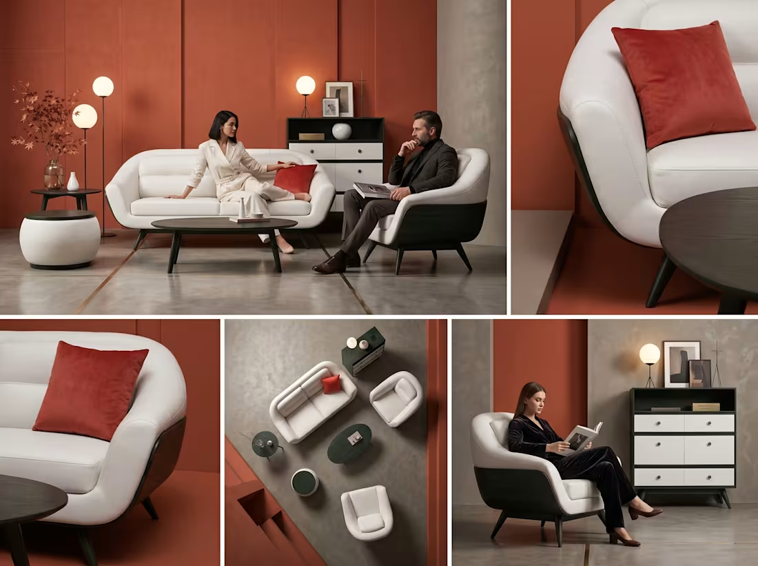
I designed this furniture brand for how people actually live.
Not for show. Not to fill space. To hold you properly.
If you have to adjust yourself to fit the piece, it’s already wrong. It should meet you where you are.
So I focused on behavior, not appearance. No extra details. No forced aesthetics. Just balance. Structure. Restraint. Comfort, redefined; not something you sink into, something that holds you.
Natra furniture is not about filling a space. It's bout how it feels to exist in one.
Full project on my Behance:https://www.behance.net/gallery/248762831/Natra-Furniture
2
88
Took things further by creating this short commercial for Natra Furniture brand using AI and Adobe After Effects…
Instead of showcasing their furniture sets, I took a completely different route by selling the feelings you get from their furniture.
1
73
I designed this furniture brand for how people actually live.
Not for show. Not to fill space.
To hold you properly.
If you have to adjust yourself to fit the piece, it’s already wrong.
It should meet you where you are.
So I focused on behavior, not appearance.
No extra details.
No forced aesthetics.
Just balance. Structure. Restraint.
Comfort, redefined;
not something you sink into,
something that holds you.
Natra furniture is not about filling a space.
It's bout how it feels to exist in one.
2
97
I made AI-generated commercials for each furniture set I am using in Natra's branding.
This is going to be something you haven't seen before from any other furniture brand by the time I finish the case study and publish it.
3
115
Not all minimal brands are forgettable, I built this one to stand out.
Saglyph logo and visual designs
A modern identity designed with clarity, structure, and intention.
From typography to application, every detail was crafted to create a cohesive, premium feel across all touchpoints.
Built for recognition. Designed to last.
Full project: https://www.behance.net/gallery/211178413/saglyph-Brand-Identity-Design
1
91
A concept that never made it past my artboard… until now.
This was one of the logo directions I explored for a brand some time ago.
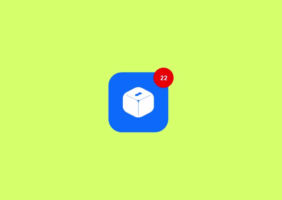
The idea behind this logo is simple; a place where value goes in and is kept safe.
At the top, the subtle opening introduces the concept of input and participation, a direct reference to the act of giving, saving, or investing. This detail connects visually with the real-world action of placing value into a secure structure, reinforcing the brand’s core function.
The overall geometry is compact, stable, and grounded, communicating reliability and structure. Its minimal execution ensures versatility across different applications while maintaining a modern and premium feel.
In essence, the mark represents a trusted container of value, where individual contributions come together to form something secure, purposeful, and enduring.
5
6
175
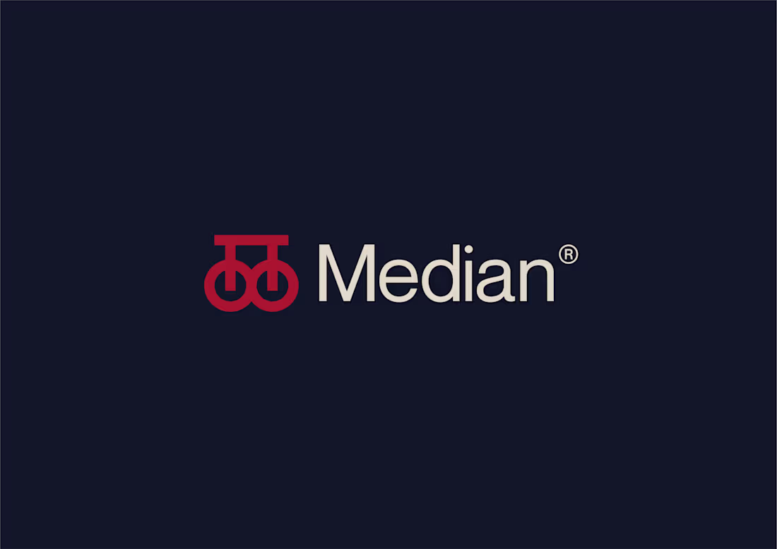
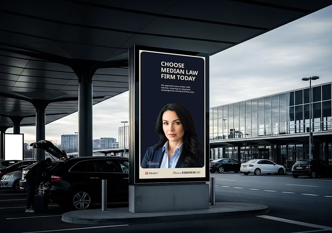
Median didn’t start from a visual. I started it from a question: what does fairness actually look like when it holds under pressure, not just in theory. That became the base. Not styling. Not aesthetics. Just structure.
As the idea developed, it became clear balance isn’t something applied at the end. It has to exist from the start. Every decision around form, spacing, and proportion followed that. Nothing decorative. Everything stable.
The logomark came out of that thinking. Two equal forms, held in place within a controlled system. No dominance. No absence. Not symbolic for the sake of it. Just a direct expression of balance.
The name followed; Median. The point that remains when everything unnecessary is removed. Not the extremes. Just what holds. In law, that idea carries weight. Because what matters is what stands when tested.
Most firms lean into authority and legacy. Very few focus on balance and structure. That’s where Median sits. Quiet, but deliberate.
Not built to impress. Built to hold.
Full casestudy: https://www.behance.net/gallery/245375919/Median-Brand-Identity
4
136
Median - The Equilibrium of Justice
Median is built on the principle that law performs best at the point of balance where clarity replaces noise and structure replaces reaction. Inspired by the mathematical meaning of the word, the brand represents stability once extremes are removed.
The name signals neutrality, precision, and measured judgment. The logomark mirrors that philosophy, equal forms held in alignment, supported by structure. Nothing ornamental. Nothing excessive. Just equilibrium by design.
Median is not about dominance. It is about disciplined thinking, balanced advocacy, and decisions that endure.
More about this project is coming...
2
129
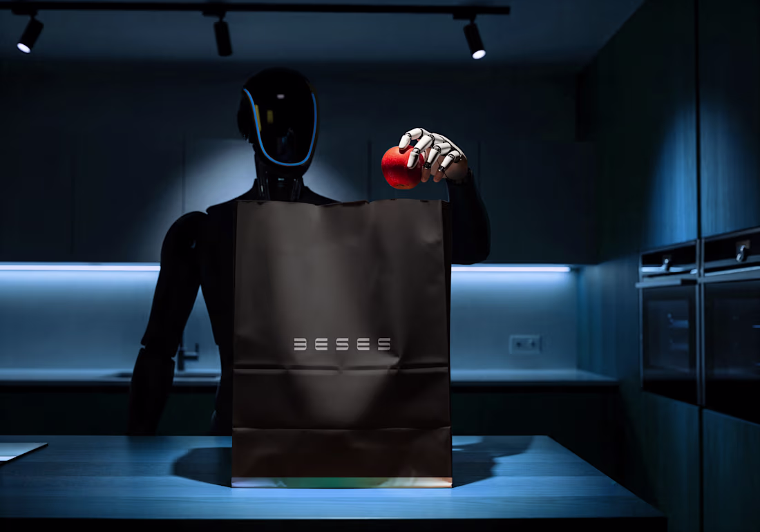
This isn’t a tech brand trying to look futuristic.
It’s a robotics company that looks exactly like what it builds; precise, repeatable, engineered.
Every line was constructed with intent.
Every curve balanced for tension and control.
Nothing added for aesthetics. Everything built for structure.
The symmetry is systematic.
The repetition is deliberate.
The geometry mirrors automation itself.
My role wasn’t just to design a logo.
It was to interrogate it, pressure-test it, and position it where it truly belongs.
From grid exploration to strategic direction, I shaped BESES into what it was always meant to be, a Robotics & Automation company built on logic, not trend.
4
131
Building AURIX wasn’t about designing another “AI-looking” brand.
From the start, the idea was clear: AURIX needed to feel like a partner founders can trust, not just a tool they use.
The logo and visuals were intentionally kept calm, minimal, and abstract, no sharp edges, no loud symbols. Every curve and form was designed to represent thinking in progress, collaboration, and clarity forming out of uncertainty. The softness reflects trust and presence, while the bold simplicity ensures the mark feels confident and future-ready.
The visual system follows the same philosophy: quiet layouts, space to think, and subtle motion that feels alive but never distracting.
This is what designing a thinking partner looks like.
3
128
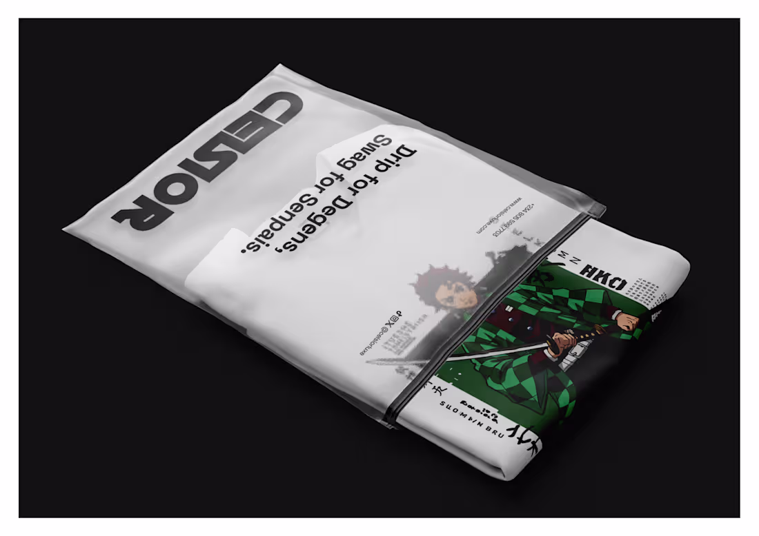
This brand wasn’t designed to “look cool.”
It was designed to belong.
I led the brand design for Celsior Luxe; a streetwear brand built for people who live between anime frames and blockchain blocks. Instead of forcing Web3 and anime into one noisy mix, the logic was simple: let each culture breathe. Separate collections. Clear signals. No filler arcs.
Every visual choice pulls from power, identity, and progression; like a main character leveling up. Not merch. Not trends. A uniform for a culture that gets it.
Check full casestudy here: https://www.behance.net/gallery/226697779/Celsior-Luxe-Brand-Identity
2
5
119
Black and white isn’t the absence of color, it’s the stage that gives color its power.
When a paint manufacturing client selected a grayscale palette, it stood out not as a safe choice, but a strategic one. As the brand prepares to expand beyond Venezuela into broader Latin American markets, color became more than aesthetics, it became cultural. Meanings shift across regions, and ignoring that nuance can weaken relevance.
Rather than competing with the vibrancy of its own products, the brand positioned itself as the neutral foundation.
This project was a reminder that strong brand design isn’t just about visuals; it’s about listening, alignment, and long-term thinking. When strategy leads, brands don’t just look good they last.
2
111
Vutter Brand Identity Development
1
5
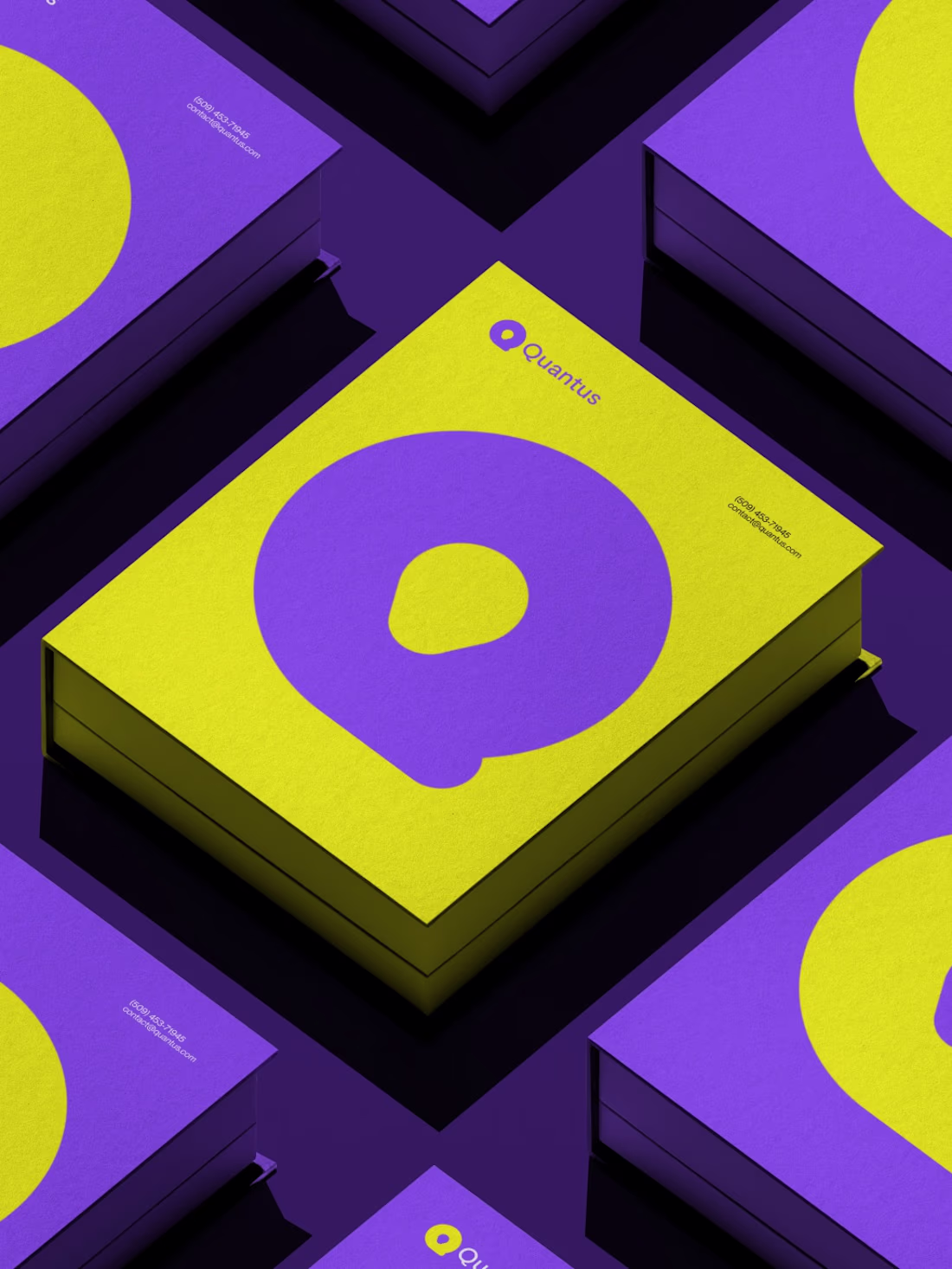
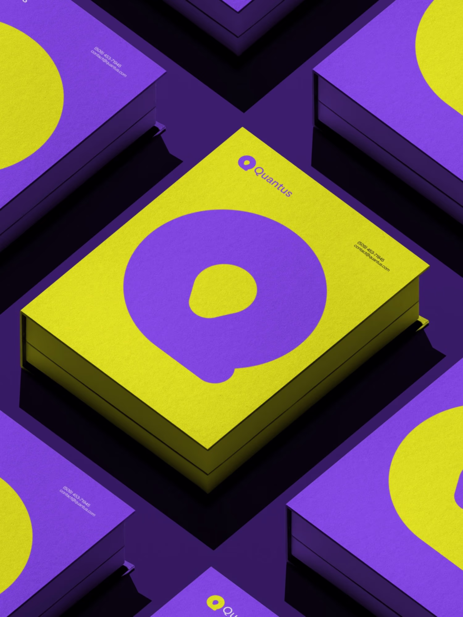
Quantus Visual Identity Design
The beauty of branding is that it doesn’t just introduce a business, it introduces a feeling, a story, a promise. Quantus is a lifestyle technology brand created to bring clarity, direction, and inspiration into everyday life.
As the brand designer, my goal was to build a visual identity that reflects simplicity, focus, and modern living. The logo system is designed around balance and forward movement, supported by a bold color palette of Turbo Yellow and Electric Violet to communicate energy and clarity.
The project included:
• Logo design
• Color system
• Visual identity direction
• Social and lifestyle applications
This brand identity equips Quantus with a strong, memorable presence and a clear foundation for future growth.
More visuals here: https://www.instagram.com/p/DOvIemJjNXM/?img_index=1
52
112
793
Some selected bento grids of the logo and brand identity I made in 2025.
Checkout the rest here:https://www.behance.net/22designs_madeit
4
3
173
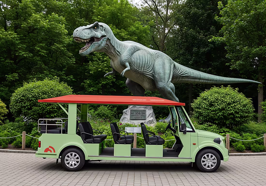
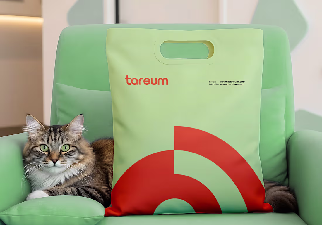
Why do so many animal-care brands try to look cute… when nature isn’t here to entertain us?
That question sparked Tareum; a quiet rebellion against shallow branding in a field that shapes how people see and respect living creatures.
I didn’t want decoration; I wanted meaning. Something wise, calm, and intentional enough to stand in zoos, veterinary spaces, conservation programs, and educational environments. The process fought back; long nights, dead ends, redesigned ideas but that struggle is what gave the brand its depth and direction.
Tareum became a system that bridges science and humanity, structure and empathy. A brand that doesn’t just represent animal care, but honors it.
Full Project on Behance: 🔗 https://www.behance.net/gallery/239419721/Tareum-Brand-Identity
If you’re building a brand with purpose, let’s talk.
2
10
203
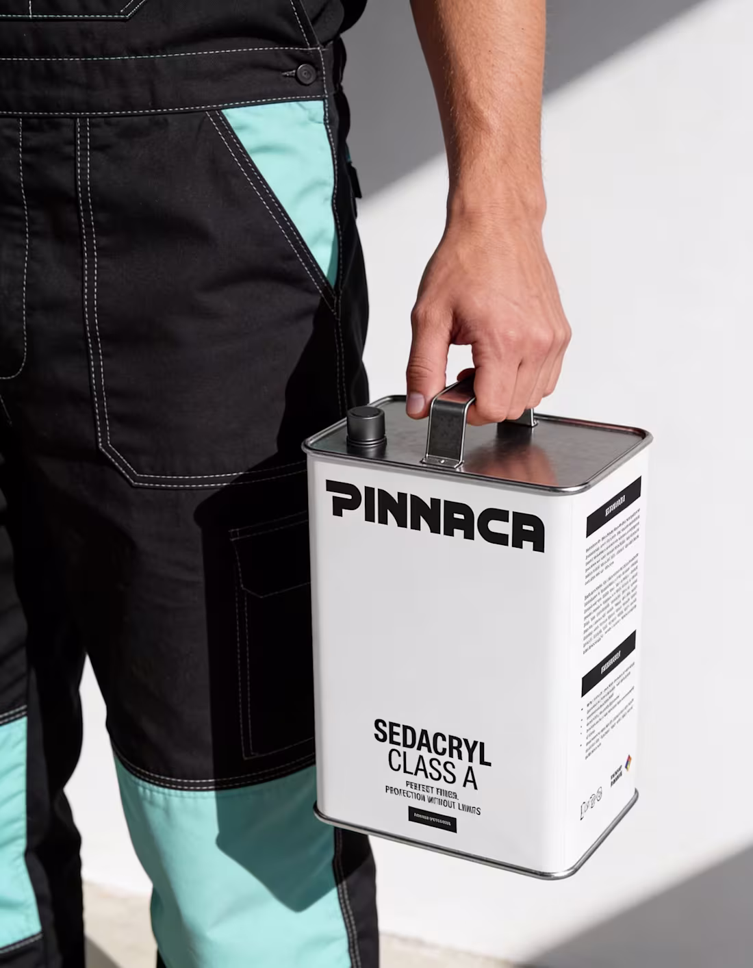
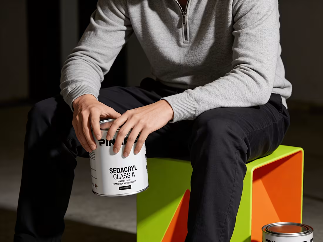
Branding for PINNACA: a paint production company based in Venezuela.
I was commissioned to work on the project. The project focused on giving the brand a refreshed logo and visual identity, one that reflects over five decades of experience across architectural, industrial, and wood coating solutions, while preparing the brand for a more global stage.
In a market saturated with color, the decision to embrace black and white was a deeply strategic and psychologically astute decision. Rather than competing with the product itself, the identity acts as a neutral foundation allowing PINNACA’s finishes, textures, and applications to speak for themselves.
Full project is on my Behance: https://www.behance.net/gallery/242476825/PINNACA-Brand-Identity
2
3
140
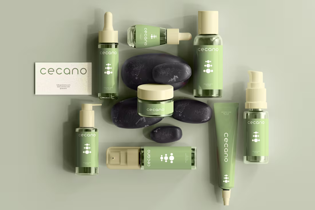
CECANO Skincare
Cecano represents a calm, nature-led approach to skincare, focusing on balance, purity, and long-term skin wellness.
Every element; from the circular logo to the muted botanical palette, expresses a philosophy of gentle restoration, where science and nature work together in harmony.
Though Cecano Skincare doesn’t exist as a commercial brand, it reflects what a modern, premium skincare line could look like: clean, minimal, soothing and grounded in the idea that beauty begins with balance.
8
11
178
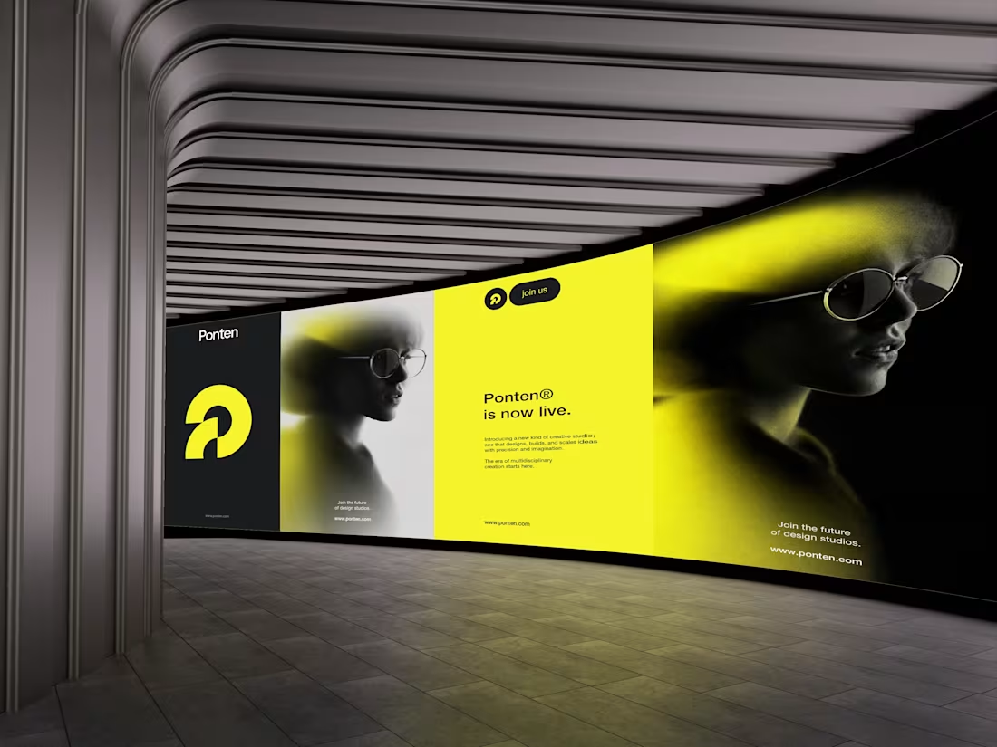
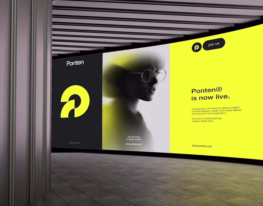
Ponten started from a simple observation: many brands struggle to find a partner that understands both identity and digital execution. Some studios focus on visuals, others on strategy; very few connect both.
Ponten was built to fill that gap.
It’s a creative and tech studio that builds modern brands, digital products, and meaningful experiences.
The logo reflects this vision; geometric, intentional, with a lens-like center that represents clarity and focus.
Ponten is the bridge between creativity and technology.
A place where ideas gain direction and become what’s next.
Full casestudy here: https://www.behance.net/gallery/237958345/Ponten-Brand-Identity
10
15
310
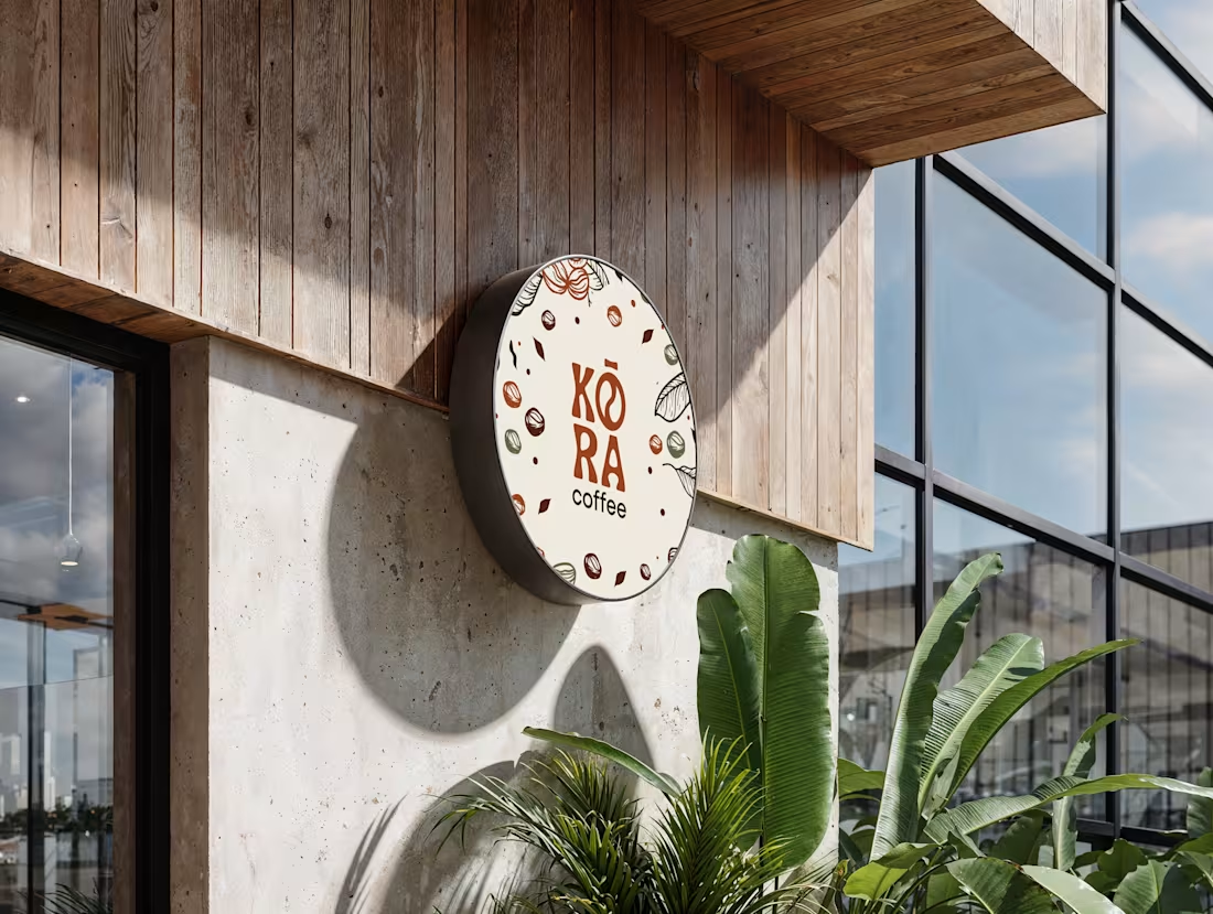
Most branding doesn’t fail because of bad visuals. It fails because the right decisions weren’t made early.
KORA coffee started during a creative block, without a rigid plan. I stripped the process back to fundamentals; type, form, and meaning, and refined everything down to four letters: K O R A. The “O” was intentionally shaped into a coffee icon so the brand could communicate instantly.
The logo came together quickly. Building a visual identity that could scale across real-world touchpoints took time, focus, and restraint, especially when translating African-inspired culture into a functional system.
KORA is a reminder that good branding isn’t about trends or speed. It’s about clarity, intention, and decisions that last.
If you’re building a brand and want identity design that goes beyond aesthetics, let’s talk.
2
7
108
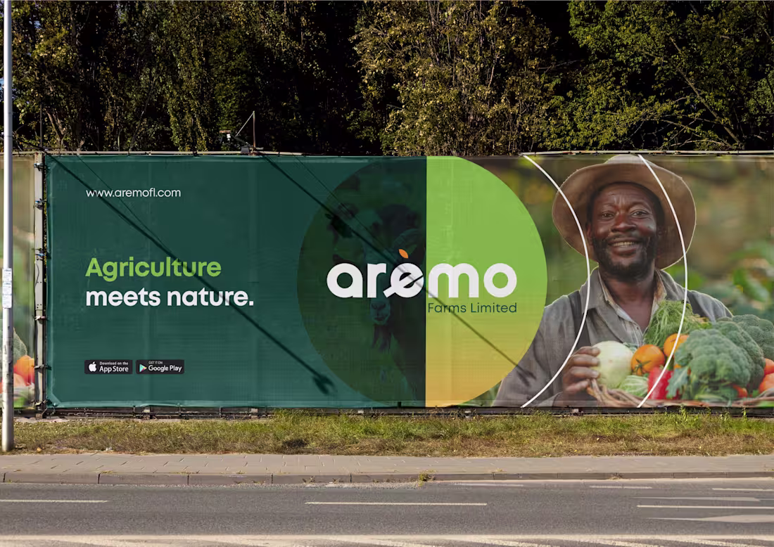
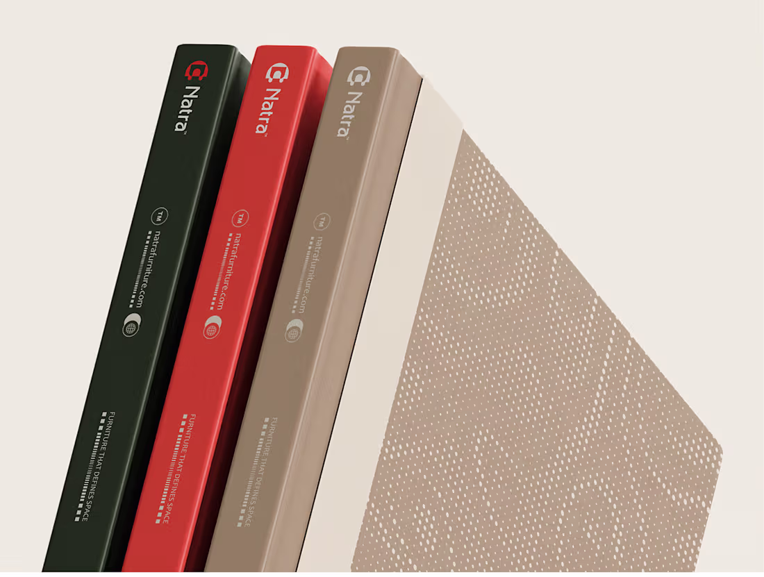
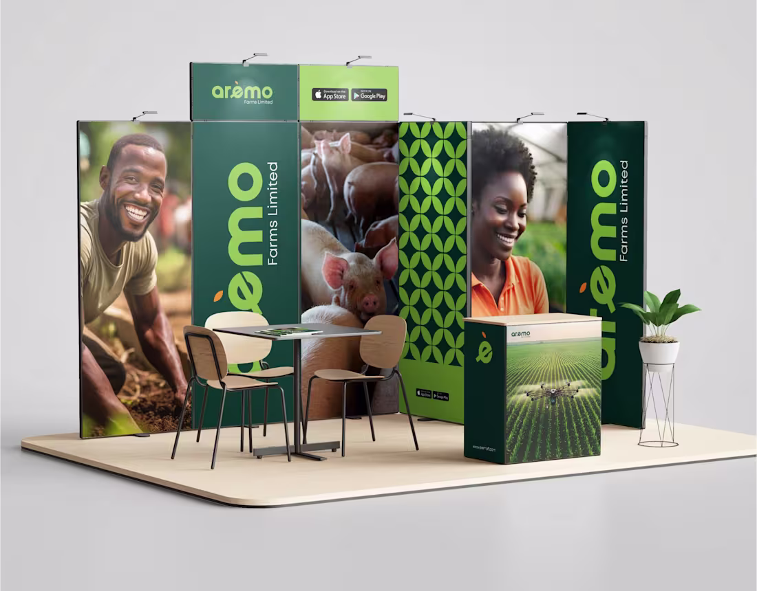
Brand identity design for Aremo Farms Ltd.
Aremo Farms Ltd. Brand Identity Design is not just a logo; its a visual language rooted in agriculture, growth, and rural heritage. 🌿 Crafted to reflect Aremo’s commitment to sustainable crop production and animal husbandry with clarity, versatility, and a modern farm aesthetic. Every asset from the custom logotype to the extended pattern system brings cohesion to the brand’s story, where tradition meets a forward-looking identity. 🌾
🔗 Full project on Behance: https://www.behance.net/gallery/209846929/Aremo-Farms-Ltd-Brand-Identity-Design
#BrandIdentity #LogoDesign #AgricultureBranding #FarmDesign #VisualIdentity #DesignCaseStudy #AremoFarmsLtd
2
2
122
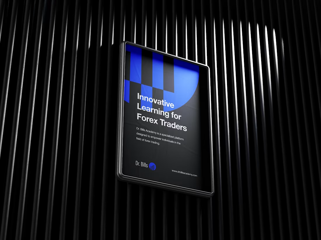
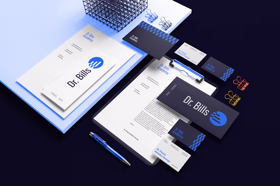
A lot of people mix these up, so let’s start here: a rebrand is a complete makeover, while a brand refresh is a clean-up, you keep the brand’s identity but make it sharper, clearer and more modern. What I did for Dr. Bills Academy was a refresh, not a rebrand.
The original logo had the right foundation but didn’t fully capture the essence of forex. I redesigned it using clean ascending candlestick bars to show growth and learning, wrapped in a circle that represents global reach. The idea was to keep the familiar feel, but express it in a clearer and smarter visual.
I then refined the colors, and overall system to give the academy a more professional look, one that aligns with their mission to guide people confidently through the forex world.
Full case study: https://www.behance.net/gallery/213062797/Dr-Bills-Academy-Rebranding
8
5
189
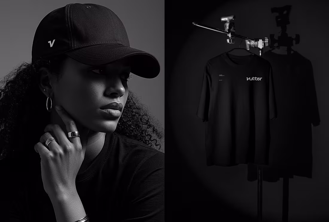
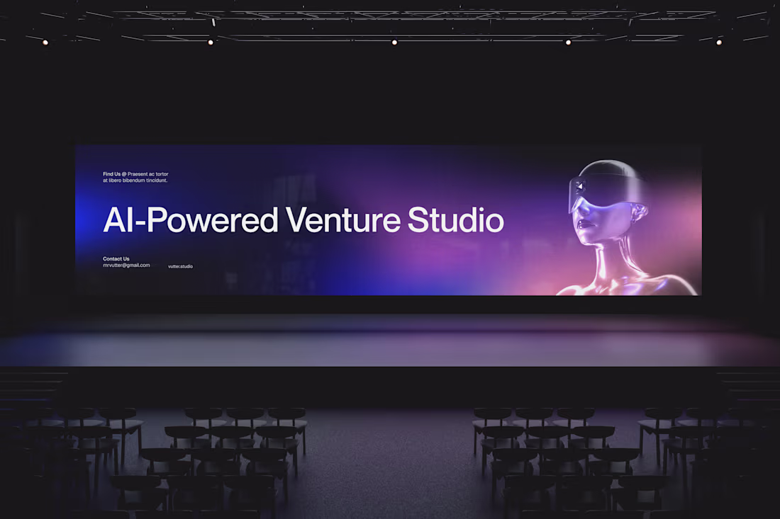
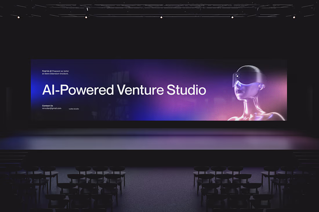
Hey fam 👋
Wanted to share a project I worked on earlier this year that still means a lot to me.
Back in June, I partnered with Vutter, an AI-powered venture studio built around speed, clarity, and bringing ideas to life fast. The vision was sharp, the collaboration smooth, and it became one of those projects that stick with you.
For the identity, I focused on creating a system that feels fast, precise, and future-ready; clean geometry, sharp structure, and intentional movement driving the whole look. Seeing it all come together with that high-velocity energy reminded me why I love brand design.
If you’re building something in the AI, SaaS, or startup world and need a brand that can match your momentum, I’m always open to chat. 🚀
Full case study: https://www.behance.net/gallery/227680085/Vutter-Brand-Identity
4
4
153
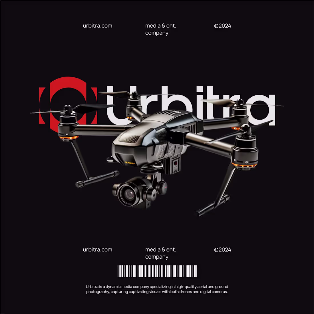
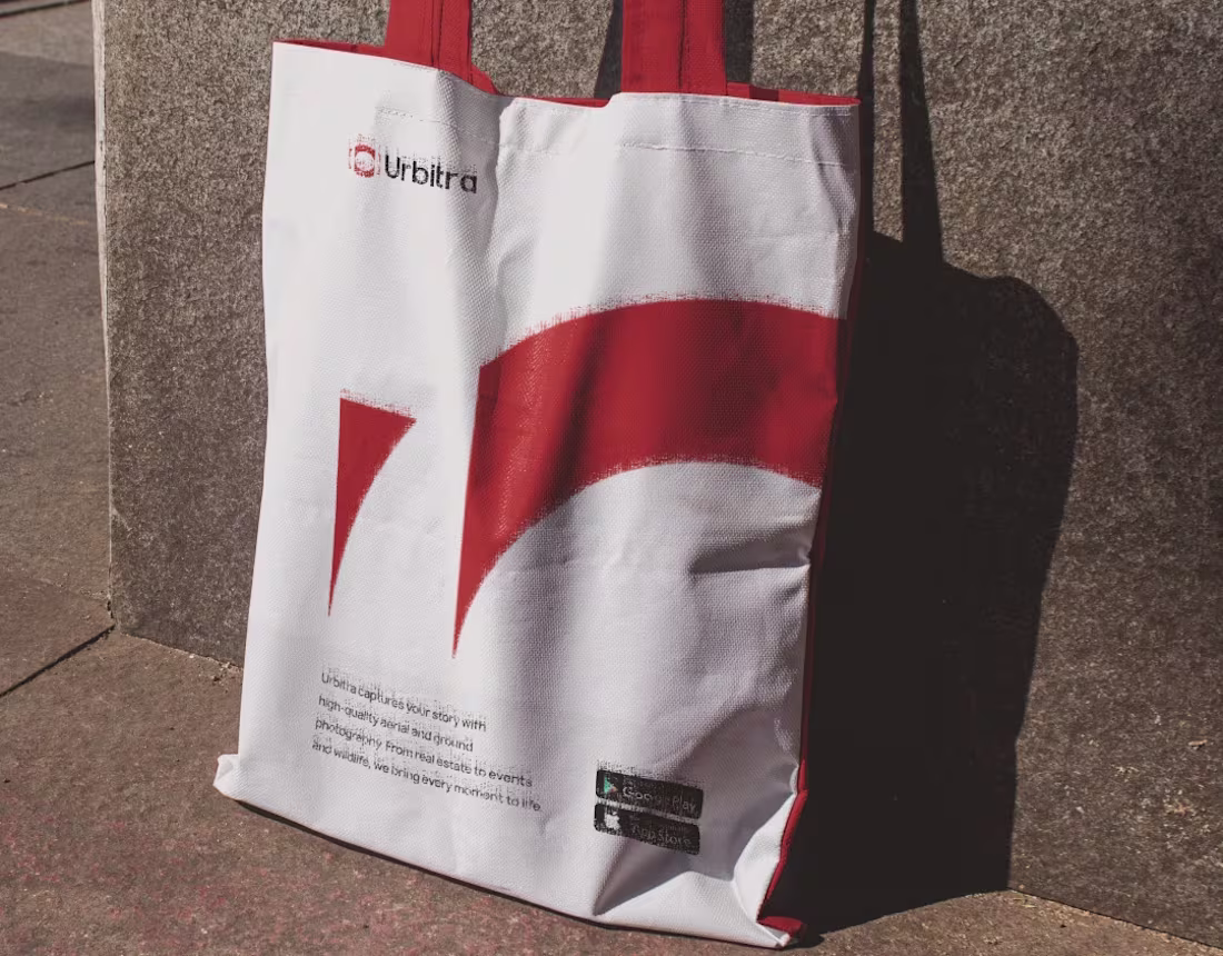
Urbitra is a media brand built for bold perspectives capturing high-quality visuals through both drone and ground photography. From real estate to lifestyle, the focus is simple: immersive angles that elevate storytelling.
I designed an icon that blends Urbitra’s core elements into one mark; a lens, a targeting frame, and a drone. The center shape represents focus and clarity, while the outer structure reflects balance, precision, and perspective.
Minimal, modern, and built for versatility. A visual identity crafted to match the brand’s vision: sharp. dynamic, and driven by innovation.
Role: Brand & Logo Designer.
Casestudy: https://www.behance.net/gallery/212703391/Urbitra-Brand-Identity
8
5
160
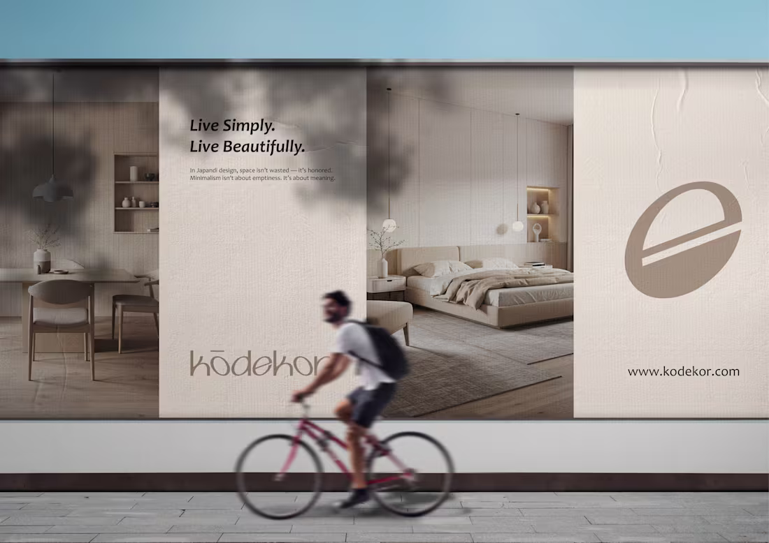
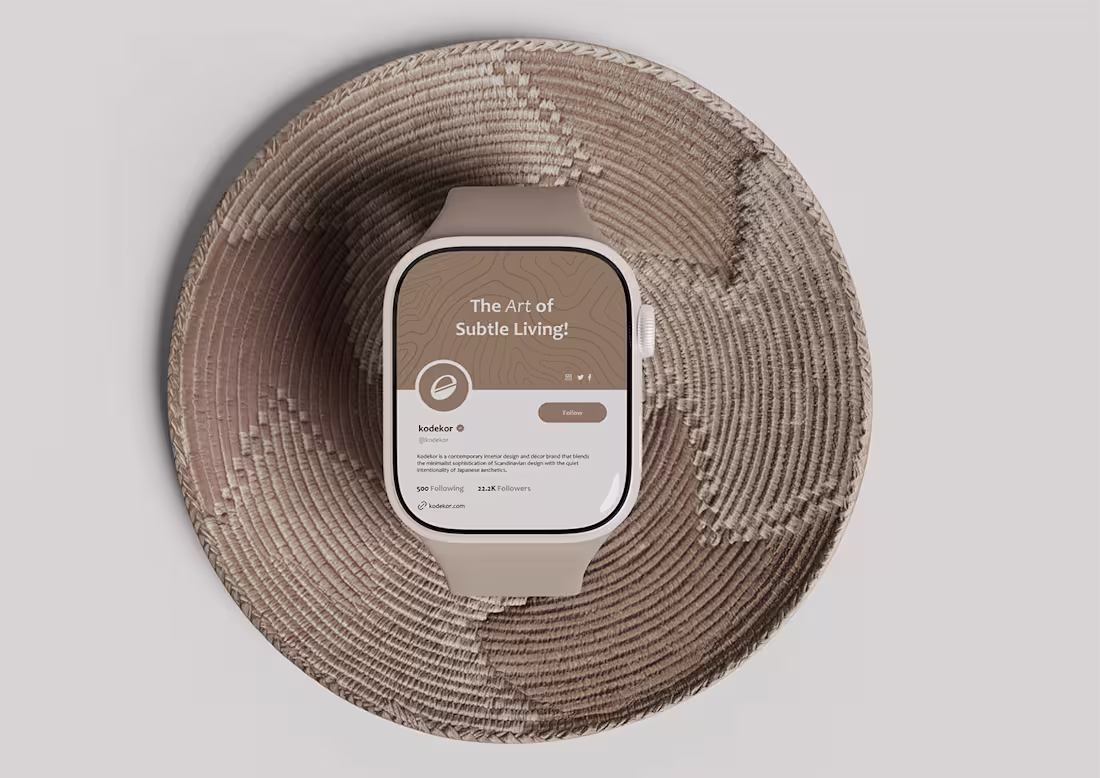
Experience KODEKOR living. ✨🪵
As the brand designer, I crafted KODEKOR as a modern interior and furniture brand inspired by Scandinavian simplicity and Japanese calm.
Designed for people who crave minimalism, warmth, and timeless elegance, KODEKOR brings harmony, texture, and intentional design into everyday living.
Soft neutrals, clean lines, and quiet luxury, each element reflects a philosophy of peace and modern clarity.
Rooted in calm. Made for modern living. 🤍🛋️
full case study: https://www.behance.net/gallery/223990867/Kodekor-Brand-Identity-Design
Looking to build a visual identity for your brand?
.
Send a DM or
Email 📧 samsonakintunde00@gmail.com
(mailto:samsonakintunde00@gmail.com)Whatsapp +2349025335891
1
118
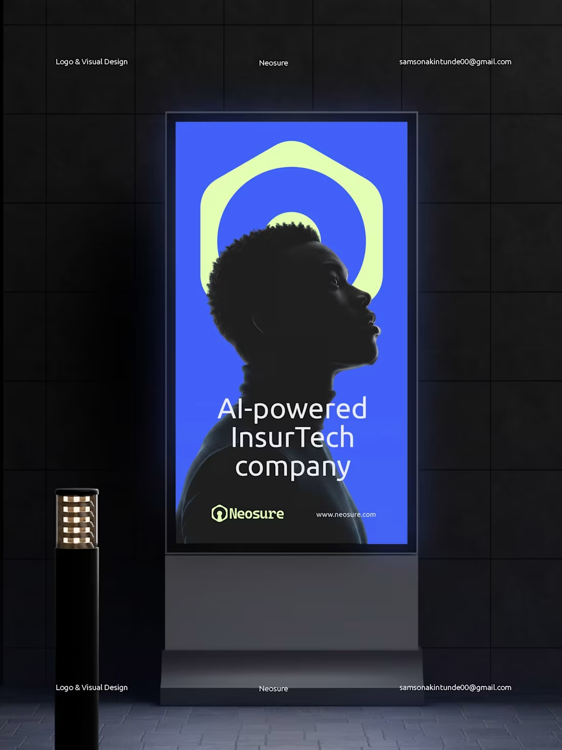
Neosure: Brand Identity Design
Neosure reimagines insurance for a digital-first world. I noticed a clear pattern: traditional insurance doesn’t fit the speed or needs of freelancers, remote teams, and modern workers. That insight inspired a simple question; what if insurance was rebuilt with AI, real-time data, and people-first logic?
The visual identity translates that idea into a system that feels smart, secure, and adaptive. The logo reflects continuous protection, while the Royal Blue and Soft Lime Green palette balances trust with innovation. Every element is designed to mirror Neosure’s core features: AI-powered automation, personalized coverage, and instant activation.
Logo is available for sale
More visuals here: https://www.instagram.com/p/DJt7LLds4uk/?img_index=1
3
145

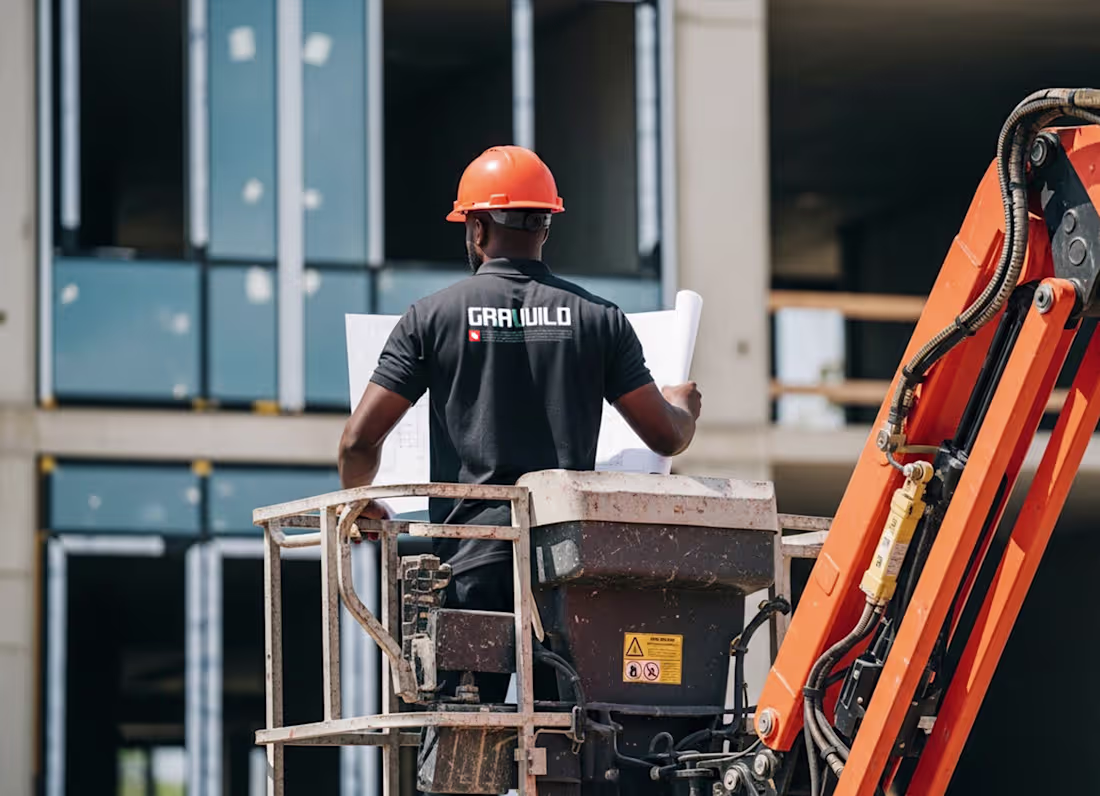
Gravuild Logo and Brand Identity
1
4
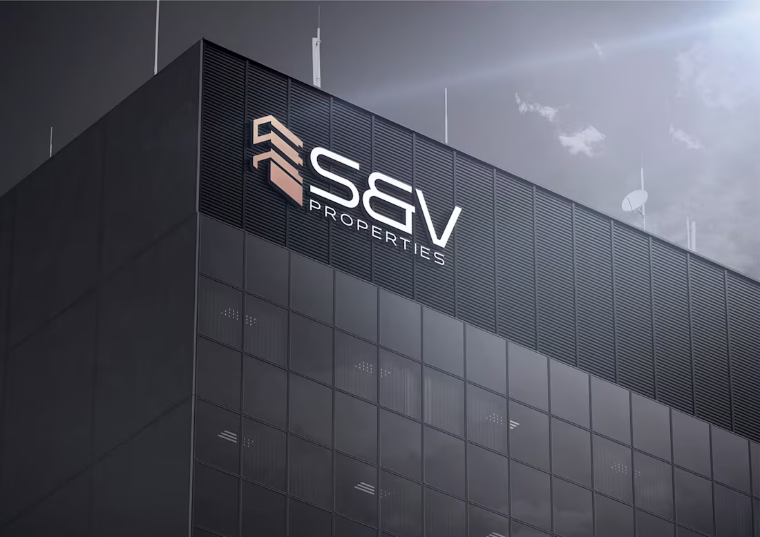
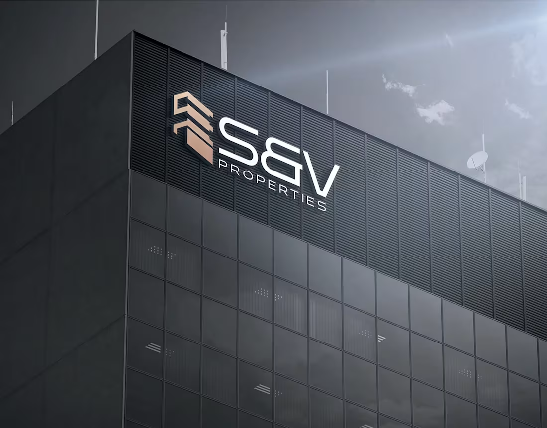
S&V Properties Rebrand :: Behance
2
4
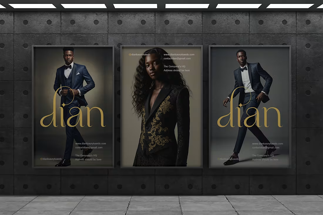
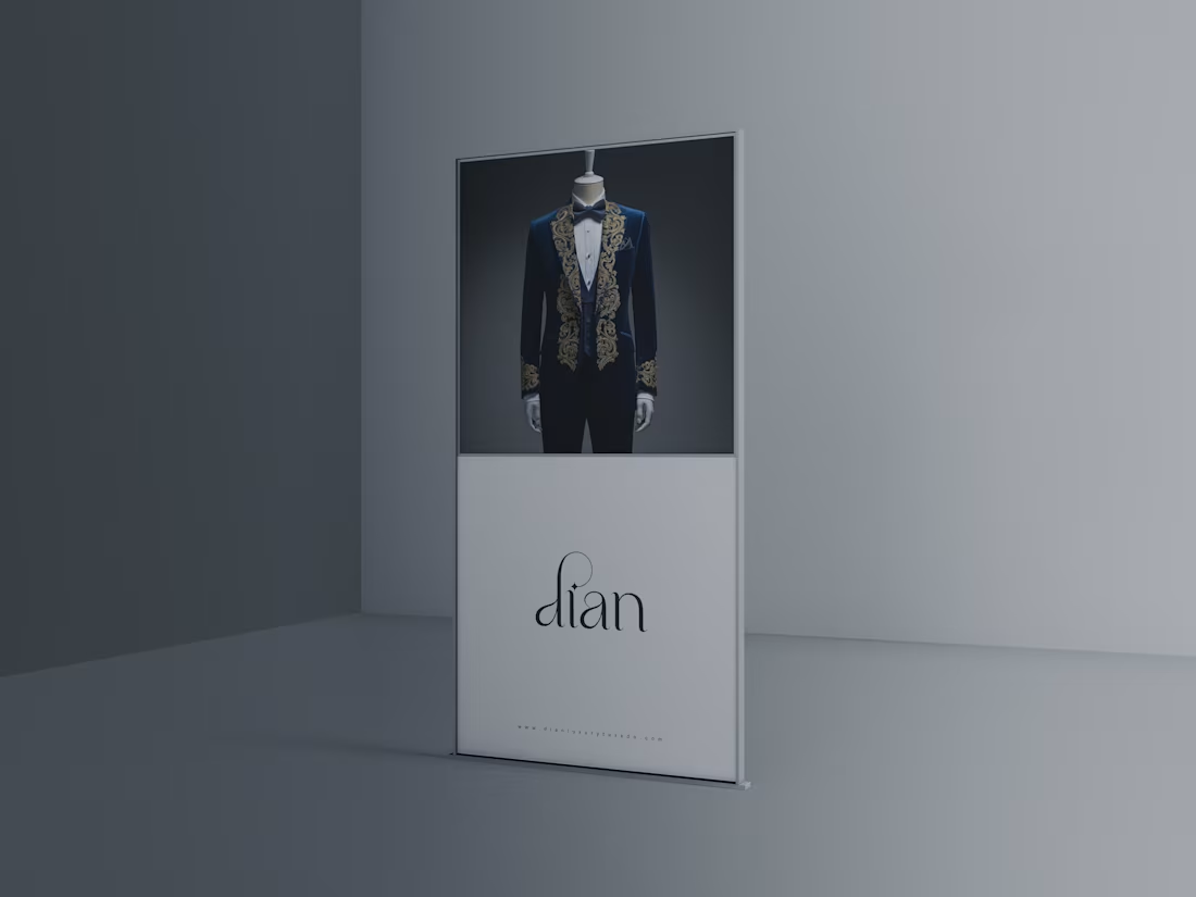
Dian Luxury Tuxedo || Brand Identity Design :: Behance
2
3
Aremo Farms Ltd. | Brand Identity Design :: Behance
1
5
Logofolio 2.0
0
0
PINNACA Brand Identity
0
0
Kodekor Brand Identity Design
0
1
Dian Luxury Tuxedo || Brand Identity Design
0
1
Vutter Brand Identity
0
1
Ponten Brand Identity
0
1
Natra Furniture
1
2
Urbitra Brand Identity
0
2
Dr. Bills Academy Rebranding
0
1
Gravuild Brand Identity
0
4
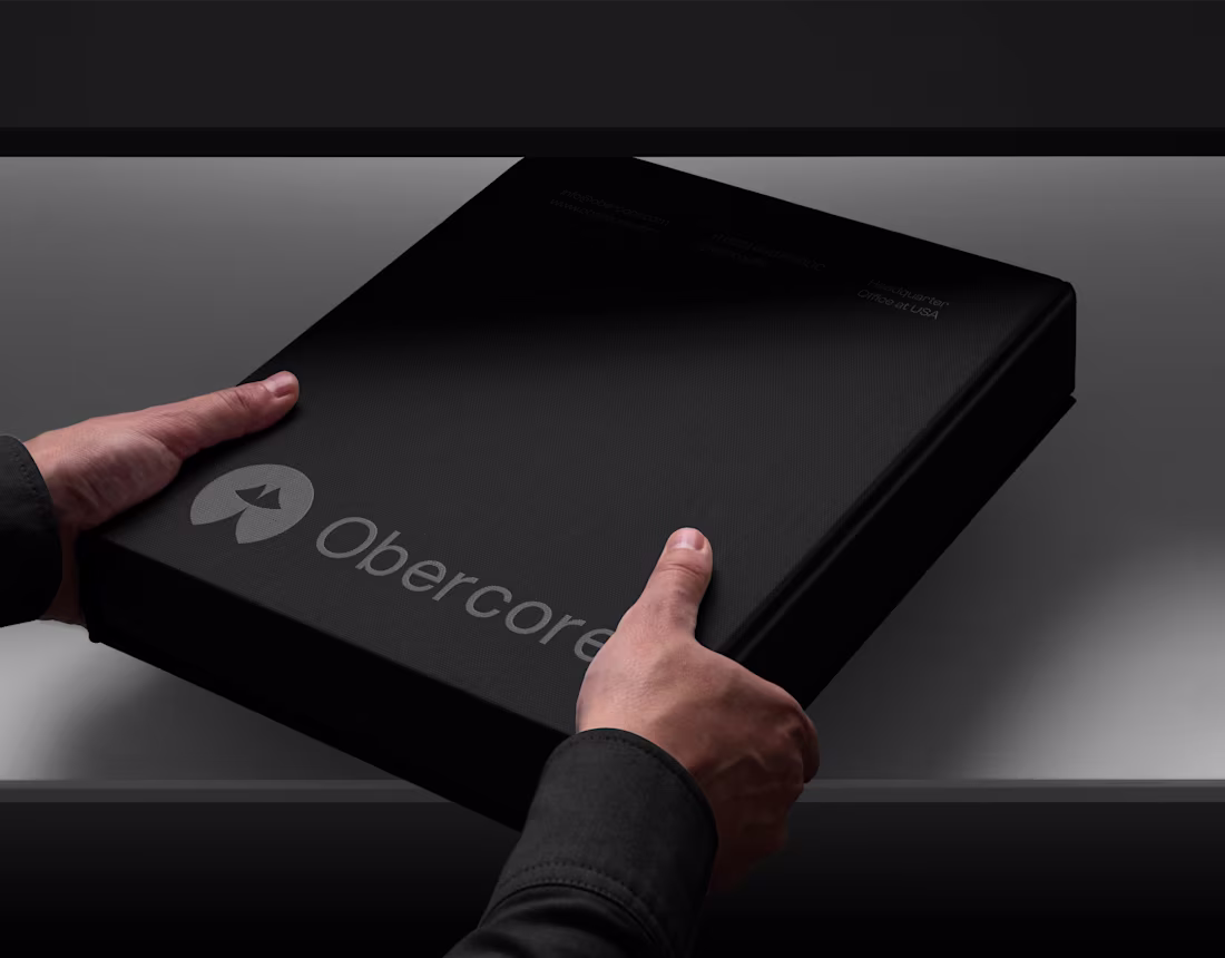
Obercore Brand Identity
0
0
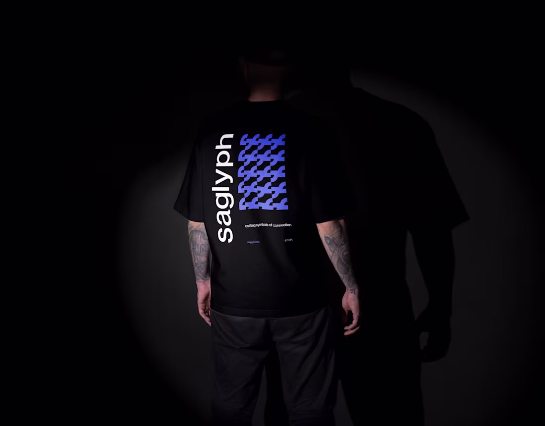
saglyph Brand Identity Design
0
4
Tareum Brand Identity
0
0
Median Brand Identity
0
3
MartTheBrand
0
1
Aremo Farms Ltd. | Brand Identity Design
0
3

Celsior Luxe Brand Identity
0
1
S&V Properties Rebrand
0
3
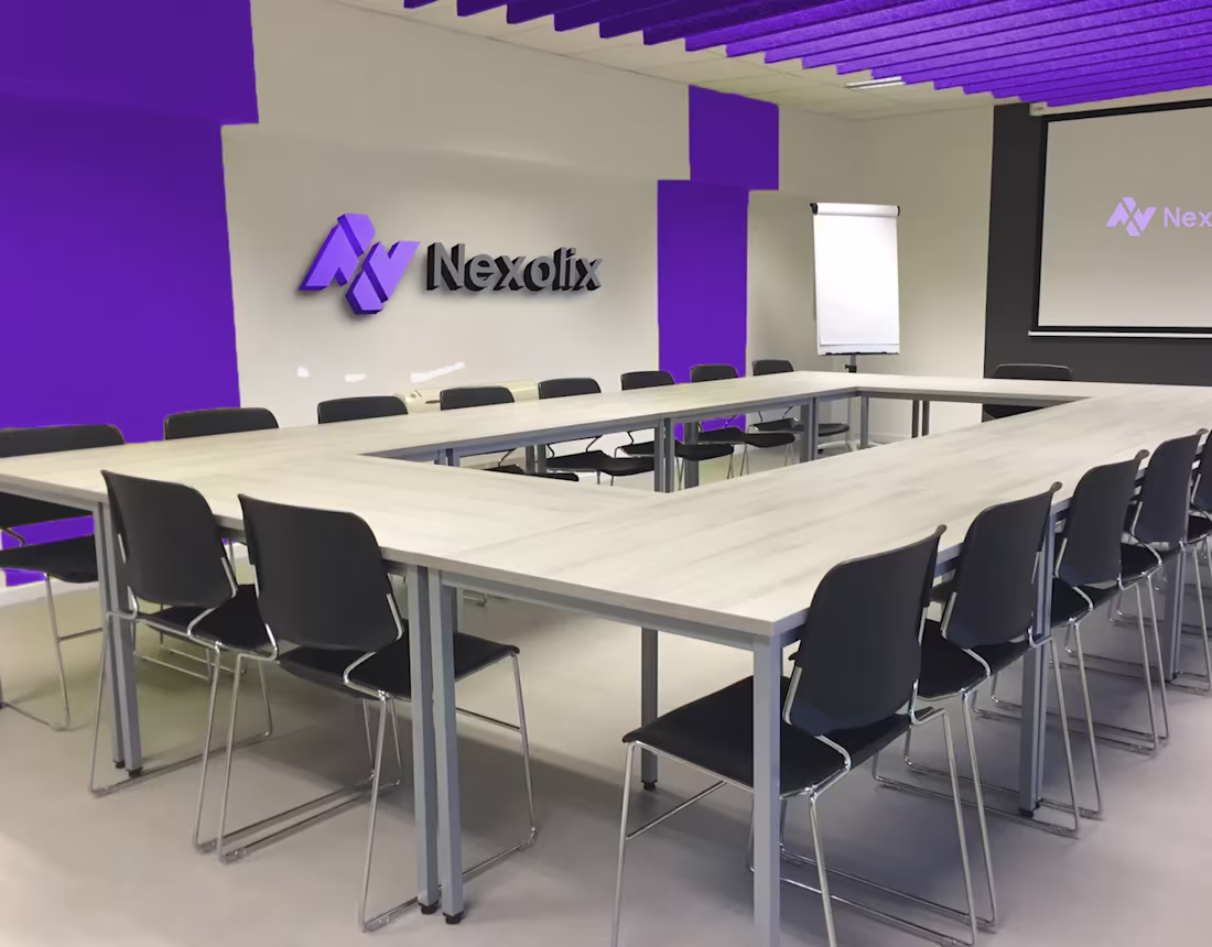
Nexolix Brand Identity Design
0
1
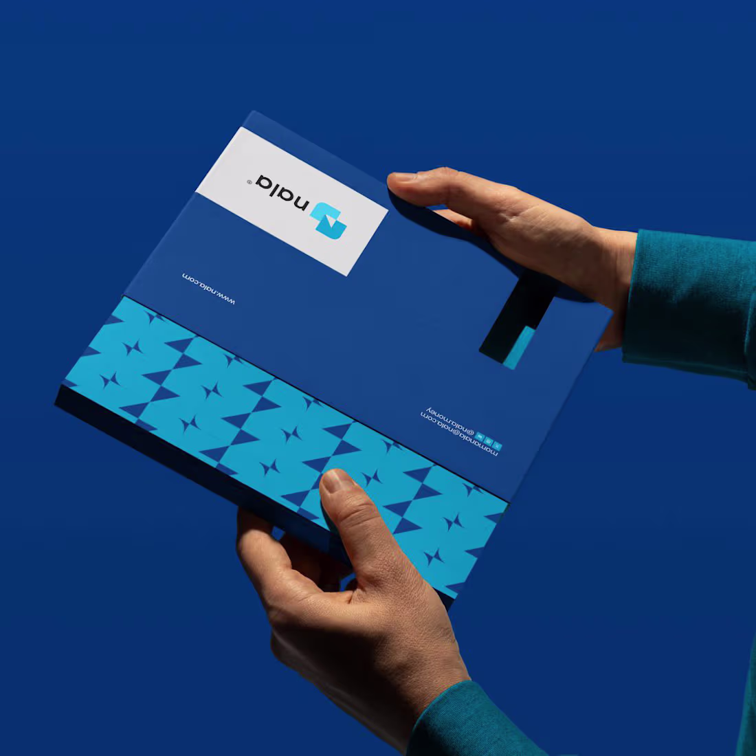
NALA Rebranding
0
1