
Branding for design-lead brands in interiors & construction


Branding for design-lead brands in interiors & construction


I love a good before and after.
This project was a full transformation for the Pan-American Equestrian Federation, spanning both branding and landing page design. Their previous identity and website felt dated and lacked the clarity and presence the organization truly holds.
This wasn’t just a visual upgrade.
We approached the landing page with a clear objective: communicate a large amount of information with precision and ease. That meant restructuring content, prioritizing what matters most, and creating a strong foundation the brand can continue to build on.
The result is a system that feels more aligned, more intentional, and far more effective.
Take a look at the before and after, and let me know what you think.
Check out the live landing page here: https://www.paecequestrian.com/
1
28
1.5K


Beauty Focused Branding & Web Design Agency
Beauty Focused Branding & Web Design Agency
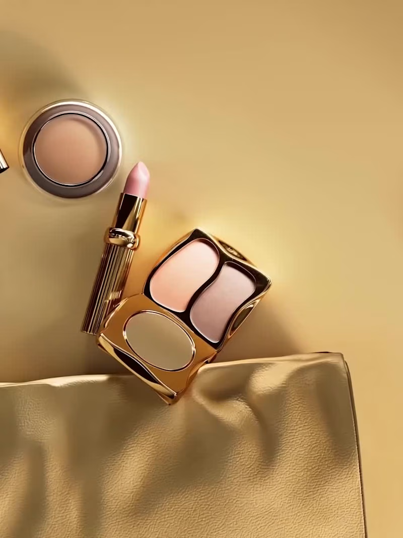
Currently working on THE ARCHIVE. Product Design, Branding, Packaging and Web Design Coming Soon.
16
44
2.8K


For RITUAL FORM, we developed a complete brand identity and custom packaging system for a contemporary luxury skincare brand rooted in ritual, tactility, and sculptural form.
The objective was to create a high-end skincare brand that moves away from visual excess and trend-driven aesthetics, and instead communicates through restraint, materiality, and proportion. RITUAL FORM is built on the philosophy of ritual over routine. Rather than positioning products around exaggerated claims, the brand reframes skincare as a daily, intentional act.
The bottle system was designed as a series of sculptural, stackable forms inspired by natural elements shaped by time, stones, shells, and softened mineral edges. The result is packaging that exists between functional design and art object.
22
62
6.7K


Strategy-led branding for wellness, beauty & lifestyle.

Strategy-led branding for wellness, beauty & lifestyle.

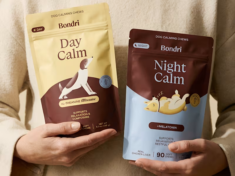


Strategic Branding & Design for Lifestyle Brands
Strategic Branding & Design for Lifestyle Brands


Refined branding & Squarespace websites ✨


Instinto Studio


Art director & designer crafting brands with soul

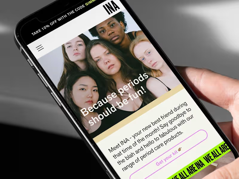


From strategy to execution: Your creative ally
From strategy to execution: Your creative ally


