🫧 Sadie Skin: Crafting a Luxurious and Organic Skincare Brand
Marina Terentii
👉🏻 About the Project: The Glow You Deserve.
Sadie Skin came to life as a skincare brand with a vision to redefine natural and organic skincare. The challenge was to develop a brand identity that would resonate with the modern consumer while maintaining a balance between minimalism and luxury.
The identity needed to reflect the brand’s core values: natural, sustainable, and effective skincare solutions. From packaging design to typography, every detail had to exude elegance, trustworthiness, and innovation.
Brand Personality
Sadie Skin’s brand personality embodies:
Effortless Sophistication: Reflected in the clean design and premium packaging, creating an elevated experience for the consumer.
Modern Wellness: Emphasized through natural-inspired visuals and messaging that promotes self-care and healthy skin rituals.
Conscious Beauty: Reinforced by eco-friendly materials and a commitment to sustainability, making Sadie Skin a responsible choice for consumers.
Key design highlights:
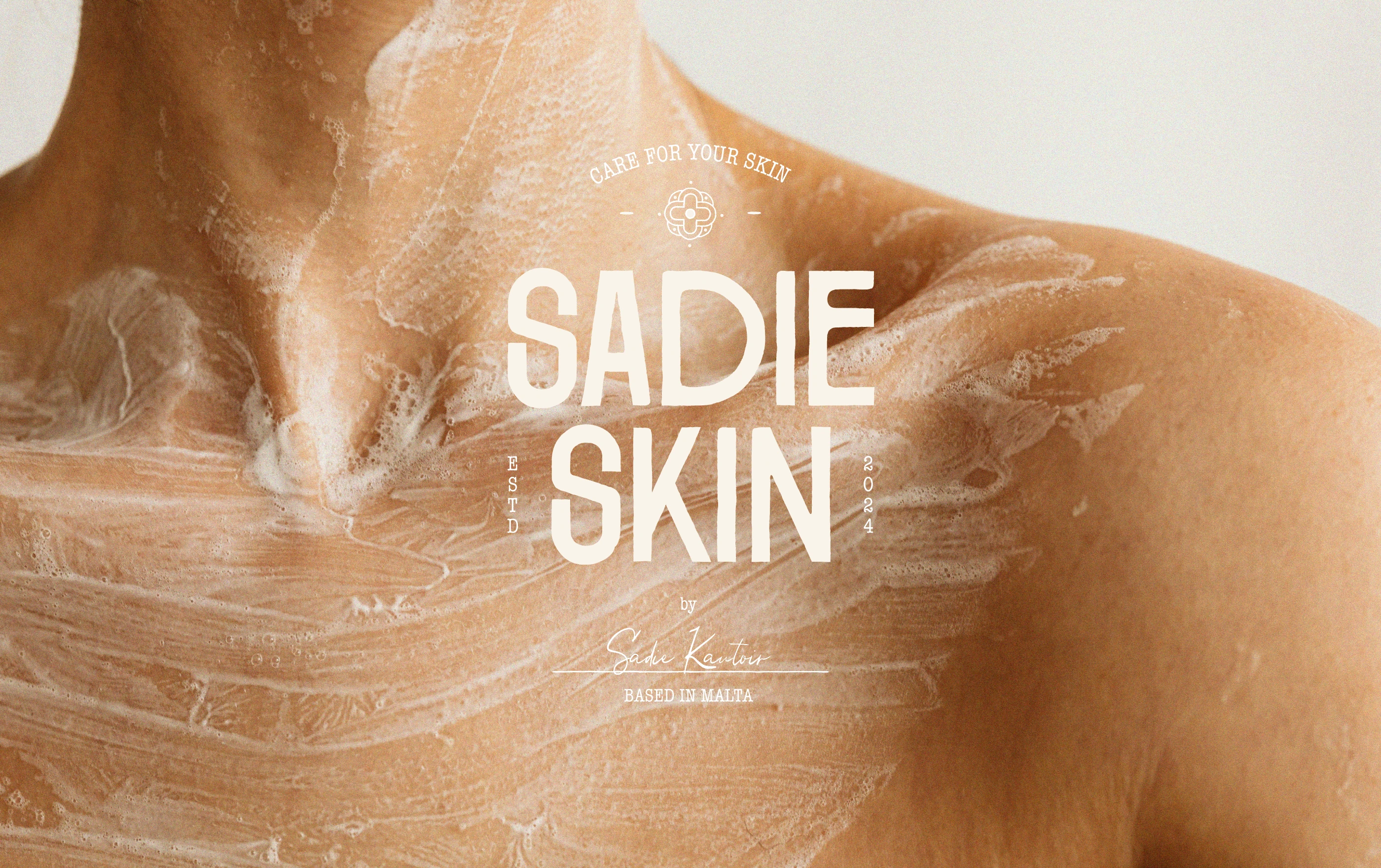
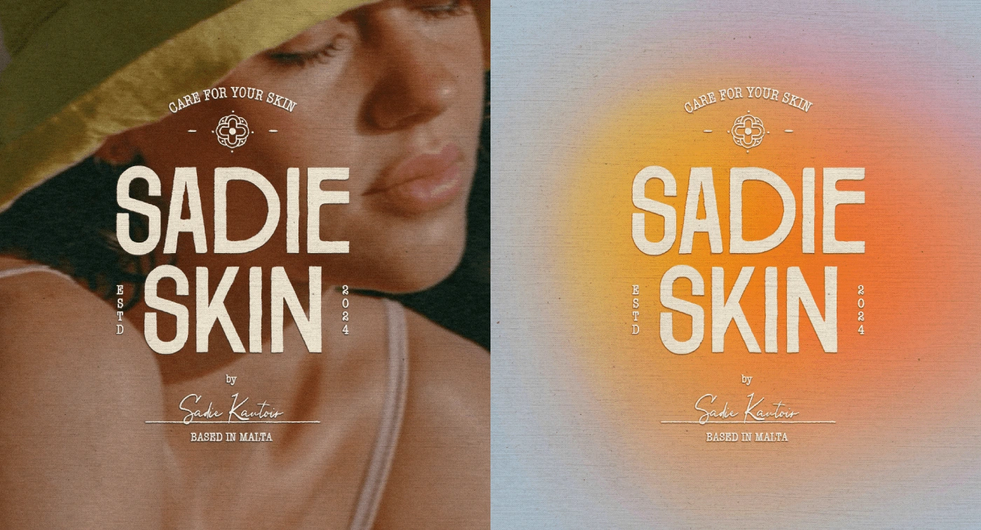
Sadie Skin - Primary Logo
Logo: A clean, sophisticated typography paired with subtle organic curves, embodying both elegance and approachability.
Packaging: Minimalistic layouts featuring custom botanical illustrations and sustainable materials, emphasizing transparency and craftsmanship.
Visual Elements: A mix of natural textures, light illustrative accents, and soft tones to evoke warmth and a connection to nature.
Tagline: "The glow you deserve". This encapsulates Sadie Skin’s mission to combine premium skincare with environmental responsibility.
The Concept
Sadie Skin’s brand concept revolves around the harmony of nature and science. The visual identity reflects a commitment to clean, natural ingredients, combined with cutting-edge skincare innovation. Every design decision—from the typography to the packaging—was crafted to evoke a sense of trust, luxury, and environmental responsibility.
The concept blends:
Transparency: Highlighting the brand’s dedication to showcasing key ingredients and their benefits.
Balance: Focusing on natural wellness paired with premium, minimalist design.
Sustainability: Reinforcing eco-consciousness in every material and visual element.
Sadie Skin - Brand Identity Recap
Color Palette
The soothing color palette includes:
Muted greens and soft beige tones to evoke nature’s purity.
Accents of vibrant yellow to symbolize vitality and rejuvenation. The palette reinforces Sadie Skin’s promise of natural, effective skincare.
Typography
The brand’s typography combines:
A modern sans-serif typeface for a clean, accessible feel.
A warm secondary font to add a touch of sophistication. This balance creates a trustworthy and approachable visual tone.
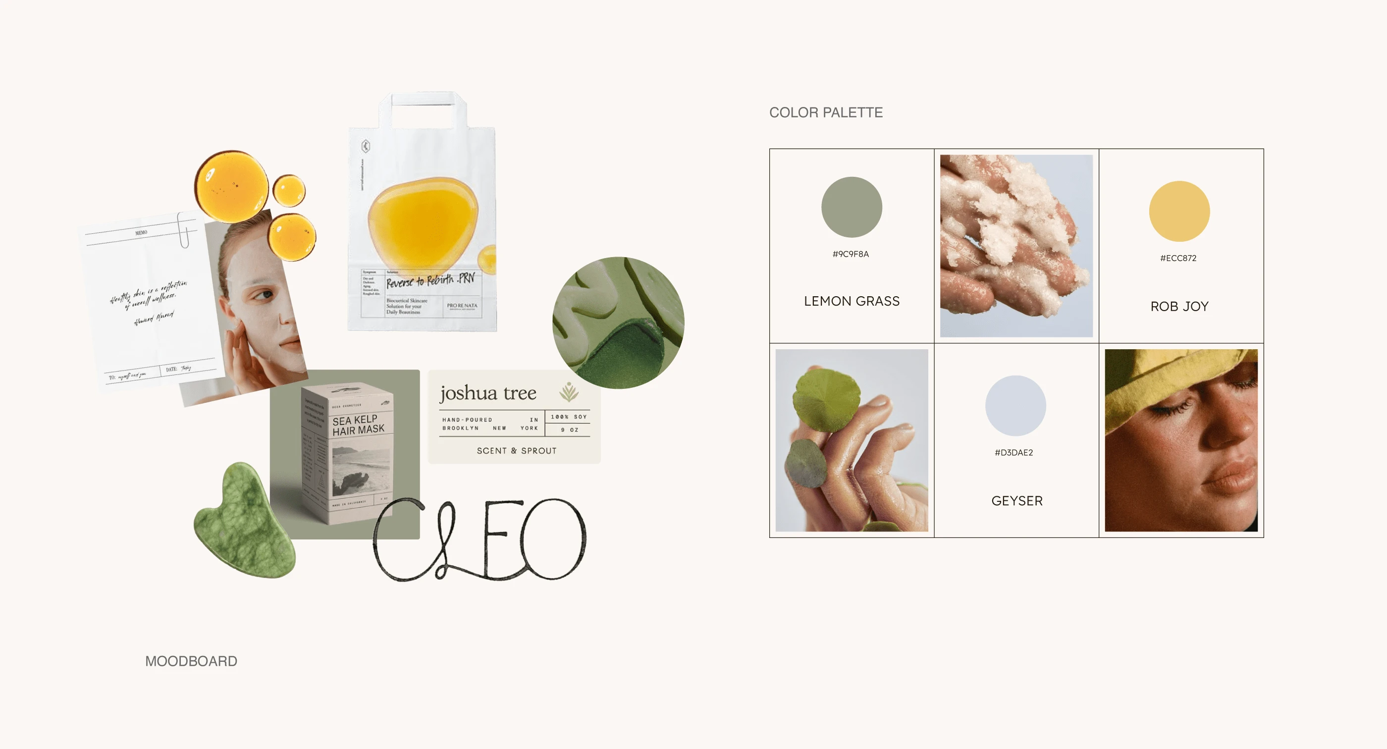
Creative Direction: Moodboard and Color Palette
Logo Design
The Sadie Skin logo is a harmonious blend of simplicity and elegance. The primary logo uses clean typography with subtle organic curves to reflect the brand’s natural essence. A secondary mark and icon version ensure flexibility across digital and physical platforms.
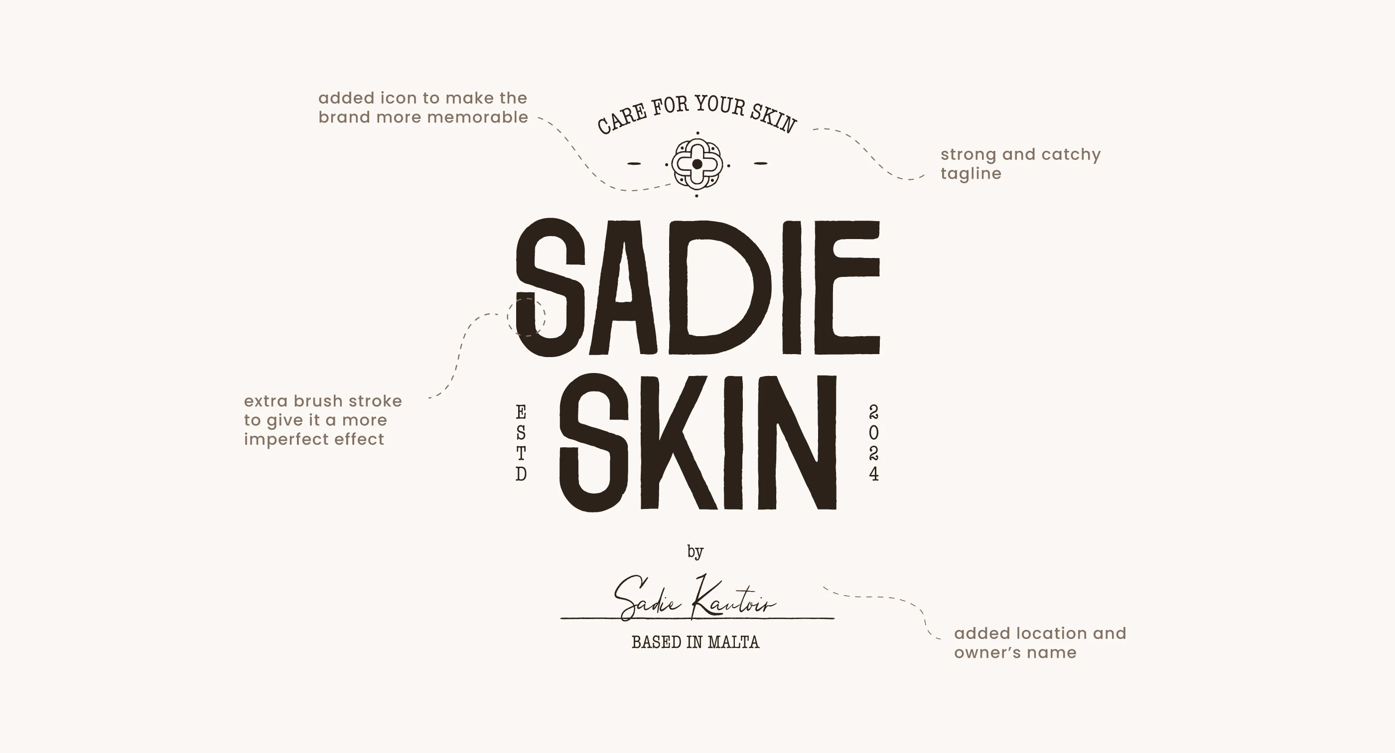
Logo Breakdown
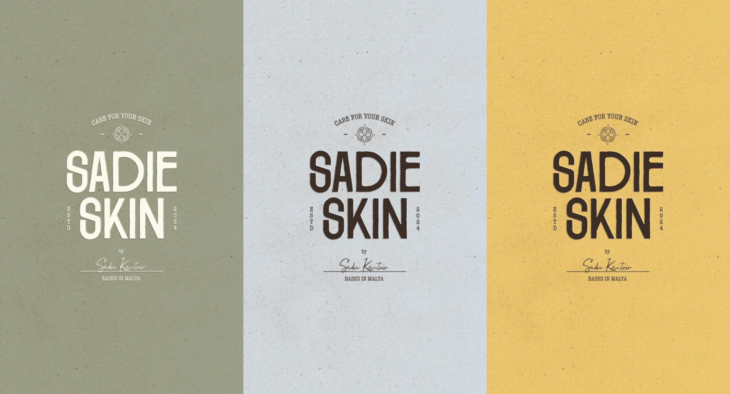
Primary Logo - Color Variations
Logo in Use
Packaging
We designed packaging that reflects Sadie Skin’s premium and eco-conscious ethos:
Custom Illustrations: Key ingredients are beautifully illustrated to communicate transparency and authenticity.
Sustainable Materials: The use of recycled and biodegradable materials highlights the brand’s commitment to the environment.
Minimalistic Layouts: Clean lines and uncluttered design ensure a timeless aesthetic.
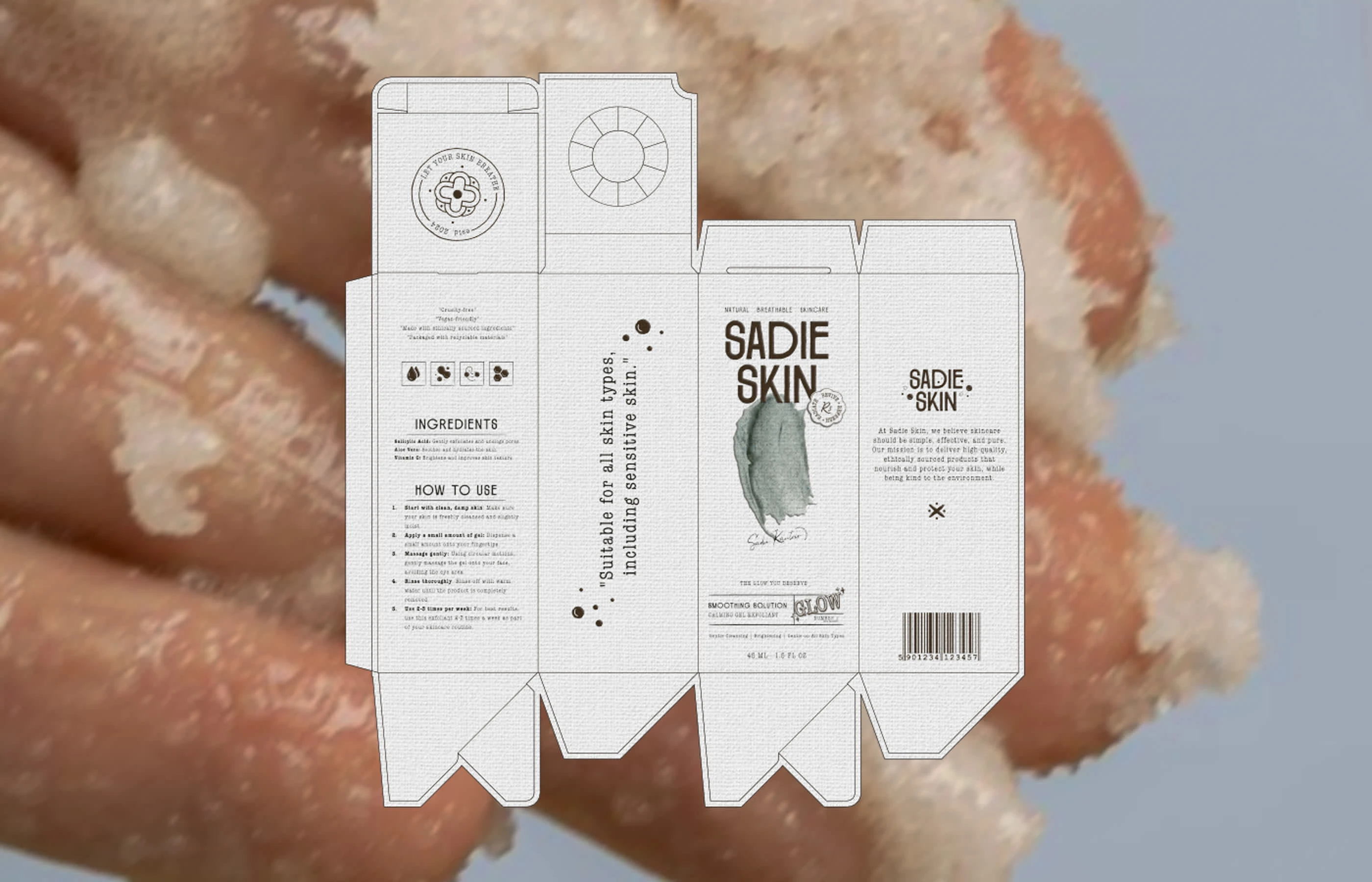
Dieline for Small Box
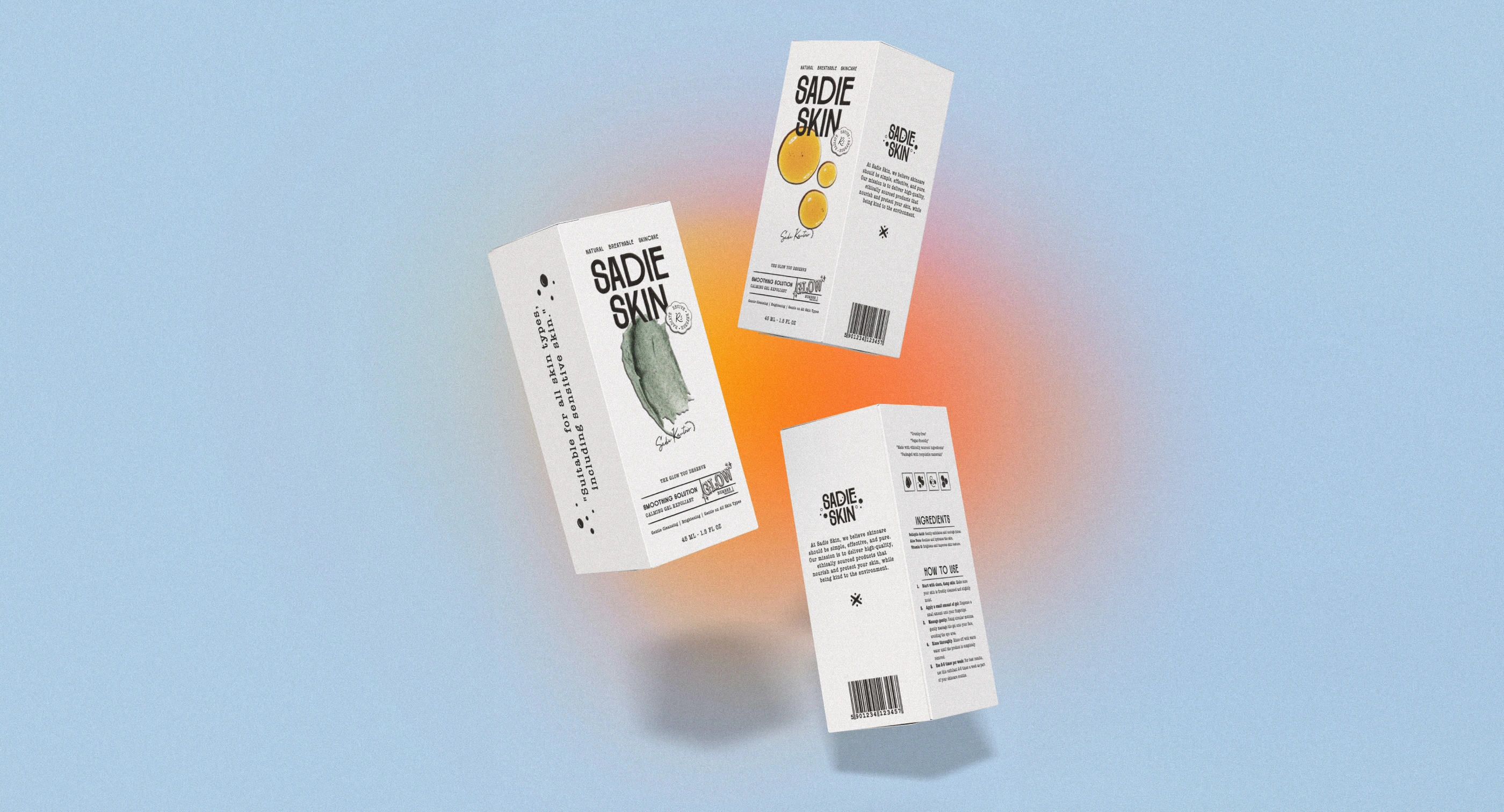
3D Boxes Mockup using Pacdora
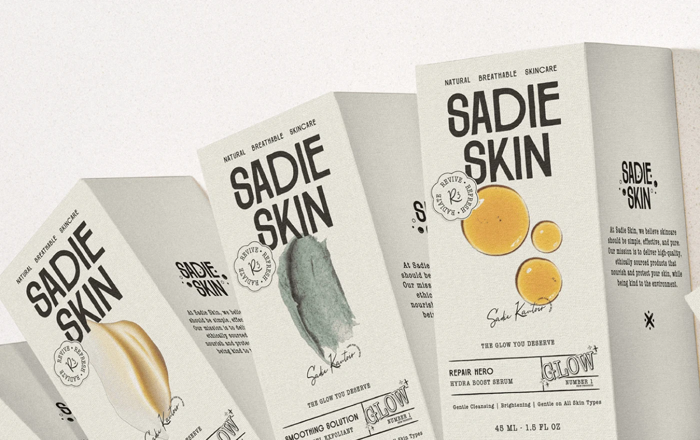
Small Boxes Mockup
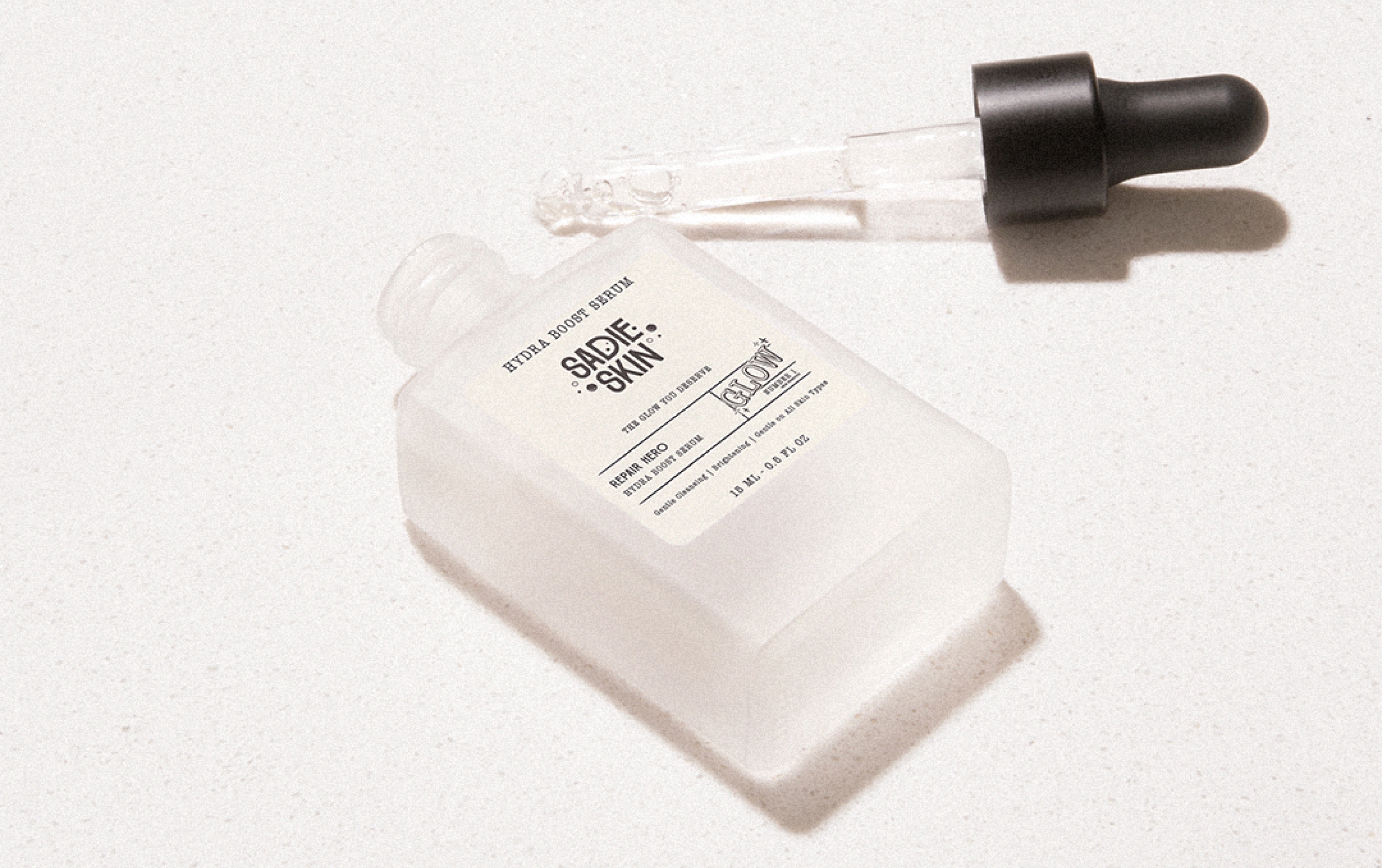
Serum Bottle Mockup
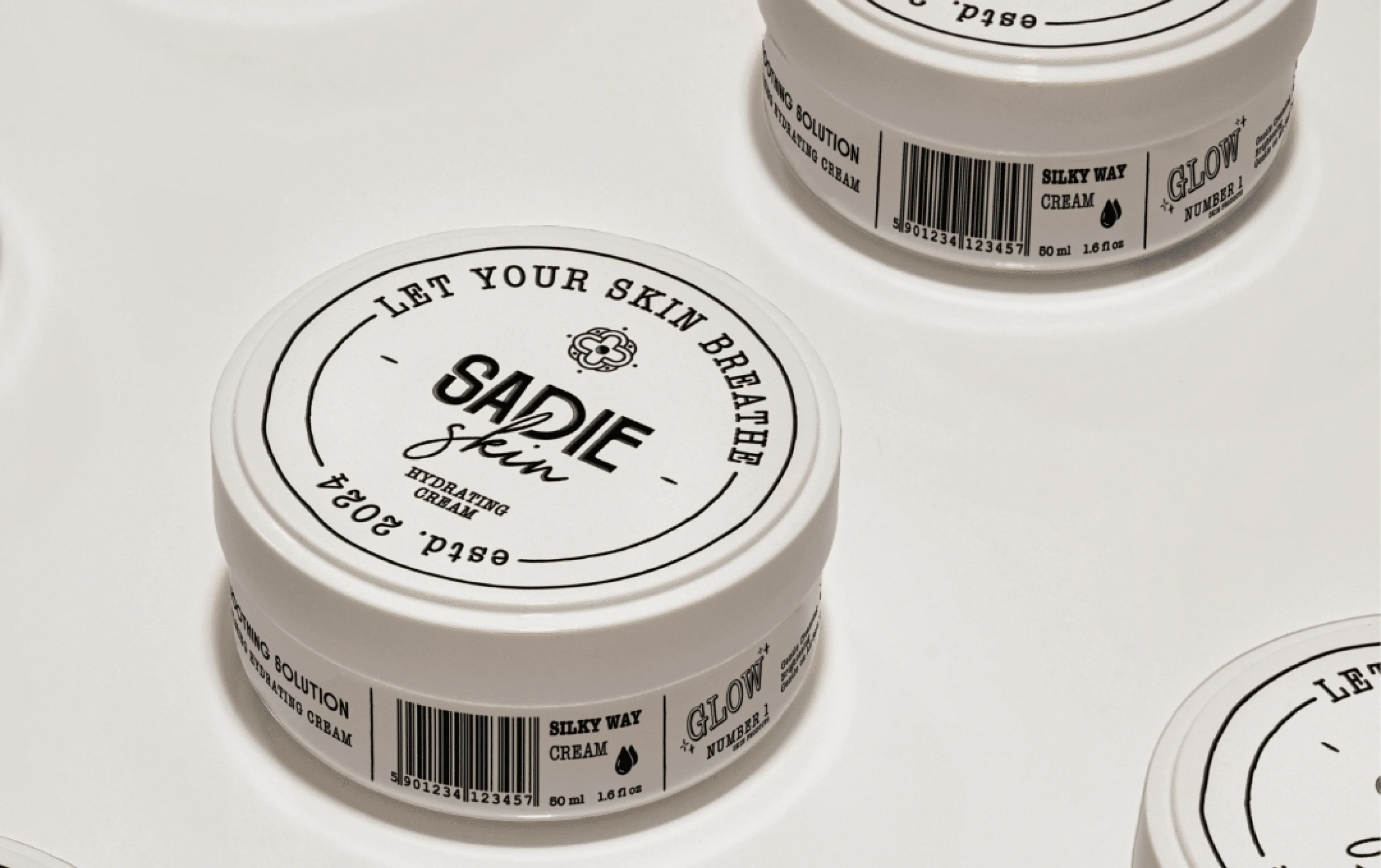
Hydrating Cream Mockup Vol. I
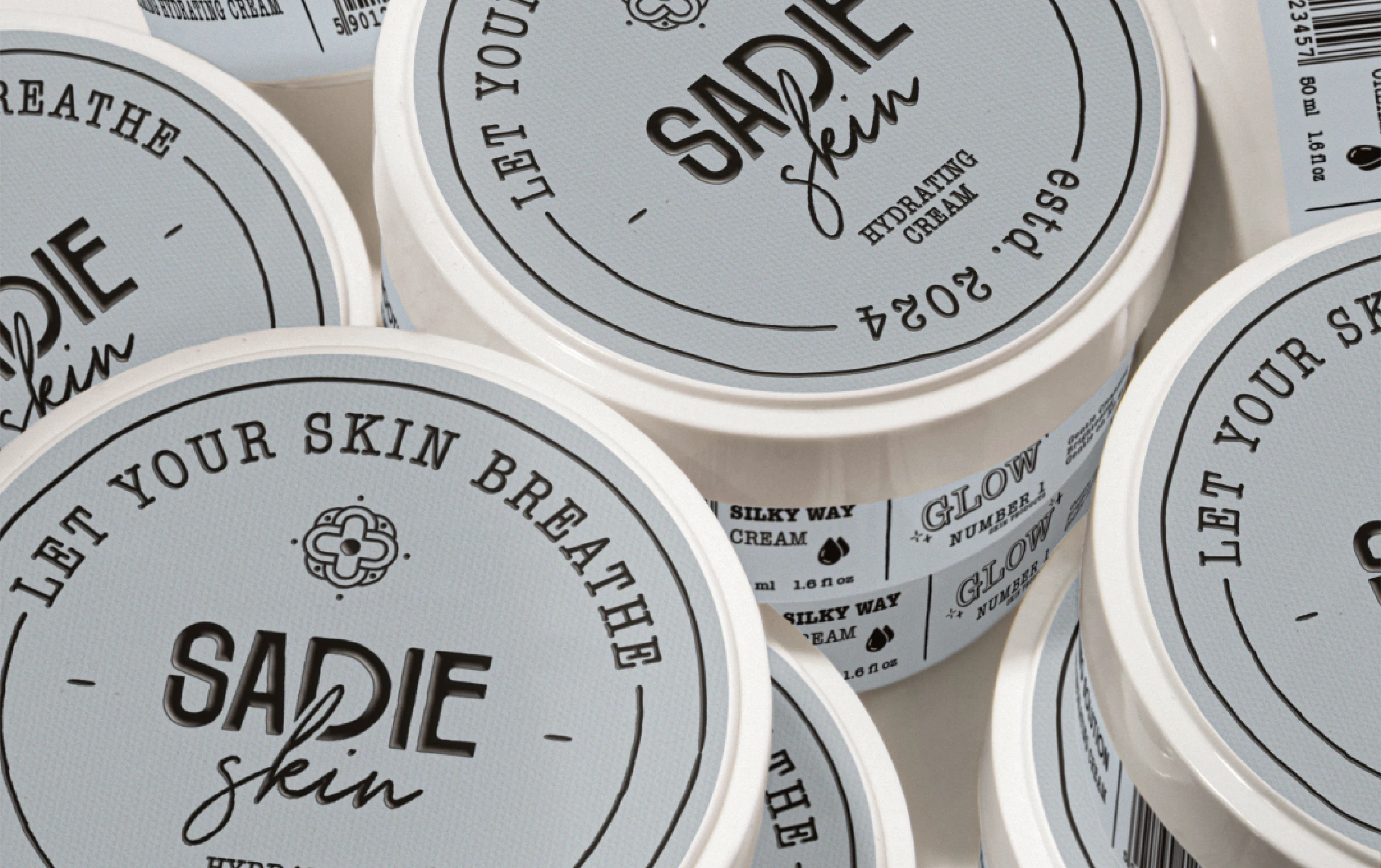
Hydrating Cream Mockup Vol. II
Supporting Elements
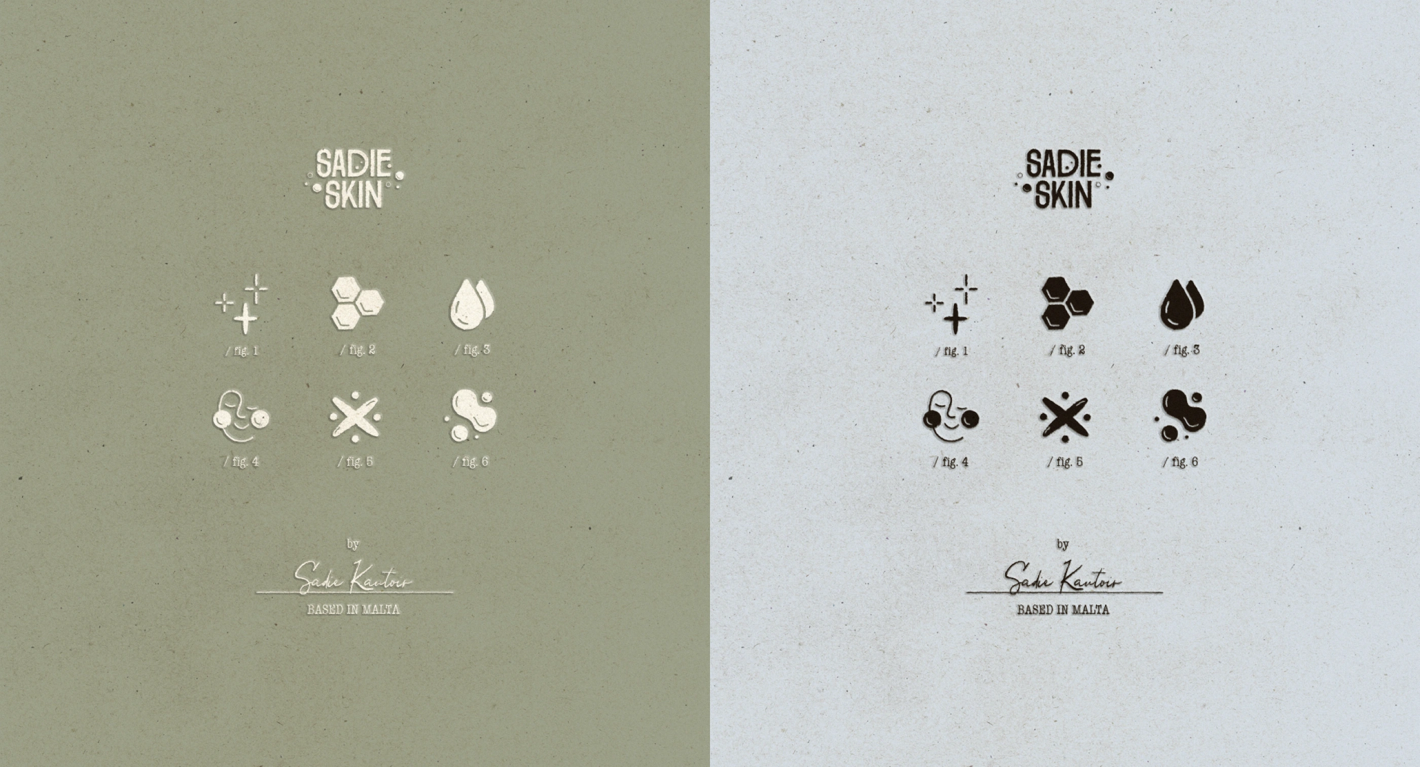
Icons and Graphics
A bespoke set of icons adds personality to the brand, blending playfulness with professionalism. These elements enhance the user experience across packaging, social media, and web platforms.
Imagery
High-quality product photography and lifestyle imagery showcase the brand’s essence, emphasizing natural beauty and wellness.
Iconography Animation
Iconography Color Variations
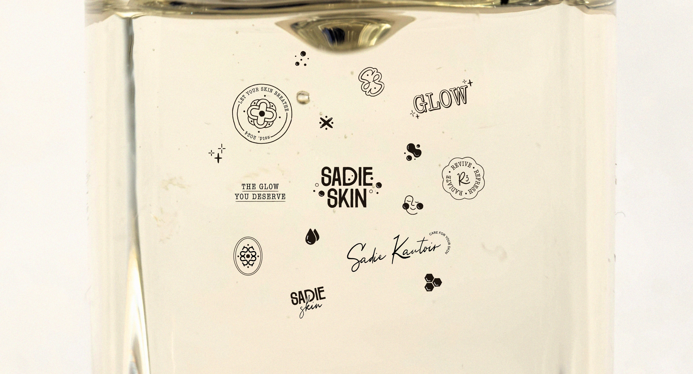
Additional illustrations and logo variations
Applications
The brand identity was applied across various platforms, ensuring consistency and impact:
Product labels and boxes
Digital assets, including website and social media
Printed materials, such as brochures and posters
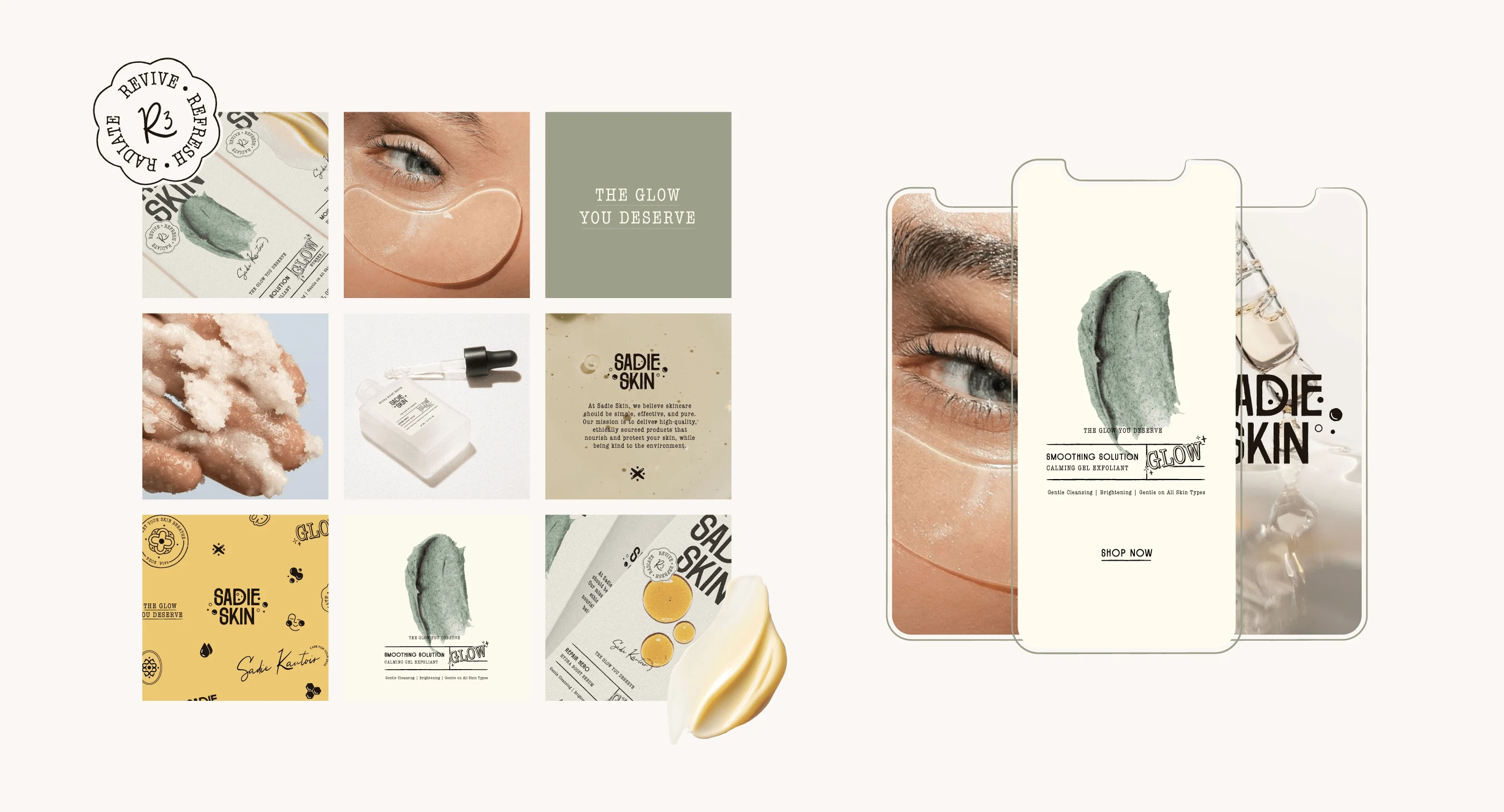
Social Media Assets - Instagram Grid and Stories Templates
Final Outcome
The Sadie Skin brand identity seamlessly blends sophistication, modern wellness, and sustainable values. It communicates the brand’s mission to provide premium, natural skincare solutions while fostering a deep emotional connection with its audience. From its elegant packaging to its inspiring digital presence, Sadie Skin is poised to become a trusted name in skincare.
If you want to see more about this project you can visit the Behance project:
To see more projects like Sadie Skin you can check my Instagram account where I post my daily work. Also, feel free to fill the enquiry form to work together.
Like this project
Posted Dec 9, 2024
Created a premium identity for Sadie Skin with clean design, sustainable packaging, and a focus on natural beauty and modern wellness.