🧘🏼♀️ Form Fit: Pilates Brand Rooted in Holistic Wellness
Marina Terentii
👉🏻 About the Project: Building a Pilates Brand Identity.
Form Fit is more than a Pilates studio; it’s a sanctuary for wellness, balance, and intentional movement. With a focus on harmonizing the mind and body, this brand identity was crafted to reflect the studio's values of alignment, connection, and holistic growth.
The result is an identity that resonates with those seeking inner peace, physical strength, and a sense of empowerment.
At its core, Form Fit emphasizes intentionality in every movement, mirroring the principles of Pilates itself. The brand identity draws inspiration from the fluidity and control inherent in Pilates, seamlessly integrating these qualities into its visual language. The design celebrates the union of strength and grace, making wellness approachable and inspiring for all.
Brand Personality
Form Fit strikes a balance between:
Elegance: Reflected in its refined typography and minimalist aesthetic, creating a sense of sophistication and calm.
Empowerment: Conveyed through strong yet approachable visuals, inspiring clients to embrace strength and growth through mindful movement.
Connection: Captured in its organic iconography and soft textures, emphasizing the importance of community and harmony.
Intentionality: Reinforced through every detail, from the choice of calming colors to the studio’s mantra of purposeful movement.
Key Design Highlights:
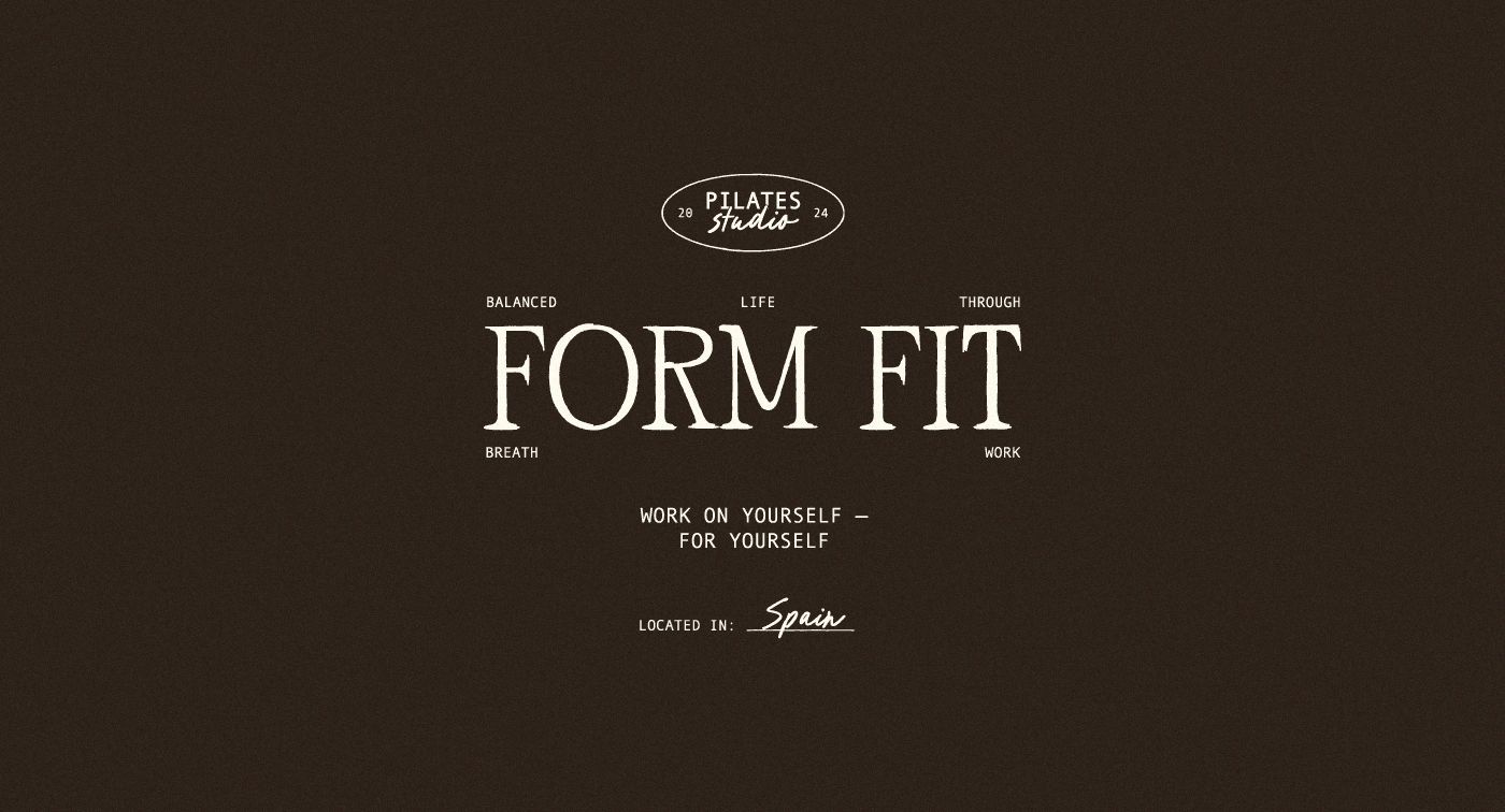
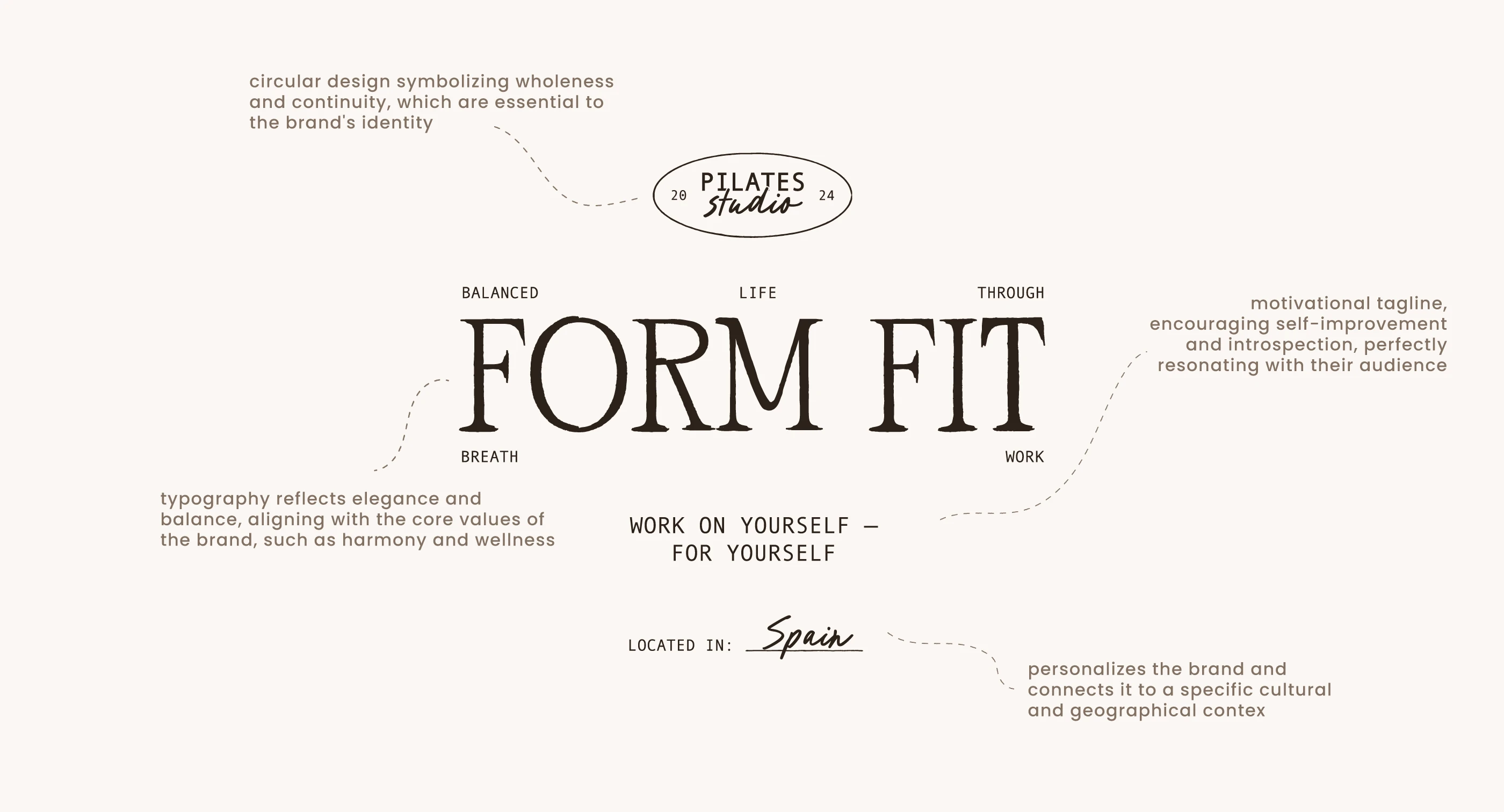
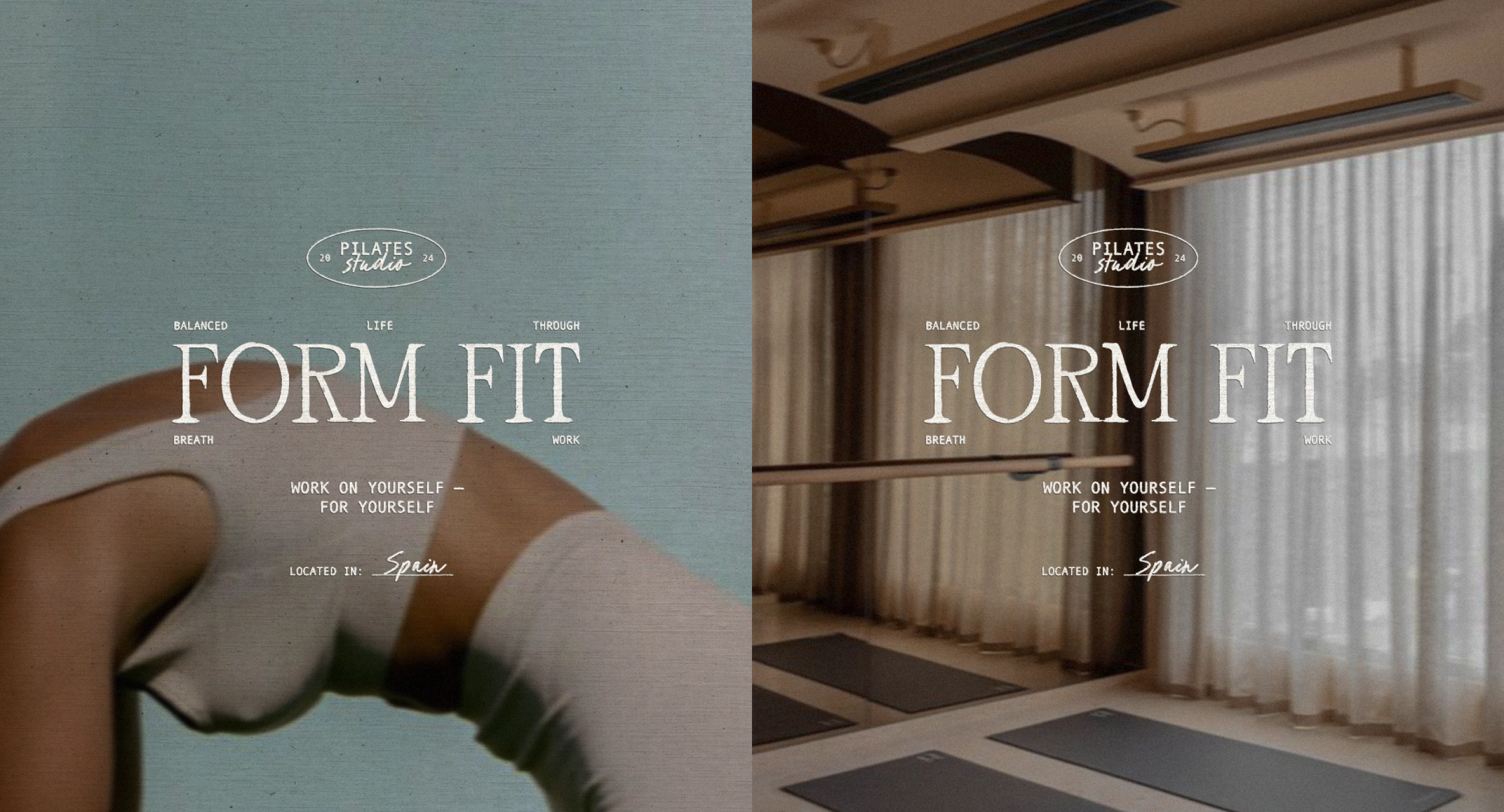
Form Fit - Primary Logo
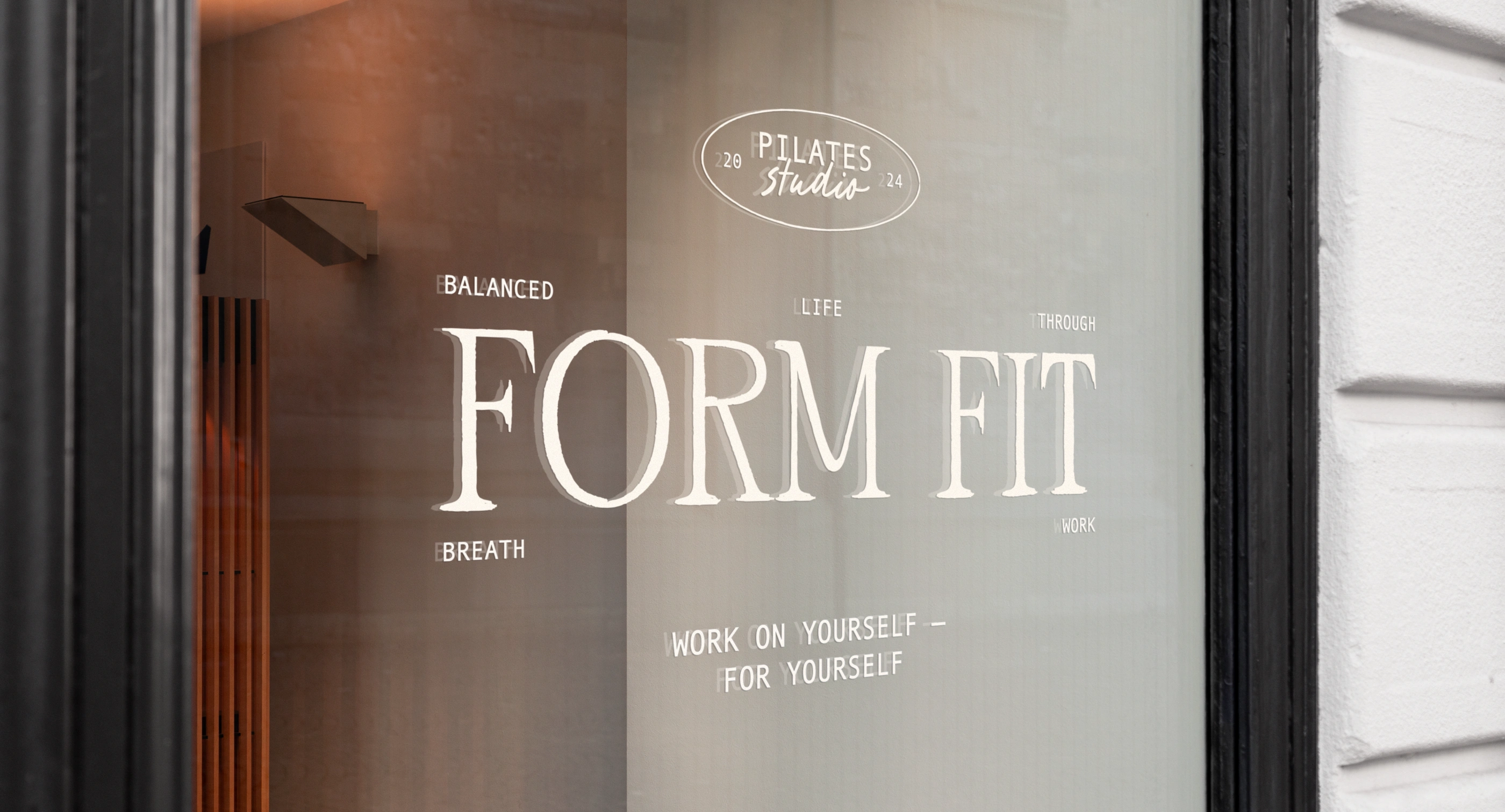
Logo: A clean, circular design representing balance and continuity, paired with elegant typography that reflects harmony and sophistication.
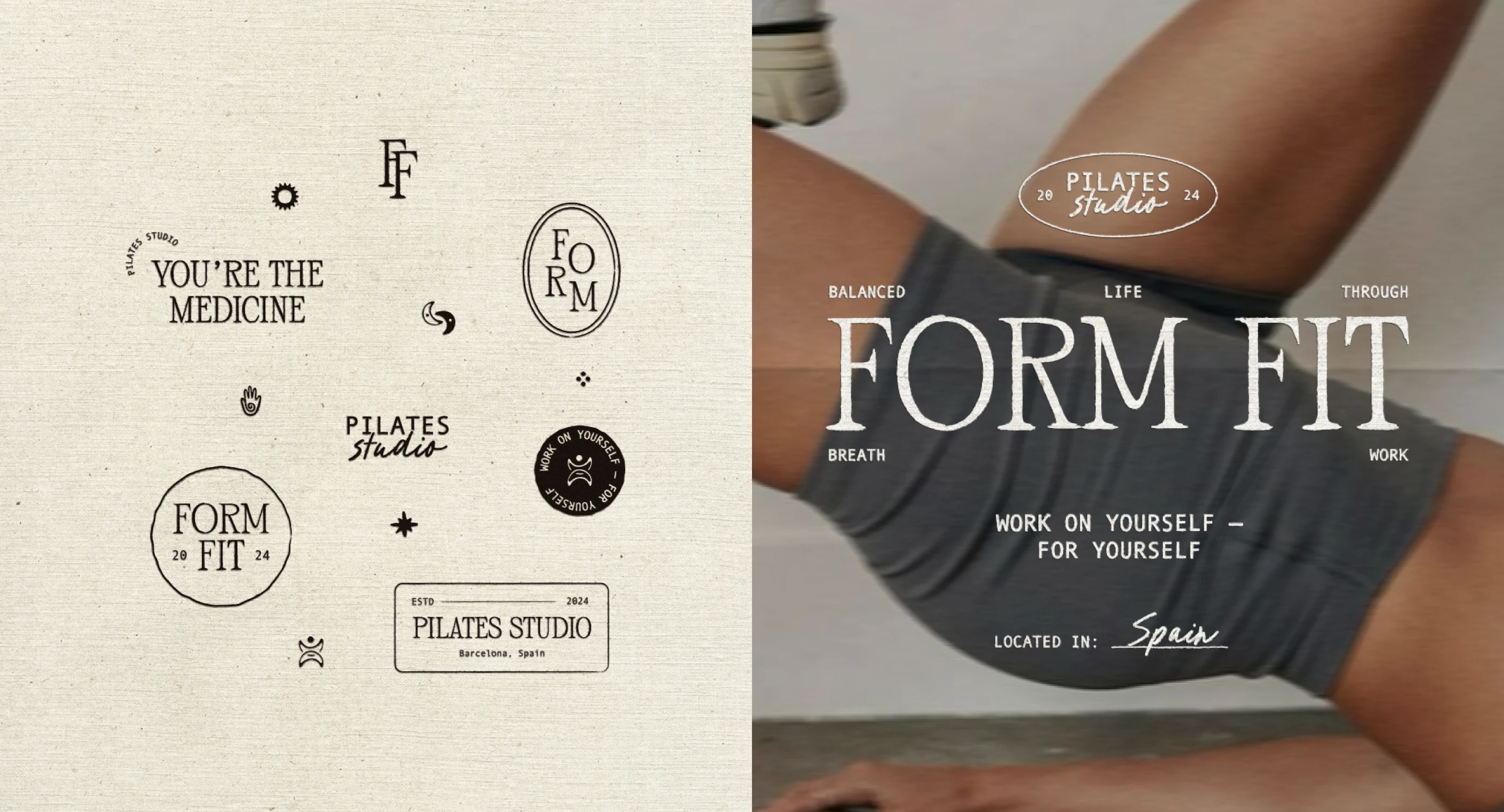
Visual Elements: A blend of subtle textures, natural motifs, and iconic symbols like the sun and hand, which evoke warmth, mindfulness, and community.
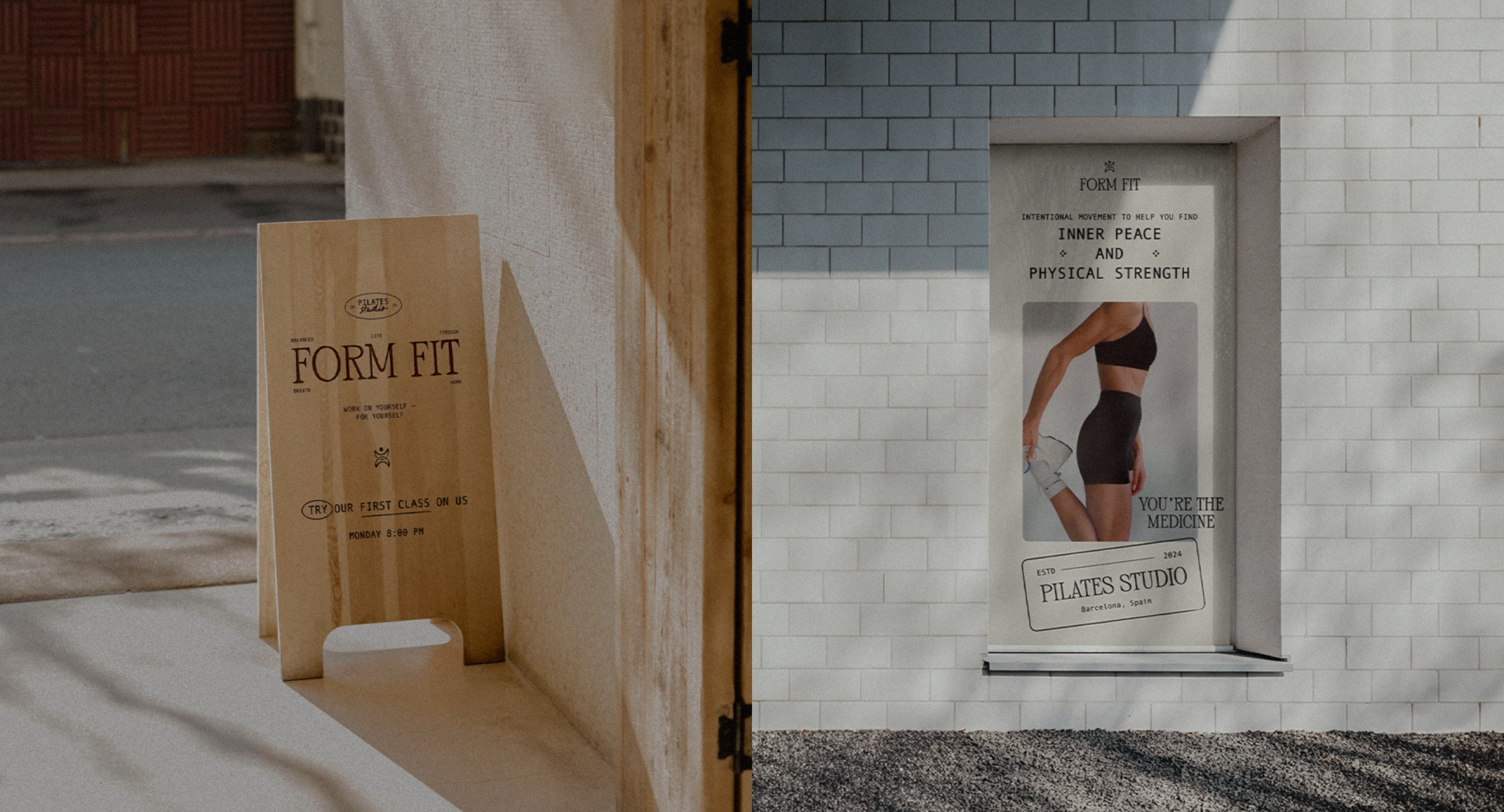
Tagline: Work on Yourself — For Yourself. It’s a powerful reminder to prioritize personal growth and self-care, aligning with the studio’s empowering ethos.
The Concept
Form Fit’s brand identity revolves around the harmony of movement, mindfulness, and holistic wellness. The visual design reflects a commitment to creating an intentional and balanced lifestyle, blending the energy of pilates with the calm of a wellness sanctuary. Every detail—from typography to imagery—has been carefully curated to evoke a sense of grounding, empowerment, and connection.
The concept blends:
Mindfulness: Celebrating intentional movement and the transformative power of pilates in building both physical and mental resilience.
Balance: Combining modern, elegant design with natural, calming aesthetics to reflect the duality of strength and serenity.
Community: Emphasizing inclusivity and connection, fostering a space where individuals can thrive in their wellness journeys.
Form Fit - Brand Identity Recap
Color Palette
The typography is a careful blend of modern elegance and timeless simplicity.
Reflects balance and refinement, while the secondary typeface introduces a handwritten touch, adding warmth and personality.
They communicate a grounded yet inviting brand.
Typography
The palette features soft linen, earthy grays, and deep browns. These hues evoke a sense of tranquility, grounding the brand in authenticity and creating an environment of calm focus for studio members.
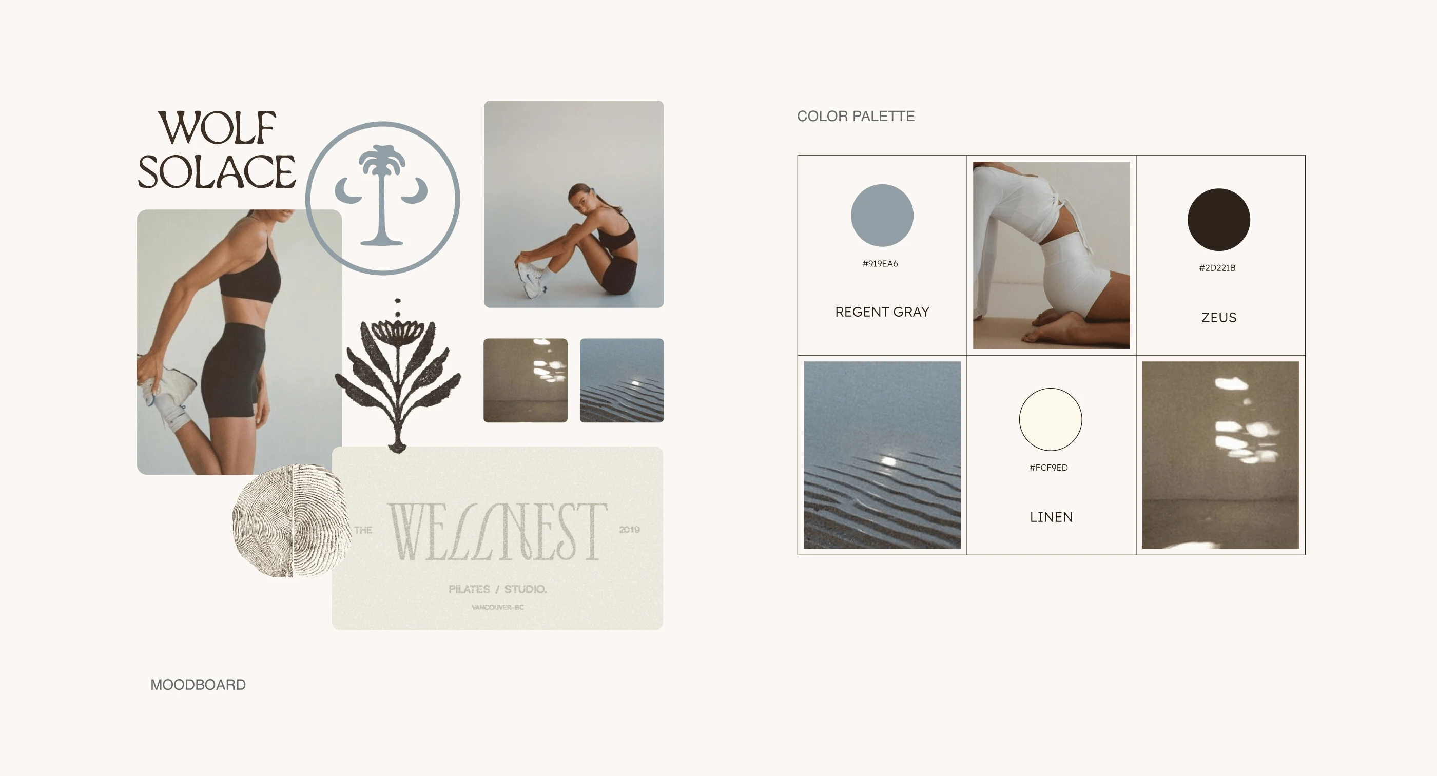
Creative Direction: Moodboard and Color Palette
Logo Design
Its timeless design makes it versatile, aligning with Form Fit’s commitment to fostering a lasting connection with its community.
Circular Form: Represents harmony and flow, mirroring the continuous movement in Pilates practice.
Typography: A refined serif font paired with subtle curves, balancing modernity with warmth and approachability.
Symbolism: Rooted in simplicity, the design conveys strength and intentionality without overwhelming the viewer.
Logo Breakdown
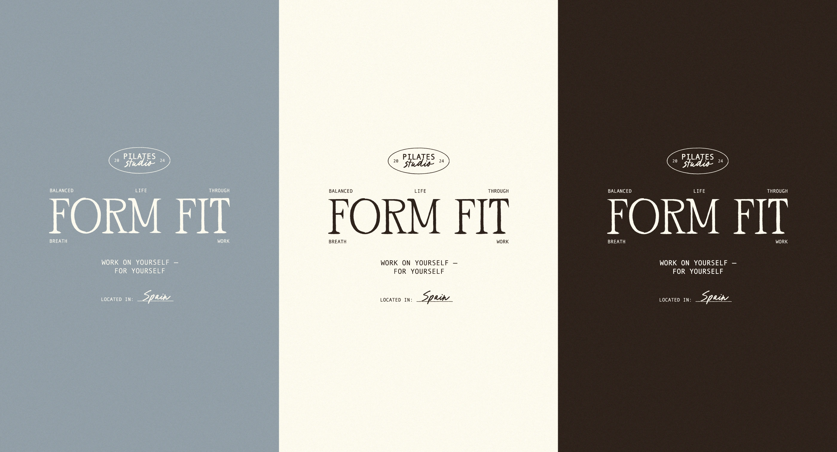
Primary Logo - Color Variations
Logo in Use
Brand Collaterals
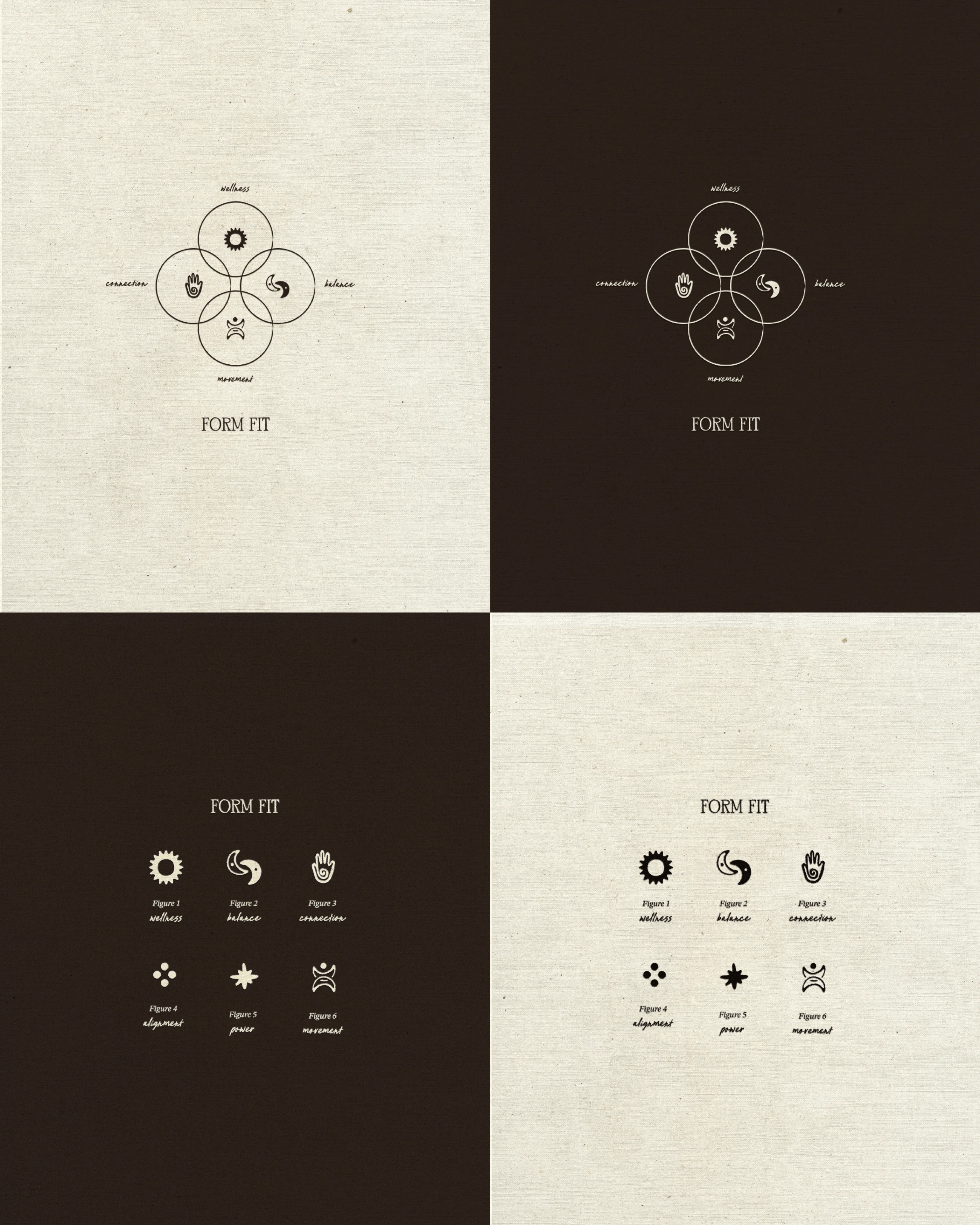
Iconography
A custom set of icons captures the essence of Form Fit’s values:
Wellness: Represented by a radiating sun, symbolizing vitality and energy.
Balance: Illustrated through a yin-yang design, emphasizing harmony and flow.
Connection: Shown with a hand motif, reflecting the importance of community and mindfulness.
Alignment: Depicted with four interconnected dots, representing stability and precision.
Power: Visualized as a dynamic starburst, signifying strength and energy.
Movement: Conveyed through a flowing, wave-like form, highlighting grace and fluidity in motion.
Iconography Animation
Textures and Details
Subtle textures like linen and shadowed layers bring depth and softness to the brand. These elements evoke a serene, tactile experience, mirroring the mindful atmosphere of the studio space.
Logo in Use and Custom Brand Illustrations
Each icon contributes to a cohesive and versatile visual system, used across branding materials to reinforce the studio's holistic approach. These symbols create a consistent narrative that resonates with Form Fit’s audience, visually tying together the studio’s mission of balance and empowerment.
Brand Illustrations
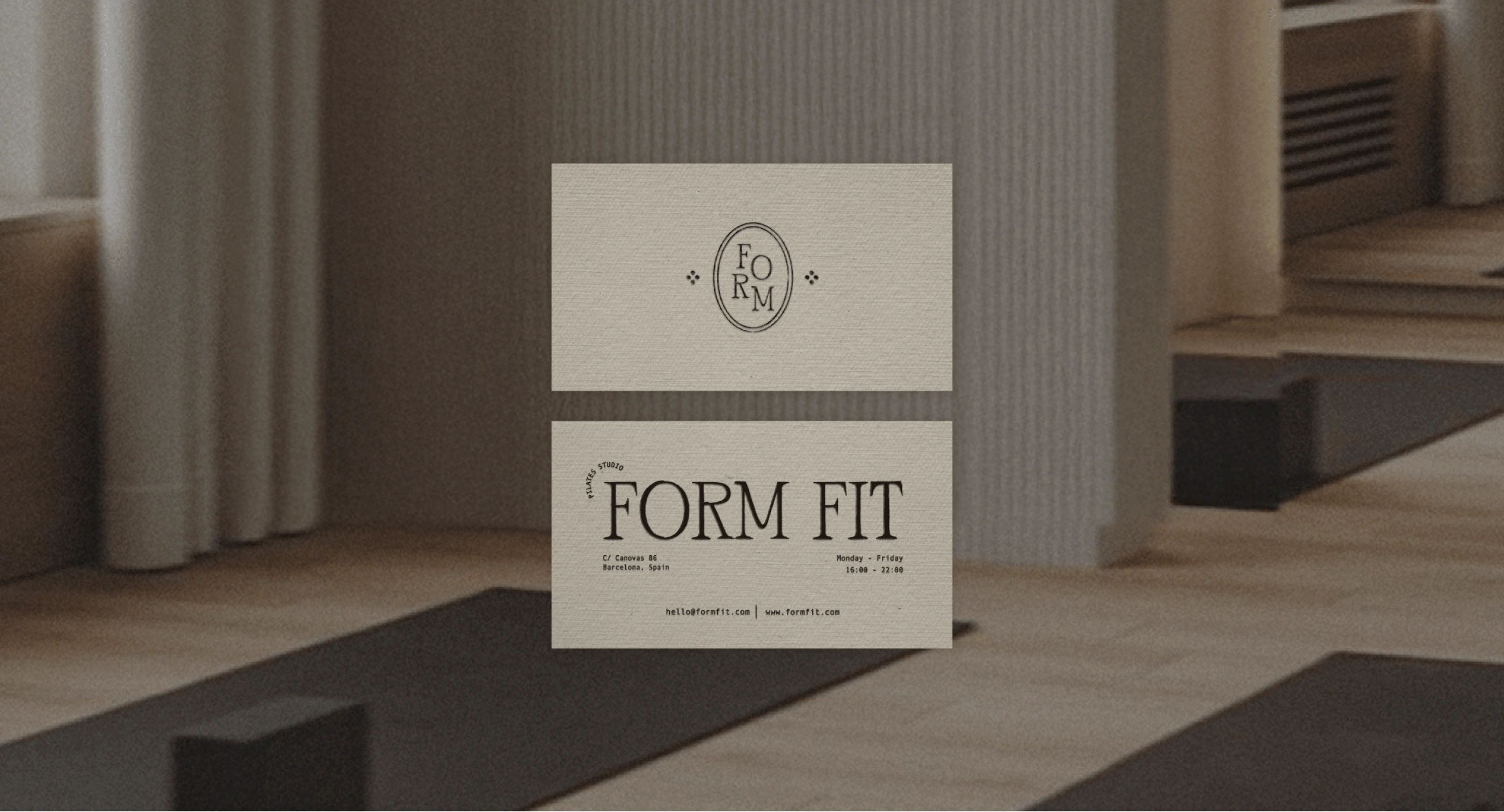
Business Card Mockup
Tagline
"Work on Yourself — For Yourself" encapsulates the studio’s empowering ethos. It’s a reminder to prioritize self-care and growth, both on and off the mat.
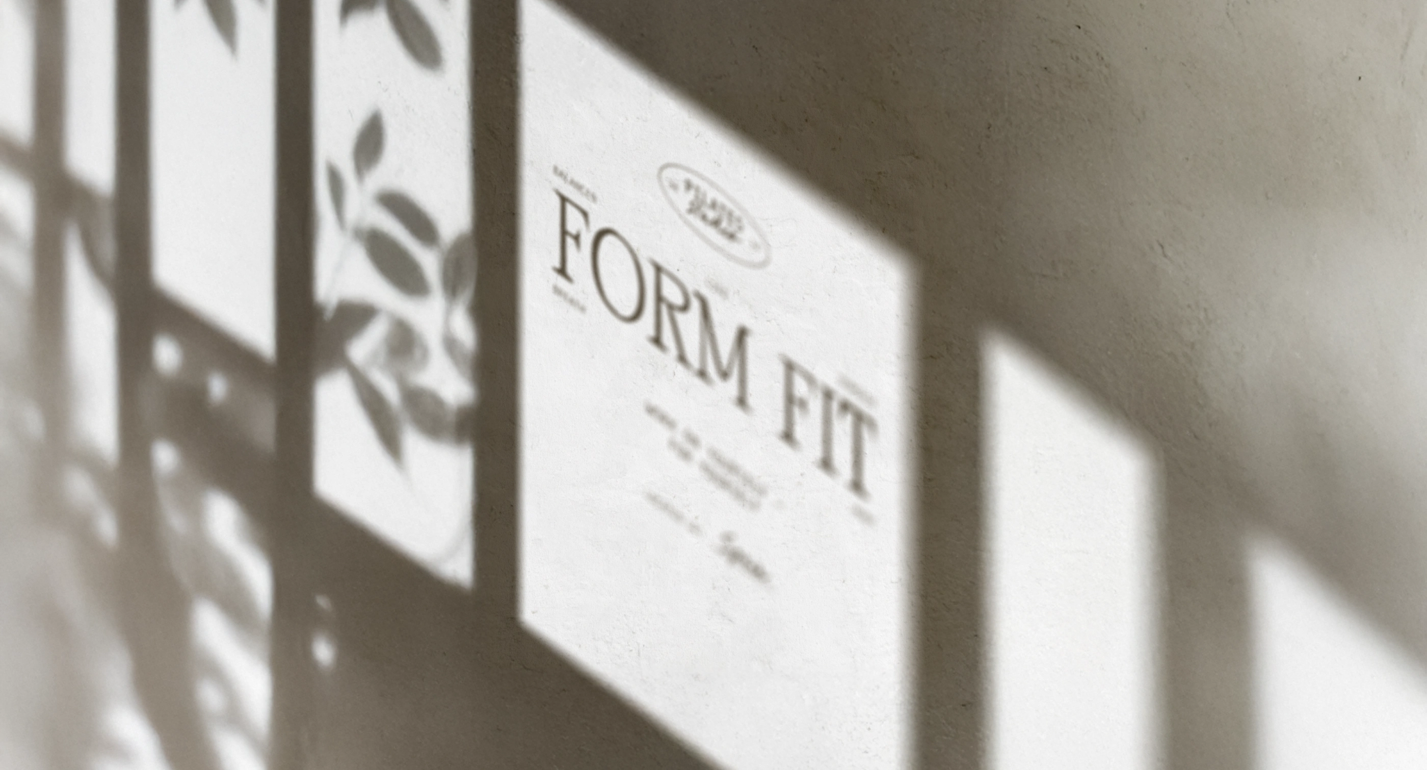
Studio Logo Mockup
Studio Assets Mockups
Social Media Presence
Form Fit’s identity extends seamlessly to social media, combining wellness-focused imagery, earthy tones, and minimalistic design.
A cohesive visual strategy focuses on earthy tones (linen, deep browns, and gray) and minimalist design. The brand voice is encouraging, approachable, and rooted in wellness.
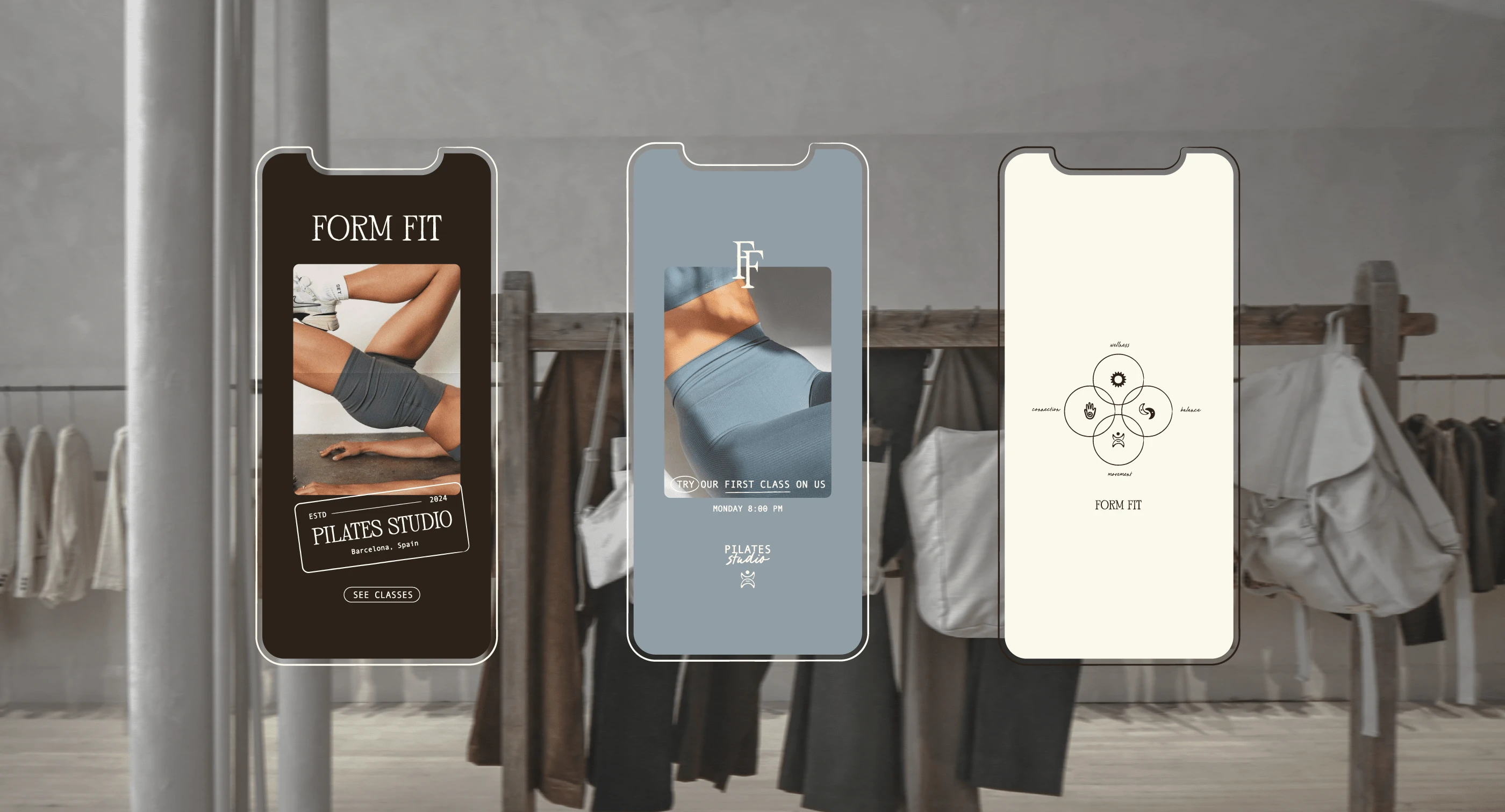
Social Media Assets - Instagram Stories Templates
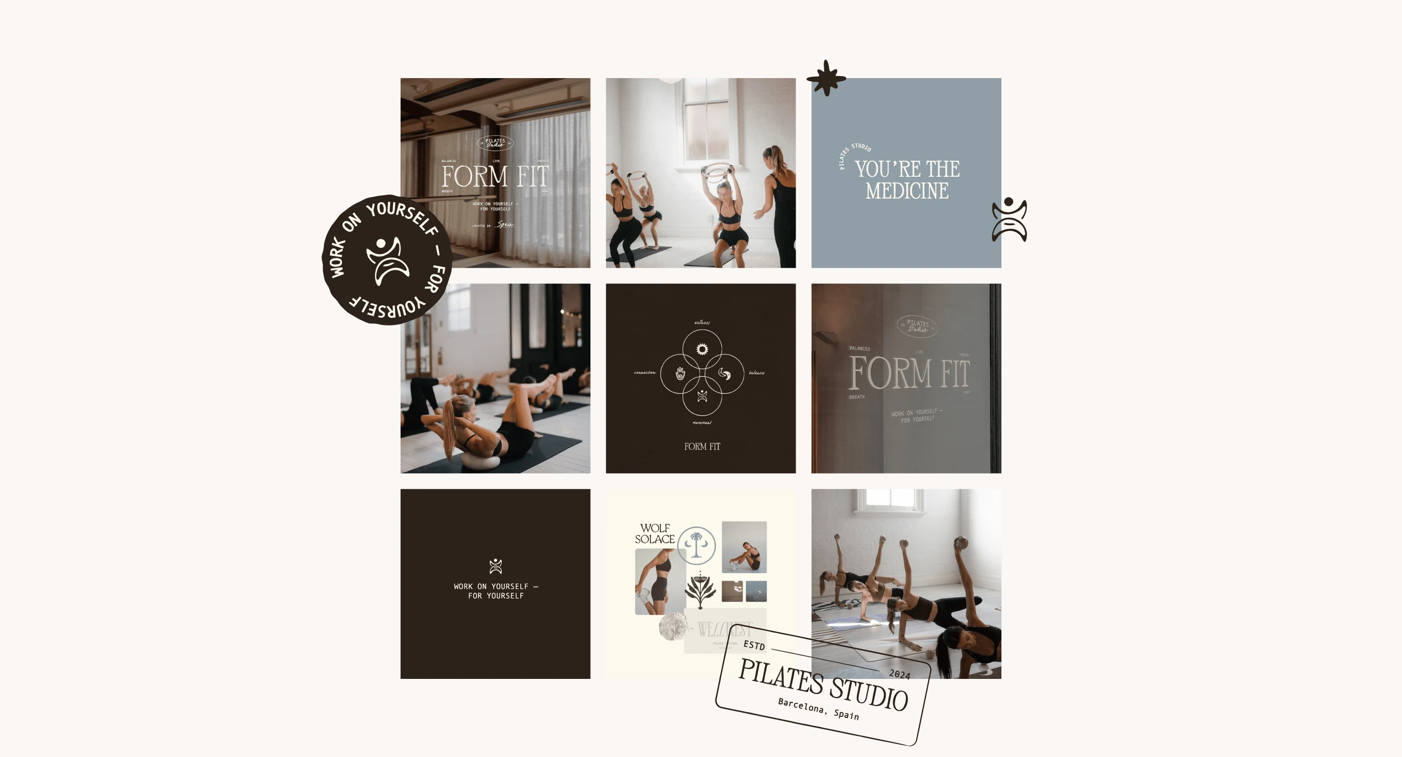
Social Media Assets - Instagram Grid Templates
Logo Mockup
Final Outcome
Form Fit’s brand identity brings to life the studio’s mission of inspiring intentional movement and holistic wellness. Every element, from typography to textures, reflects the balance and empowerment that Pilates offers, creating an identity that feels as natural and uplifting as the practice itself.
If you want to see more about this project you can visit the Behance project:
To see more projects like Avoil you can check my Instagram account where I post my daily work. Also, feel free to fill the enquiry form to work together.
Like this project
Posted Dec 13, 2024
Designed Form Fit's brand identity, blending mindfulness, balance, and community through elegant visuals, typography, and holistic design elements.