

Content Creator and Social Media Strategist ✨


Product Designer | Framer Designer | UX/UI for Startups


Product Designer | Framer Designer | UX/UI for Startups

xcited to share Fitlife, a fitness landing page template I built in Framer.
What’s inside:
Responsive layouts for desktop, tablet and phone
Full English and Arabic (RTL) versions
Shop and product pages connected to a CMS, so store owners add products and set their own buy links
Editable components, text styles and color styles
Live demo: https://compassionate-flows-092115.framer.app
1
3
134


Video Editor | Helping you find your editing style 🤍
- $•••••
- Earned
- 18x
- Hired
- 5.0
- Rating
- 493
- Followers
Video Editor | Helping you find your editing style 🤍


Social Media Manager, Content Creator & Video Editor
- $10k+
- Earned
- 3x
- Hired
- 5.0
- Rating
- 35
- Followers
Social Media Manager, Content Creator & Video Editor


Visual Designer & UGC Creator


Content creator (76K followers) & newsletter writer
- $5k+
- Earned
- 1x
- Hired
- 19
- Followers
Content creator (76K followers) & newsletter writer


Video Editor & Social Media Creative for Brands
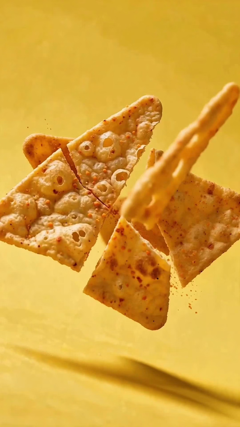
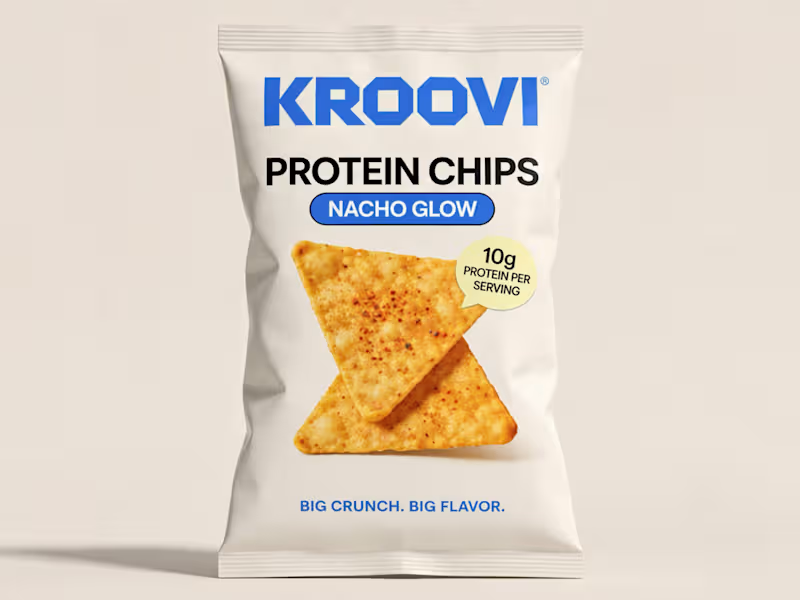
🚀 From Concept to Commercial — KROOVI: The Crunch Effect
What does it take to turn a fictional snack brand into a high-energy, cinematic commercial?
For my latest spec project at SSK Creatives, I developed KROOVI, a modern protein snack brand, and brought it to life through creative direction, AI-assisted video production, and editing.
The goal wasn’t just to generate beautiful visuals. It was to create a commercial with intentional movement, strong visual storytelling, and a cohesive brand identity.
🎬 A closer look at the creative process:
• Creative Direction & Branding: Developed the visual identity, packaging concept, color palette, and overall campaign aesthetic.
• Motion Choreography: Directed dynamic chip collisions, realistic fractures, flying fragments, and high-speed food sequences.
• Cinematic Transitions: Designed camera movements that connect the crunchy explosion, vibrant ingredients, and final product reveal.
• AI Video Production: Used AI tools to create photorealistic product visuals and complex motion sequences.
• Editing & Sound Design: Combined multiple generated sequences into a polished 10-second commercial, refining the pacing, transitions, and visual continuity.
Tools: CapCut Pro, AI Lab & AI video generation.
✨ The result? A bold, visually engaging snack commercial that demonstrates how creative direction and AI-assisted production can work together.
I’m a freelance Video Editor, AI Video Editor & Social Media Creative, helping brands turn concepts into compelling short-form content.
I’d love to hear your thoughts on the final commercial!
Open to collaborations with brands, agencies, and creative teams.
Independent spec project by SSK Creatives — not a commissioned brand campaign.
#CreativeDirection #AIVideo #VideoEditing
6
4
142
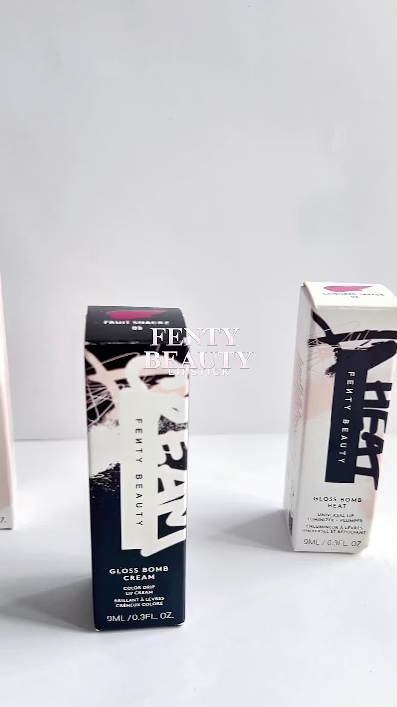
THE ART OF THE GLOSS | Fenty Beauty 💄
Created as a spec UGC / product film an exploration of how I’d bring a beauty product to life through my lens.
There’s something about beauty content that lives in the details “ the shine” ,the texture, the way light catches the packaging.
For this Fenty Beauty spec piece, I wanted the product to feel almost tangible through the screen. Clean macro shots, intentional movement and just enough drama to let the gloss do what it does best: shine.
Creative Direction · UGC · Product Videography · Beauty Content · Video Editing
1
215

Product Designer for AI & Digital Products
BRAYD: The Braided Focus Flame 🔥
BRAYD is an original mascot created for BURN THE TASK, a fictional productivity ritual brand built around focus, completion, and quiet discipline.
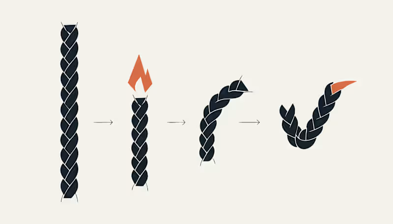
Rather than designing a cute candle character, I built a full mascot system around one clear visual behavior: focused time burns into completion. BRAYD is a braided wick core inside a faceted wax body. As a task progresses, the wick burns down, the wax form changes through clear stages, and the final braided strand becomes a checkmark.
The mascot was designed to stay recognizable across every touchpoint, from the custom wordmark and hero poster to the sticker system, focus ritual packaging, burn sequence, and consistency board. Every asset uses the same visual DNA: the same braided wick, the same faceted wax body, the same angular flame, and the same final checkmark.
This project explores how a single mascot can become the face of a fictional productivity world by turning an abstract idea, focus, into a visual ritual.
Character Brief
Name: BRAYD
Role: The Braided Focus Flame
Personality: quiet, intense, disciplined, stubborn, focused, and encouraging without being soft.
BRAYD does not rush you and does not distract you. He simply burns with you until the task is done. His braided wick represents focused effort, his faceted wax body represents pressure and progress, and his final checkmark represents completion earned through attention.
Recraft Project
Explore the full project here:
https://www.recraft.ai/project/a75515d8-3533-42f4-9a93-9815d2f3f7e3
Applications Included
The BRAYD system includes a custom name logo, hero poster, sticker pack, focus ritual packaging, burn to checkmark sequence, and a final consistency board showing the mascot across multiple moments and touchpoints.
Proof of Consistency
Same wick. Same facets. Same flame. Same final checkmark.
#RecraftAI #CharacterDesign #MascotDesign #BrandIdentity #CreativeAI #Illustration #DesignChallenge #BrandDesign #ConceptArt #MotionDesign #GraphicDesign #MascotSystem #ProductivityDesign #DigitalArt
12
22
821

12% Human is a short corporate-AI thriller about a job candidate who gives the most human interview possible and fails because of it.
I used ChatGPT to develop the concept, character direction, interview-room visuals, facial expression references, tablet reveal, and storyboard, then built the shots in Renoise Canvas with Seedance video generation, including the spoken dialogue directly inside the video clips.
The final cut was assembled in CapCut with a readable tablet evaluation overlay, ambient sound, timing adjustments, and a minimal end card to make the twist land clearly.
1
3
285
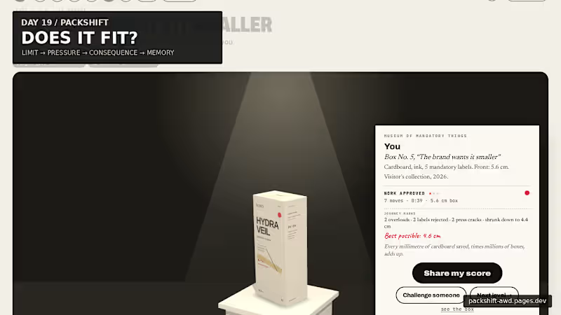
Packaging looks like graphic design. But every word takes physical space.
For Day 19, I built PACKSHIFT an interactive packaging experience where claims, languages, warnings and data become pressure on a finite surface.
It starts with the real 56 mm width of the carton.
Then you try to make everything fit.
Make the box smaller and the pressure becomes physical:
56 mm → pressure → CRACK → recovery → museum
The final package doesn’t just show the solution — it remembers the negotiation that produced it.
Underneath the public game is a deeper spatial compiler built with Blender + Three.js / React Three Fiber, where the same package can open, decompose, expose its dieline, redistribute information and refold.
Packaging is not a file. It is a compiled surface.
Full case study ↓
https://contra.com/p/3WBccUlM-packshift-packaging-is-a-compiled-surface
Live experience ↓
https://packshift-awd.pages.dev/
GitHub ↓
https://github.com/Faadil1/PACKSHIFT
Would love to know which moment lands most for you: Actual Size, the Hydraulic Press, or the Museum?
1
130