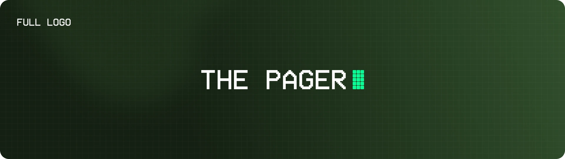
The Pager (Brand Design)
denise kuay
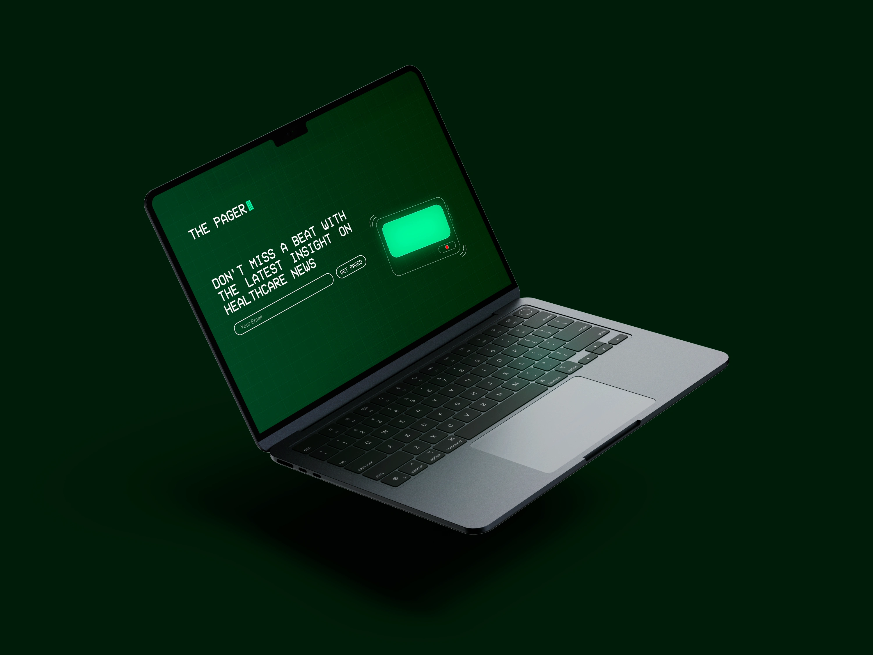
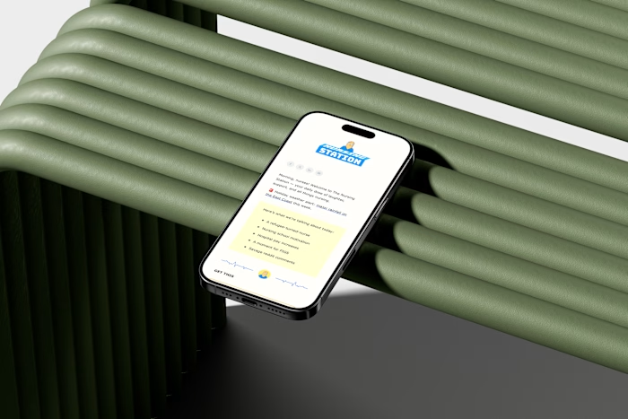
The Pager | Healthcare Newsletter
The Pager is a smart, scannable healthcare newsletter built for the morning scroll.
Inspired by the clarity and urgency of a real pager, it’s designed to cut through the noise and keep readers informed fast.
Scope of work
Brand & visual identity
Illustrations
Newsletter UX
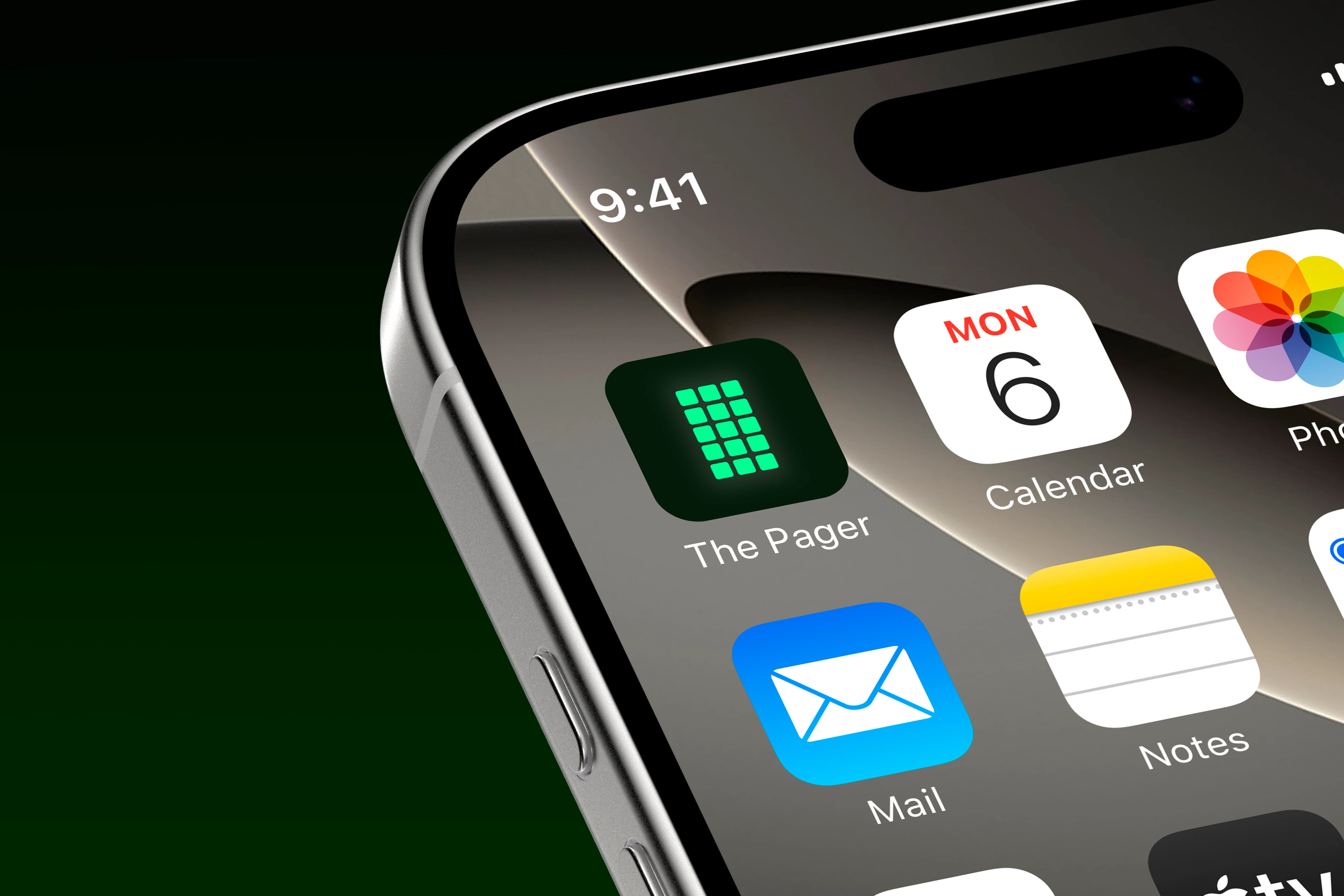
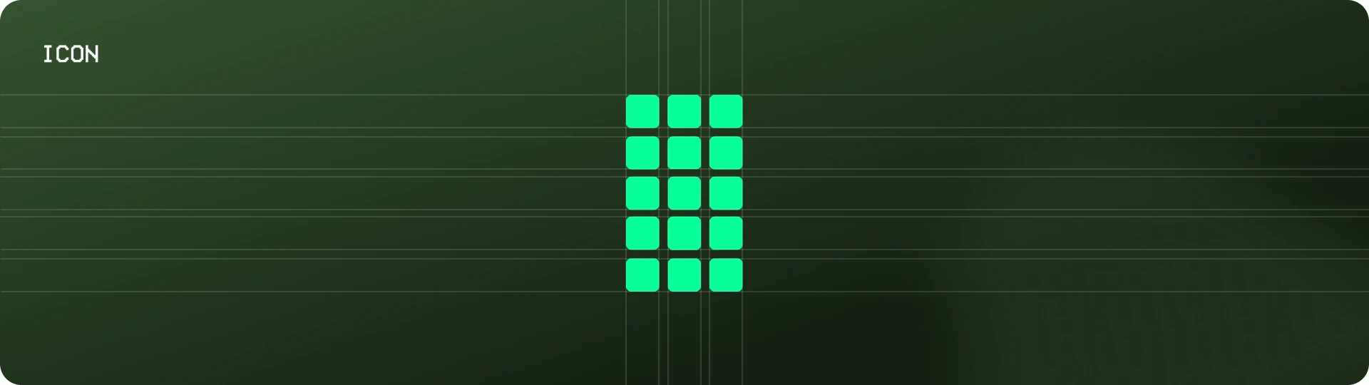
Icon Design
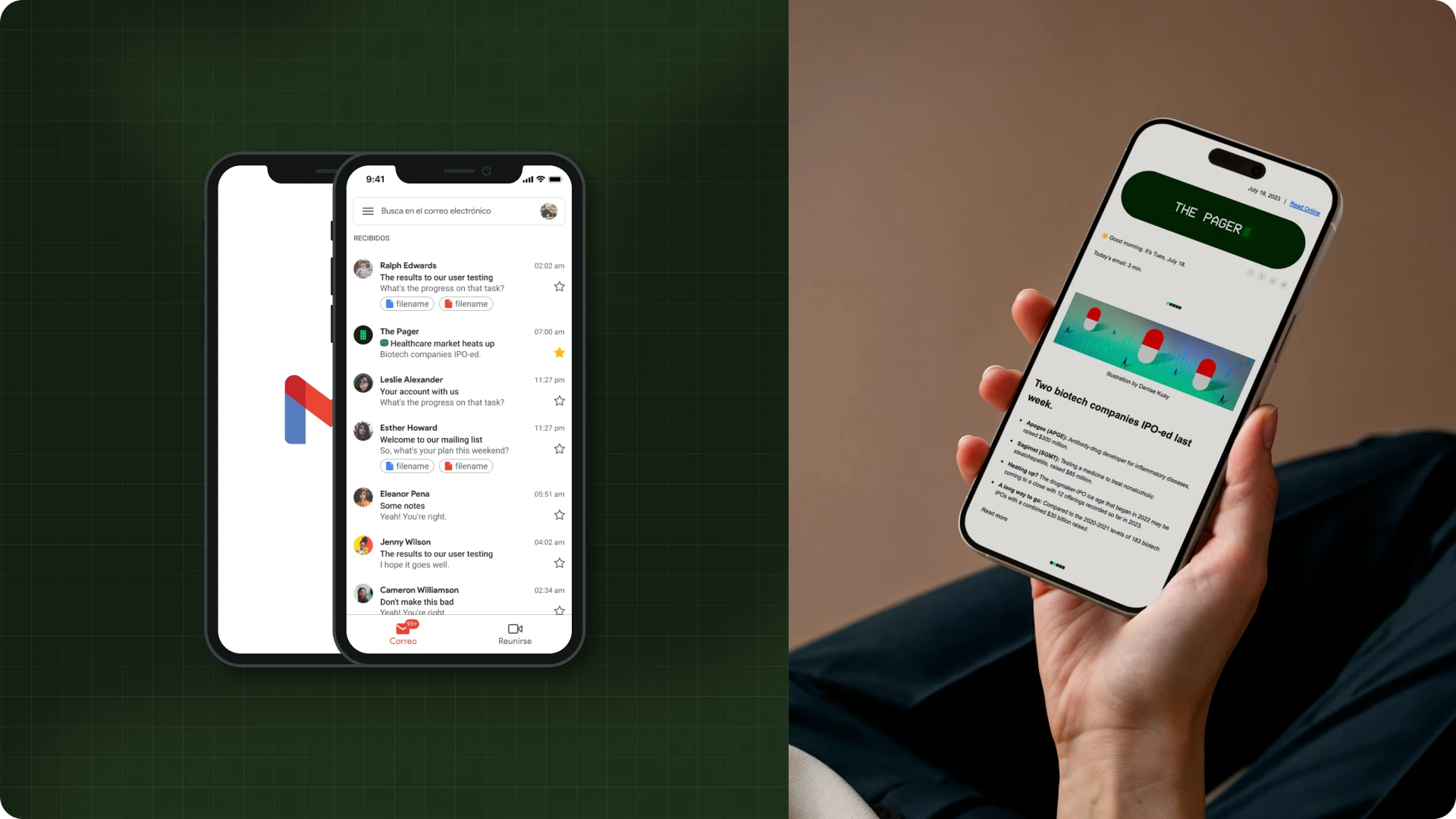
We reverse-engineered where readers would first encounter our icon (crowded Gmail inbox) and designed for that split-second moment.
The goal
Instant recognition
✔ Design that demands notice at a glance
✔ Colors that instantly signals importance
✔ Simple shapes for quick recognition & recall
The Result
A symbol that draws you in like the real pager - bold, urgent, and impossible to miss.
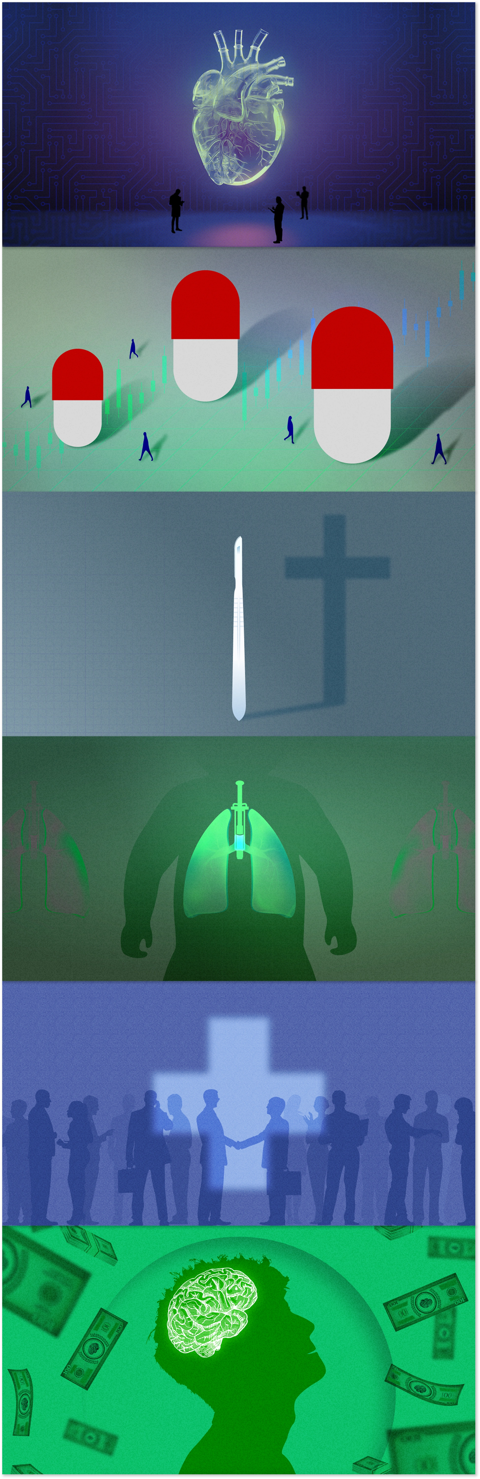
Newsletter Illustrations
Featured Images
Each visual is concept-driven, leaning on metaphor, color, and form to make you pause and think, even for just a second.
To give the visuals more edge and energy, I often brought them to life as looping GIFs. The motion wasn’t just for flair, it helped highlight key takeaways and made the newsletter feel more dynamic and alive in an inbox full of noise.
The Goal
To create visual storytelling that respects your time, rewards your attention, and makes even the most complex topics a little easier to digest.
Like this project
Posted Sep 1, 2025
A scannable, pager-style healthcare newsletter providing timely, clear insights to keep professionals informed each morning.
Likes
10
Views
80
Timeline
Jul 18, 2023 - Oct 30, 2023