Graphic designer focused on branding, web, and UX/UI.
- $1k+
- Earned
- 2x
- Hired
- 4.9
- Rating
- 21
- Followers
Graphic designer focused on branding, web, and UX/UI.

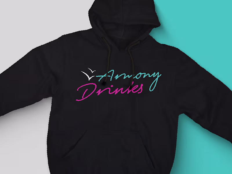
Brand Identity Designer | Logo & Visual Systems


Your creative partner. Design with empathy and patience.
New to Contra
Your creative partner. Design with empathy and patience.

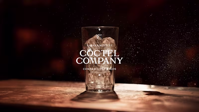
Visual identity designer.

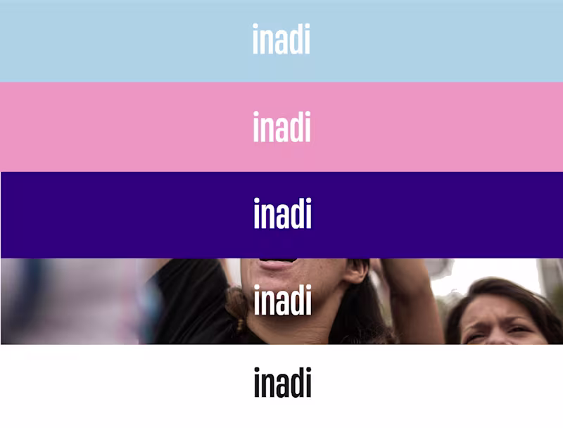
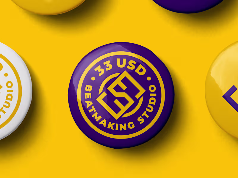
Graphic designer specializing in visual identity
Product/Graphic Designer & Framer Expert

Brand Strategist & Social Media Manager
Brand Strategist & Social Media Manager


View more →
Graphic & Multimedia Designer | Branding, Digital Marketing.
Graphic & Multimedia Designer | Branding, Digital Marketing.