Iron Lab® | Visual Identity
Julian Orlando
Iron Lab is a gym equipment brand born from within the industry. Its founder comes from the metalworking world, with experience in electromechanical structures and systems, which allowed him to identify a real problem: the lack of a product that combined quality construction, thoughtful design, and a visual identity befitting modern fitness spaces.
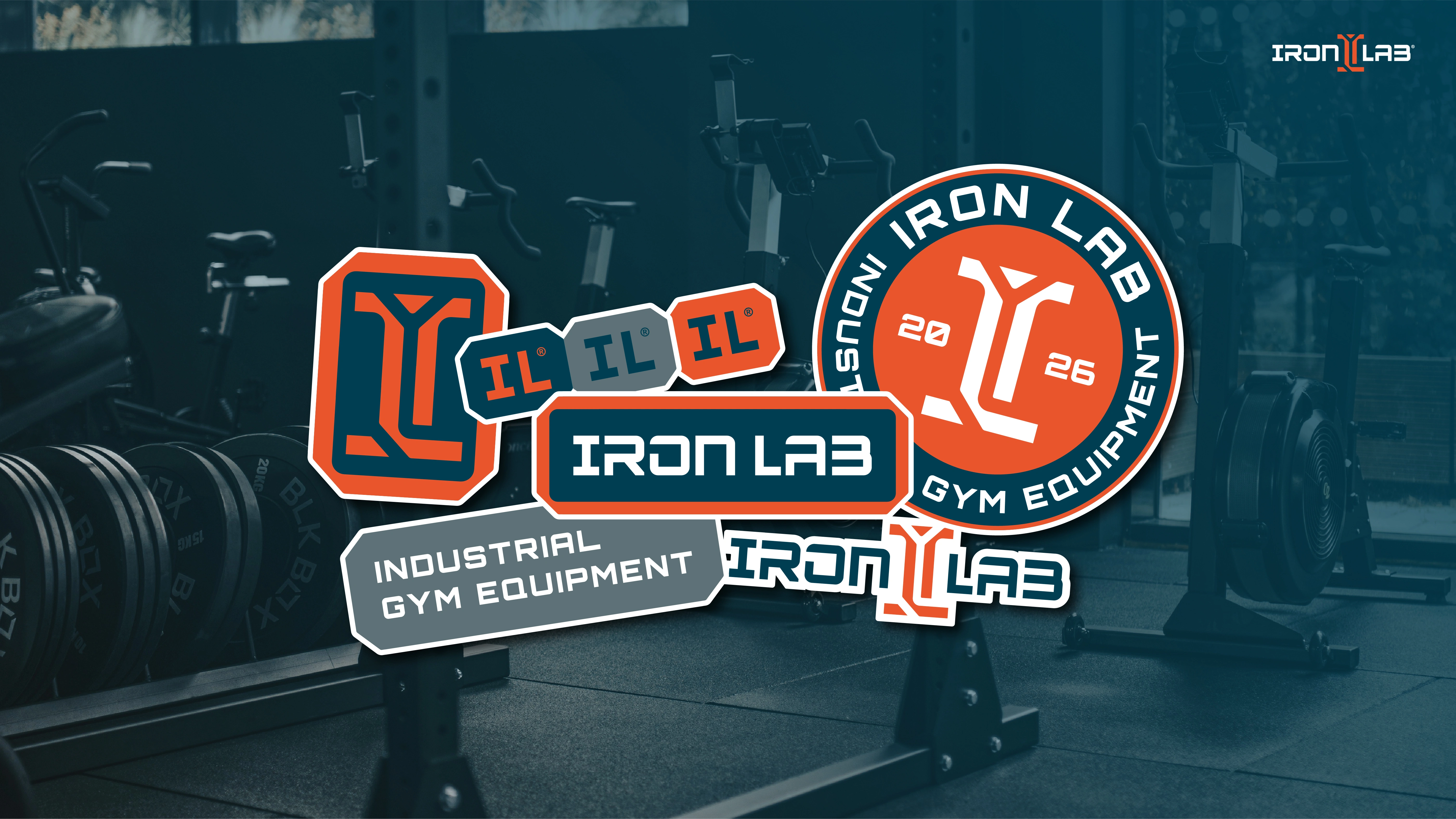
The color palette was built on a tension between the industrial and the human. Iron Blue provides the structural foundation, Ember energizes the brand with the raw power of metal, Old Red deepens this chromatic family, and Industry Grey completes the system with the tone of exposed materials. Together, they tell a story that moves from the workshop to the gym. The logo was born from a double meaning: the I of Iron and the L of Lab, fused into a shape that describes the cross-section of a steel beam. Denotation and connotation resolved in a single stroke.
The Iron Lab logo isn't glued or printed onto the machines: it's laser-cut directly into the sheet metal, becoming part of the product's structure. This influenced every graphic decision: lines with the necessary thickness to withstand the cutting process, shapes designed to maintain their integrity during the cutting, and a logo tested to function on different material thicknesses.
To complement this approach, the system incorporates Saira Stencil as the cut-out font, with internal cuts that allow the text to be transferred to metal without losing legibility. This typeface completes the circle between graphic identity and physical production.
The brand identity was implemented across all brand touchpoints. Digitally, the color palette and typography create high-impact pieces for social media and websites. In print, the brand appears on posters, banners, and stickers with the same consistency. Merchandise and apparel extend the identity beyond the product itself. But it's on the machines where everything converges: the logo cut into the metal sheet is the most honest application of the system, the moment when the brand ceases to be mere communication and becomes an object and a structure.
Like this project
Posted Jun 13, 2026
Visual identity design for Iron Lab, a gym equipment brand born from within the industry, where graphic and industrial design merge.
Likes
1
Views
2
Timeline
Mar 16, 2026 - Apr 17, 2026