Neuropsi: Neuropsychology Clinic Branding
Joaquin Cardelli
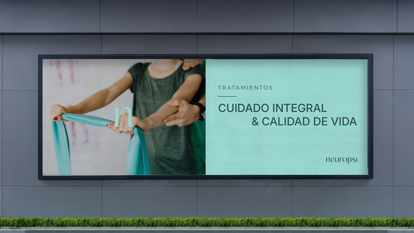
Integral Care in Public Spaces. The brand's design aims to convey serenity and professionalism. This billboard, with its message of "Integral Care & Quality of Life," reflects how Neuropsi's visual identity adapts to high-impact formats, communicating trust and hope to patients of all ages.
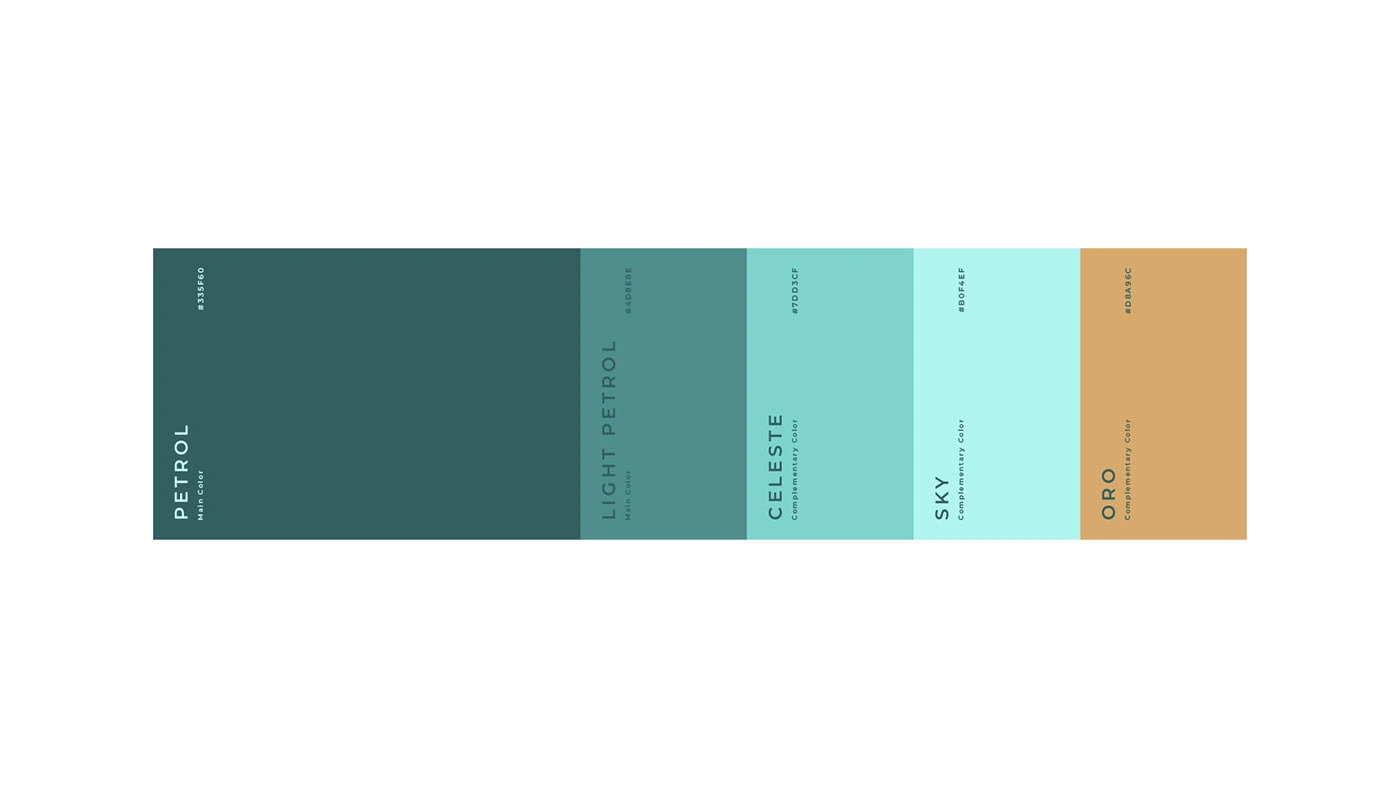
The Neuropsi Color Strategy
Trust, Calm, and Warmth. The palette was designed to balance scientific reliability with a sense of well-being. The deep Petrol tones provide professionalism and stability, while the lighter Celeste and Sky hues inject calm and hope. The complementary Oro (Gold) introduces necessary warmth and accessibility, creating a sophisticated yet sensitive visual environment ideal for neuropsychological care.
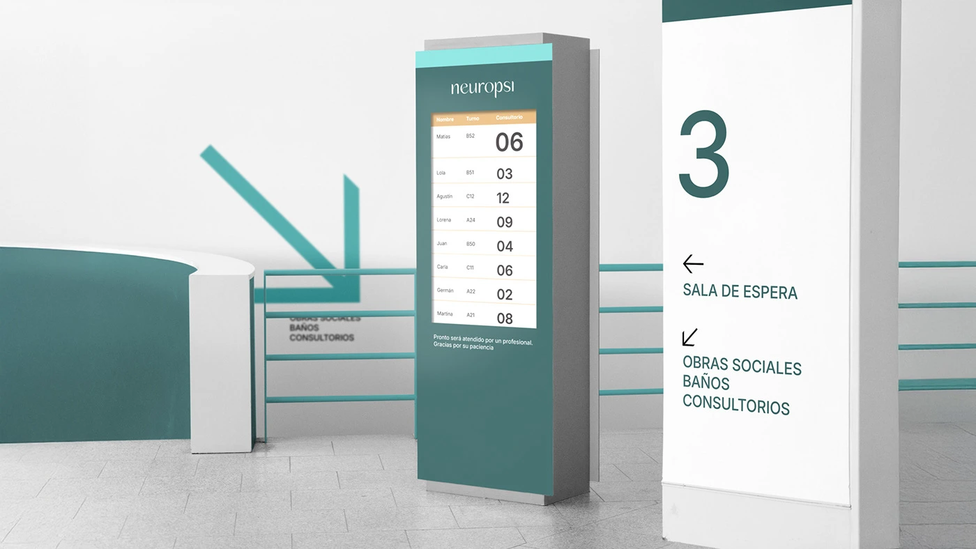
Patient Flow & Clear Guidance.
This visual demonstrates Neuropsi's integrated digital queuing system and interior signage. The design prioritizes clarity and a calming aesthetic, using brand colors and clean typography to guide patients efficiently. From transparent waitlist displays to directional signs for waiting rooms and consultations, every element contributes to a stress-free and supportive patient experience within the clinic.
Modular Signage System.
This animated sequence showcases Neuropsi's intuitive modular signage, designed to guide patients with clarity and ease throughout the facility. Each square element, integrating the brand's core colors and clean iconography, symbolizes direction, progress, and a seamless patient journey within a supportive environment. The system ensures accessibility and reinforces the brand's commitment to integral care.
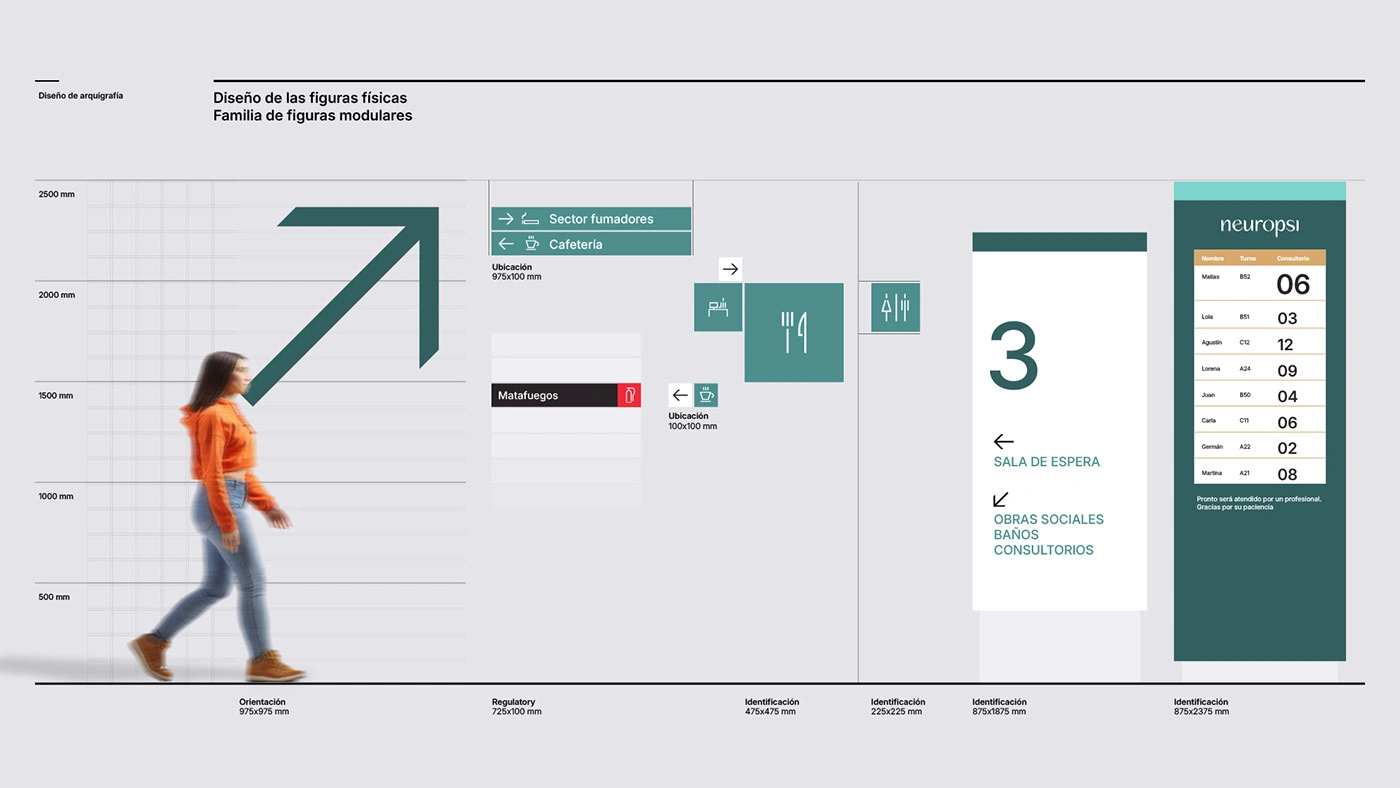
Modular Signage Planning.
This technical visualization demonstrates the planning and modularity of Neuropsi's physical wayfinding system. We defined a family of modular figures, specifying scale and hierarchy for various sign types: Orientation, Regulatory, and Identification. The large-format graphics and precise dimensions ensure visual clarity and seamless integration within the clinic's architecture, reinforcing an organized and reassuring patient experience.
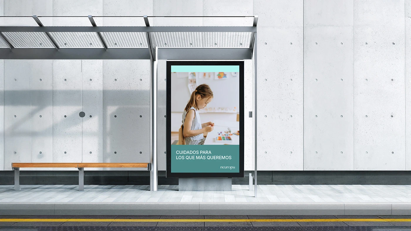
This public advertising display emphasizes Neuropsi's dedication to high-quality care, specifically for children ("Care for those we love the most"). The design uses warm imagery and the brand's calming palette to convey trust and empathy, positioning Neuropsi not just as a clinic, but as a supportive partner in the patient’s journey toward well-being.
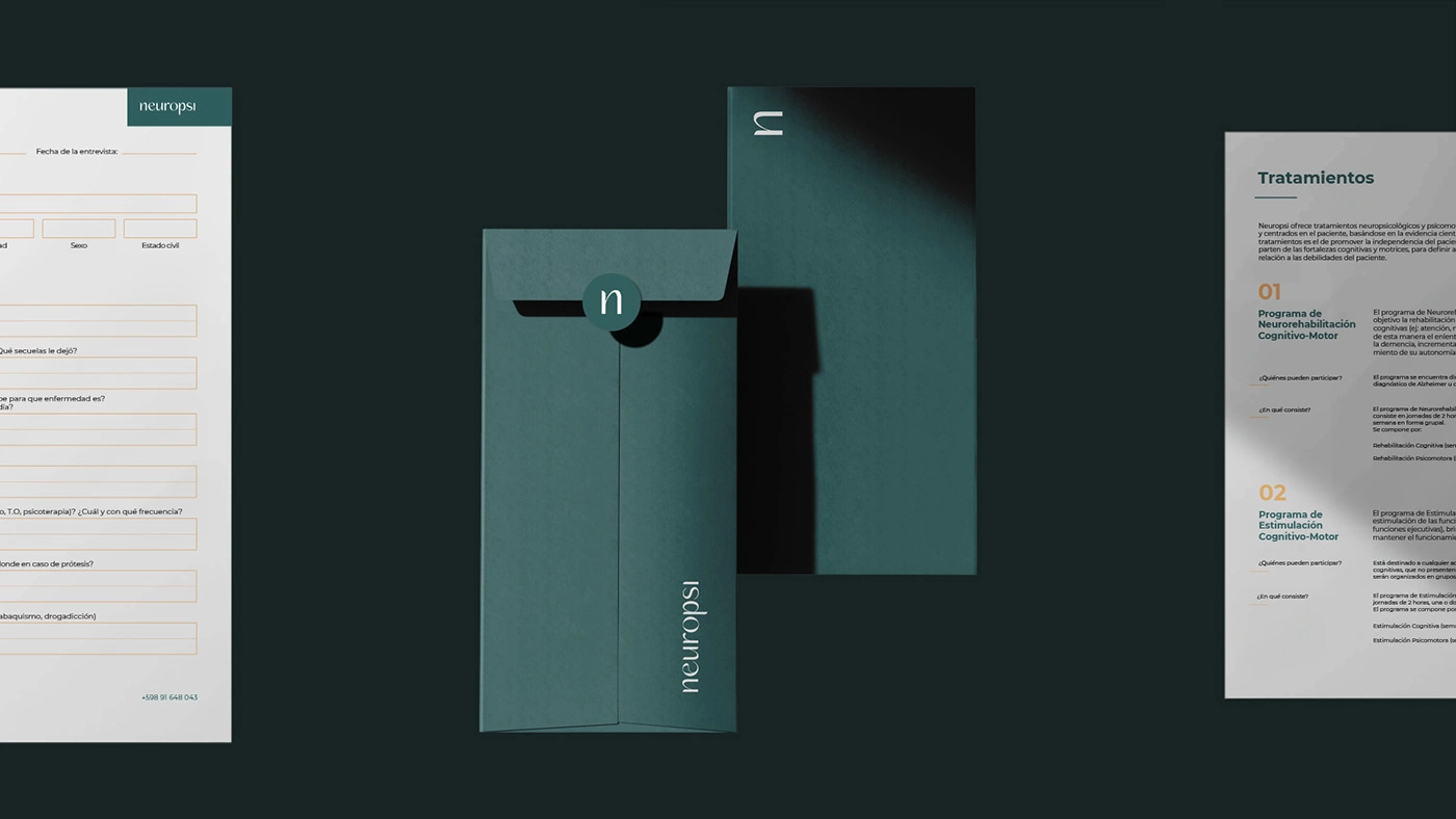
Clinical Documentation.
This visual highlights the application of the Neuropsi identity across critical internal assets, including consultation forms and secure envelopes. The design leverages the primary Petrol color and clean typography to ensure professionalism, discretion, and trust in handling patient information. Even in essential clinical documentation, the brand maintains its cohesive aesthetic, reinforcing the seriousness and reliability of the neuropsychological service provided.
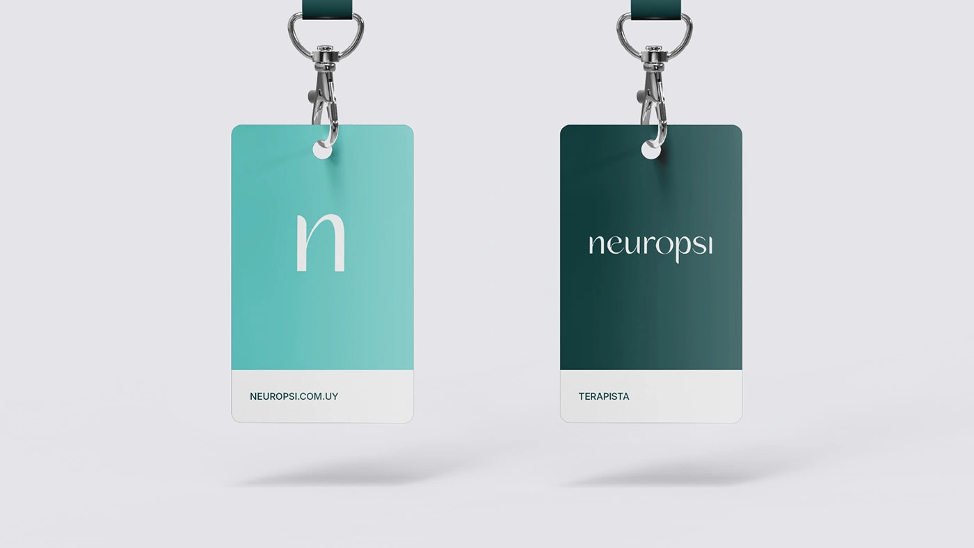
Therapist Credentials.
These staff credentials highlight the brand's commitment to internal consistency and professionalism. The dual-color design utilizes the calming Sky/Celeste and stable Petrol tones to clearly differentiate roles and sides. The clean typography and clear hierarchy ensure staff and patients can easily identify personnel and access key contact information, reinforcing a secure and trustworthy clinical environment.
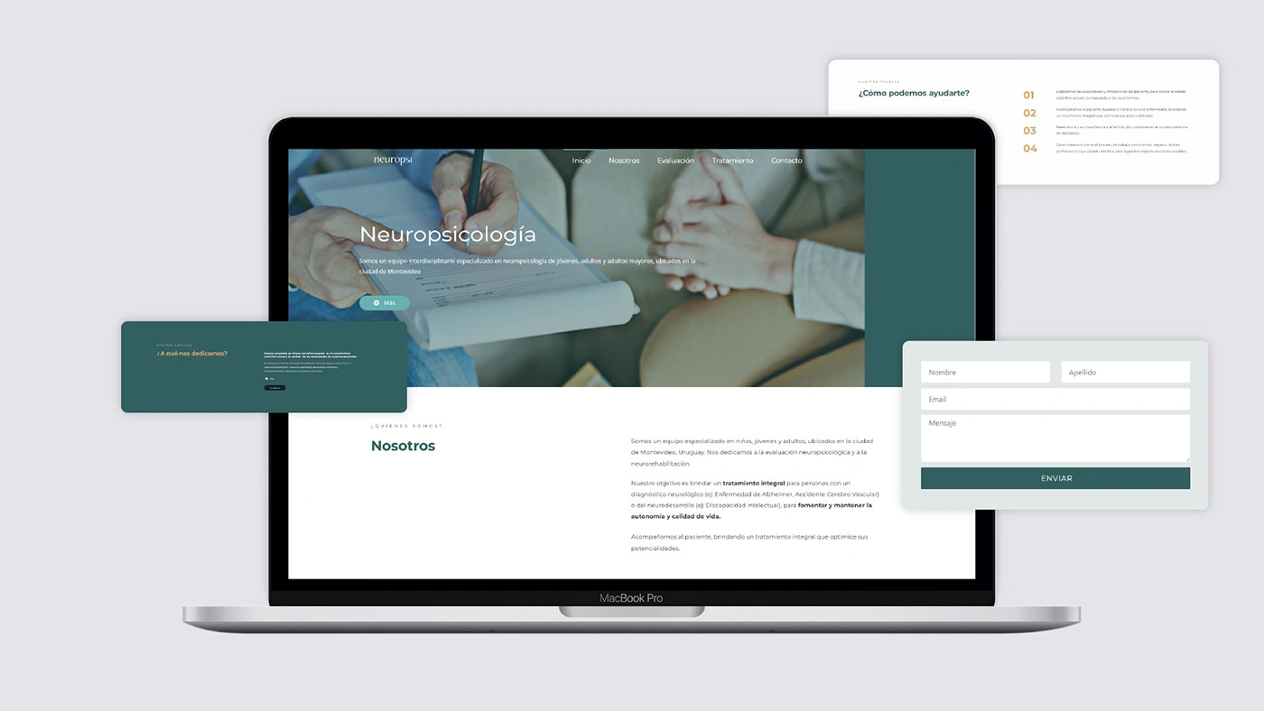
User Experience of Trust. This visual demonstrates the application of the Neuropsi brand identity in the digital space. The website design focuses on clarity and intuitive navigation, essential for sensitive topics like neuropsychology. We utilized the calming color palette and clean typography to build a professional, accessible, and user-friendly interface, ensuring that the online experience reinforces the clinic's commitment to patient well-being and clear communication.
The Neuropsi rebranding established a visual identity that achieved the balance between the scientific rigor of neuropsychology and the human sensitivity required for its patients. We designed a comprehensive graphic system—from wayfinding and documentation to the website—that communicates trust, professionalism, and facilitates a more fluid and organized care experience. The new brand positions Neuropsi as a benchmark for integral care and quality of life in Uruguay.
Like this project
Posted Nov 4, 2025
Visual identity for Neuropsi (Uruguay). Design communicates trust, sensitivity, and scientific rigor for neuropsychological treatment across all ages.