Waikiki: Gothic Ocean Typeface
Joaquin Cardelli
Gothic Meets the Ocean.
This visual introduces Waikiki, a custom-designed blackletter typeface that challenges traditional forms. Inspired by the powerful, fluid movements of the sea and the waves of Waikiki, the font blends the formal structure of Gothic scripts with organic, subtle curves and dynamic motion. It’s an exercise in contrast, delivering historical weight with a modern, coastal flow.
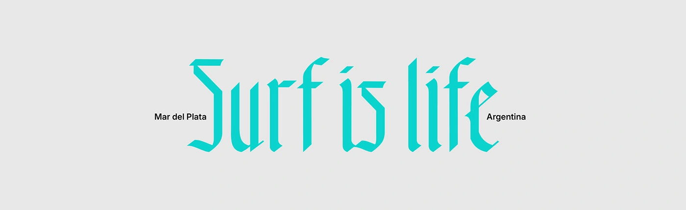
Capturing the Surf Spirit. This application showcases the Waikiki typeface in a context inspired by its essence: "Surf is life," rooted in Mar del Plata, Argentina. The custom gothic-oceanic letterforms fluidly adapt to this vibrant message, demonstrating how the font can evoke a dynamic, adventurous, and authentic feel, blending historical craftsmanship with modern, free-spirited culture.
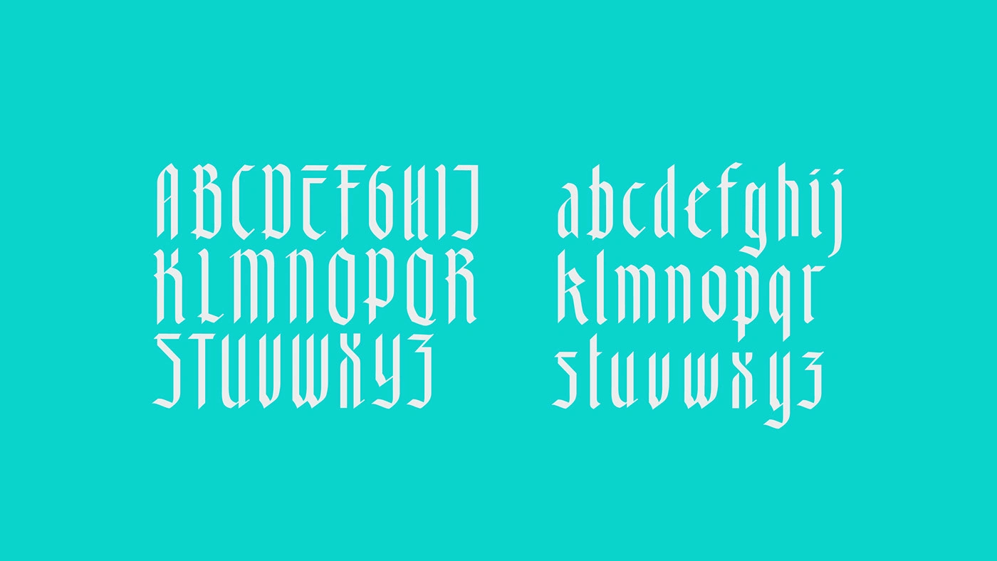
This visual presents the complete character set for the Waikiki typeface, showcasing both uppercase and lowercase letters. Each meticulously crafted glifo reflects the unique fusion of traditional Gothic structure with the dynamic fluidity inspired by ocean waves. The consistent design across all characters ensures legibility and a distinctive aesthetic for any application, from bold headlines to nuanced branding.
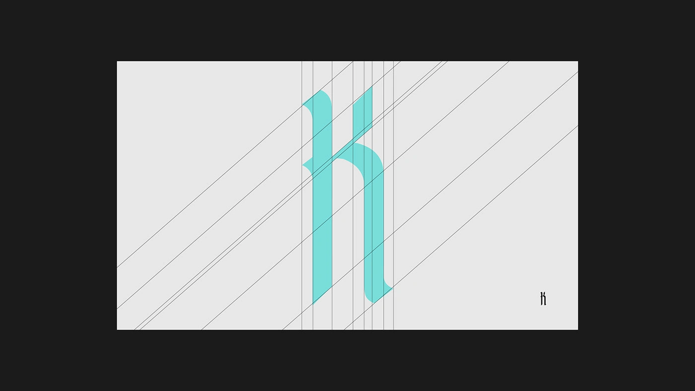
This technical view reveals the underlying structure of the Waikiki typeface. Precise geometric guidelines and construction lines were used to define the character's weight, contrast, and flow. This rigorous process ensured that the fluid, wave-inspired curves were consistently applied across the entire alphabet, achieving maximum legibility while preserving the distinct, dynamic aesthetic of this Gothic-oceanic fusion.
This visualization highlights the complete set of numeral characters. By applying the same geometric structure and dynamic curves defined in the letters, the numerals maintain the unique Gothic-oceanic aesthetic. Displayed here in an outline style, it showcases the versatility of the font family and ensures cohesive visual identity when used for dates, statistics, or numerical headers.
This final view showcases the comprehensive support for specialized characters, including the full set of Spanish diacritics (á, é, í, ó, ú, ñ) and essential symbols ($, /, punctuation). This careful attention to detail ensures the Waikiki typeface is functional and linguistically sound for international use, maintaining its distinctive Gothic-oceanic style across all necessary marks and symbols.
Custom Ligatures in Motion. This GIF showcases the custom ligatures designed for the Waikiki typeface (e.g., fi, fl). Ligatures are crucial in a Blackletter style to prevent character collision and enhance the text's flow and readability. The seamless connection between these letter pairs maintains the font's rhythmic, oceanic fluidity, demonstrating meticulous attention to spacing, kerning, and the final aesthetic quality of the typeset.
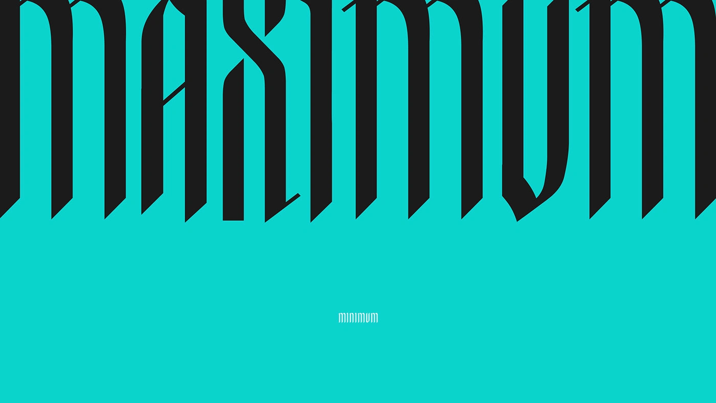
. This striking visual demonstrates the inherent rhythm and stylistic contrast within the Waikiki typeface. By juxtaposing the tall, imposing forms of the uppercase letters ("MAXIMUM") with the small, refined scale of the lowercase ("minimum"), it showcases the font's versatility for creating strong visual hierarchy and compelling display headlines, while maintaining the unique fluid-Gothic aesthetic.
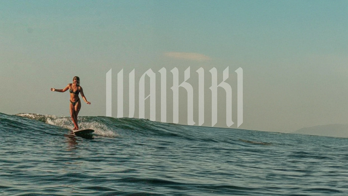
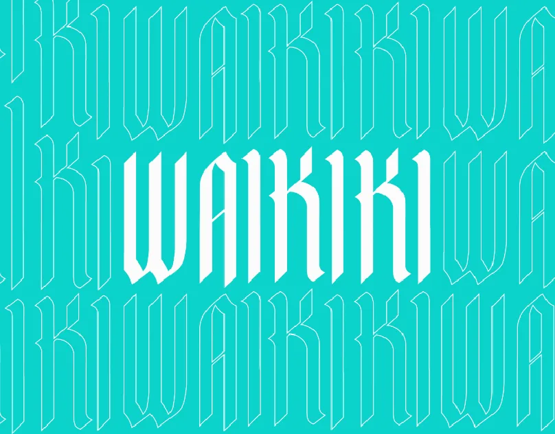
This visual directly connects the typeface's name and its core inspiration. The tall, dynamic forms of the Waikiki font visually mimic the motion and crest of a powerful ocean wave. This application perfectly illustrates the font's ability to be used in high-impact branding and thematic design, successfully blending the classic weight of Gothic script with the adventurous, fluid spirit of surf culture.
Waikiki is a display typeface project that merges the rigid structure of Gothic (Blackletter) script with the fluid, organic movement of ocean waves. The resulting design is a dynamic, bold, and rhythmic font that achieves a striking visual contrast, making it ideal for branding and headlines that seek a balance between historical craftsmanship and the energetic spirit of modern surf culture.
Like this project
Posted Nov 5, 2025
Custom display typeface merging Blackletter structure with the fluid, dynamic energy of the ocean. Designed for bold branding and headlines.
Likes
0
Views
7