Freelancers using Adobe Photoshop in Bogota
Sign Up
Post a job
Sign Up
Log In
Filters
2
Projects
People
Juan Hoyos
pro
Colombia
Frontend Developer | Framer & Webflow Expert
$25k+
Earned
10x
Hired
5.0
Rating
22
Followers
expert
Follow
Message
Frontend Developer | Framer & Webflow Expert
0
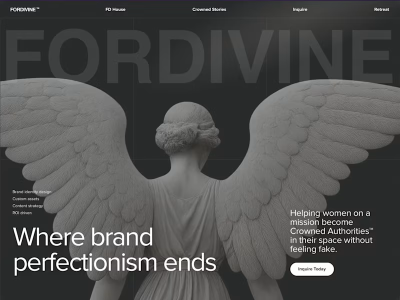
FORDIVINE • Framer Redesign & Framer Build
0
9
0
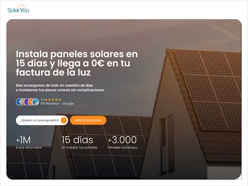
SolarYou — Solar System Platform for Spain
0
9
0
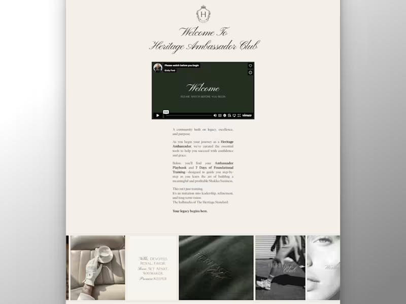
Heritage Club • Framer Redesign & Framer Build
0
11
$9K+ earned
0
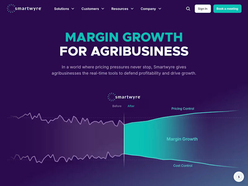
Smartwyre • Website Migration & Scalable Design System
0
55
Adobe Photoshop
(1)
Follow
Message
Marlon Velásquez
Colombia
Motion designer
$25k+
Earned
6x
Hired
5.0
Rating
15
Followers
Follow
Message
Motion designer
4
Zilverk - Stream Assets
4
15
2
Dupla - Animated assets
2
17
3
Portfolio
3
35
View more →
Adobe Photoshop
(3)
Follow
Message
Daniel Castellanos
pro
Bogota, Colombia
Brand Identity & Content Creation | Video & Motion
5.0
Rating
22
Followers
Follow
Message
Brand Identity & Content Creation | Video & Motion
3
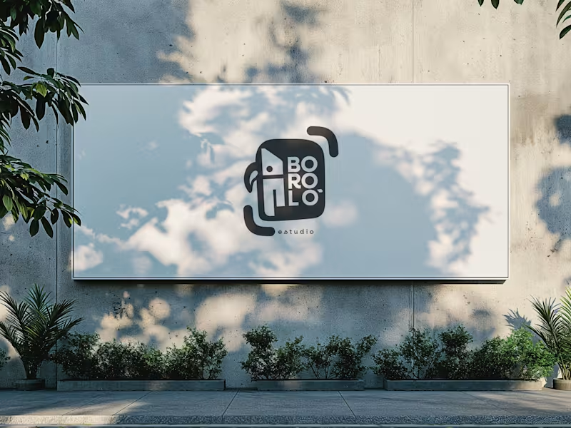
There are design decisions that don't come from the client. They come from within—and sometimes, that is exactly the problem. The previous logo for Boroló Estudio had soul. It had pre-Columbian roots, a hand-drawn stroke, and an indigenous character. It evoked drums, authenticity, and the Chocó—one of the most biodiverse and culturally rich regions in Colombia, a land of jungle, rivers, and a visual identity unlike any other. I loved it. And precisely because of that, I failed to evaluate the challenges the logo would face on real-world platforms: on a website, as an Instagram avatar, or in digital spaces. The redesign wasn't about letting go of the logo. It was about letting go of the attachment. The problem wasn't aesthetic—it was one of coherence. The studio’s brand had evolved, but the logo hadn't. A composition with too many elements in tension made the icon struggle to be memorable; what people saw didn't connect with who Boroló truly is. The new system retains the bird—now geometric, set in negative space within the icon. The inner container references the studio’s actual architectural blueprint: the diagonal of the cyclorama ceiling and the two zones of the space. The brackets refer to photographic framing. No layer imposes itself over the other—they are discovered. The result is a versatile system: imagotype, vertical logo, and wordmark. It works on a sticker, a billboard, an avatar, or a website. It scales without losing its identity. Redesigning doesn't mean the initial design was bad. It means communication needed to evolve. And from that point of view, the change isn't a correction—it’s a decision.
3
166
3
Not every brand needs to shout. CPLUS Ingeniería sells reliability to the industrial sector. Their clients make high-impact technical decisions — they don't buy on impulse. The communication I developed for them reflects that reality: social media graphics presenting products, services, and application notes without detours, without unnecessary visual noise, without artificial urgency. Just clear information, well structured, and with the tone the brand demands. Some brands need to move slow. Communicating with calm isn't a limitation — it's a strategic decision.
1
3
199
3
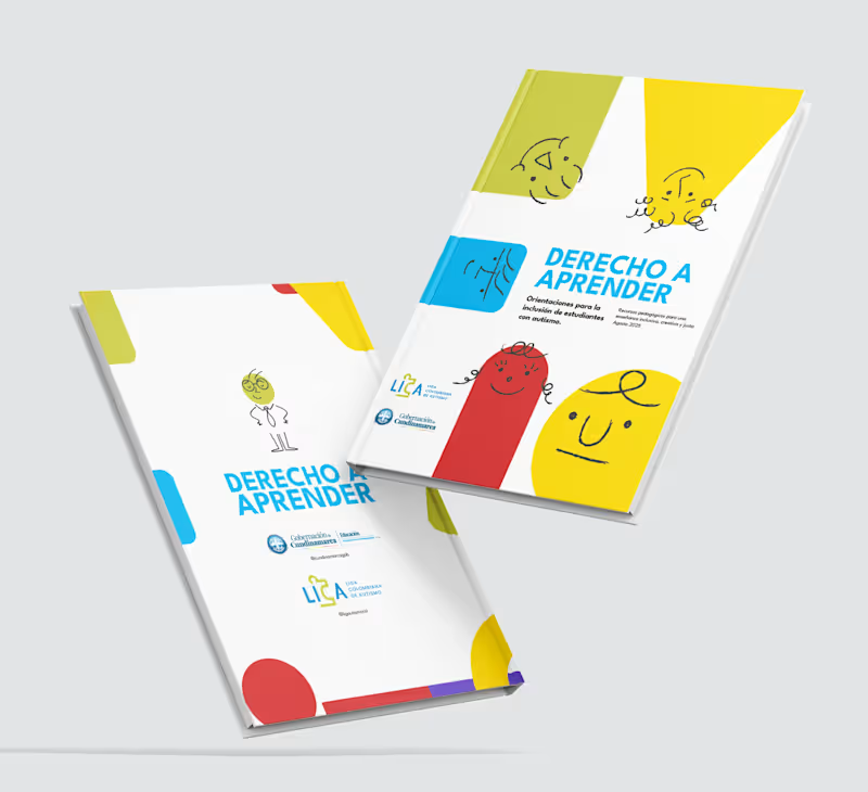
Design for Inclusion: Crafting Educational Tools for Neurodiversity I’m proud to share my work on a key initiative for the Gobernación de Cundinamarca in partnership with LICA (Liga Colombiana de Autismo). I led the editorial design and layout of the central pedagogical guidebook, a vital resource created to support inclusive education for students with neurodevelopmental disorders (ASD) across the region. My role focused on transforming complex technical content into a highly functional, visually accessible editorial piece. By bridging the gap between specialized information and practical classroom application, I ensured that teachers and families had a clear, intuitive roadmap for implementing inclusive strategies. While this was part of a larger toolkit, the guidebook served as the visual and structural anchor for the printed materials. This project reinforced my belief that design is a powerful tool for social change, especially when it comes to making education more accessible for every mind.
1
3
416
2
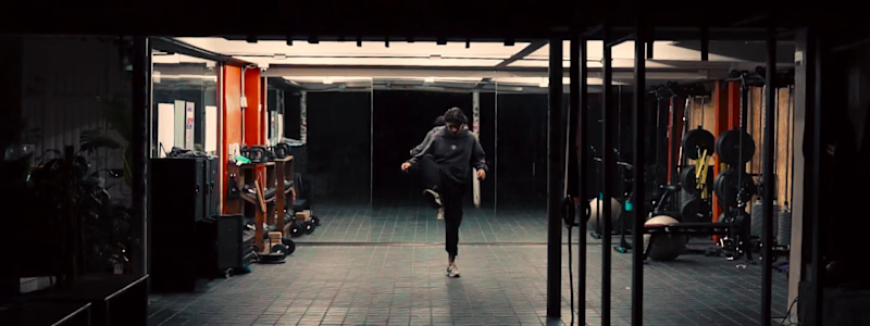
BIRRIA. There's a version of food content that treats the dish as the star and rushes to get there. This isn't that. Birria is a slow process — layers of dried chiles, bones, hours of heat. The edit follows that logic. The music is slow, almost pre-Columbian, but the cuts don't drag. They move with the rhythm, not against it. Close on the clay pot. The char on the chiles. Hands working. The result feels warm. Domestic. Like something your grandmother would recognize even if she'd never seen a camera. Detail-first food cinematography, edited to feel like the dish tastes.
2
23
Adobe Photoshop
(3)
Follow
Message
Samuel Eastmond
Bogota, Colombia
Architect | Interior Designer | 3D Rendering |
5.0
Rating
11
Followers
Follow
Message
Architect | Interior Designer | 3D Rendering |
0
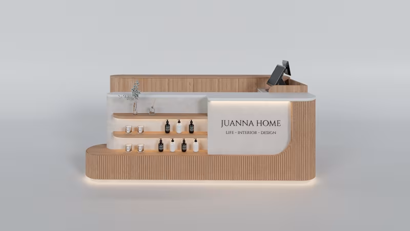
MALL KIOSK DESIGN + 3D RENDERS
0
7
0
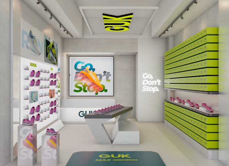
GUK RETAIL STORE DESIGN + 3D RENDERS
0
11
0
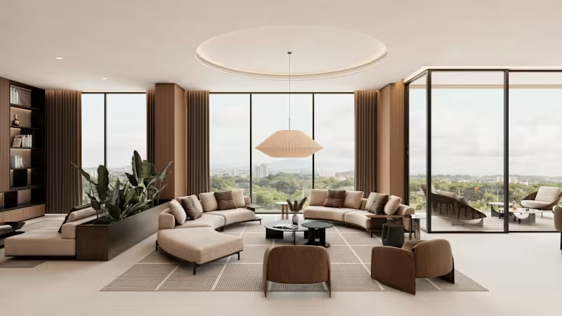
MAIA APARTMENT - INTERIOR DESIGN + 3D RENDERS
0
12
3
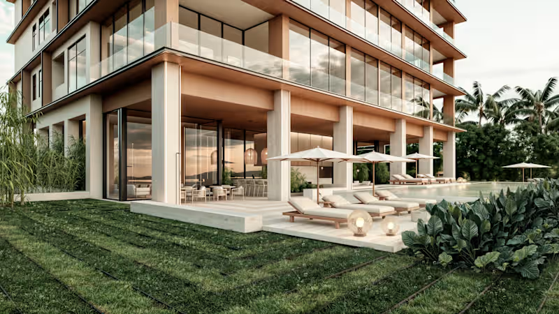
MAIA BUILDING - 3D EXTERIOR / INTERIOR RENDERINGS
3
19
Adobe Photoshop
(3)
Follow
Message
Miguel Morales
Bogota, Colombia
Freelance Logo, Brand and Motion Designer

New to Contra
Follow
Message
Freelance Logo, Brand and Motion Designer

0
Oreo® Christmas Key Visual
0
4
1
Advertainment Visual Identity Design
1
2
0
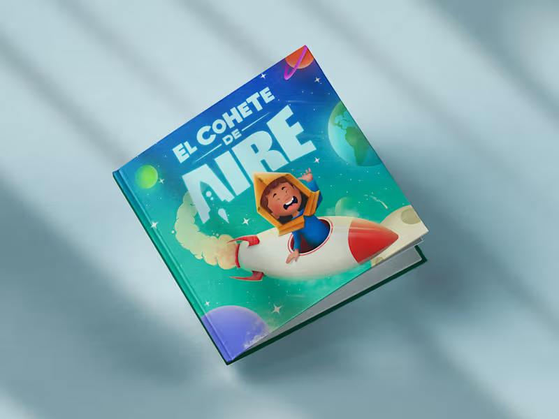
The Air Rocket | Cover Book Illustration
0
3
0
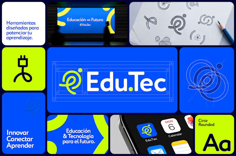
Visual identity | Edu.Tec™
0
5
Adobe Photoshop
(4)
Follow
Message
Anna Selkova
Bogota, Colombia
Ad Creatives, Websites, Branding | Multidisciplinary Design
10
Followers
Follow
Message
Ad Creatives, Websites, Branding | Multidisciplinary Design
7
ZOE – Social Media Ads Pack We developed a premium ad creative suite for ZOE, a leading scientific platform that replaces generic diets with personalized microbiome and metabolic data. The main challenge was to translate complex biohacking research, clinical percentages, and body markers into simple, clickable social media formats. The final deliverables include a high-converting carousel, a static single ad, and a dynamic video asset optimized for Meta and LinkedIn. The visual style is built on strict data-driven minimalism using clean backgrounds, a precise modular grid, and sharp typography. Technically, the focus was on advanced data visualization–turning complex research into high-contrast charts, body-marker graphs, and engaging myth-busting layouts, while strictly adhering to platform safe zones to drive app installs among entrepreneurs and high-performers.
3
7
99
0
Website Design & Development – PrideX Career My role: Creative Director Project description: Pridex is a leading construction company looking to attract top talent. My task was to design and develop a professional recruitment website from concept to final launch. The goal was to present the brand as a reliable employer and make the job search effortless for candidates on both desktop and mobile. I created a clean and modern digital experience featuring structured vacancy sections, key company milestones, and real employee stories. To drive engagement and support applicant decision-making, I integrated practical tools like an income calculator, a step-by-step onboarding guide, and a helpful FAQ section. The result is a premium and high-converting website that strengthens trust in the company and simplifies the hiring journey.
0
125
0
Website Design & Development — CNI Fulfillment My role: Creative Director & Web Designer Project description: CNI Fulfillment is a nationwide logistics and distribution company. My task was to design and develop a full cycle website from concept to final launch. The goal was to create a clear and trustworthy platform that highlights their award winning services and technology driven approach. I created a conversion focused digital experience with structured service pages and a streamlined request a quote system. Both desktop and mobile versions are built for maximum efficiency and ease of navigation. The result is a modern online presence that strengthens long term partnerships and positions CNI as an industry leader.
0
127
0
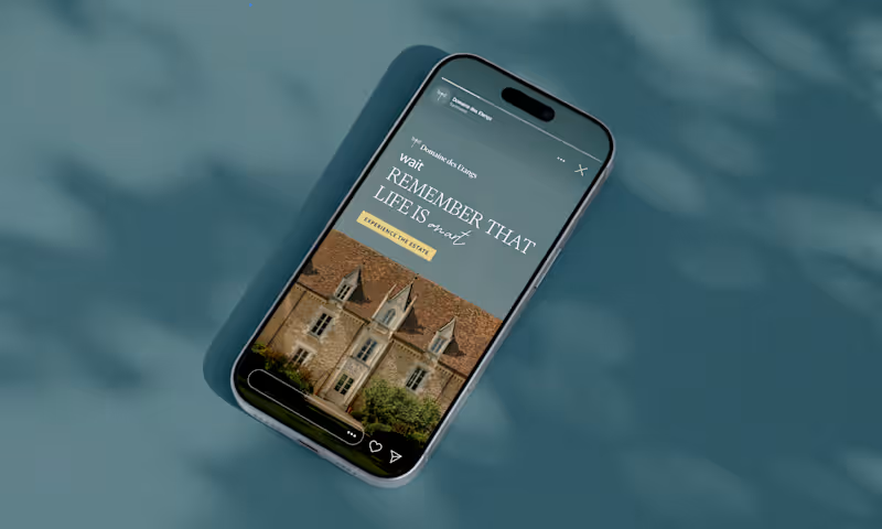
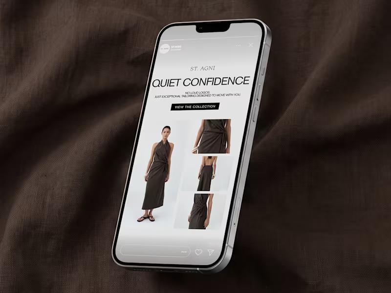
Promotional Ad Creatives for Hyperice My role: Content Designer & Visual Strategist Project description: For this project, I created Instagram and Facebook Stories creatives for Hyperice focused on brand awareness and engagement. The designs highlight the product in a dynamic, premium way, emphasizing recovery, performance, and innovation. Each creative follows a clear visual structure with strong messaging and a call to action, built in a 9:16 format with proper safe zones. Real product and logo assets were paired with clean, energetic backgrounds, optimized for social and paid media use.
0
142
Adobe Photoshop
(10)
Follow
Message
Angie Sánchez Zapata
Bogota, Colombia
Brand Identity Designer & Creative Director | Visual systems
Follow
Message
Brand Identity Designer & Creative Director | Visual systems
1
MRH — Website Redesign & Ecommerce Optimisation Project Type: UX/UI Redesign, Shopify Development & SEO Sector: Streetwear & Urban Apparel The context: MRH already had an online store, but it lacked structure, consistency, and a clear customer journey. Rather than redesigning isolated screens, I approached the project as part of a broader brand strategy — identifying friction points across the entire shopping experience and rebuilding the site around usability, storytelling, and scalability. My role: I led the full redesign end to end — from information architecture through custom Shopify development and SEO — working directly within the brand system I had already established for MRH. What I did: Reorganised the site's information architecture, simplifying navigation, menus, and product discovery for a more intuitive purchasing flow Redesigned the homepage — the highest-abandonment section — into a clearer introduction to the brand and its universe Separated storytelling from technical product information across product pages to improve readability and purchase decisions Built a dedicated blog giving each illustrated character its own narrative, connecting editorial content to ecommerce without interrupting the buying experience Developed custom Shopify components using Liquid, including interactive size-chart pop-ups (managed through metafields), dynamic product characteristics with visual icons, FAQs, trust indicators, and automated "Notify Me" functionality for out-of-stock items — all designed for the client to manage without touching code Restructured product categories into a dedicated Products section (previously a single catalogue-all page) and built a custom Collaborations page that auto-groups tagged products by partner brand Ran a complete SEO optimisation pass: restructured product descriptions, built keyword-focused URLs and metadata, and created a scalable metafield system so new products publish following the same optimised structure Set up quick-response templates in WhatsApp Business to streamline customer service Created a dedicated brand page explaining MRH's origins and philosophy, strengthening the connection between visual identity and digital presence The result: A website that isn't just visually stronger — it's easier to manage, more discoverable through search, and built to support MRH's growth long after launch. Full case study on Behance (https://www.behance.net/gallery/253684079/Website-Redesign-Ecommerce-Optimization)Live web (https://mrh-brand.com/)
1
37
1
MRH — Building a Brand Identity System for a Streetwear Label The challenge: MRH is a Colombian streetwear brand with a strong creative instinct — rooted in Japanese aesthetics and a clear sense of who they wanted to be — but no system to express that consistently. No brand manual, no visual structure, just raw identity waiting to be organised. What I did: Conducted a full brand audit to understand their visual language, values, and audience Developed a cohesive brand identity system translating their Japanese-inspired aesthetic into consistent visual rules Built a strategic brand structure to guide how the identity shows up across every touchpoint — from product to digital presence The result: MRH didn't become a different brand — it became a more consistent one. Same energy, same roots, now backed by a system that lets it scale without losing what made it recognisable in the first place. If your brand has the instinct but needs the structure, I can help you find it. Full case study on Behance: https://www.behance.net/gallery/253561681/Brand-Identity-MRH Live web: https://mrh-brand.com/
1
31
0
Fidelino Vivero — Brand Identity & E-commerce Web Design Fidelino is a premium plant nursery that needed more than a website — it needed a world, a place where buying a plant felt as intentional and warm as the act of gifting one. The brand's core idea, regalos que crecen (gifts that grow), shaped every design decision from the logo to the checkout experience. The visual identity centres on a hand-drawn botanical illustration mark, paired with a deep forest green and warm amber palette that communicates both sophistication and organic life. The typographic system balances editorial elegance with the approachability of a neighbourhood nursery that knows every plant by name. The e-commerce experience was designed end-to-end for both desktop and mobile: homepage with curated editorial photography, product catalogue with personality-driven copy, individual product pages with size and pot selection, collection pages organised by category (plantas, materas, macramé décó, especiales), a functional shopping cart with shipping calculator, lifestyle gallery, FAQ section, and contact form — all maintaining consistent brand language across every touchpoint. The mobile experience received equal design attention, with a navigation system, product detail drawer, and cart view optimised for touch interactions and conversion.
0
94
0
Cumbia Express — Brand Identity & Visual System Cumbia Express is a delivery service brand built around a simple, powerful promise: cumplo — I deliver. The challenge was translating that reliability into a visual identity with enough personality to stand out in a crowded urban market, without losing the warmth and cultural familiarity that makes local service brands feel trustworthy. The identity draws from Colombian street culture and retro Americana aesthetics — a combination that feels both locally rooted and timelessly bold. The central character, a helmeted motorcycle messenger, becomes the visual anchor of the entire system: energetic, recognizable, and instantly communicative of what the brand does. The typographic system pairs Alex Brush (script, warm, human) with American Typewriter (slab, bold, reliable) — two typefaces that hold natural tension between speed and trust. The 6-color palette — Yellow, Red, Green, Sky Blue, Cream, and Near-Black — was designed for maximum versatility across physical applications: stickers, signage, packaging, and merchandise. The full brand system includes two logo versions (circular and vertical), four color variations (including high-contrast dark and light backgrounds), a complete sticker collection of 7+ applications, and business card design — demonstrating how a single identity can stretch across an entire brand ecosystem without losing coherence.
0
109
Adobe Photoshop
(9)
Follow
Message
Nathalia Acosta
Colombia
Graphic Designer
Follow
Message
Graphic Designer
0
T'aime - Brand Identity
0
9
0
Colour't - Brand Identity
0
9
0
Trave - Brand Identity
0
9
0
Nathalia Acosta - Website Design
0
5
Adobe Photoshop
(3)
Follow
Message
Explore people