
Anna Selkova
Ad Creatives, Websites, Branding | Multidisciplinary Design



OSEYA Freediving
0
0
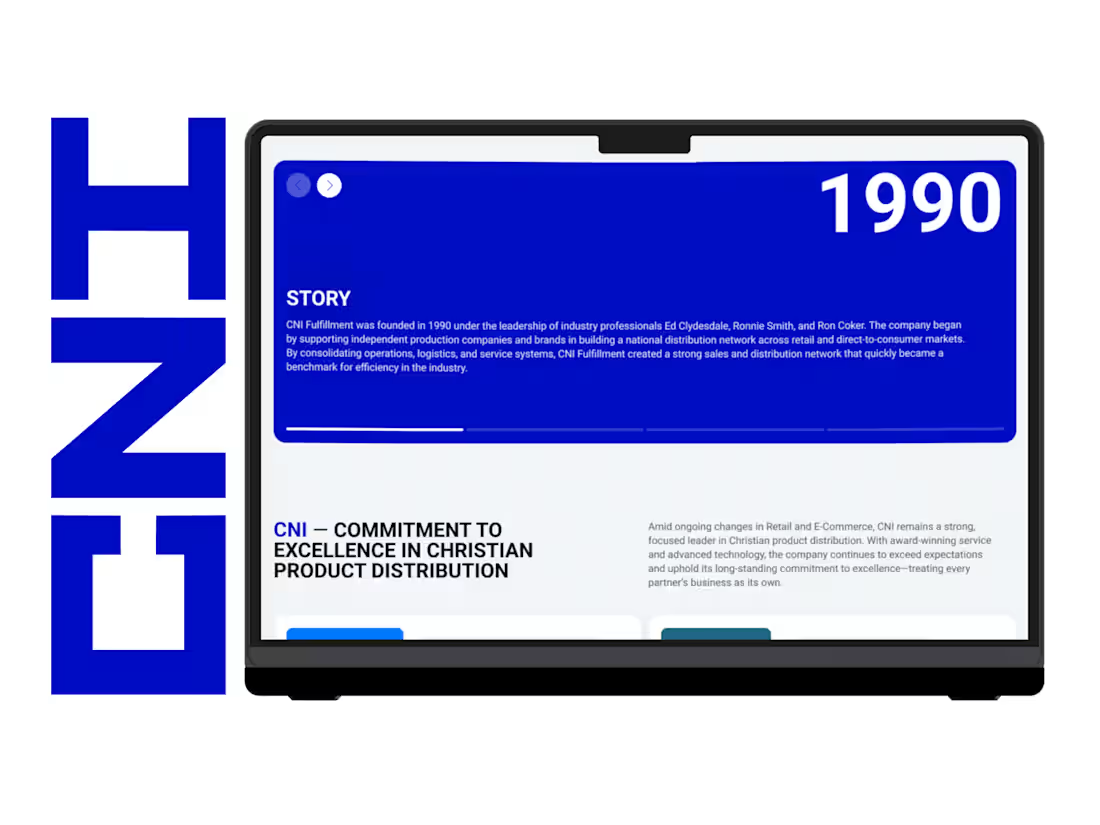
CNI Fulfillment – Website
0
2
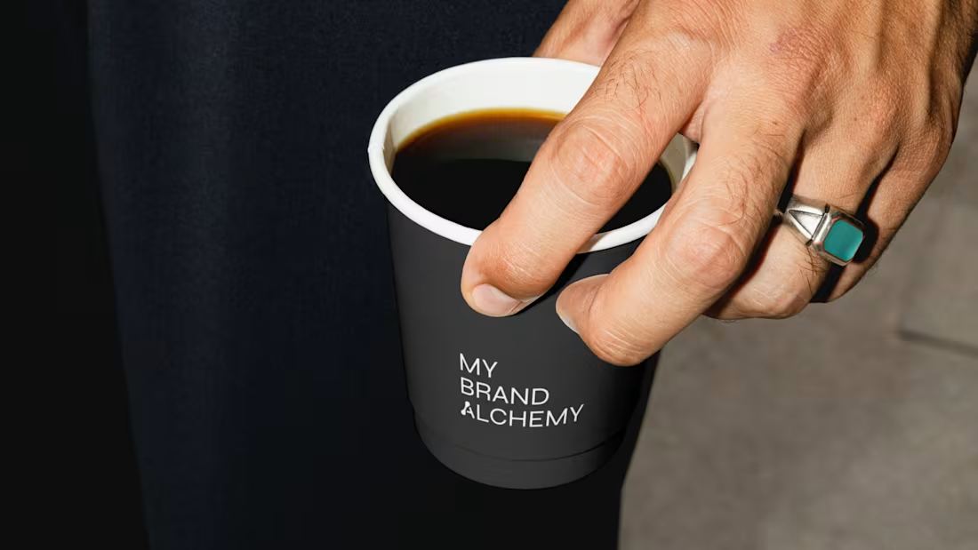
My Brand Alchemy – Visual Identity
How do you brand a branding agency without hiding behind someone else’s product?
The real question with My Brand Alchemy, a studio that helps entrepreneurs reimagine and transform their businesses, was this: Its identity had to stand on its own, not borrow from anyone else's.
We built the system around one metaphor: the laboratory. Strategy as an experiment and clarity as the result of patient work.
→ A monochrome palette, stripped of anything decorative
→ Precise, concept-driven typography with a custom symbol woven into the wordmark
→ Atmospheric glass photography against clean geometric forms
The whole system is meant to feel like a workshop, not a showroom. Transformation as something slow and carefully made, not performed.
Would you trust a branding studio more if its own brand looked like a lab, or like a gallery? 👇
4
14
361
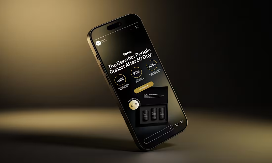
Forus – Sleep Supplement Launch Creative
Designed the launch creative suite for Forus, a sleep and nervous system supplement brand entering a crowded recovery market.
Supplement ads live or die in the first two seconds — trust has to be built before the user has even registered what the product is. So I split the creative across four conversion angles instead of one hero message: customer social proof, ingredient breakdowns, bundle offers, and expert endorsements from medical professionals. Each one answers a different buyer objection in isolation, which gives the media buyer clean testing signal on day one.
Visually, kept the system restrained – matte black bottles, floating capsule motion, oversized typography doing the hooks. The product is premium-priced, so the ads had to signal that without leaning on lifestyle photography the category already overuses.
Full suite of vertical video and motion creatives, sized for Meta and TikTok, plus the creative strategy for post-launch scaling.
0
66