Freelancers using Adobe Illustrator in Bogota
Sign Up
Post a job
Sign Up
Log In
Filters
2
Projects
People
Daniel Castellanos
pro
Bogota, Colombia
Brand Identity & Content Creation | Video & Motion
5.0
Rating
23
Followers
Follow
Message
Brand Identity & Content Creation | Video & Motion
3
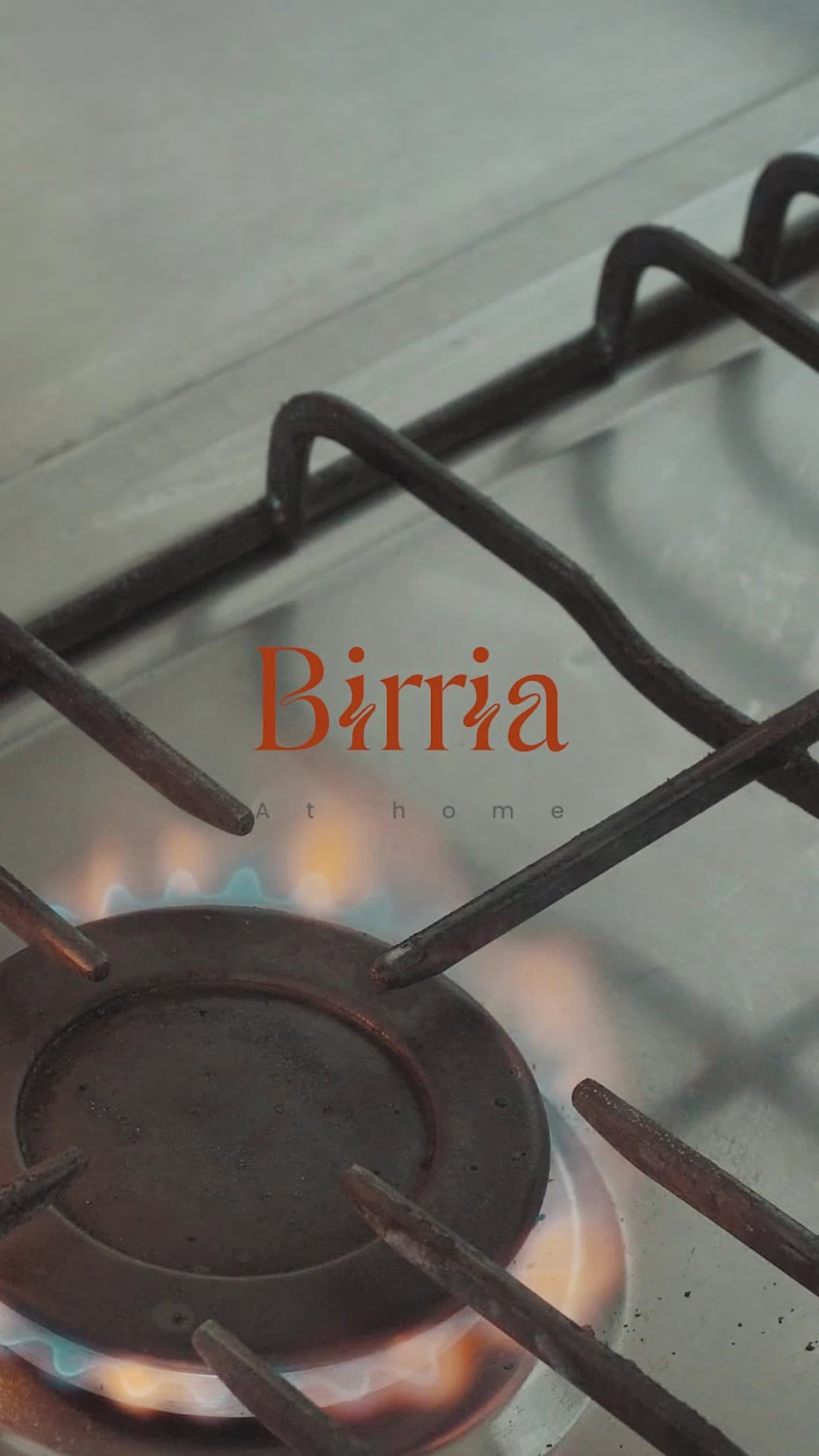
BIRRIA. There's a version of food content that treats the dish as the star and rushes to get there. This isn't that. Birria is a slow process — layers of dried chiles, bones, hours of heat. The edit follows that logic. The music is slow, almost pre-Columbian, but the cuts don't drag. They move with the rhythm, not against it. Close on the clay pot. The char on the chiles. Hands working. The result feels warm. Domestic. Like something your grandmother would recognize even if she'd never seen a camera. Detail-first food cinematography, edited to feel like the dish tastes.
3
83
3
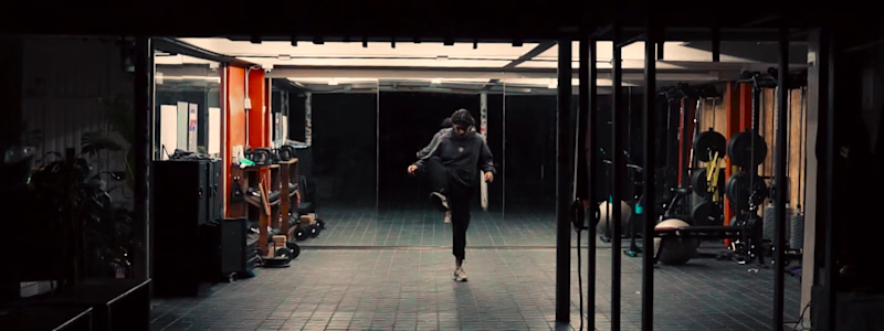
THE FULL PIECE IS HERE. German doesn't talk about climbing the way most people do. For him, it's not a sport you practice — it's a language you learn to speak with your body. That's what we wanted to capture. The first half is deliberate: static wide shots that hold the space, detail cuts that show the work behind the warmup. Intentional restraint before the release. Then the fade to black. What follows is the same athlete — same walls, same hands — but a completely different energy. The low-end of the beat dictates the cut. Movement becomes rhythm. He ends where he started. Sitting on the wall. The logo closes it. Shot and edited at his gym, built around his vision of the sport. Hope you like it !
3
117
3
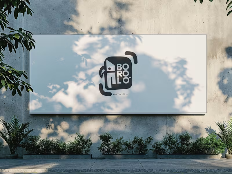
There are design decisions that don't come from the client. They come from within—and sometimes, that is exactly the problem. The previous logo for Boroló Estudio had soul. It had pre-Columbian roots, a hand-drawn stroke, and an indigenous character. It evoked drums, authenticity, and the Chocó—one of the most biodiverse and culturally rich regions in Colombia, a land of jungle, rivers, and a visual identity unlike any other. I loved it. And precisely because of that, I failed to evaluate the challenges the logo would face on real-world platforms: on a website, as an Instagram avatar, or in digital spaces. The redesign wasn't about letting go of the logo. It was about letting go of the attachment. The problem wasn't aesthetic—it was one of coherence. The studio’s brand had evolved, but the logo hadn't. A composition with too many elements in tension made the icon struggle to be memorable; what people saw didn't connect with who Boroló truly is. The new system retains the bird—now geometric, set in negative space within the icon. The inner container references the studio’s actual architectural blueprint: the diagonal of the cyclorama ceiling and the two zones of the space. The brackets refer to photographic framing. No layer imposes itself over the other—they are discovered. The result is a versatile system: imagotype, vertical logo, and wordmark. It works on a sticker, a billboard, an avatar, or a website. It scales without losing its identity. Redesigning doesn't mean the initial design was bad. It means communication needed to evolve. And from that point of view, the change isn't a correction—it’s a decision.
3
188
1
When a product needs to be understood, not just seen. Chemyunion is a high-performance cosmetic ingredients company. Their client isn't the end consumer — it's the formulator, the distributor, the professional making technical decisions about what goes into a product. For the presentation of Seriliss, their active ingredient for hair straightening and nutrition, the challenge was clear: show the product in action and explain why it works at the same time. The piece combines studio audiovisual production — with a professional demonstrating the application process step by step, from root to tip — with motion graphics integrated directly over the video to highlight specific areas of the hair, visualize the technical process, and translate chemical information into something digestible without sacrificing precision. Two languages in a single piece. The video demonstrates. The motion explains. Neither one is excess. That balance is what defines a strong technical content piece: it's not about making the product look good — it's about making the client understand it well enough to trust it.
1
175
Adobe Illustrator
(22)
Follow
Message
José Tovar
pro
Bogota, Colombia
Creating what matters, for brands with vision.
1x
Hired
58
Followers
Follow
Message
Creating what matters, for brands with vision.
1
Sten & Kant — Logo Design
1
7
1
Wisp — Brand Identity Design
1
6
2
Autip — Brand Identity Design
2
5
114
I’ve been exploring motion and design for Gambo Café's hero: a danish pastry / colombian beans café in Copenhagen... and I ended up liking both concepts for completely different reasons. Now I genuinely can’t decide which direction feels stronger! Which one would you choose, 1 or 2? Feedback is always appreciated!
51
114
3.9K
Adobe Illustrator
(3)
Follow
Message
Miguel Morales
Bogota, Colombia
Freelance Logo, Brand and Motion Designer

New to Contra
Follow
Message
Freelance Logo, Brand and Motion Designer
1
Advertainment Visual Identity Design
1
2
0
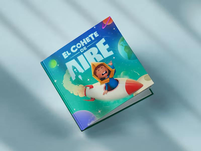
The Air Rocket | Cover Book Illustration
0
3
0
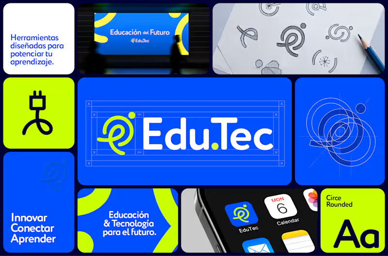
Visual identity | Edu.Tec™
0
6
0
Oreo® Christmas Key Visual
0
5
Adobe Illustrator
(3)
Follow
Message
Angie Sánchez Zapata
Bogota, Colombia
Brand Identity Designer & Creative Director | Visual systems
Follow
Message
Brand Identity Designer & Creative Director | Visual systems
1
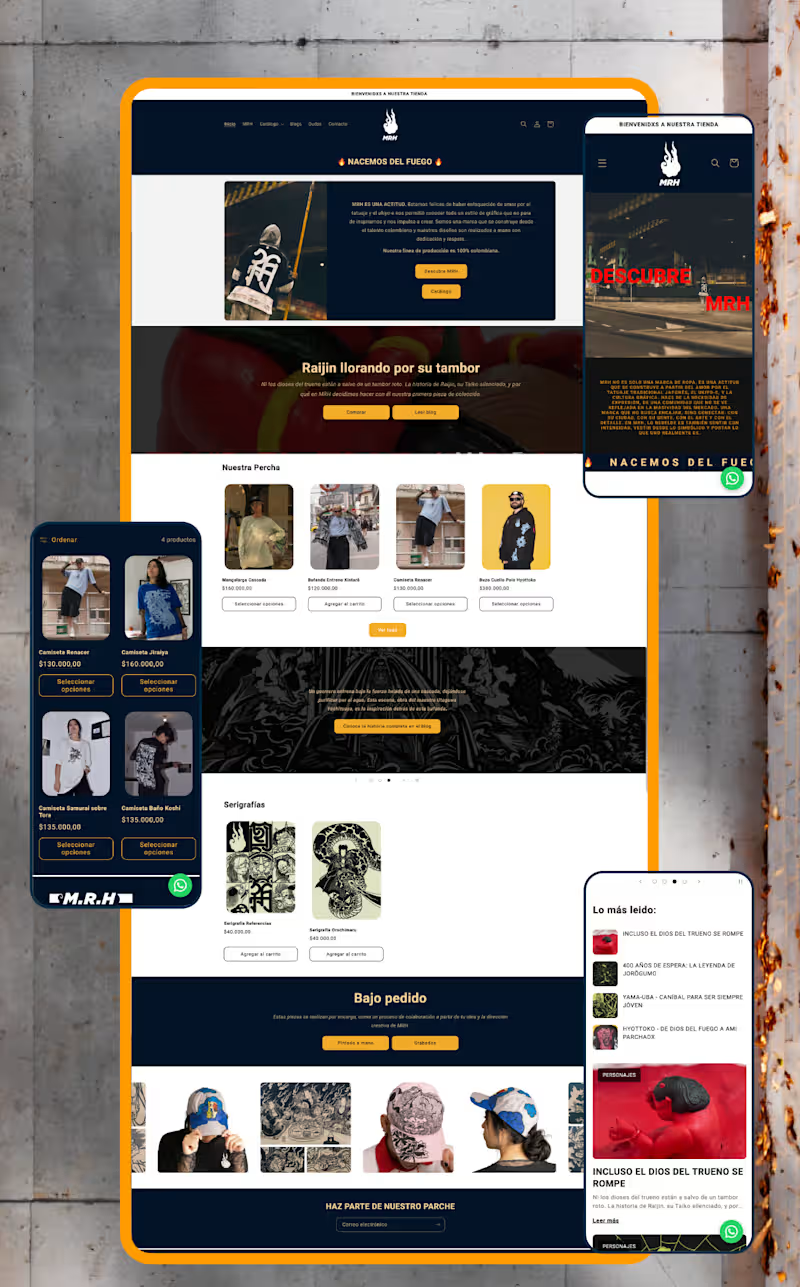
MRH — Website Redesign & Ecommerce Optimisation Project Type: UX/UI Redesign, Shopify Development & SEO Sector: Streetwear & Urban Apparel The context: MRH already had an online store, but it lacked structure, consistency, and a clear customer journey. Rather than redesigning isolated screens, I approached the project as part of a broader brand strategy — identifying friction points across the entire shopping experience and rebuilding the site around usability, storytelling, and scalability. My role: I led the full redesign end to end — from information architecture through custom Shopify development and SEO — working directly within the brand system I had already established for MRH. What I did: Reorganised the site's information architecture, simplifying navigation, menus, and product discovery for a more intuitive purchasing flow Redesigned the homepage — the highest-abandonment section — into a clearer introduction to the brand and its universe Separated storytelling from technical product information across product pages to improve readability and purchase decisions Built a dedicated blog giving each illustrated character its own narrative, connecting editorial content to ecommerce without interrupting the buying experience Developed custom Shopify components using Liquid, including interactive size-chart pop-ups (managed through metafields), dynamic product characteristics with visual icons, FAQs, trust indicators, and automated "Notify Me" functionality for out-of-stock items — all designed for the client to manage without touching code Restructured product categories into a dedicated Products section (previously a single catalogue-all page) and built a custom Collaborations page that auto-groups tagged products by partner brand Ran a complete SEO optimisation pass: restructured product descriptions, built keyword-focused URLs and metadata, and created a scalable metafield system so new products publish following the same optimised structure Set up quick-response templates in WhatsApp Business to streamline customer service Created a dedicated brand page explaining MRH's origins and philosophy, strengthening the connection between visual identity and digital presence The result: A website that isn't just visually stronger — it's easier to manage, more discoverable through search, and built to support MRH's growth long after launch. Full case study on Behance (https://www.behance.net/gallery/253684079/Website-Redesign-Ecommerce-Optimization)Live web (https://mrh-brand.com/)
1
79
1
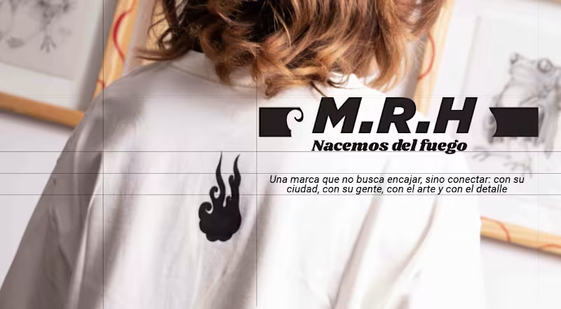
MRH — Building a Brand Identity System for a Streetwear Label The challenge: MRH is a Colombian streetwear brand with a strong creative instinct — rooted in Japanese aesthetics and a clear sense of who they wanted to be — but no system to express that consistently. No brand manual, no visual structure, just raw identity waiting to be organised. What I did: Conducted a full brand audit to understand their visual language, values, and audience Developed a cohesive brand identity system translating their Japanese-inspired aesthetic into consistent visual rules Built a strategic brand structure to guide how the identity shows up across every touchpoint — from product to digital presence The result: MRH didn't become a different brand — it became a more consistent one. Same energy, same roots, now backed by a system that lets it scale without losing what made it recognisable in the first place. If your brand has the instinct but needs the structure, I can help you find it. Full case study on Behance: https://www.behance.net/gallery/253561681/Brand-Identity-MRH Live web: https://mrh-brand.com/
1
83
0
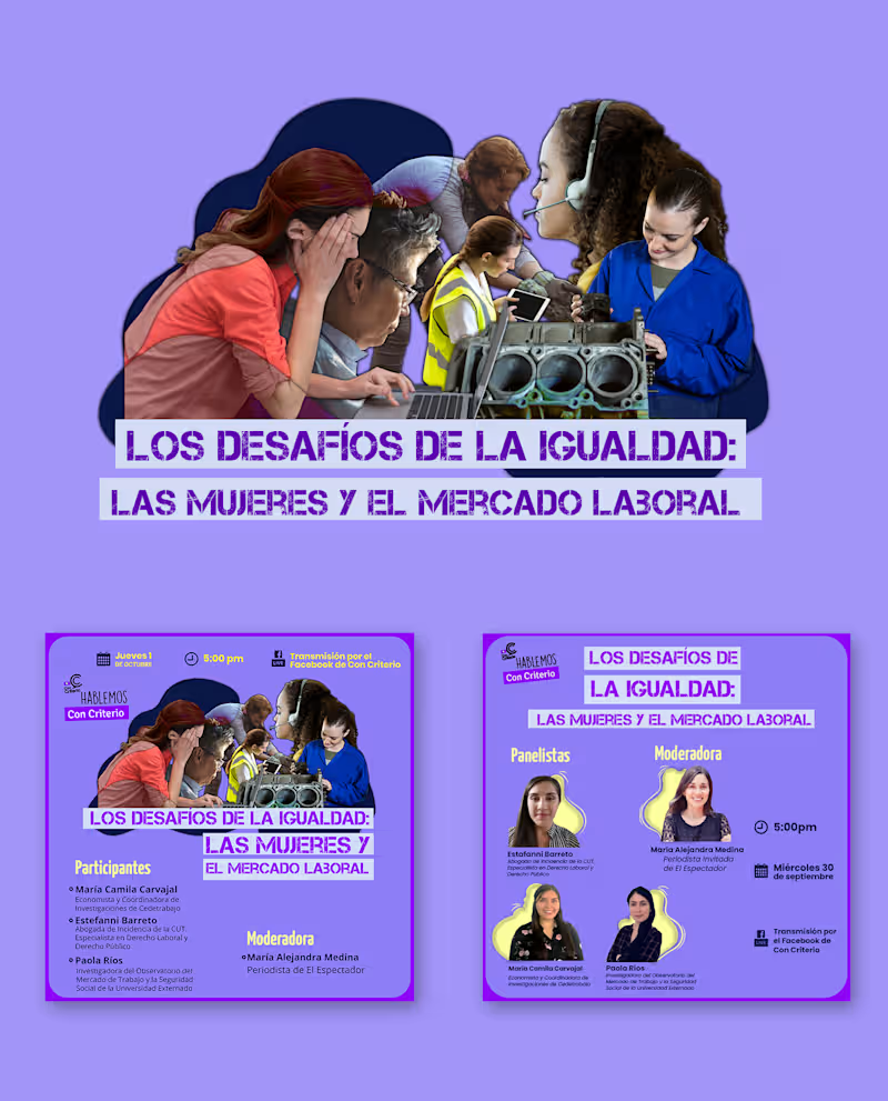
The context: Con Criterio was built as a new brand to sponsor "Tenemos que Hablar," a positioning campaign centred on a series of economic forums. Each forum needed its own visual identity, distinct enough to stand on its own, but clearly part of the same overarching campaign. My role: As part of my work with Cedetrabajo, I developed the individual graphic lines for each economic forum under this campaign, translating each forum's specific topic into its own visual language while keeping every line rooted in Con Criterio's core brand identity. What I did: Designed distinct graphic lines for multiple forums within a single unified campaign Balanced individual visual identity per forum with overall brand consistency Built a scalable visual approach that could extend to future forums under the same campaign umbrella
0
29
0
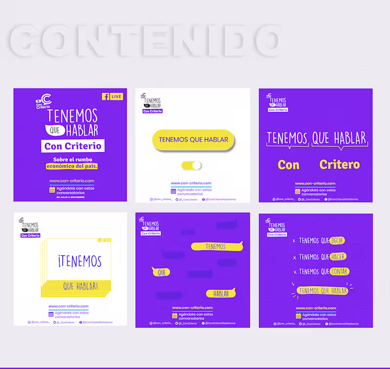
Aquí está el texto para este proyecto: Con Criterio — Social Positioning Campaign The context: Con Criterio is a platform focused on economic analysis and commentary. The goal was to position the brand on social media around its core economic focus areas, but 2020's pandemic isolation completely changed how audiences were engaging with content, so the strategy had to adapt to that new reality. The idea: Instead of one static campaign, we developed a series of forums, each with its own name and topic, unified under one overarching vision. Every forum carried its own distinct visual line, different enough to feel fresh and specific to its subject, while staying anchored to the same core brand identity throughout. My role: As part of my work with Cedetrabajo, I led design and art direction for the campaign, building the flexible visual system that let each forum feel distinct while keeping Con Criterio instantly recognisable across every post. What I did: Designed a modular visual system adaptable across a series of themed sub-campaigns Directed the graphic line for each forum while maintaining consistent brand identity Adapted content for social media formats in response to shifting audience behaviour during the pandemic
0
19
Adobe Illustrator
(13)
Follow
Message
Nathalia Acosta
Colombia
Graphic Designer
Follow
Message
Graphic Designer
0
T'aime - Brand Identity
0
9
0
Colour't - Brand Identity
0
10
0
Trave - Brand Identity
0
10
0
Nathalia Acosta - Website Design
0
6
Adobe Illustrator
(3)
Follow
Message
Dandy Torres
Colombia
Senior Creative Designer at Edelman
Follow
Message
Senior Creative Designer at Edelman
0
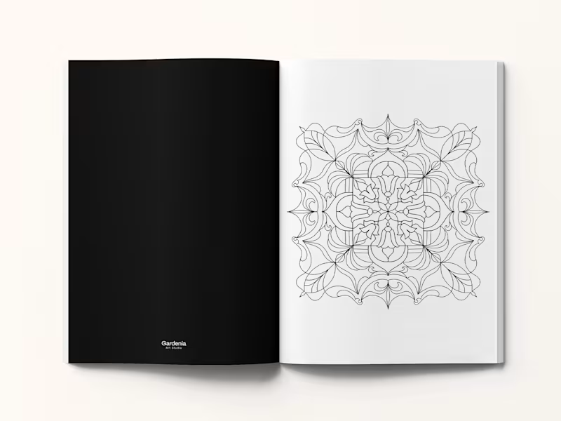
Coloring Book - Editorial Design & Illustration
0
34
0
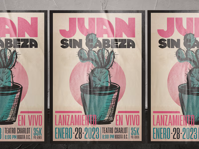
Music Brand Identity & Cover Art Design
0
41
0
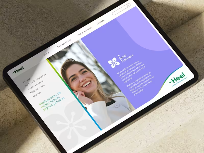
Brand Identity & Iconography Design - Heel Ltda.
0
34
0
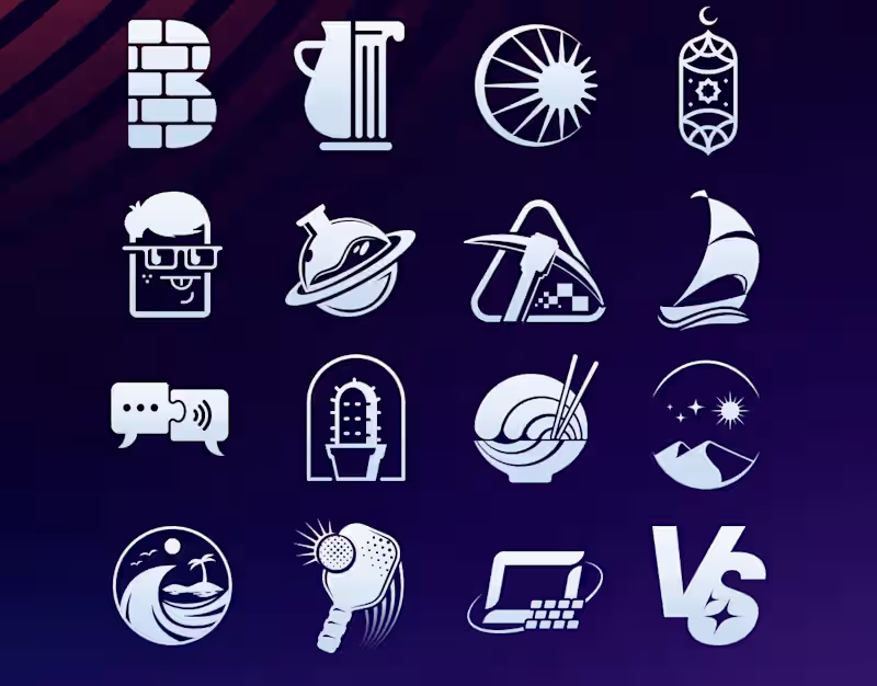
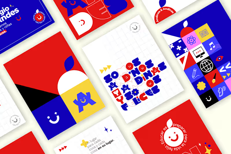
School Brand Identity Design
0
23
Adobe Illustrator
(7)
Follow
Message
Cósmica Studio
Colombia
Branding and packaging specialist
Follow
Message
Branding and packaging specialist
0
BackBone I Rebranding :: Behance
0
7
0
Quintaesencia on Behance
0
45
0
BBetter on Behance
0
8
0
Tres Gracias on Behance
0
18
Adobe Illustrator
(4)
Follow
Message
OZK ART
Bogota, Colombia
Graphic Designer & illustrator
Follow
Message
Graphic Designer & illustrator
0
Logo Creations
0
2
0
Social Media Publications
0
0
0
Print Content Collection
0
2
0
Posters & Banners PART ONE
0
2
Adobe Illustrator
(4)
Follow
Message
Explore people