Sten & Kant — Logo Design

José Tovar


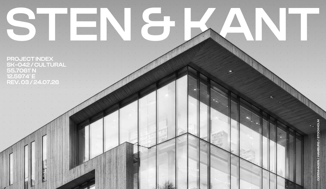
Sten & Kant — Logo Design
The need of an identity that reflected the studio’s architectural approach: precise, material-driven and quietly confident, without falling into the predictable minimalism of the industry.
We created a bold visual system built around structure, contrast and proportion. Strong typography, a restrained palette and modular graphic elements position Sten & Kant as a contemporary architecture practice shaped by clarity, permanence and purpose.

Logo
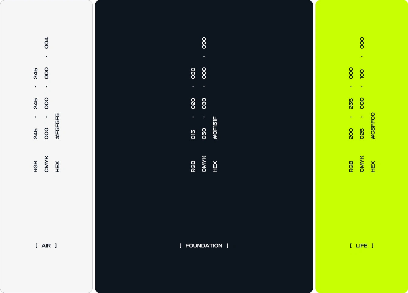
Colour Palette
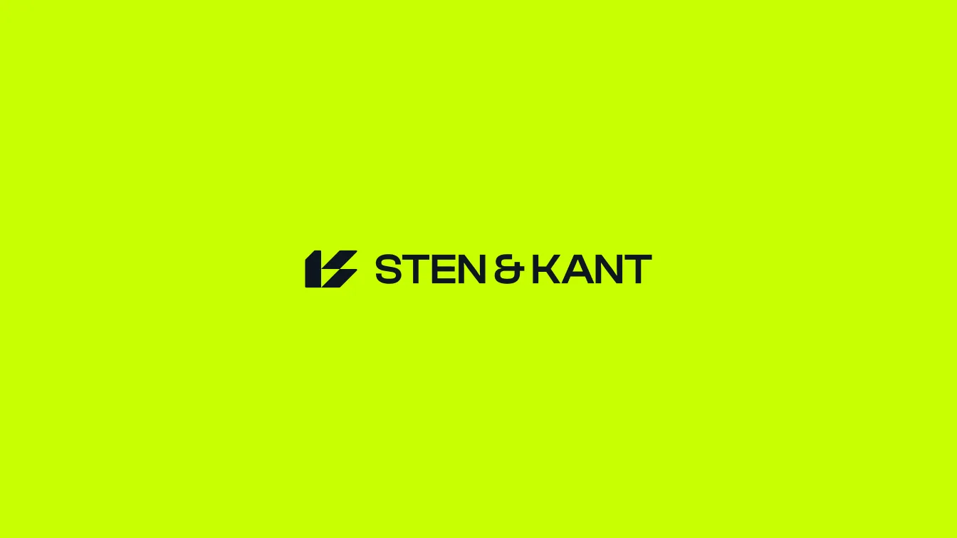
Logo + Wordmark

Poster

Stationery

Icon
Let's design a brand that matters together.
Like this project
Posted Jul 25, 2026
A bold architectural identity shaped by structure, contrast and proportion, positioning Sten & Kant as precise, modern and quietly confident.