
Angie Sánchez Zapata
Brand Identity Designer & Creative Director | Visual systems
Ready for work
Angie is ready for their next project!
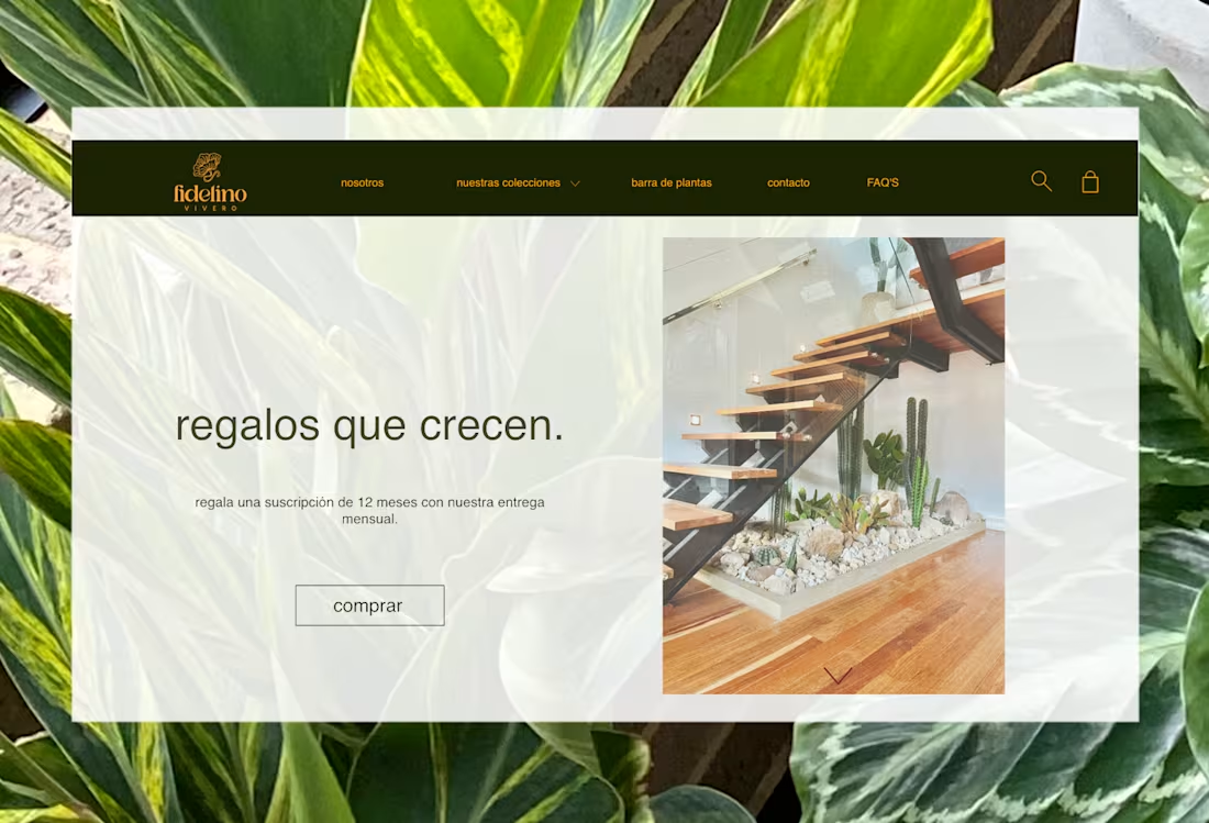
Fidelino Vivero — Brand Identity & E-commerce Web Design
Fidelino is a premium plant nursery that needed more than a website — it needed a world, a place where buying a plant felt as intentional and warm as the act of gifting one. The brand's core idea, regalos que crecen (gifts that grow), shaped every design decision from the logo to the checkout experience.
The visual identity centres on a hand-drawn botanical illustration mark, paired with a deep forest green and warm amber palette that communicates both sophistication and organic life. The typographic system balances editorial elegance with the approachability of a neighbourhood nursery that knows every plant by name.
The e-commerce experience was designed end-to-end for both desktop and mobile: homepage with curated editorial photography, product catalogue with personality-driven copy, individual product pages with size and pot selection, collection pages organised by category (plantas, materas, macramé décó, especiales), a functional shopping cart with shipping calculator, lifestyle gallery, FAQ section, and contact form — all maintaining consistent brand language across every touchpoint.
The mobile experience received equal design attention, with a navigation system, product detail drawer, and cart view optimised for touch interactions and conversion.
0
64
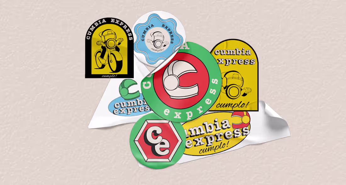
Cumbia Express — Brand Identity & Visual System
Cumbia Express is a delivery service brand built around a simple, powerful promise: cumplo — I deliver. The challenge was translating that reliability into a visual identity with enough personality to stand out in a crowded urban market, without losing the warmth and cultural familiarity that makes local service brands feel trustworthy.
The identity draws from Colombian street culture and retro Americana aesthetics — a combination that feels both locally rooted and timelessly bold. The central character, a helmeted motorcycle messenger, becomes the visual anchor of the entire system: energetic, recognizable, and instantly communicative of what the brand does.
The typographic system pairs Alex Brush (script, warm, human) with American Typewriter (slab, bold, reliable) — two typefaces that hold natural tension between speed and trust. The 6-color palette — Yellow, Red, Green, Sky Blue, Cream, and Near-Black — was designed for maximum versatility across physical applications: stickers, signage, packaging, and merchandise.
The full brand system includes two logo versions (circular and vertical), four color variations (including high-contrast dark and light backgrounds), a complete sticker collection of 7+ applications, and business card design — demonstrating how a single identity can stretch across an entire brand ecosystem without losing coherence.
0
71
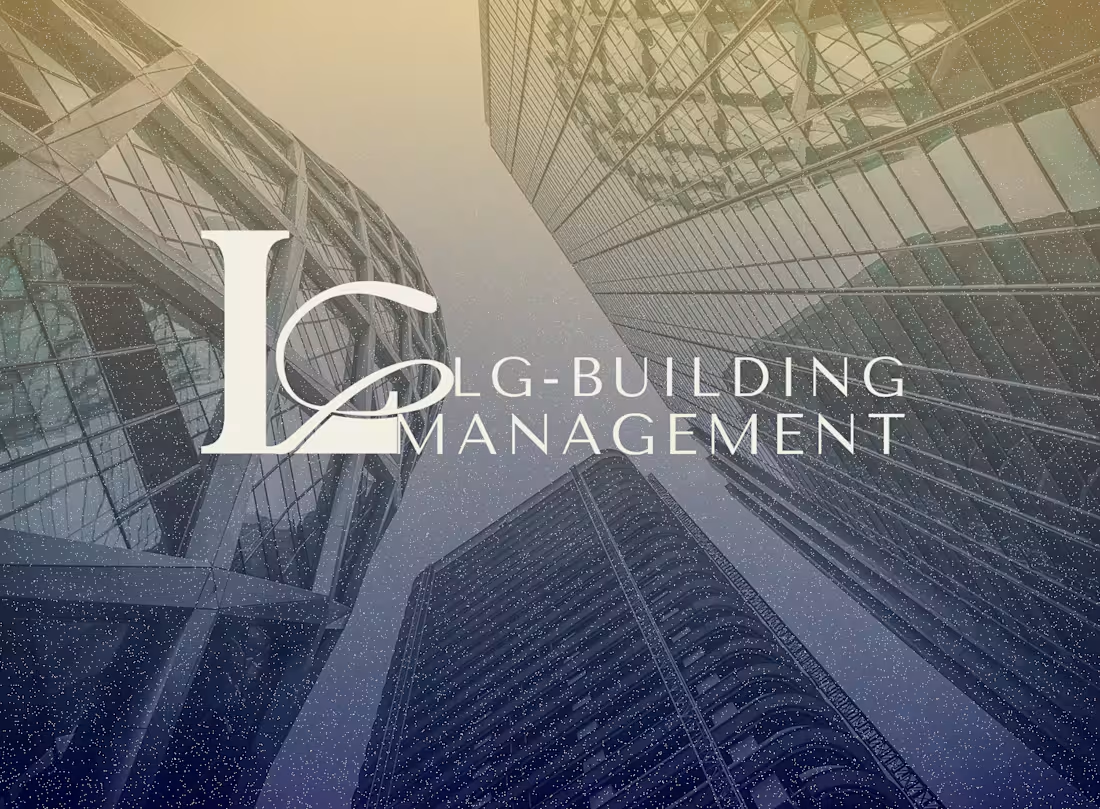
LG Building Management — Brand Identity & Web Design.
LG Building Management came with a clear vision but no brand — a Sydney-based company specialising in luxury residential and commercial property management, entering a competitive market with nothing to show clients except their word.
I built the entire brand presence from zero: a logo system with two versions (principal and horizontal), a refined colour palette and typography system aligned to the luxury real estate sector, and a complete set of print collateral, including brochure and business cards — all designed to communicate trust, precision, and premium service from the first touchpoint.
Beyond the visual identity, I architected and designed the company website on Wix from scratch — organising the information structure when the client had a vision but no content hierarchy. The site launched with four homepage sections and three pages (Services, About, Contact), designed to convert first-time visitors into inquiries.
The result: within months of launch, LG Building Management secured its first clients and now operates with two fixed ongoing contracts in the luxury property sector.
0
74
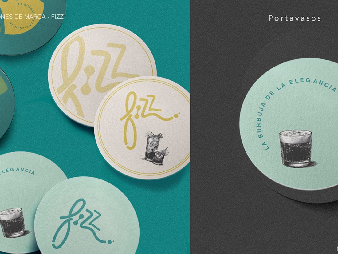
FIZZ — Luxury Mobile Cocktail Bar Brand Identity
FIZZ needed a brand that felt as refined as the experience it sells — luxury cocktails, served anywhere. Starting with zero brand equity, I developed the complete identity from concept to application: brand narrative, logo system with intentional anatomy (curves for elegance, bubbles for the cocktail surface, waves for the mixing process), a 5-tone color palette anchored in Teal and Old Gold, and a typographic system built for premium environments.
The visual language draws from Italian Amalfi coast aesthetics — warm, coastal, effortlessly elevated. Every element was designed to translate across both intimate private events and high-end venues without losing its character.
Deliverables included two logo versions (horizontal and vertical), brand patterns, a comprehensive brand guidelines system, and three physical applications: the mobile bar wrap, printed menu, and branded drink coasters.
0
83
Pitch Deck
0
4
Bran Design -Cattia
0
8
Brand Identity for a Non-profit organitation
0
13
Layout Design
0
11