Angie Sánchez Zapata's Work | ContraWork by Angie Sánchez Zapata
Angie  Sánchez Zapata

Angie Sánchez Zapata

Brand Identity Designer & Creative Director | Visual systems

Ready for work

Angie is ready for their next project!

Cover image for MRH — Website Redesign &
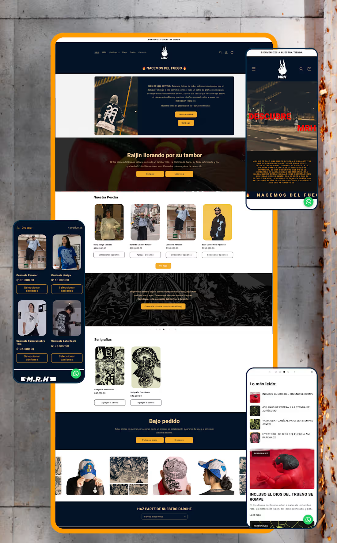
MRH — Website Redesign & Ecommerce Optimisation Project Type: UX/UI Redesign, Shopify Development & SEO Sector: Streetwear & Urban Apparel The context: MRH already had an online store, but it lacked structure, consistency, and a clear customer journey. Rather than redesigning isolated screens, I approached the project as part of a broader brand strategy — identifying friction points across the entire shopping experience and rebuilding the site around usability, storytelling, and scalability. My role: I led the full redesign end to end — from information architecture through custom Shopify development and SEO — working directly within the brand system I had already established for MRH. What I did: Reorganised the site's information architecture, simplifying navigation, menus, and product discovery for a more intuitive purchasing flow Redesigned the homepage — the highest-abandonment section — into a clearer introduction to the brand and its universe Separated storytelling from technical product information across product pages to improve readability and purchase decisions Built a dedicated blog giving each illustrated character its own narrative, connecting editorial content to ecommerce without interrupting the buying experience Developed custom Shopify components using Liquid, including interactive size-chart pop-ups (managed through metafields), dynamic product characteristics with visual icons, FAQs, trust indicators, and automated "Notify Me" functionality for out-of-stock items — all designed for the client to manage without touching code Restructured product categories into a dedicated Products section (previously a single catalogue-all page) and built a custom Collaborations page that auto-groups tagged products by partner brand Ran a complete SEO optimisation pass: restructured product descriptions, built keyword-focused URLs and metadata, and created a scalable metafield system so new products publish following the same optimised structure Set up quick-response templates in WhatsApp Business to streamline customer service Created a dedicated brand page explaining MRH's origins and philosophy, strengthening the connection between visual identity and digital presence The result: A website that isn't just visually stronger — it's easier to manage, more discoverable through search, and built to support MRH's growth long after launch. Full case study on Behance (https://www.behance.net/gallery/253684079/Website-Redesign-Ecommerce-Optimization)Live web (https://mrh-brand.com/)
1
37
Cover image for MRH — Building a Brand
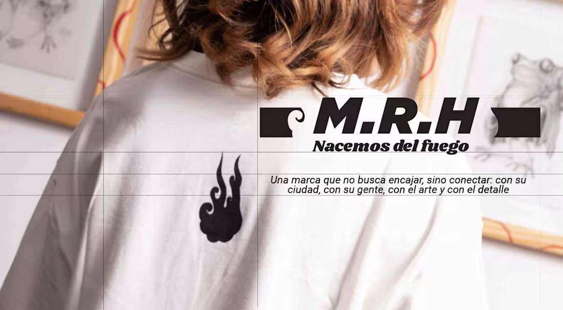
MRH — Building a Brand Identity System for a Streetwear Label The challenge: MRH is a Colombian streetwear brand with a strong creative instinct — rooted in Japanese aesthetics and a clear sense of who they wanted to be — but no system to express that consistently. No brand manual, no visual structure, just raw identity waiting to be organised. What I did: Conducted a full brand audit to understand their visual language, values, and audience Developed a cohesive brand identity system translating their Japanese-inspired aesthetic into consistent visual rules Built a strategic brand structure to guide how the identity shows up across every touchpoint — from product to digital presence The result: MRH didn't become a different brand — it became a more consistent one. Same energy, same roots, now backed by a system that lets it scale without losing what made it recognisable in the first place. If your brand has the instinct but needs the structure, I can help you find it. Full case study on Behance: https://www.behance.net/gallery/253561681/Brand-Identity-MRH Live web: https://mrh-brand.com/
1
31
Cover image for FIZZ — Luxury Mobile Cocktail
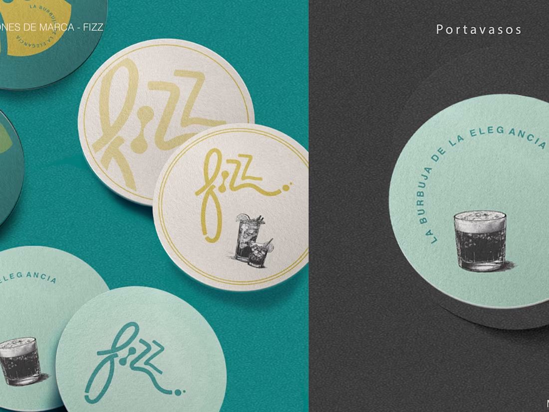
FIZZ — Luxury Mobile Cocktail Bar Brand Identity FIZZ needed a brand that felt as refined as the experience it sells — luxury cocktails, served anywhere. Starting with zero brand equity, I developed the complete identity from concept to application: brand narrative, logo system with intentional anatomy (curves for elegance, bubbles for the cocktail surface, waves for the mixing process), a 5-tone color palette anchored in Teal and Old Gold, and a typographic system built for premium environments. The visual language draws from Italian Amalfi coast aesthetics — warm, coastal, effortlessly elevated. Every element was designed to translate across both intimate private events and high-end venues without losing its character. Deliverables included two logo versions (horizontal and vertical), brand patterns, a comprehensive brand guidelines system, and three physical applications: the mobile bar wrap, printed menu, and branded drink coasters.
0
136
Cover image for LG Building Management — Brand Identity
LG Building Management — Brand Identity & Web Design. LG Building Management came with a clear vision but no brand — a Sydney-based company specialising in luxury residential and commercial property management, entering a competitive market with nothing to show clients except their word. I built the entire brand presence from zero: a logo system with two versions (principal and horizontal), a refined colour palette and typography system aligned to the luxury real estate sector, and a complete set of print collateral, including brochure and business cards — all designed to communicate trust, precision, and premium service from the first touchpoint. Beyond the visual identity, I architected and designed the company website on Wix from scratch — organising the information structure when the client had a vision but no content hierarchy. The site launched with four homepage sections and three pages (Services, About, Contact), designed to convert first-time visitors into inquiries. The result: within months of launch, LG Building Management secured its first clients and now operates with two fixed ongoing contracts in the luxury property sector.
0
128
Cover image for Cumbia Express — Brand Identity
Cumbia Express — Brand Identity & Visual System Cumbia Express is a delivery service brand built around a simple, powerful promise: cumplo — I deliver. The challenge was translating that reliability into a visual identity with enough personality to stand out in a crowded urban market, without losing the warmth and cultural familiarity that makes local service brands feel trustworthy. The identity draws from Colombian street culture and retro Americana aesthetics — a combination that feels both locally rooted and timelessly bold. The central character, a helmeted motorcycle messenger, becomes the visual anchor of the entire system: energetic, recognizable, and instantly communicative of what the brand does. The typographic system pairs Alex Brush (script, warm, human) with American Typewriter (slab, bold, reliable) — two typefaces that hold natural tension between speed and trust. The 6-color palette — Yellow, Red, Green, Sky Blue, Cream, and Near-Black — was designed for maximum versatility across physical applications: stickers, signage, packaging, and merchandise. The full brand system includes two logo versions (circular and vertical), four color variations (including high-contrast dark and light backgrounds), a complete sticker collection of 7+ applications, and business card design — demonstrating how a single identity can stretch across an entire brand ecosystem without losing coherence.
0
109
Cover image for Fidelino Vivero — Brand Identity
Fidelino Vivero — Brand Identity & E-commerce Web Design Fidelino is a premium plant nursery that needed more than a website — it needed a world, a place where buying a plant felt as intentional and warm as the act of gifting one. The brand's core idea, regalos que crecen (gifts that grow), shaped every design decision from the logo to the checkout experience. The visual identity centres on a hand-drawn botanical illustration mark, paired with a deep forest green and warm amber palette that communicates both sophistication and organic life. The typographic system balances editorial elegance with the approachability of a neighbourhood nursery that knows every plant by name. The e-commerce experience was designed end-to-end for both desktop and mobile: homepage with curated editorial photography, product catalogue with personality-driven copy, individual product pages with size and pot selection, collection pages organised by category (plantas, materas, macramé décó, especiales), a functional shopping cart with shipping calculator, lifestyle gallery, FAQ section, and contact form — all maintaining consistent brand language across every touchpoint. The mobile experience received equal design attention, with a navigation system, product detail drawer, and cart view optimised for touch interactions and conversion.
0
94
Cover image for Pitch Deck
Pitch Deck
0
7
Cover image for The context: Con Criterio was built
The context: Con Criterio was built as a new brand to sponsor "Tenemos que Hablar," a positioning campaign centred on a series of economic forums. Each forum needed its own visual identity, distinct enough to stand on its own, but clearly part of the same overarching campaign. My role: As part of my work with Cedetrabajo, I developed the individual graphic lines for each economic forum under this campaign, translating each forum's specific topic into its own visual language while keeping every line rooted in Con Criterio's core brand identity. What I did: Designed distinct graphic lines for multiple forums within a single unified campaign Balanced individual visual identity per forum with overall brand consistency Built a scalable visual approach that could extend to future forums under the same campaign umbrella
0
5
Cover image for Aquí está el texto para
Aquí está el texto para este proyecto: Con Criterio — Social Positioning Campaign The context: Con Criterio is a platform focused on economic analysis and commentary. The goal was to position the brand on social media around its core economic focus areas, but 2020's pandemic isolation completely changed how audiences were engaging with content, so the strategy had to adapt to that new reality. The idea: Instead of one static campaign, we developed a series of forums, each with its own name and topic, unified under one overarching vision. Every forum carried its own distinct visual line, different enough to feel fresh and specific to its subject, while staying anchored to the same core brand identity throughout. My role: As part of my work with Cedetrabajo, I led design and art direction for the campaign, building the flexible visual system that let each forum feel distinct while keeping Con Criterio instantly recognisable across every post. What I did: Designed a modular visual system adaptable across a series of themed sub-campaigns Directed the graphic line for each forum while maintaining consistent brand identity Adapted content for social media formats in response to shifting audience behaviour during the pandemic
0
3
Cover image for ¡Quiero Saber! — Campaign Content
¡Quiero Saber! — Campaign Content & Visual Direction The context: ¡Quiero Saber! is a social awareness campaign born from a coalition of Colombian organisations focused on social policy research, created to bring clarity and accessible information to the public about government decisions. Its second edition focused on COVID-19 — building a bridge between policy and society so both decision-makers and vulnerable populations could stay informed on how those decisions affected them. My role: As part of my work with Cedetrabajo, I led the design and art direction for this edition — developing an adaptable graphic line built around the campaign's core logo, flexible enough to shift with each new topic and intended outcome while staying visually consistent across every piece. What I did: Designed and adapted campaign content across formats for public distribution Built a mood board and visual direction to guide tone and consistency across the edition Ensured every asset stayed on-brand while adapting to different policy topics within the campaign
0
3
Cover image for Bran Design -Cattia
Bran Design -Cattia
0
10
Cover image for Brand Identity for a Non-profit organitation
Brand Identity for a Non-profit organitation
0
14
Cover image for Layout Design
Layout Design
0
11